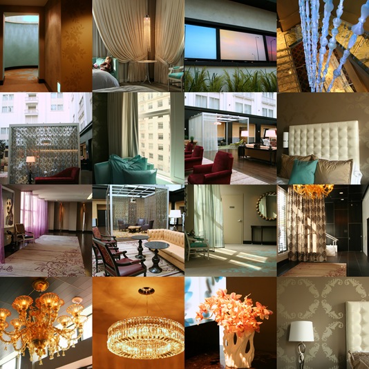
Five Simple Tips to a Better Architectural Photo


I thought we’d relax after yesterday’s trip to Vancouver with a little photography.  I was fascinated to see that a full 89% of you who responded to the recent Urtak survey said you enjoyed photography, so I hope this next post will prove to be both interesting and useful to many of you.

I had the enormous pleasure of meeting Michele, a professional architectural photographer, on the Blogging Your Way weekend. Her blog is newish, but wonderful – she has a warm, witty, very funny voice and takes seriously awesome photographs.  And yes, you have to read her blog posts in a Brooklyn accent.

First of all, I’m totally having an anxiety attack because someone reads my blog. And not just someone, but the lovely, creative, funny, and incredibly spirited, Paola. And not only does she read my little photoblog, Tripping on Asphalt, but she likes it enough that she’s asked me to write something for her wonderful blog. I’m melting into a little puddle on the floor. Then she’s all, “Sorry for the short notice, Love” and I’m swooning over the super-cool accent (because, of course, I read her emails with an accent), and in my head I’m all, “seriously, sister; if you’d given me a week instead of 24 hours, I’d’ve died from an anxiety attack instead of getting myself together and writing this post”.

So here we are! My name is Michele, and I began my architectural photography business, Sequined Asphault Studio, back in 2005. I was born and raised in Brooklyn and now live in Connecticut with my very tall husband and my very small dog, who I am trying to teach to work a cocktail shaker. If you’d like to get to know me a bit better, consider yourself warned, but you can read about some of my random idiosyncrasies on my blog, Tripping on Asphalt .

Paola tells me you love photos! So we thought I’d share with you just a few of the techniques I use to create an image; techniques that you can easily steal to make your own photos even better. For the last tip you’ll need a dslr/slr and be able to set it to manual mode, but for all the others any camera will do. Now, I tend to steer away from the how-tos for fear of being Miss Bossy Pants, but for Paola, I’m going to be adventuresome. I humbly present to you, Five Simple Tips to a Better Architectural Photo.


Tip 1:   Use a Tripod.


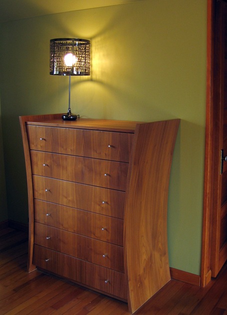
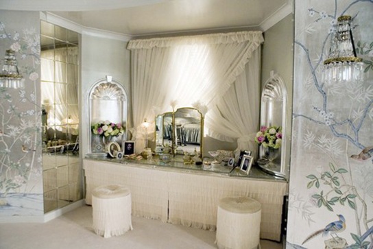
scotto1

I basically can’t talk to you any more if you don’t follow this advice, because everything else I’m going to tell you requires you to put down the camera so that you can be more conscious of everything in your shot. If you’re using one already, 5 points for Gryffindor! If you are not, don’t despair, just give it a go. And don’t break the bank if you don’t have one already. Chances are you can find something in a friend or relative’s basement. If not, get an inexpensive base model and it will serve you loyally.

Now, if you are attempting to get a shot of newly mobile toddlers using a tripod, you will get a headache trying to get them in frame, which will lead to more vodka and less pictures. But a tripod can elevate many types of photography, even, or maybe especially, a basic family portrait where you can mindfully set up your shot and possibly hop in after you’ve set the timer.


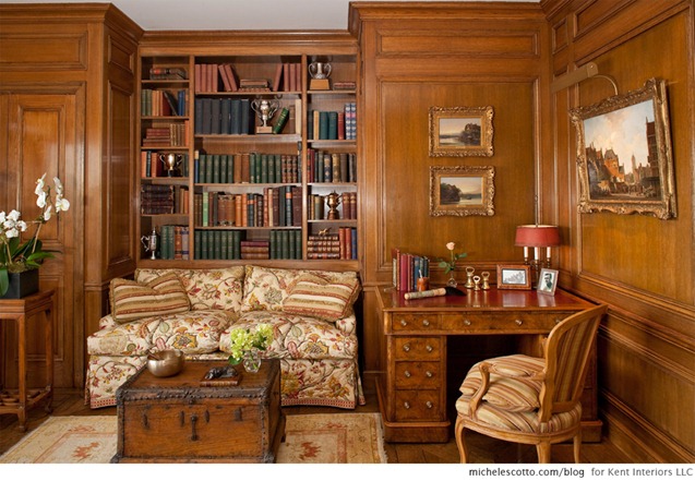
Tip 2:  Be Conscious of Your Lines


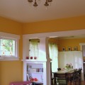
scotto2


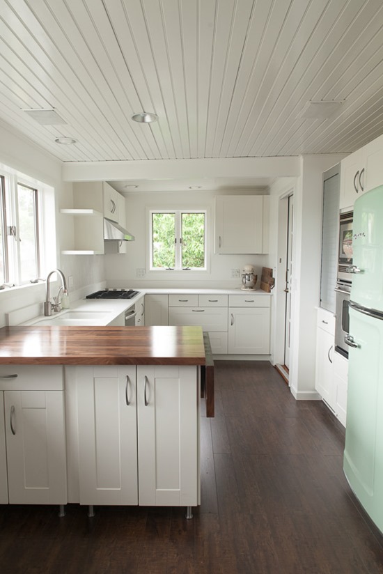
Now that your camera is on a tripod, look through your viewfinder at the walls, moldings, doorways, bookcases, trees, or anything that creates a right angle or parallel lines within the frame of your photo. Get right up in your viewfinder and position the camera so these lines are as straight as possible. Especially the floor and ceiling. I shoot directly to the computer and can double check on a larger screen, but you can use your viewfinder and LCD screen quite effectively. Most often when things look cockeyed on the screen after I’ve take the time to perfect my lines, I find I’ve been looking through the camera at some messed up angle, so make sure you’re not crooked either.

While you’re at it, analyze the lines you’ve got. If you don’t want to see the ceiling, zoom in and get it out of there. Make sure those lines include exactly what speaks to you to photograph. Nothing more, nothing less.


Tip 3: Consciously Choose Objects to Convey the Mood


scotto3

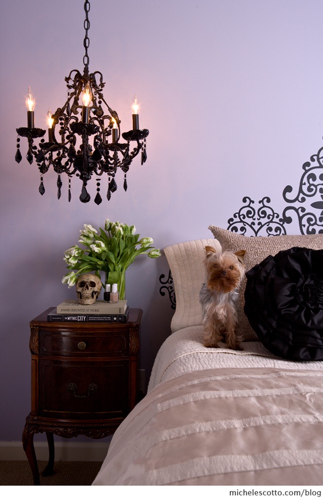
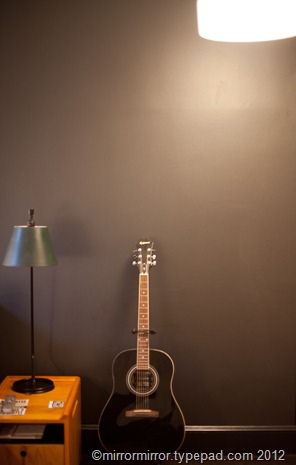
My husband, Dug, is convinced that my 3 pound Yorkie, Chewbacca, would make every single photo I take better. (Paola would likely prefer a disinterested cat.) I’ve unsuccessfully tried to explain to Dug that at some point, people might stop paying me for my services if I refuse to take photos without Chewie. To which he calmly shakes his head and repli es, “Have they met him?”

But Dug makes an excellent point. Animals warm the heart and can create a more inviting photo. Embrace animals, or items that show personality. Since this shot was taken in my own home, it was super simple to grab Chewie and everything on that nightstand from other places in the house to create a quick scene that reflects me, instead of the clutter that was actually there, which also reflects me, though I’d prefer my used Kleenex and iPhone charger not be recorded for posterity.


Tip 4:  Declutter and Edit Out Objects that You Don’t Want Stealing the show


scotto4


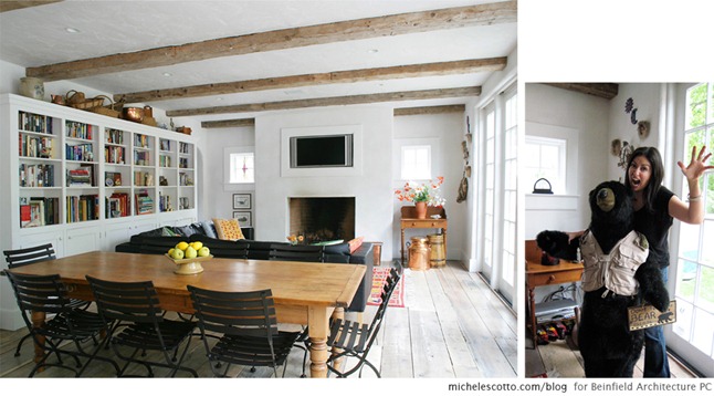
Sometimes there can be too much personality. Go ahead and move stuff out of the frame that’s distracting. Declutter. And here we come back to the tripod again. Because once you’ve got the camera pointed at your subject matter, you can keep going back and checking the composition to actively decide what you want in the frame and what you don’t. Get all the crap out of the way because the only thing that matters for your photo is what the camera can see. Armageddon can be, and often is, 2 inches outside of the frame, and no one will ever know.

I loved this bear. I totally wanted to take him home. But if I’d left him in the shot, no one would be looking at the architecture, right? They’d be all, ‘Bear!’ Which was pretty much how I felt all day at this shoot. “Bear!’ We even set him a place at lunch. You can also see the equipment and wiring in the corner behind me that we covered with the homeowner’s cool jugs (now I’ve gone and accidentally made a boob reference and I’m never going to get invited back).

OK, bear with me while we get a tad technical. (and now I’m punning, how unfortunate)


Tip 5: For a Sharp All Over Photo, Set a Large Numbered f-stop


scotto5

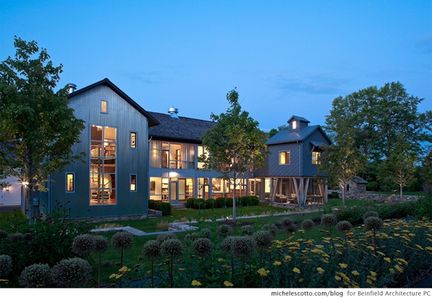
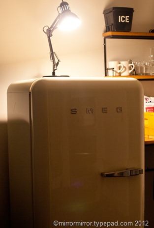
When I’m setting up an overall, wide-angle shot, I want everything as crisp and sharp as possible throughout the entire image. None of the beautiful bokeh, the blurred background that pops your subject, people love so in portraits. To make this happen using only available light, crank the f-stop setting to as high a number as you can go (a higher number is actually considered a smaller f-stop because it means the resultant opening for light is very small), then find your shutter speed through experimentation. You’ll need a much longer exposure, so just keep adjusting your shutter speed to find the right balance of light. Anything moving in a long exposure shot, like an animal, person, or branch in the wind, will end up a motion blur, which can be pretty interesting.

This night shot is an extreme example but the shutter was open for 3.2 seconds and the f-stop set at f/16. Obviously I couldn’t hold the camera still for 3.2 seconds, so thanks to my trusty tripod, that’s 3.2 seconds during which I was sipping pinot noir.

Our time here has come to an end, lovelies. I thank you so much for the opportunity to chat, and thank you Paola for having me as your Guest Blogger for the day! I’d love to hear if you’re able to make use of any of these tips, or if you have any questions I can tackle about the kinds of photos you see on my site or in the design magazines. Drop by any time for a visit.

xoxo MS T
   
Share

Mad Men: More On Don Draper’s New Apartment


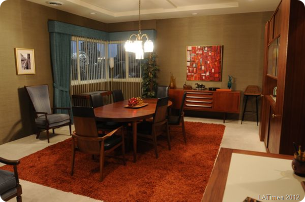
don-draper-dining-room


It went a little crazy round these parts when I wrote my recent analysis of Don Draper’s new apartment, so for the 47% of you who watch Mad Men (and for the remaining 53%, why the heck don’t you?), here are some more great articles I’ve found online about his new digs.

Firstly the LA Times did a great interview with set designer Claudette Didul about how she put the look together, and including a list of shopping resources.


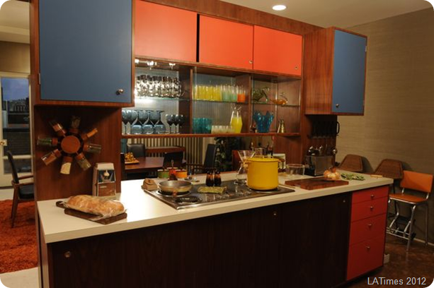
don-draper-kitchen


Secondly, the LA Times also did a piece on the reaction to Don’s new pad online and included a link to THIS.VERY. BLOGAnd they called me ‘astute’.  What a remarkably sensible and insightful paper the LA Times is! 

The divine Tula, shopping guru extraordinaire, wrote two great pieces.  One on how to recreate Don’s apartment in your own home and another on how you can channel your inner Megan.


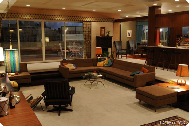
don-drapers-living-room


And the ever fabulous Tom and Lorenzo are again doing their weekly episode by episode Mad Style round-ups, which focus mainly on the fashions, but also on the interiors and sets.  I swear only people who are more insightful and knowledgeable about the show are the writers and producers themselves.

   
Share

Meet My New Office Manager


So as mirrormirror begins its quest for world blogging domination, I thought it was about time I brought in a new office manager to get things organised round here.

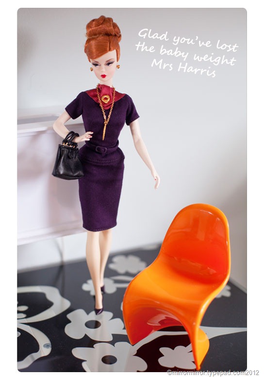
joan-holloway-barbie7


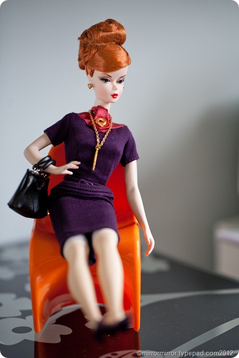
Remember when I pre-ordered a Joan Holloway Barbie doll?  AGES ago?  And how I was looking for a suitable mid-century Barbie-sized 1:6 scale chair to sit her on? (Which was not an incredibly expensive Vitra Miniature)

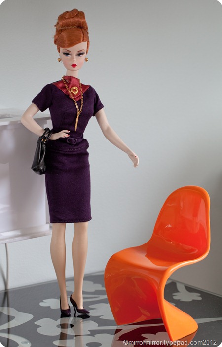
Well when I was in New York last month I finally found what I was looking for in the MOMA shop – a 1:6 scale Panton chair (also available online at Lexington Modern in a variety of colours).

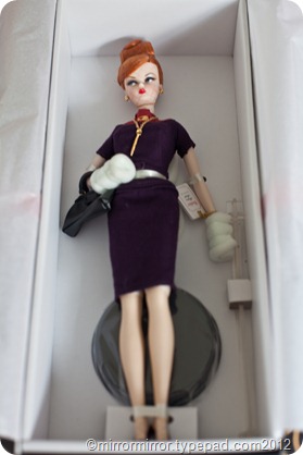
So today I finally unpacked Ms Holloway from her cardboard coffin and brought her in to kick some ass.


joan-holloway-barbie (1 of 6) joan-holloway-barbie (2 of 6)

joan-holloway-barbie (5 of 6)


Unfortunately I hadn’t reckoned on the fact that she doesn’t have jointed knees, so after all that she looks rather ridiculous sitting on her Panton chair.  And her skirt is so tight it rides up and shows the tops of her stockings. Not that I expect the real Joan would have minded that though.


joan-holloway-barbie (4 of 6)


Maybe I should have bought her the Vitra Miniature Saarinen Womb Chair and Ottoman after all. (Haha! No. Have you seen the price?)

I have to say that the attention to detail on this Barbie is wonderful, from her carefully painted finger and toenails, to the seams in her stockings and her exquisite jewellery.  I’ve never had a Collector’s Edition Barbie before and I adore her.

   
Share

Mad Men: Don Draper’s New Apartment


Zou Bisou Bisou.

I don’t think I’m ever going to get that song out of my head.

I trust we were all watching last night?  The big news of course is that Don Draper, apart from getting himself a sexy little package of a new wife -  who I predict is going to be nothing but trouble – but has also got himself a sexy, new, not-so-little apartment.


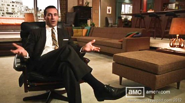
don-draper-apartment11


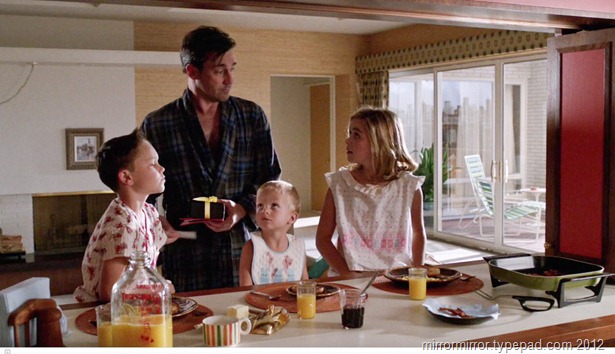
Don now lives in the big city, away from Betty and her suburban angst and her suburban furniture (remember her er, lovely ‘fainting couch’?) in an apartment big enough that his kids can come visiting and where his wife can host wild surprise parties.

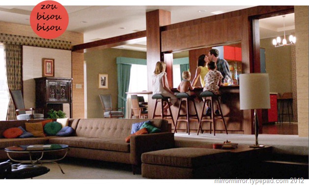
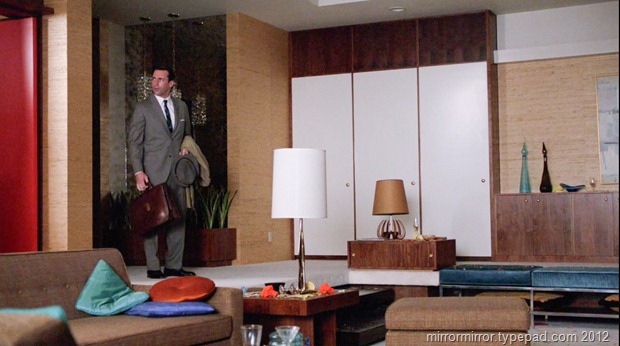
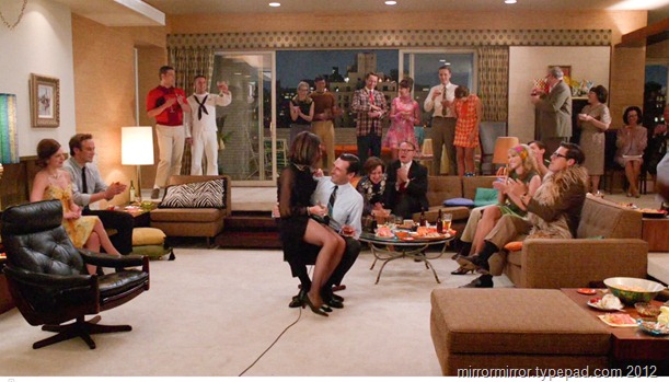
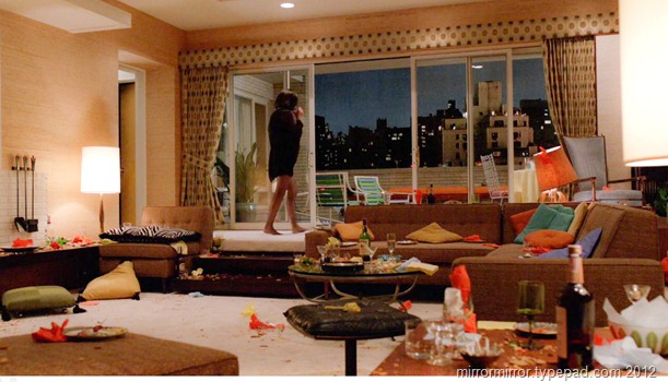
It’s a clever set.  Instead of filling it with mid-century icons such Saarinen tables and chairs and Arco lamps (unlike Roger’s office with its shipped-in style), it just feels very comfortable and of its time, very sixties, but not ostentatiously so. 

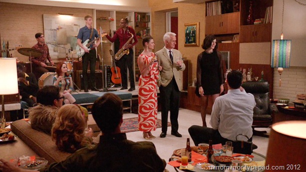
The colour scheme of burnt orange and turquoise is kept to the periphery and the accents  -  the aqua curtains, the seating out on the balcony, the orange kitchen cabinets and the gorgeous throw pillows, but the main body of the set is very brown, very boxy and very wood-panelled, with even the pattern on the curtains seeming quite subdued.


don-draper-apartment (1 of 19)


don-draper-apartment (16 of 19)


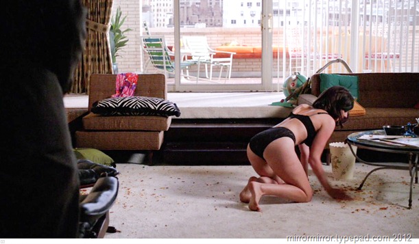
A little light relief is offered by the white cupboard doors, the white feature wall and of course the infamous white rug, with the occasional dark red painted door or panel, but in general the main body of the set is kept quite spare and neutral.  Even the art on the walls is quite dull and nondescript.


don-draper-apartment (9 of 19)


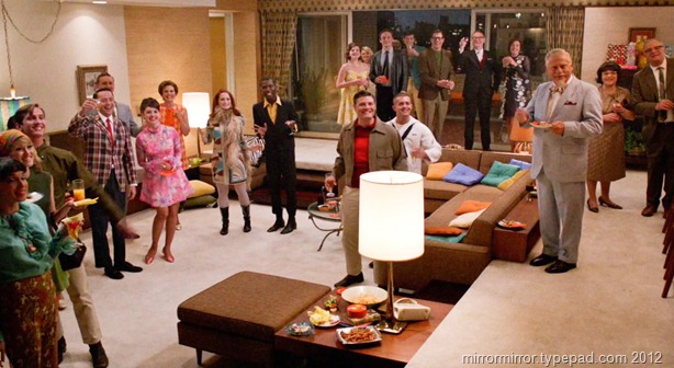
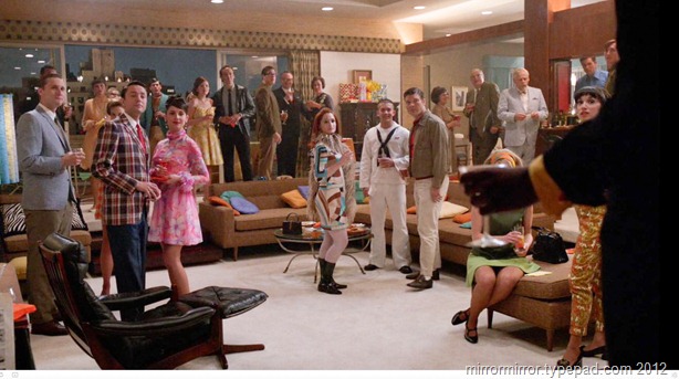
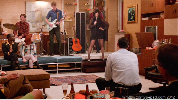
Which makes sense of course if the marriage-threatening surprise parties you hold are such a riot of sixties pattern and colour.  Weren’t the costumes in these scenes just awesome?


don-draper-apartment (12 of 19)


don-draper-apartment (11 of 19)


don-draper-apartment (18 of 19)


I managed to spot a few Sixties icons dotted about – the Catherine Holm enamel bowls, the Eames lounge chair, the Murano glass and the zebra-striped cushion. Did any other Sixtie s paraphernalia catch your eye?


don-draper-apartment (13 of 19)


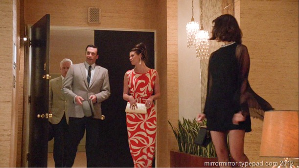
And I have to give a shout out to the exquisite chandeliers in the entrance way, and that lovely low-hanging blue lamp.  What did you like most about the set?


don-draper-apartment (14 of 19)


don-draper-apartment (19 of 19)


These images show how the designers had fun with costumes, party accoutrements and accent pieces to create a mood.  I’m sure we’re going to see that mood darken as the season progresses.


don-draper-apartment (15 of 19)


I am certain the Husband had eyes for nothing but that glorious aqua Sixties vacuum cleaner in this scene.


don-draper-apartment (17 of 19)


So did you watch? Did you enjoy it? What did you think of the new apartment? Any particular objects you were coveting?  I’m enjoying how the new Mrs Draper is quite literally leading Don by the balls.  I’m sure that’s going to end up well.

Zou Bisou Bisou.

   
Share

Go Love Your Room: Vanessa Bruno’s Paris Apartment


This week’s Go Love Your Room – where I take a room, house or apartment and analyze why it really, really speaks to me – features French designer Vanessa Bruno’s apartment in Paris.

I actually blogged about this briefly back in 2007, but it has haunted me all this time and I recently came across a great set of photos.  I thought it would be interesting to examine what I love about it, and see whether it has stood the test of time.

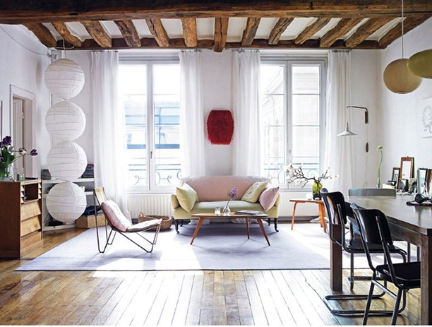
vanessabrunoapartmentparis


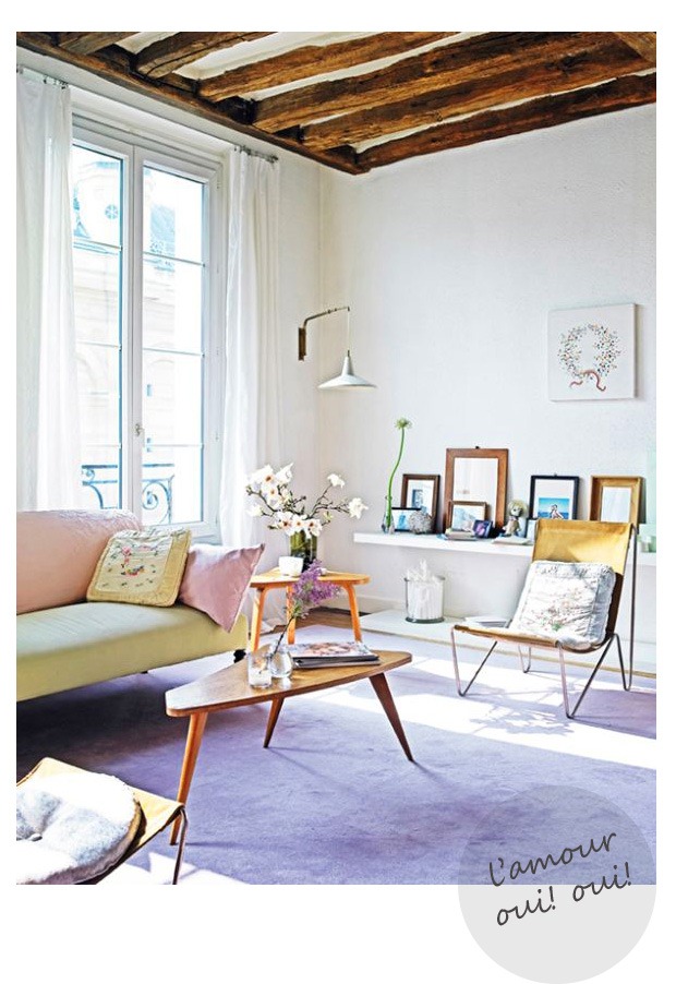
The space itself is cheating of course.  It doesn’t take much design talent to make those high ceilings and rustic beams look good.

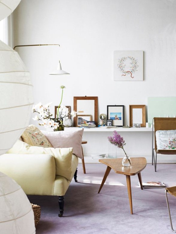
The sugared almond colour scheme of lilac, celery green and dusky pink is still very attractive and feminine, though a perhaps a little sweet for my taste nowadays.  Though the colours, the sprigged embroidered cushions, the fresh flowers and the garland artwork are unashamedly girly, I love how Bruno keeps everything else spare and plain to avoid it tipping over the edge.


vanessa-brunos-apartment


The low picture shelf is a lovely touch (that Diane von Furstenburg could learn from) as are the rustic wooden frames that echo the beams. And I like the echoing triangles of the side tables and the chair legs. And is that just a plain, pistachio green canvas propped up to give an additional hint of colour?


vanessa-brunos-apartment (5)


Pulling out a bit the red furry (beady?) artwork on the wall is a touch of genius, providing an emphatic focal point,, emphasising the symmetry of the room, dirtying up the colour scheme and providing a much needed touch of luxurious texture.  I also like that, unlike last week’s room she’s used a huge floor rug to cosy things up a little and ground the spindly-legged and rather insubstantial furniture, even at the cost of covering up those marvellous floorboards.

The string of paper lampshades, which Bruno apparently put together herself, is also a fabulous touch.


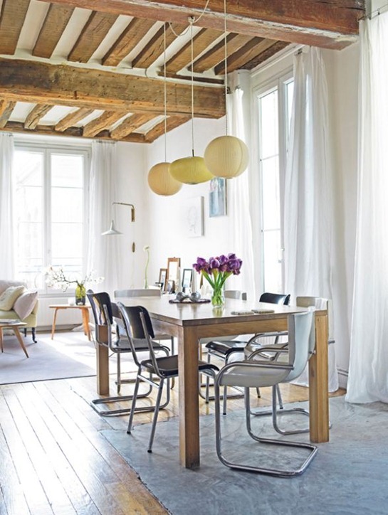
vanessa-brunos-apartment (1)


The coloured lampshades over the table are clever too, bringing the colour palette into the dining area and echoing the shades on the other side of the room. And I absolutely love how the central one is elliptical and not round to prevent a surfeit of balls everywhere (and that’s never a good idea).

The hefty wooden table and industrial chairs again counteract the girliness and the substantial table legs contrast well with the flighty nature of the surrounding pieces. I’m not sure about having the table and chairs half on and half off the rug though.


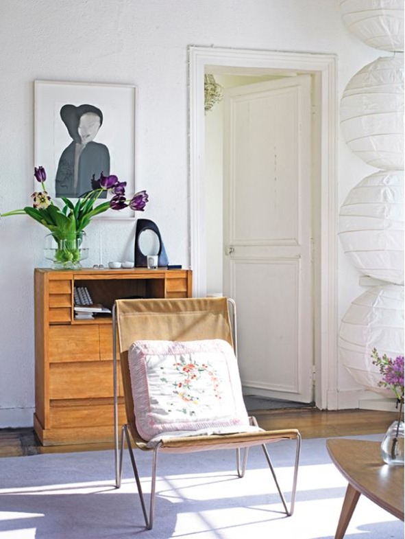
vanessa-brunos-apartment(3)


I like here how the sculpture on the secretaire reflects the painting above. 

This room is another study in geometric shapes – it seems I’m a sucker for them – the aforementioned triangles, the square cushions and dining chairs, the rectangles of the windows and the big round balls.  And also a study in contrasts – romantic v industrial, light v substantial, rough v smooth, spare v ornate. 

Though I think nowadays I’d add a bit more punch to the colour scheme and maybe some more graphic elements, I think this has stood the test of time very well and I certainly wouldn’t mind moving in tomorrow.

What do you think?  Too feminine or just right (or not feminine enough?)  Do you think it looks dated? Where can I get a red fuzzy thing to hang on my wall?

See how the sun is streaming into the rooms above?  It’s a photographer’s nightmare, but that’s what’s happening in Seattle at the moment.  It’s going to be a great weekend.  Have fun wherever you are.

   
Share

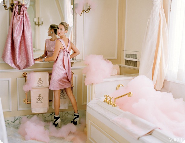
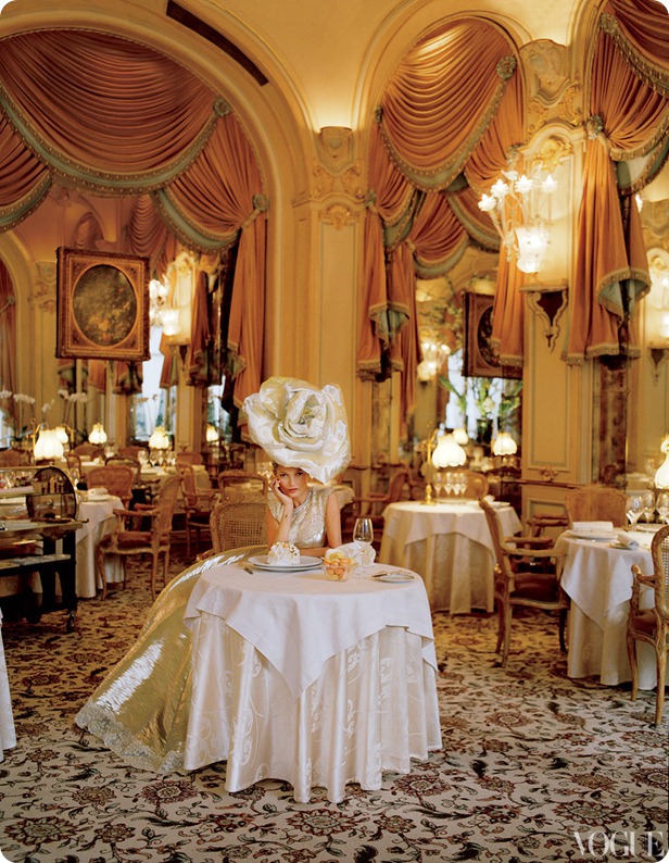
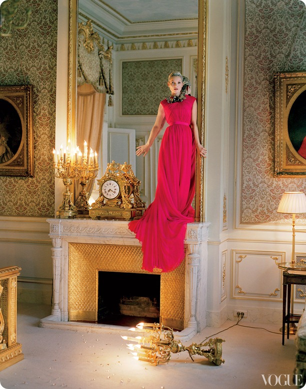
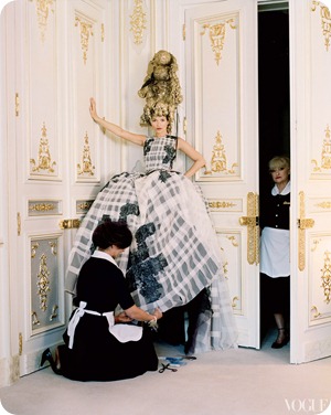
Kate Moss at the Ritz for Vogue US


I just subscribed to US Vogue on my iPad, and to celebrate I thought I’d share the most gorgeous fashion editorial I’ve seen in a long while.


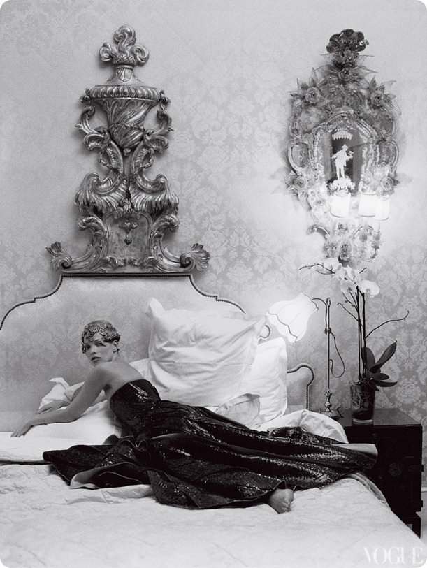
ritz-kate-moss-vogue (6)

Balenciaga by Nicolas Ghesquiere

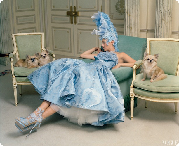
ritz-kate-moss-vogue(1)


Alexis Mabille Haute Couture
   

It’s not often you get to ogle exquisite interiors as well as exquisite frocks, but Vogue wanted to celebrate the iconic Ritz Hotel in Paris, before it closes for a major refurbishment.


ritz-kate-moss-vogue (9)


Giambattista Valli Haute Couture
   

ritz-kate-moss-vogue (8)

Armani Prive’
   

ritz-kate-moss-vogue (2)

Alexander McQueen
   

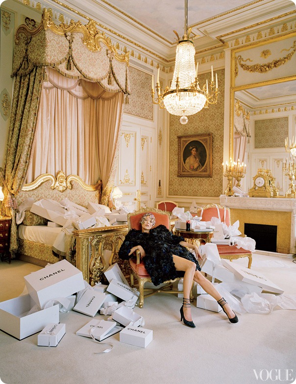
ritz-kate-moss-vogue (3)

Chanel Haute Couture
   
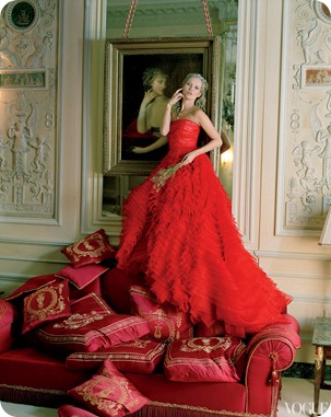
ritz-kate-moss-vogue

Dior Haute Couture
ritz-kate-moss-vogue (7)

Full editorial here. Photos by Tim Walker.

   
Share

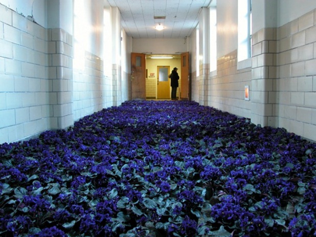
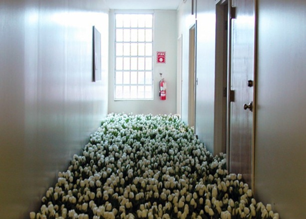
The Story of Bloom by Anna Schuleit


I was so incredibly moved by this art installation that I came across recently.

There’s something about the beauty of the flowers in such a bleak space, and the hope they represent in a place that must have seemed devoid of hope for so many people.  Art can sometimes be so incredibly powerful.


BLOOM-by-Anna-Schuleit-Blue-Hallway


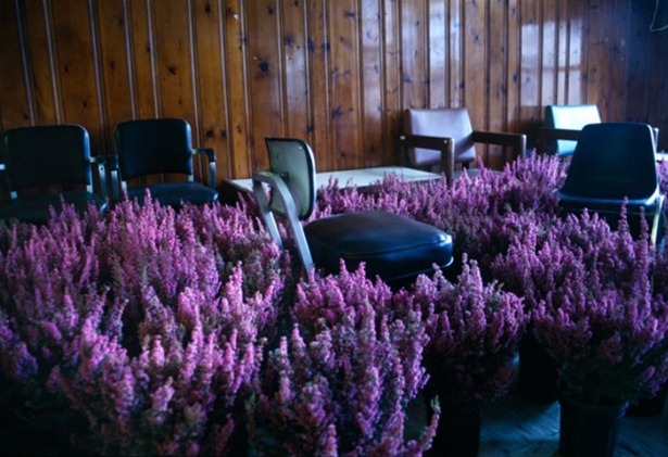
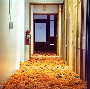
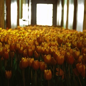
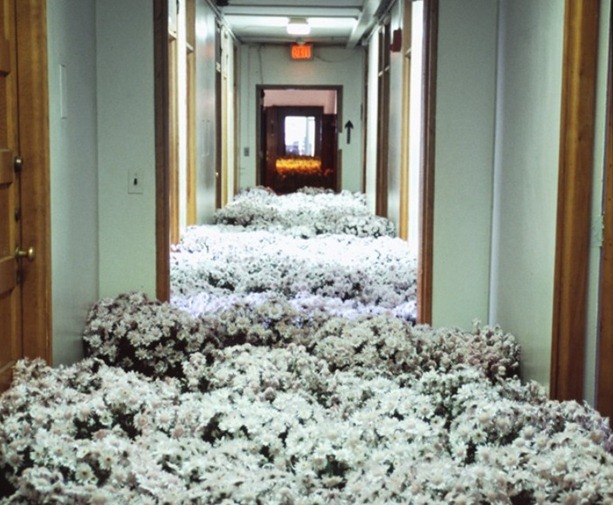
In 2003 Anna Schuleit was asked to create a commemorative art installation to mark the closure of the Massachusetts Mental Health Center.  She noted that psychiatric patients are rarely brought flowers, so she used old hospital records to calculate how many people had passed through the facility and decided to commemorate each one with flowers.


BLOOM-by-Anna-Schuleit-Pink-Heather


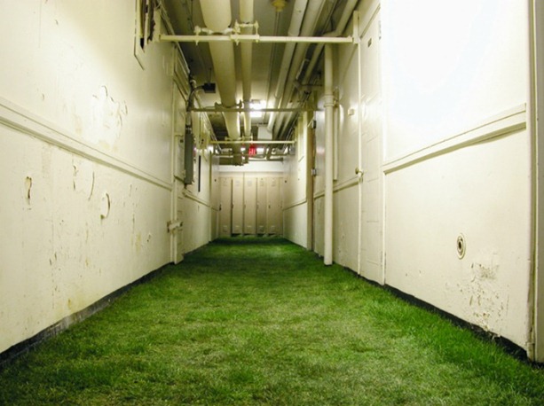
The 28,000 potted plants and green turf were spread throughout the building which was opened up to the public, including former patients and staff, for four days.  Then the plants were distributed to patients in care homes throughout the region (which is why Schuleit insisted on using potted plants instead of cut flowers).


BLOOM-by-Anna-Schuleit-Basement-with-Sod

BLOOM-by-Anna-Schuleit-White-Tulips


BLOOM-by-Anna-Schuleit-orange-begoniasBLOOM-by-Anna-Schuleit-orange-Tulips

BLOOM-by-Anna-Schuleit-White-Mums


Read more about it here. {Images by Anna Schuleit}

   
Share

Fancy Hotel of the Week: The Ace Hotel NYC


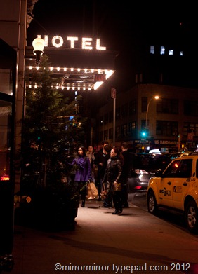
While in New York I had a great time at the Ace Hotel.  It was fascinating to stay there since we’d enjoyed ourselves so much at the Ace in Palm Springs and I was intrigued to see how their aesthetic would translate to a New York setting.


acehotelnyc

And what they’ve done is very clever. The free-wheeling hippie chick of Palm Springs has smartened herself up for New York and become a little more glam and a little more polished, while still being a bit rough and ready around the edges and retaining her creative rocker vibe.

The refurbishment of the 1904 midtown Hotel Breslin is not exactly to my taste, but it’s hugely clever and hugely comfortable, and, as you would expect, full of thoughtful and quirky touches which add greatly to the pleasure of the stay.


acehotelnyc5acehotelnyc8


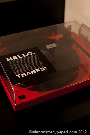
Our room featured tattoo art (and super comfortable beds) a guitar (of course, every hotel room should have a guitar) and a full-sized fridge, a working record-player and water bottles in the shape of gin bottles (I loved those).


acehotelnyc6

acehotelnyc9 

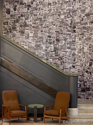
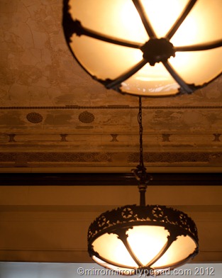
Downstairs in the lobby everything was dark and a little seedy, with glamorous filmstar lights, polished vintage woods and antique ceiling lights, while the funky graffiti wallpaper echoed the tattoo art in the bedroom.


acehotelnyc3

acehotelnyc12

acehotelnyc10

acehotelnyc21


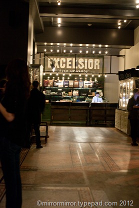
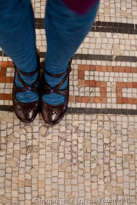
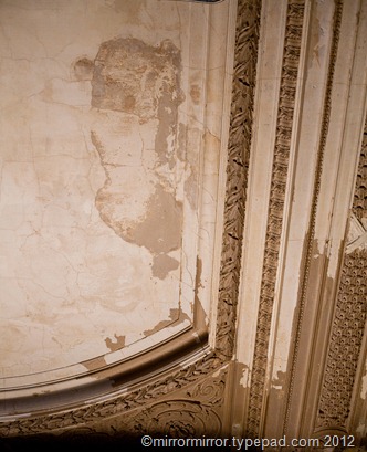
Using vintage artifacts and furniture everywhere, while retaining the worn mosaic floors and chipped plaster ceilings made everything seem a little louche and decadent, while being respectful of the building and its history.


acehotelnyc13

acehotelnyc19


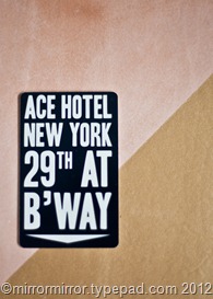
And someone had had huge fun with the graphic design (and having the address written so prominently on the keycard was super useful when grabbing a cab late at night).


packing (1 of 1)

acehotelnyc16

acehotelnyc20

acehotelnyc7


The food was good, the coffee was great, the bar was jumping and staff couldn’t have been more pleasant, helpful and friendly.

All in all a fun, comfortable and reasonably-priced place to stay in New York.  I will be back.

   
Share

Go Fug Your Room: Adam Levine’s Hollywood Hills House


Is the Husband reading?  No? Good. Because here is where I confess to a teensy weensy crush on Maroon 5 lead singer Adam Levine.

It helps that he looks uncannily like an Australian I had a bit of a crazy affair with (it couldn’t be called dating) before I met the Husband, and I’m also really liking his attitude as a judge on The Voice (I think you really are revealing too much about yourself today, Ed)  – he’s cute and funny and seems to really care about the contestants in his team and about music in general.  I’d been afraid that he’d turn out to be a complete douchebag (how I still love that word) much like the handsome Australian turned out to be, but for me he’s added major charm points.  Oh and I like his clothes.

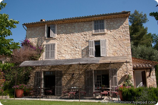
But we all know that we can’t come to a proper conclusion about a man until we’ve seen the inside of his home, so fortunately Adam Levine’s house in the Hollywood Hills was featured recently in Architectural Digest so I could ascertain whether he was a worthy recipient of my affections.


adam-levine-hollywood-hills-home-01-portrait-lg


Here’s Adam waiting to pick me up and whisk me off.  It’s looking good so far, isn’t it ladies (and gay men)?


adam-levine-hollywood-hills-home-03-kitchen-lg


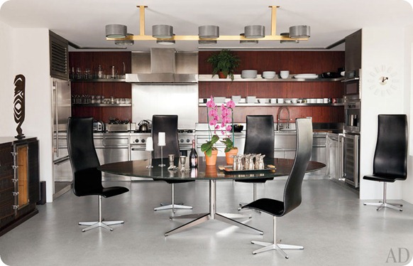
And here’s the kitchen. Some great furniture (a Florence Knoll table and some Jacobsen chairs).  It doesn’t look like he cooks much, but I’d be happy to bake him a cake.  A little bit of colour would be nice somewhere -  this looks a bit like a space-age conference room – and the stylist who brought in the pink orchids obviously agrees.  But overall not bad.


adam-levine-hollywood-hills-home-02-living-room-lg


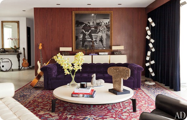
Oh dear. Purple VELVET?  And the Chesterfield shape looks a bit incongruous and grannyish with all the mid-century stuff going on.  I don’t like the rug either, something more graphic and less Miss Havisham would have worked better.  And the dark drapes continue the ‘conference room at a mid-sized bank’ theme. 


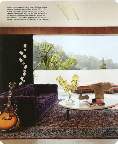
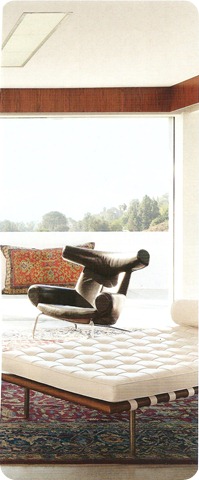
image0-2 image0-3


Admittedly it looks a little better from this side. I take it back, the van der Rohe daybed does work with the couch, and the big cushions outside are cool. I still wish he’d change that hideous rug though. Love the floor lamp.


adam-levine-hollywood-hills-home-04-bedroom-lg


This really feels like a musician’s house.  Adam comes across as really loving music on The Voice and this feels really authentic and true to him.

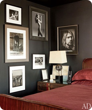
However, I could do without more tufted velvet – I love the piece, but not here – and  yet another granny rug, and although I have been known to like black walls in some contexts, this all looks far too dark and louche for southern California. 

Adam, you are disappointing me.


image0-1


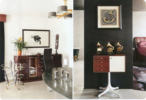
Guns and Grammys?  Seriously?  I know you want me to know that you’re overloaded with testosterone, but this is all a bit much. I absolutely adore your sideboard though.


adam-levine-hollywood-hills-home-05-bedroom-lg image0


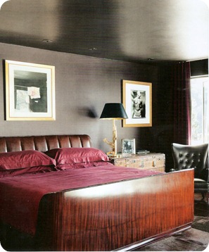
And THIS is the bed you are planning to throw me on to?  Isn’t it, shall we say, a little staid and a bit Hilton Hotel-ish?  More for snuggling up in flannelette pyjamas on your own with a good book, I’d say.  And I’m not sure that black walls, looming portraits of hairy rockers and SKULLS are exactly going to get me in the mood.

I’m sorry Adam, but I’ve just remembered a prior engagement.


So my lovelies, what did you think of Adam’s shag palace tastefully appointed home?  I really wanted to love iy, but to me it’s just too weird a mix of fabulous furniture, chain hotel and trying-too-hard mancave, with a hint of douchebaggery round the edges.  But I have a sneaky suspicion that might be a pretty authentic reflection of Mr Levine’s personality anyway.

What do you guys think?  Is this house fugly? Please post your thoughts about his body in-depth analysis of the interiors in the comments.


An astonishing 74% of you agreed that Ines de la Fressange’s Provencal home was fugly. 

   
Share

Blogging Your Way: NYC Road Trip Part 2


leslieshewring


Day two of the Blogging Your Way workshop (other pics here and here), found Leslie Shewring from A Creative Mint taking her day in the sun (quite literally as the sun came out in New York after two days of Seattle-like torrential rain).

After hearing Leslie’s inspiring story of clicking with Holly online and subsequently striking up a great blogging and teaching partnership, we settled down for a day of more practical creativity.


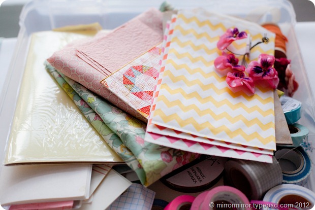
tulips props


The biggest thing I took away from the workshop is that styling is ALL about telling stories in an image.

Whenever I’m styling something I know I always look at the colours and shapes first, forget about the mood or story I’m trying to convey, and then wonder why the image seems flat and dead. I can be very dense sometimes. Of course, it’s all about the storytelling. Well, duh.


props (2)


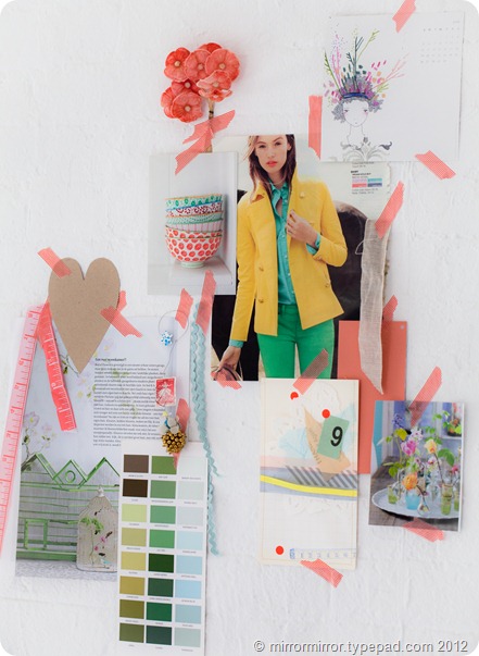
Leslie showed us how she pulls together inspiration boards to figure out moods and colour schemes.  She’s just one of those people who can instinctively pull together a bunch of random stuff and magically turn it into a coherent and pleasing whole.

It does help that she has some great props – she gave us lots of sources for what she called ‘curated hoarding’.  This was the second most useful thing I learned at the workshop.  Now I can explain to the Husband what I’m doing when he complains about the crap on my desk.


moodboard (2)


We then talked about composition, lighting and the basics of photography and Holly gave us a ton of tips about styling and photographing interiors.  Then for the rest of the day we had time to play ourselves and make the most of the lovely light at Divine Studio and Leslie’s pretty props.

Here’s a little ‘inspiration board’ I pulled together, with things I’d pulled off my desk at home.


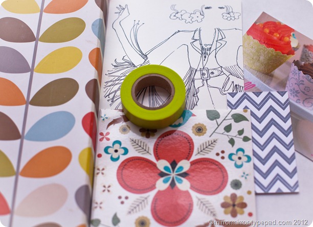
orlakielystem


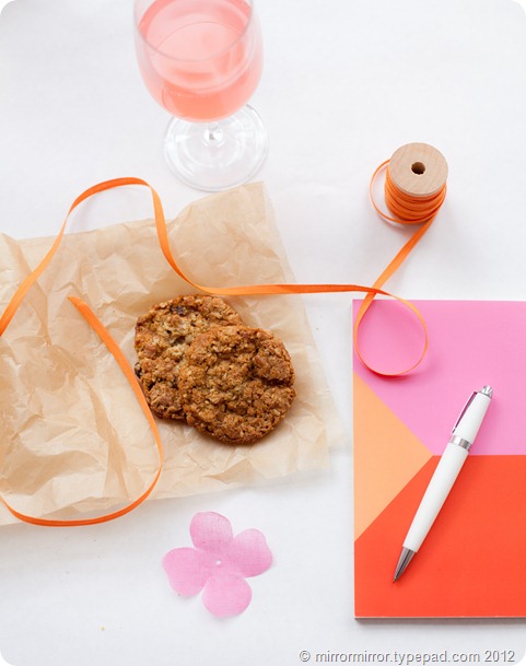
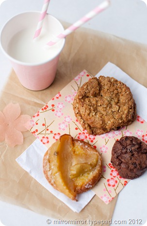
And here are a few shots I styled and photographed of the beautiful food.  Can you see what stories I’m trying to tell?


cookies


milkandcookies cookiesandmilk
Leslie encouraged us to explore our subjects from lots of different angles to find the best composition.
   

cookie


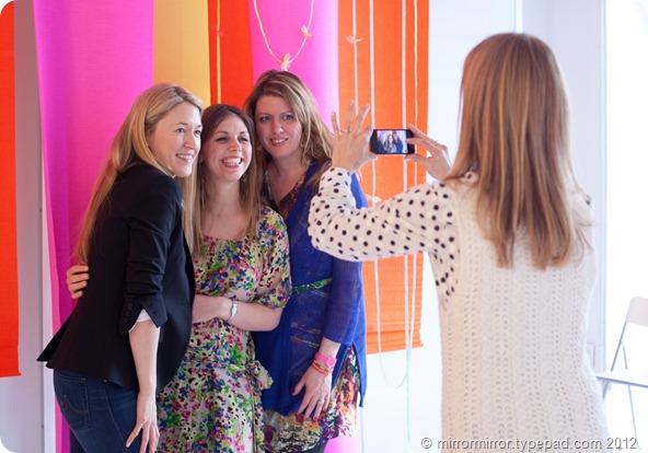
At the end of the day we all had fun taking pictures of all our new-found fri ends. Of course a huge part of the value and pleasure of doing these sorts of events is meeting a ton of inspirational and creative women.  New friends include Tina, Audrey, Michele, Natalie and Gretchen, Jessica, Ashley, Amanda and Fiona (seen below, who’d flown in all the way from England).  Also special thanks to Marianne, for being the most charming and easy-to-live-with roommate one could wish for.  I highly recommend taking a stroll through the links above, you’ll find some super charming and talented women and some new and fabulously inspirational blogs.

And once more a HUGE thank you to Holly and Leslie. You ladies rock SO hard.


hollybecker (3)

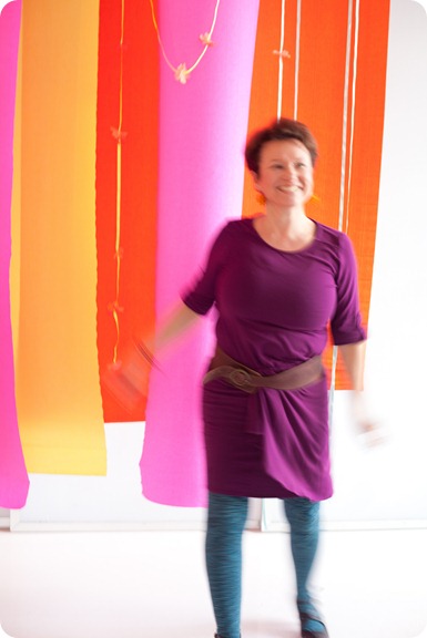
The simple crepe paper hangings Leslie had put up made a great back drop for photos.


One day I’ll have a picture taken with Holly where I’m not looking either blurred or deranged (See also San Francisco pics). 


paolathomas

   
Share