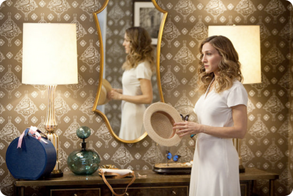
Love TOO Wallhanging by Paul Smith (seen hanging inside Carrie’s entrance hall, I haven’t been able to find a photo of this in situ)
So there’s been lots of chatter recently about Carrie’s apartment makeover in the movie. It’s not too much of a spoiler (and by now the the whole world and her girlfriends have seen the movie anyway) to say that Carrie is apparently earning enough from her books to be able to afford an interior decorator to makeover her apartment.
It’s no secret that the producers of the show go to immense trouble to reflect the characters’ personalities and lives in their clothes and surroundings, so it does make sense for Carrie’s apartment to get an update as she becomes more successful and ‘grown up’.
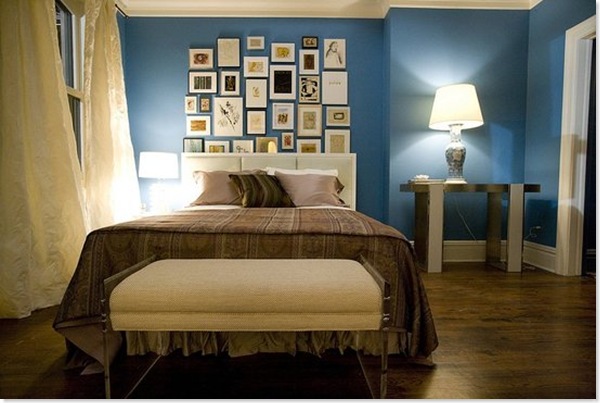
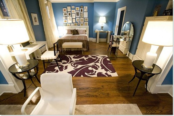
The most obvious change – which really stood out in the cinema – is the colour of the walls throughout the apartment (custom-mixed, but apparently a close relation of Benjamin Moore’s Electric Blue). It’s a pretty colour but I thought it was just a bit too much. I’d have gone for something very slightly more muted and soft and not quite so, er, electric. (It also looked brighter in the film I thought than it does here).
Carrie’s apartment AFTER
Her bedroom has been hugely smartened up. The blue walls and white trim really bring out the brown floors, which again unify the space throughout the apartment and stop the blue from being too overwhelming. I also really like the billowy curtains, which soften the space and, because they are hung to each side of the window, really make the windows seem more imposing. However I really don’t like that bedspread, which looks like something you’d find in a seedy hotel.
I also don’t like the artwall. Firstly aren’t art walls a bit over done now? And where did all this art come from? Does Carrie have a secret Etsy/Ebay addiction which has never been mentioned? She’s never shown any interest in interior decor before. Or, heaven forbid, did the decorator just buy up all this art in one day? And why is some of it tucked behind the headboard of the (rather uninspiring) bed?
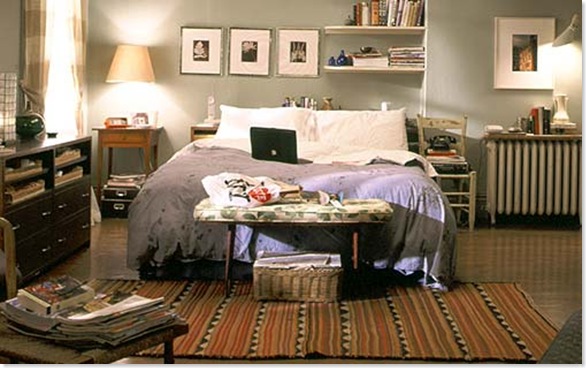
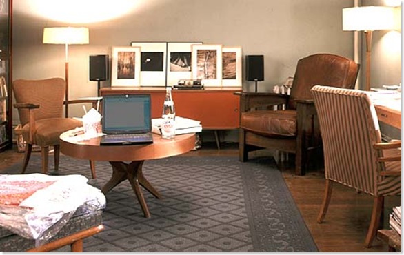
Carrie’s apartment BEFORE
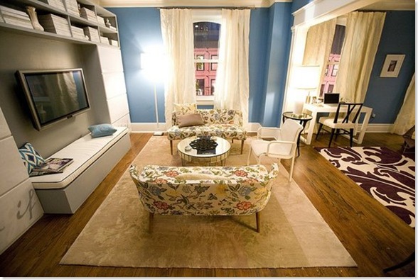
Big kudos to the Rug Company – one of my favourite UK design companies – for providing the rugs. Such a good way of building up their profile in the US. A big thumbs up from me for the purple one they’ve used here, which is the Overleaf by Marni. However I don’t think it really goes with either with the bedspread or with the little chintzy floral couches. I’m all for mixing patterns – and on their own the couches are lovely – but these patterns don’t have any relationship to each other at all, and if you’re mixing patterns I think there needs to be some sort of unifying thread (and throwing in a blue ikat pillow doesn’t really help matters).
The huge TV seems hugely out of place here. When does Carrie ever watch telly? Unlike Miranda, when you see her on your own she’s reading a book or magazine, which brings me to another bugbear. Where are Carrie’s books? How is she going to reach her magazines? And where is the hugely comfortable chair/sofa for curling up and reading? Those floral couches are meant for perching, not snuggling. And if she is going to settle down and watch the enormous telly, is she really meant to sit bolt upright on that incredibly uncomfortable-looking white chair?
I also wished that they would have kept a few of Carrie’s familiar old things around. One of the key components of her personal style has always been her ability to mix new and vintage stuff. So wouldn’t she have kept that great coffee table and credenza? And was it callous or inevitable that she ditched Aidan’s chair? And why not keep the fabulous Bakelite phone?
I suppose ultimately my complaint is that while it is definitely a much more beautiful apartment, it ends up not being Carrie’s apartment. All the personality has been sucked out of the place and replaced with interesting decorator pieces (and product placement opportunities).
What did you think?
![CropperCapture[1]](/images/various/WindowsLiveWriter/CropperCapture%5B1%5D_thumb.jpg)


I like Carrie’s old shabby apartment more…It’s more charming
Yes it is the blue I like as opposed to the ‘new look’ having looked at these pictures. The closest colours I can find in the UK are’Chinese Blue’ by Farrow and Ball, or Fired Earth’s ‘Bamiyan Blue’ – I’m a little obsessed with it at the moment as you can tell :).
I agree that TV is just wrong, too big, too central – just not Carrie! And how could they get rid of that gorgeous vintage chair and replace it with those horrid pretend sofa’s? But that Paul Smith Wallhanging is fabulous – I want!
I know it’s just a movie (set), but it really bugs me that the entire radiator was removed. Guess I cannot suspend belief quite that far!
hate.
it all looks so DONE.
it also is just not Carrie – for all the reasons you mention: TV, no snuggly seat, where do the books and magazines go? really – that television is just ridiculous. A design pet peeve of mine is a space where there is no snuggly seat – unless all you do is invite friends in for cocktails and lounge on the bed when home alone, a snuggly seat is essential. It all looks very cold and unwelcoming.
(I haven’t seen the movie)!
Funnily enough when I saw the movie I thought the new apartment was fabulous, but now, looking at these pictures I’m not quite so sure. The separate pieces are all pretty Carrie I would say, but somehow together you’re right, it doesn’t add up to her apartment.
ha ha Kate. I could just about cope with the radiator (HUGELY expensive underfloor heating perhaps?). My break point came when Big magicked a huge closet out of nothing…
Liz, I was looking a blues while writing this piece and I think Farrow & Ball’s Chinese Blue comes pretty close and may well be the slightly more subtle colour that I thought would look better in the space..
Zoe, I agree, individually the pieces are Carrie, I just wish they’d kept a bit more of the quirkiness
All I know is she should have given me Aidan’s chair if she was going to get rid of it.
Have friends who have lots of money and no particular feeling for interiors, and who have spent an absolute fortune on a designer who has created a drawing room which, while being impeccably colour matched, is completely lacking in any personality whatsoever – isn’t that what always happens when you get a stranger to design your home?
Not that I liked Carrie’s original apartment – the clutter of all those shoe boxes made me shudder.
How can I get that Paul Smith “Love Too” wall hanging?
It’s here…
http://www.therugcompany.info/default.aspx
How can I get that old coffee table from??
I much prefer the old apartment, the new one just isn’t Carrie, I may have liked it a little more if Aidan’s chair was there, I love that chair!!
Aidan’s chair was auctioned for charity, when the series finished, so they couldn’t get it back.
All the magazines and books must be filed away in those enormous cabinets either side of the TV.
I like the seating underneath the TV, not always making it a focus.
I reckon the pictures on the wall behind the bed had been collected over years but had just been stuffed in books before, although there should be more photos.
I loved Carrie’s old apartment. It was real and honest and something everyone can really relate to. Not some showcase apartment. If she wanted to sell it, then doing what the ” designer” did in the movie is smart, but I don’t even think a “new” Carrie would be inspired to write there. And her bookcase right off the entry hallway in the old apartment was to die for. I am slowly working my way up to that bookcase, one month at a time. I just really loved her old apartment, it was cluttered and mismatched like most everyone in America lives. Not everyone lives in a model apartment.
I do not believe this
hate. overall. I do like the blue, but maybe done only one wall in it. I also like the two smaller tables holding the two lamps when you walk into the bedroom. Other than that, I think they definitely should have left a few of the friendly, vintage, Carrie familiar items around. I also do agree with the above comment, to remove a radiator is quite a feet. And the glass vanity is pseudo 80’s shoulder pad glam. Not a huge fan.
Anyone know where the bookcase in the old apartment came from? Room and Board makes one similar, but Carrie’s seemed to have legs on the bottom.
i have to say, i’m really liking the new apartment. after the jilting at the gorgeous library wedding and the heartbreaking scenes that followed on her credit card honeymoon (days in bed, bags under the eyes)….i think carrie wanted to change the old her and show everyone she’d grown up and grown stronger. yes its nothing in comparison to the old carrie apartment which is even more heartbreaking because it really means sex and the city is drawing to its dreaded end….a tears rolls down my cheek…..
lets hope and pray no more fights break out over pay and sex and the city 2 is out soon!?!?!? fingers crossed….
I simply love the shelving units… Does anyone know where they from or where one is able to get a similar system?
How can I get a hold of her new brown bedding? I quite like it actually. Help Please!
I love the cabinets around the TV, does anyone know where you can get that?
I hate this apartment so much.
Its too perfect! No one lives like that!
Sociologists have said seeing the every day objects of your life is important!
There isnt even a stray hair on her floor.
Im shocked and horrified!
Worst before and after ever.
Its like Carrie ditched her real life to live in this sterile pretend land.
In the old apartment Carie had the Handbag framed picture… does anyone know where i can get a picture or a link to this?
i think her new apartment is fabulous. it’s grown up, but the blue keeps the vibrant & young at heart personality of carrie alive. it basically shows that she’s ready to simplify her life and stay organized with everything as she settles down. I LOVED the old apartment, but i think the new makeover was vital to the movie and her character.
I liked the old apartment better. It was cozier and I loved the big bookshelf that you could see when she walked through the door. Does anyone know the designer of the blue bedding/duvet that she had in the old shows?
http://cgi.ebay.co.uk/Sex-and-the-City-Painting-Paul-Smith-Inspired-Oil-Hand_W0QQitemZ150340989068QQcmdZViewItemQQptZUK_art_Paintings_GL?hash=item150340989068&_trksid=p3286.c0.m14&_trkparms=72:1683|66:2|65:12|39:1|240:1318
an inspired painting like carries from apartment, handpainted and beautiful!
it’s lovely, but so not Carrie at all..
I love the first one, the cleanest of them all!
-Sam
You can buy the shelving units (as seen around her TV) at Ikea:
http://www.ikea.com/us/en/catalog/products/70146688
I’m trying to find the bedspread. If anyone knows who it’s by, I’d really appreciate an e-mail at polichiktk at gmail dot com.
Thanks in advance 🙂
Hey, if any of you want the “Love Too” Painting…don’t spend a fortune on it. I can paint you an exact duplicate.
Let me know!
bpelsue23@gmail.com
in carrie’s living room, what kind of shelving units are those?
I love love love her new apartment and I think it fits the whole style of the movie. Her old apartment fit her lifestyle in the show but the movie glams up all the girls so I think that the revampd appt is more fitting for the tone of the movie.
I prefer the old apartment definitely!! and i was so disappointed by the movie,with the way they acted out their scenes,to the over the top fashion which was all about the labels and nothing about layering and putting outfits together which pat fields did so beautifully in the series..i could go on and on :o)
but yes,older one is much better
The new aptartment looked too “staged”, not liveable. I much perfer the old one. There could have been a nice balance if they had combined the new wall color with some great comfy chairs, more relaxed furnishings. I was disappointed myself, ugh… Carrie would never live in a showroom…
Come across to browsing your wonderful webpage, very like the type of your post and very need that I can certainly publish so competent content articles exactly like you. But I strongly think I am going to fare better some day if I keep working harder and read a lot more publications or exceptional weblogs.
ja chce sexxxxxxxxxxxxxxxxxxxxxxxx
I am really late to the game here, but her new apartment is very contrived. I don’t actually remember noticing a big change when I saw the original movie 2.5 yrs ago, but when I see it here… wow. Where did all that extra space at the foot of the apartment come from? Since when does Carrie watch TV or have guests who need to sit on stiff little loveseats? And where did the radiator go? Half the charm of the apartment was that it was old and Victorian, but now it looks too faux-chic.
Then again, I didn’t like the movie either. It was more of a designer catalogue than a movie and by the end, I was satisfied that the characters had become unrelatable and boring, so I guess the room reflects that? I never did see the second SATC.
love/hate
an incredible apartment… so gorg. something i would definitely live in, but definitely NOT Carrie at all. Carrie’s eclectic, and somewhat old school, she love vintage, and this apartment would be wayyyy too modern for here taste.
I don’t like the electric blue wall either. It’s better to use lighter paint color. My sister’s New York apartment with rental short term included in the terms and conditions is amazing. Why? I’m in love with her living room design. Lighter paint colors are used and the combination of furniture colors and wall paint hues is fabulous.
actually, i prefer the apartment before the transformation, it looks more humble, welcoming, simple. as someone else has already written, the new apartment looks very ”DONE”, ”dont touch it” and it does not feel like Carrie at all. too much.
Wow, just saw this site and all the comments. I was looking for information on Carrie’s old apartment, especially the chairs. I agree with all the comments about the old apartment being better. I like the old vintage chairs she had and I was wondering where they were from, and needed a reminder of what they looked like. Does anyone know what designs they are?
I didn’t really watch Sex in the City (except with my ex GF sometimes) but I’m a freak for people’s living spaces (real and Imaginary) so Carrie’s apartment was something I had had my eye on. I never saw the movies, but this is an incredibly wrong headed redesign. The first apart had a warmth and a style to it that not only reflected the character but actually looked lived in. For the movie set it looks like they are trying push the “Glamor” of the film, so they gave Carrie an equally glamorous apartment, clean and pristine….but instead of looking like an apartment it looks like a movie set and its impossibly tidy.
They do stuff like this all the time for TV to Movie translations though…The bridge of the Enterprise in the movie Star Trek: Generations suddenly became a dark, shadowy submarine bridge, with extra crew members and brightly lit machine bits when before (on the Star Trek: The Next Generation TV show) it had almost been a brightly lit lounge.
They changed a lot on the new setting gives Carrie’s room an uplifting mood. But as far as artistry is concerned, the more meaningful thing is to make the show as real as possible. Although Carrie’s room’s new look is better, artistry should not go beyond to keep positive vibes in all corners.
where can i get the blue paint what kind the blue is it?
I think that’s the point. The old apartment was the vintage/urban/city girl doing her own thing, Life if Messy, day to day thing. The Mr. Big Carrie is a more grown up proper city girl with a touch of the old Carrie as seen in the Mr. & Mrs. Big apartment. When the marriage doesn’t happen Carrie is stuck between the 2 worlds. Hence the miss matched colors and the “stray pillow”. Trying to “grow up” on her own but still a tiny bit of Life is Messy.
Where can i get the blue paint what kind the blue is it? Which type?