Love TOO Wallhanging by Paul Smith (seen hanging inside Carrie’s entrance hall, I haven’t been able to find a photo of this in situ)
So there’s been lots of chatter recently about Carrie’s apartment makeover in the movie. It’s not too much of a spoiler (and by now the the whole world and her girlfriends have seen the movie anyway) to say that Carrie is apparently earning enough from her books to be able to afford an interior decorator to makeover her apartment.
It’s no secret that the producers of the show go to immense trouble to reflect the characters’ personalities and lives in their clothes and surroundings, so it does make sense for Carrie’s apartment to get an update as she becomes more successful and ‘grown up’.
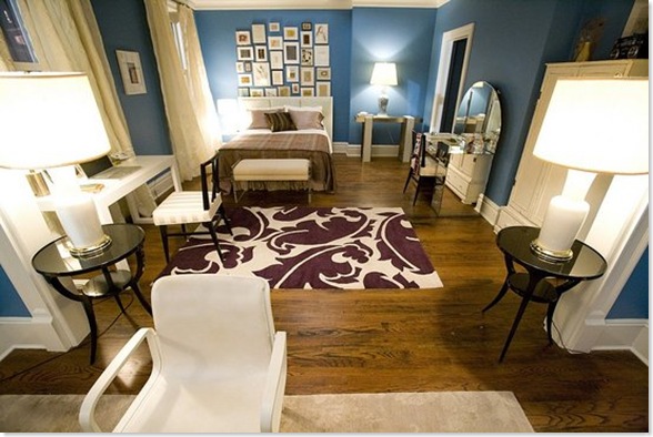
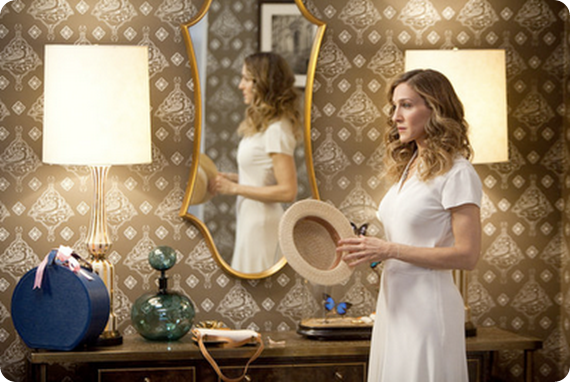
The most obvious change – which really stood out in the cinema – is the colour of the walls throughout the apartment (custom-mixed, but apparently a close relation of Benjamin Moore’s Electric Blue). It’s a pretty colour but I thought it was just a bit too much. I’d have gone for something very slightly more muted and soft and not quite so, er, electric. (It also looked brighter in the film I thought than it does here).
Carrie’s apartment AFTER
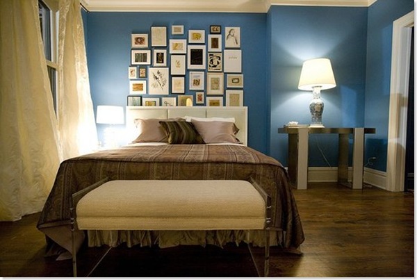
Her bedroom has been hugely smartened up. The blue walls and white trim really bring out the brown floors, which again unify the space throughout the apartment and stop the blue from being too overwhelming. I also really like the billowy curtains, which soften the space and, because they are hung to each side of the window, really make the windows seem more imposing. However I really don’t like that bedspread, which looks like something you’d find in a seedy hotel.
I also don’t like the artwall. Firstly aren’t art walls a bit over done now? And where did all this art come from? Does Carrie have a secret Etsy/Ebay addiction which has never been mentioned? She’s never shown any interest in interior decor before. Or, heaven forbid, did the decorator just buy up all this art in one day? And why is some of it tucked behind the headboard of the (rather uninspiring) bed?
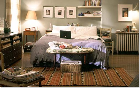
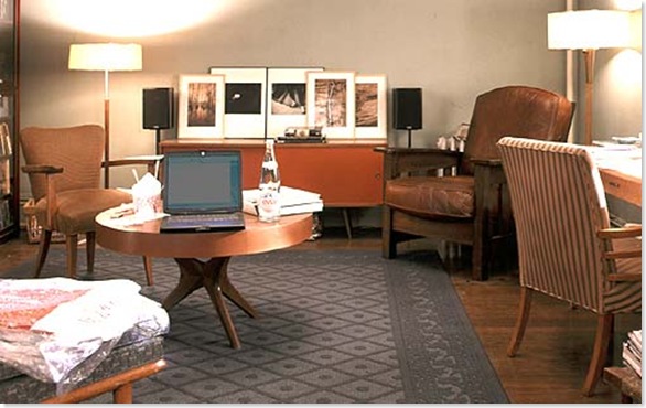
Carrie’s apartment BEFORE
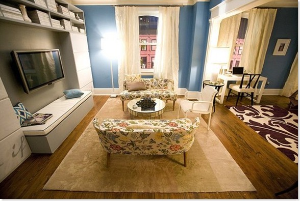
Big kudos to the Rug Company – one of my favourite UK design companies – for providing the rugs. Such a good way of building up their profile in the US. A big thumbs up from me for the purple one they’ve used here, which is the Overleaf by Marni. However I don’t think it really goes with either with the bedspread or with the little chintzy floral couches. I’m all for mixing patterns – and on their own the couches are lovely – but these patterns don’t have any relationship to each other at all, and if you’re mixing patterns I think there needs to be some sort of unifying thread (and throwing in a blue ikat pillow doesn’t really help matters).
The huge TV seems hugely out of place here. When does Carrie ever watch telly? Unlike Miranda, when you see her on your own she’s reading a book or magazine, which brings me to another bugbear. Where are Carrie’s books? How is she going to reach her magazines? And where is the hugely comfortable chair/sofa for curling up and reading? Those floral couches are meant for perching, not snuggling. And if she is going to settle down and watch the enormous telly, is she really meant to sit bolt upright on that incredibly uncomfortable-looking white chair?
I also wished that they would have kept a few of Carrie’s familiar old things around. One of the key components of her personal style has always been her ability to mix new and vintage stuff. So wouldn’t she have kept that great coffee table and credenza? And was it callous or inevitable that she ditched Aidan’s chair? And why not keep the fabulous Bakelite phone?
I suppose ultimately my complaint is that while it is definitely a much more beautiful apartment, it ends up not being Carrie’s apartment. All the personality has been sucked out of the place and replaced with interesting decorator pieces (and product placement opportunities).
What did you think?
![CropperCapture[1]](/images/various/WindowsLiveWriter/CropperCapture%5B1%5D_thumb.jpg)
