Well, we all know the movie’s crap – two of the best reviews here and here – but what did we think of the set design? Most specifically what about Carrie and Big’s new grown-up married folks apartment?
Carrie confesses in the film that over the past year or two she’s been ‘cheating on fashion for furniture’ and she’s been working with same designer, Lydia Marks, who also revamped her apartment in the first movie.
So let’s take a tour.
One of my main bugbears with this new apartment is the colour scheme, which is basically blue and brown. I know Carrie is trying to create an environment that Big will also feel at home in, but it just makes everything seem rather dark and depressing and yet again very not Carrie. I know she’s grown up now, but where’s the fun, the liveliness, the inventiveness, the eccentricity and the bohemia?
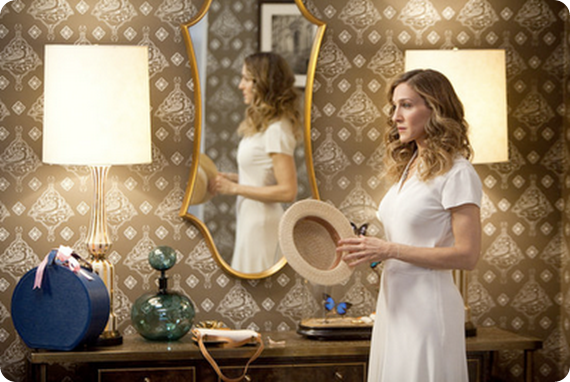
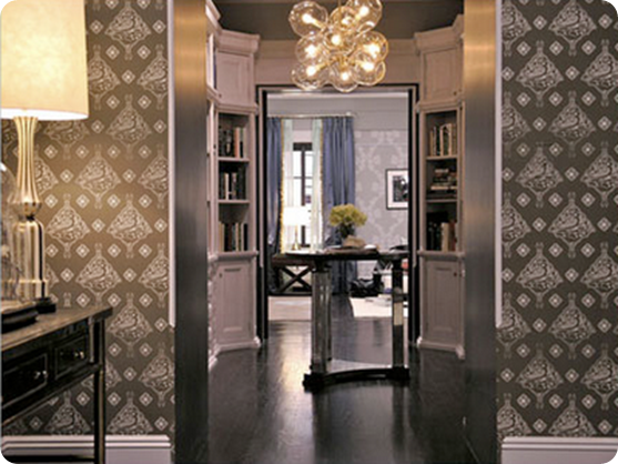
The entrance way sets the tone for the whole, some great pieces – love the wallpaper and green glass bottle - but just a little too fussy and cluttered and somehow old fashioned. Would Carrie really have a glass case of dead butterflies on display?
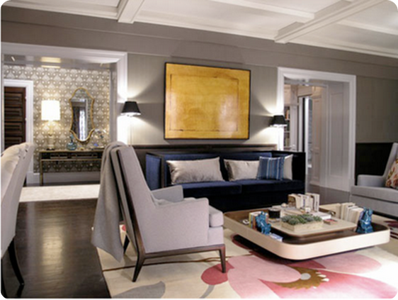
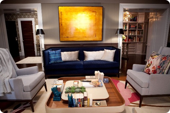
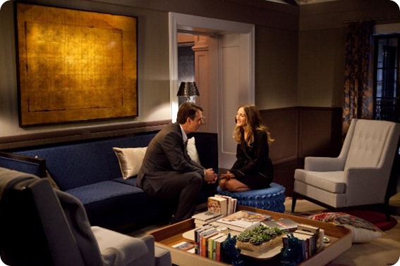
Entering the living room, I like this view of it. The Rug Company rug is beautiful, as is the coffee table, though, as in her old apartment, the sofa and chairs still seem rather more for ‘perching’ than truly relaxing, though much is made in the movie of Big turning into a couch potato. I think I like the gold painting though I can’t help thinking that Big and Carrie would have a more striking piece of modern art.
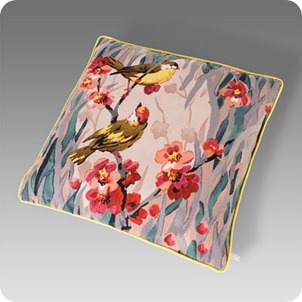
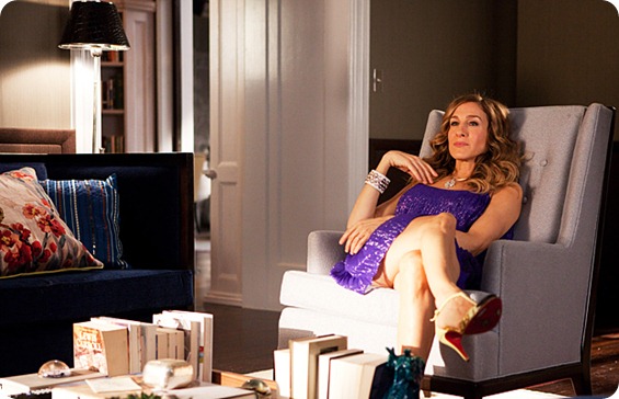
Paul Smith got an excellent bit of product placement in here with his ‘Birdie Blossom’ cushion, which Carrie is seen cuddling like a new lover. It’s lovely, though I’m not sure the pattern really works here, but it does seem more authentically ‘Carrie’ than much of the rest of the stuff. It’s also great to see all the books everywhere. One of the things we all complained about last time was the lack of books in bookworm Carrie’s apartment.
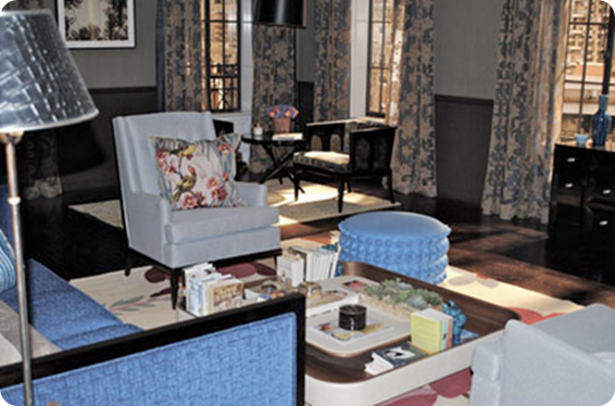
From here though things go downhill faster than an Olympic skiier. This view of the sitting room is a cluttered and fussy as a pair of Queen Victoria’s bloomers. There are just too many little pieces of furniture, too many patterns and too many little splashes of colour against horribly dark and serious walls.
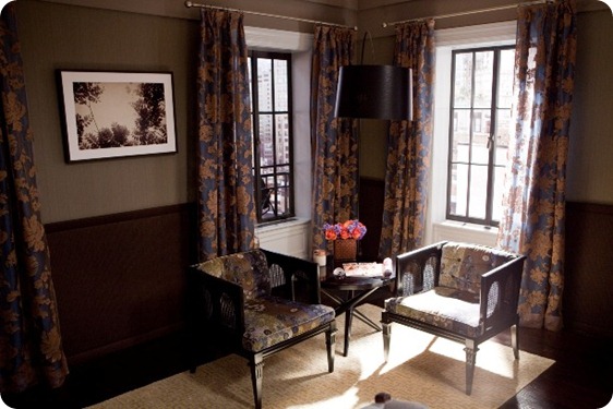
This little seating area seems especially ridiculous. Are Carrie and Big really going to sit here as if they were in doctor’s waiting room taking afternoon tea? Isn’t this the perfect spot for a huge comfortable reading chair facing out towards the view?
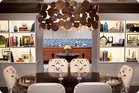
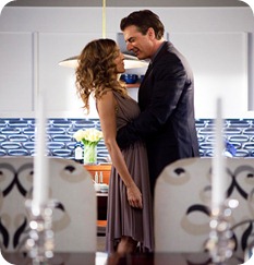
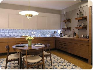
I like the lighter fresher feel in the formal dining area. The Lee Jofa fabric works well and the light fitting is wonderful, though shelves could do with a bit of editing. It goes through to what I think must be the kitchen, though it seems rather impractical to cook in, and I would never, ever, EVER put a rug, however pretty, in space for cooking. But maybe that’s just me.
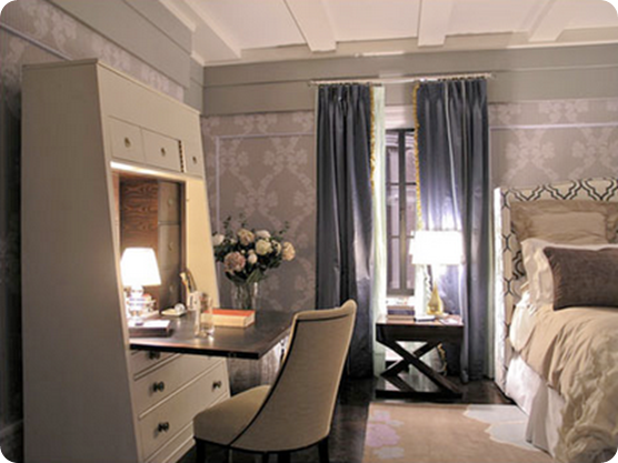
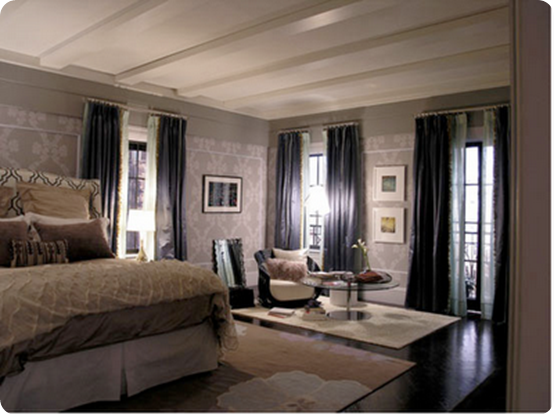
Looking to the left from the entrance hall we catch a glimpse of the bedroom, with another fabulous light fitting in the small library and beautiful Cole & Son wallpaper on the bedroom walls, which echoes the paper in the hall.
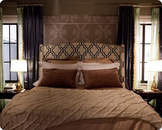
Carrie makes a huge amount of fuss in this movie about Big’s purchase of a big TV for their bedroom, thus confirming a) that we were right that the big TV in Carrie’s old apartment was incongruous and out of character and b) the TV product placement people have a lot of money.
The bedroom feels a bit ‘hotelly’, but I do like the way they’ve echoed the pattern on the wallpaper with the headboard. And below we’ve got another lovely rug/useless seating area/boring artwork situation happening.
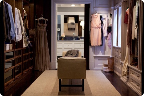
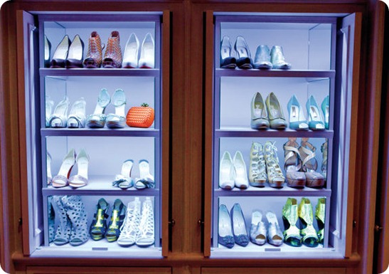
The piece de resistance is naturally the closet, with ridiculously twee ‘his and hers’ sides. I know people have been charmed by this conceit, but to me it looks as ludicrous as having two different his and hers sinks, one ‘feminine’ and one ‘masculine’ side by side in a bathroom.
Not bad shoe storage though.
(By the way Habitually Chic has put together a great post on where to source many of these pieces, including identifying the books that Carrie and Big are currently reading.)
So what do you think? Additional comments hugely encouraged.


oh dear! oh dear. that’s why i left new york. but i do love the paul smith pillows and the fabric on the dining chairs. never a fan of the show.
The bedroom is the worst! So sad! I hate the colors!
I was a HUGE fan of the show which was genuinely witty, compelling and just plain fun in seasons 2,3 and 4 and hate what they’ve done to the franchise in this movie. It makes me sad….
Wish I could have an apartment that’s as big as this one! It looks like a boutique or a hotel room. Nice, nice, nice! But even I can’t afford to buy that one, I’m still fortunate enough to have an apartment that looks decent, and is spacious enough for my family.