A Morning with Tess Casey–Flower District NYC

For our version of #BlogTour, Veronika from Modenus was keen to introduce a learning component, where we’d meet a bunch of fabulous creatives (am I the only person who loathes that word?) and get to see them at work and ask them questions.

A Morning with Tess Casey-Flower District NYC photography by www.paolathomas.com

I can safely say that these sessions were some of the most fascinating and rewarding of the whole tour, and none more so than the morning we spent with Tess Casey who designs floral arrangements for films and TV shows. You may not have heard of her, but you’ve very probably glimpsed her work, in movies such as Sex and the City, The Devil Wears Prada  and The Nanny Diaries, or on TV shows such as Boardwalk Empire, Ugly Betty  and Pan Am. Tess prides herself on creating camera-ready, period, season and character appropriate flowers for all manner of productions and the amount of work and research that can go into an arrangement that is scarcely glimpsed on scene is truly mindblowing. I for one will look at on-set flowers in a whole new light from now on.

A Morning with Tess Casey-Flower District NYC photography by www.paolathomas.com

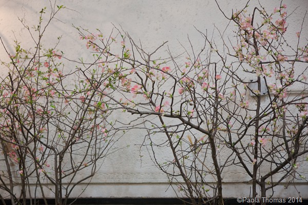
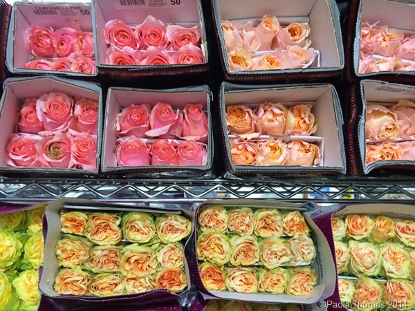
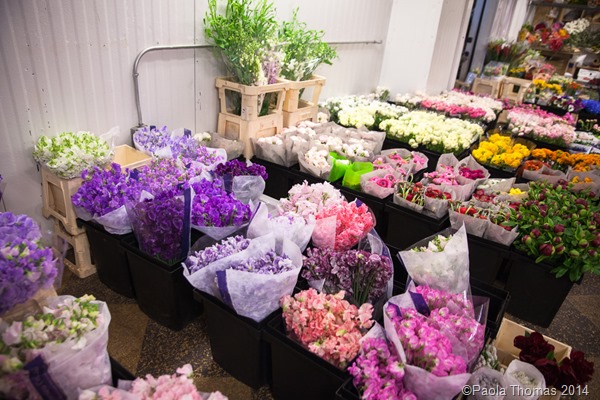
It was a cold and frosty morning when we headed down to New York’s Flower District on W 28th St, but in the various shops Spring was definitely springing. Our tour was sponsored by the wonderful team behind the  WestEdge Design Fair and they met us together with Tess and her super cute assistant Miles for a tour of Tess’s favourite flower and accessories retailers.

A Morning with Tess Casey-Flower District NYC photography by www.paolathomas.com

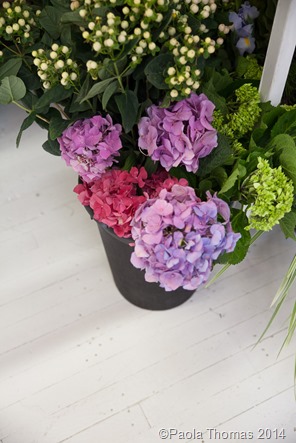
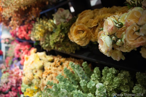
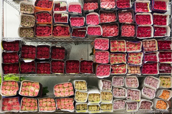
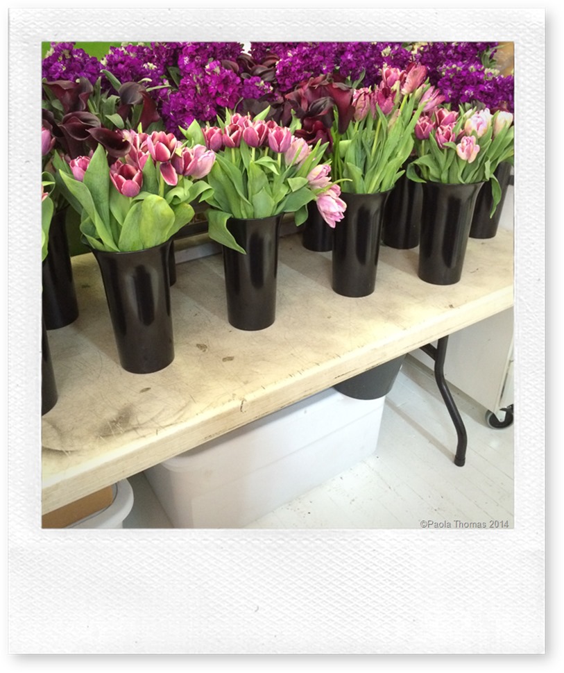
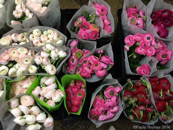
I’ve been a little disappointed by the quality and variety of flowers that I’ve been able to get in Seattle, and here everything was explained. All the flowers in the world are hiding out in New York. The selection was truly incredible and we were still in the depths of March.

A Morning with Tess Casey-Flower District NYC photography by www.paolathomas.com

A Morning with Tess Casey-Flower District NYC photography by www.paolathomas.com

A Morning with Tess Casey-Flower District NYC photography by www.paolathomas.com

A Morning with Tess Casey-Flower District NYC photography by www.paolathomas.com

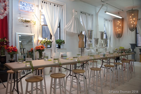
After the tour, we were welcomed to Tess’s glorious Flower District studio. I love seeing where creative people work and as studios go this was a DOOZY. You really couldn’t fail to be inspired here.

A Morning with Tess Casey-Flower District NYC photography by www.paolathomas.com

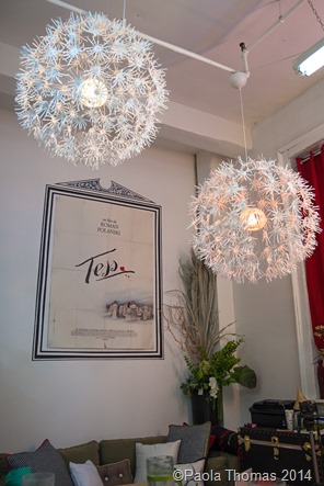
The room was full of charming details. Yes, that’s Tess’s wedding dress hanging up and those glorious chandeliers at the far end were made by Tess and Miles for an event out of Home Depot pot racks and some hanging chains.
A Morning with Tess Casey-Flower District NYC photography by www.paolathomas.com A Morning with Tess Casey-Flower District NYC photography by www.paolathomas.com

I was amused to spot a poster from Roman Polanski’s Tess on the wall. Could someone PLEASE bring out a movie called ‘Paola’ so I can have a movie poster with my name on it?
A Morning with Tess Casey-Flower District NYC photography by www.paolathomas.com A Morning with Tess Casey-Flower District NYC photography by www.paolathomas.com

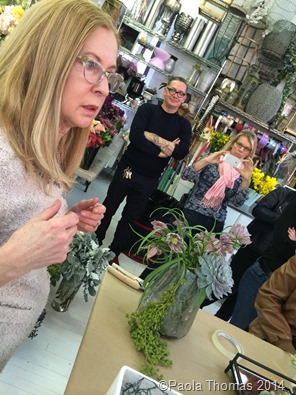
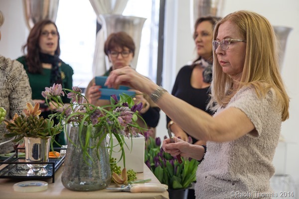
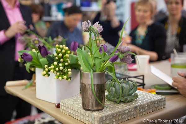
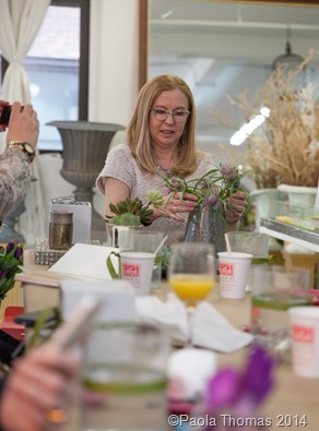
Then Tess demonstrated a few simple flower arrangements, showing us how to create the internal ‘mechanics’ of an arrangement using either chicken wire, oasis or the stems of the flowers themselves. She is a mistress of improvisation showing us that many of the vases she uses are buckets and pots sourced from Home Depot or Bed, Bath and Beyond and repurposed as vases.

A Morning with Tess Casey-Flower District NYC photography by www.paolathomas.com

Originally from Ireland, Tess lived and trained in London at Knightsbridge florists Pulbrook & Gould and her naturalistic, organic but luxurious style seemed very English to me. Tess moved to New York in the early nineties and apparently had a fun time in the New York club scene. She is currently pitching a screenplay of her life story and I for one would love to see that movie happen – you know at the very least the flowers will be extraordinary.

A Morning with Tess Casey-Flower District NYC photography by www.paolathomas.com

A Morning with Tess Casey-Flower District NYC photography by www.paolathomas.com

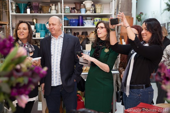
The Blogtour paparazzi in full force

A Morning with Tess Casey-Flower District NYC photography by www.paolathomas.com A Morning with Tess Casey-Flower District NYC photography by www.paolathomas.com

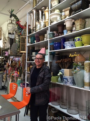
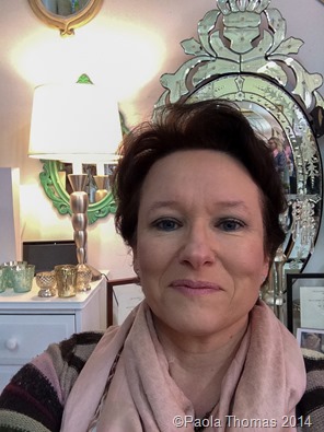
Here’s super cute Miles with part of Tess’s gigantic vase collection and a very happy me taking a selfie just because really.

A Morning with Tess Casey-Flower District NYC photography by www.paolathomas.com

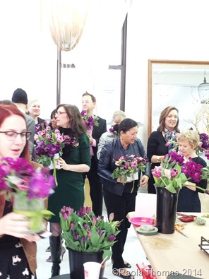
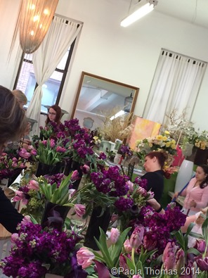
After the demo we were each given our own generous bucket of flowers to try making our own arrangements with Tess’s guidance.
A Morning with Tess Casey-Flower District NYC photography by www.paolathomas.com A Morning with Tess Casey-Flower District NYC photography by www.paolathomas.com

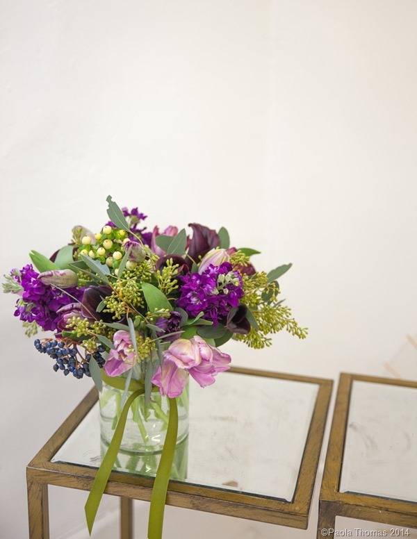
It was fascinating to see all the different variations which we produced using essentially the same raw materials.

I was utterly delighted with mine, it was such a pleasure to work with such beautiful blooms instead of the supermarket flowers I normally use, and was thrilled that they offered to transport all the bouquets back to the hotel, so we could enjoy them in our rooms.

A Morning with Tess Casey-Flower District NYC photography by www.paolathomas.com

A Morning with Tess Casey-Flower District NYC photography by www.paolathomas.com

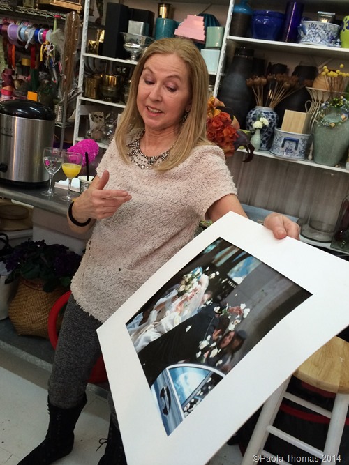
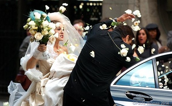
After all the hard work, we managed to get Tess gossiping a bit. For the famous scene where Carrie smashes her wedding bouquet over Big’s head, Tess had to prepare fifty identical bouquets, each one with the thorns removed, so Chris Noth’s face wouldn’t be destroyed, and each with the stems specially prepared to shatter easily.

A Morning with Tess Casey-Flower District NYC photography by www.paolathomas.com

Because she had to design the bouquets Tess was one of very few people in the know about Carrie’s wedding dress. Even producer Michael Patrick King was kept in the dark. Apparently when he finally saw what Carrie was wearing he turned to Tess and said, ‘She’s wearing a fucking bird on her head.’

A Morning with Tess Casey-Flower District NYC photography by www.paolathomas.com

Thus echoing my words and the words of every single person in every cinema everywhere who saw it.

Share

Go Fug Your Room! – SJP NYC

I do believe it’s time for a Go Fug Your Room! It’s been so long that I’m sure we’ve all forgotten how to do them.

Go Fug Your Room! - SJP NYC photography by www.paolathomas.com

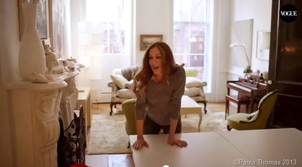
Anyway this one seems particularly fitting as I was in la Grande Pomme only last weekend and am flying back out this weekend for Blogtour and of course we’ve all dreamed of having a New York brownstone of our very own.

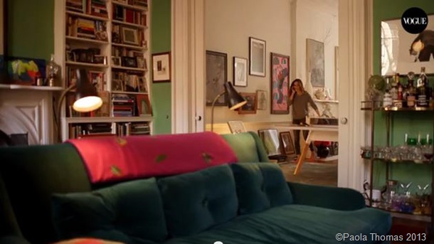
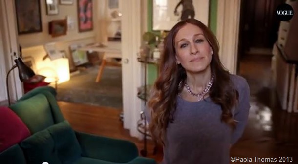
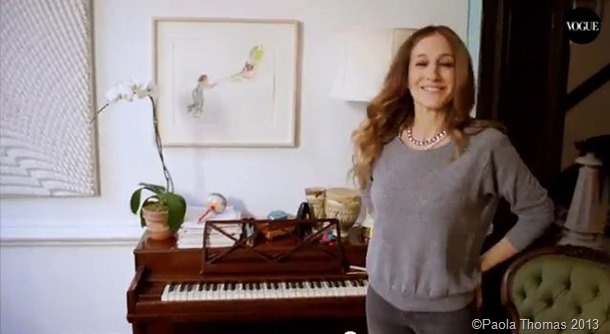
The pics are screen caps taken from a ‘73 Questions’ interview on Vogue TV. You’ll get an idea of the house from the screen caps but I do recommend that you watch the video as SJP comes across as cute and charming and the sort of person I would tragically like to be BFFs with (though I would have to have WORDS with her about her old-fashioned and derivative new shoe collection).

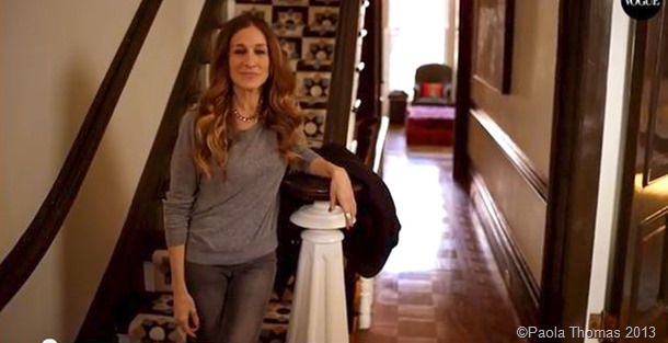
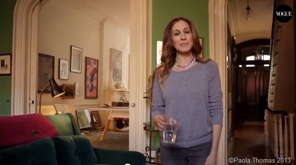
First of all I think we can all agree that the house has MAGNIFICENT bones – that arch, those stairs, those ceilings, those windows, THAT. LIGHT. And I do find it refreshing that it seems so normal and lived in. How wonderful to see a celebrity who has books and art, whose house doesn’t appear to be styled to within an inch of its life, and who could conceivably occasionally allow her three kids to share the space.

So SJP, take it away.

Go Fug Your Room! - SJP NYC photography by www.paolathomas.com

Loving the hallway, not sure if that’s a rug or tiles on the stairs, but they look like quintessentially Victorian encaustic tiles and so work for me, though I thought that was more of a London thing rather than New York.

Go Fug Your Room! - SJP NYC photography by www.paolathomas.com

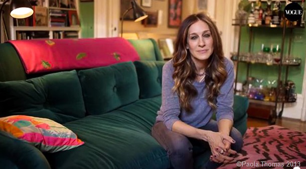
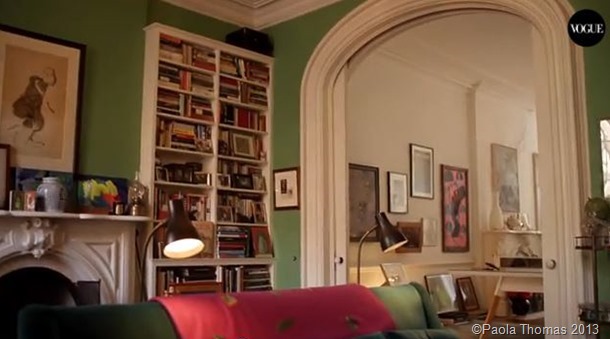
I’m struggling with this room though Sarah J.  I just don’t like that green on the wall, it just seems too bright and unsophisticated really, especially when matched with peacock blue velvet and hot pink accents, including a pink zebra-striped pouffe thingy (just say those words out loud and you’ll know how WRONG that sounds).

Go Fug Your Room! - SJP NYC photography by www.paolathomas.com

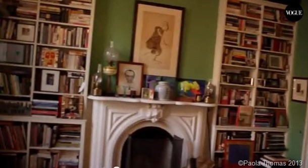
And maybe there are rather too many books and little pictures and tchotchkes and THINGS just cluttering things up.  The bar is quite fun though.

Go Fug Your Room! - SJP NYC photography by www.paolathomas.com

Go Fug Your Room! - SJP NYC photography by www.paolathomas.com

OK Ms P. No need to look like that, it’s just MY OPINION (which is what the Minx says when she is about to say something breathtakingly rude).

Go Fug Your Room! - SJP NYC photography by www.paolathomas.com

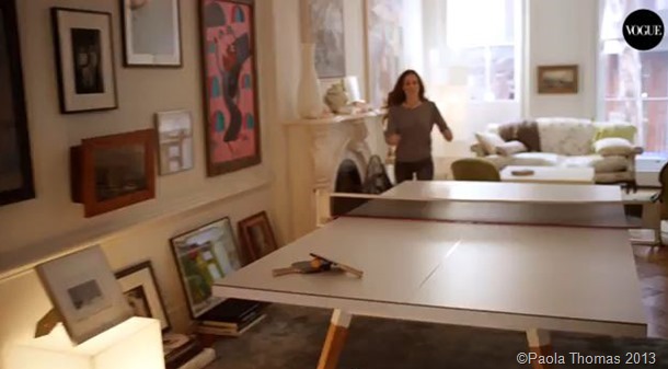
Let’s move on shall we? Arch gorgeous, artwork lovely, light, windows and fireplace amazing. Possibly one too many ping pong tables.  (Seriously?)

Go Fug Your Room! - SJP NYC photography by www.paolathomas.com

Go Fug Your Room! - SJP NYC photography by www.paolathomas.com

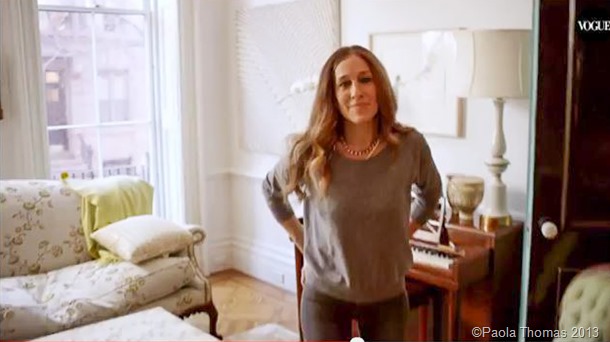
But yes, SJP I would be proud of this end of the room too. So pretty. I’m particularly loving the celery green and robin’s egg blue (behind the door) accents – much nicer colours than the green on the sitting room walls. 

Go Fug Your Room! - SJP NYC photography by www.paolathomas.com

Go Fug Your Room! - SJP NYC photography by www.paolathomas.com

Here’s the full video, which I do recommend. Her English accent is terrible though.

So, in your considered opinion is this house fugly or not? Feel free to show additional workings in the comments.

Update: Oh and thanks to commenter Becky for reminding me that I blogged about SJP’s glorious house in the Hamptons more years ago than I care to remember. She is one lucky girl.

Share

Go Fug Your Room – Carrie and Big’s Apartment


Well, we all know the movie’s crap – two of the best reviews here and here –  but what did we think of the set design?  Most specifically what about Carrie and Big’s new grown-up married folks apartment?

Carrie confesses in the film that over the past year or two she’s been ‘cheating on fashion for furniture’ and she’s been working with same designer, Lydia Marks, who also revamped her apartment in the first movie.

So let’s take a tour.

One of my main bugbears with this new apartment is the colour scheme, which is basically blue and brown. I know Carrie is trying to create an environment that Big will also feel at home in, but it just makes everything seem rather dark and depressing and yet again very not Carrie. I know she’s grown up now, but where’s the fun, the liveliness, the inventiveness, the eccentricity and the bohemia?


entryway-


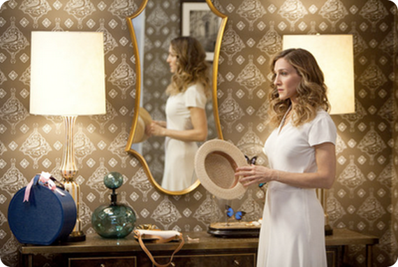
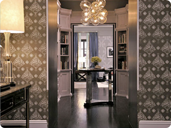
The entrance way sets the tone for the whole, some great pieces – love the wallpaper and green glass bottle -  but just a little too fussy and cluttered and somehow old fashioned. Would Carrie really have a glass case of dead butterflies on display?

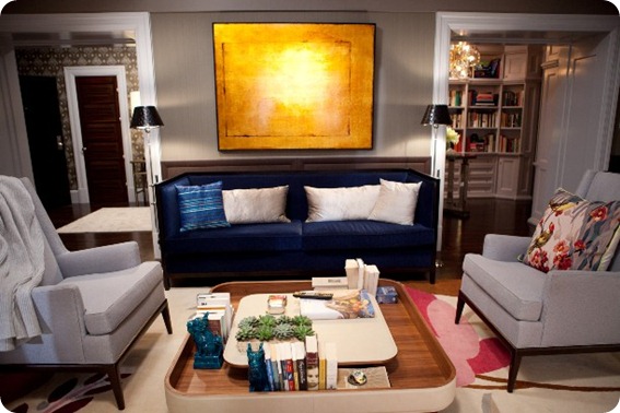
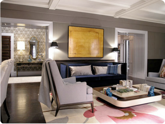
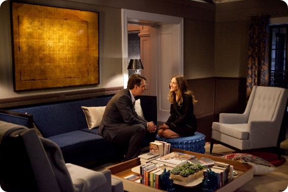
Entering the living room, I like this view of it. The Rug Company rug is beautiful, as is the coffee table, though, as in her old apartment, the sofa and chairs still seem rather more for ‘perching’ than truly relaxing, though much is made in the movie of Big turning into a couch potato.  I think I like the gold painting though I can’t help thinking that Big and Carrie would have a more striking piece of modern art. 
 

 Picture 11

Sex and the City 2


r8sr-rugc-birbyb-1-18182


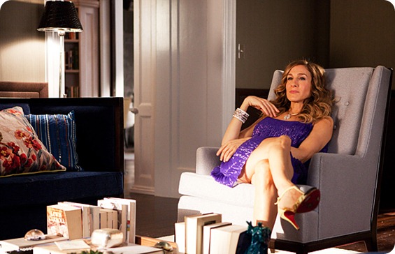
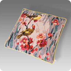
Paul Smith got an excellent bit of product placement in here with his ‘Birdie Blossom’ cushion, which Carrie is seen cuddling like a new lover.  It’s lovely, though I’m not sure the pattern really works here, but it does seem more authentically ‘Carrie’ than much of the rest of the stuff.  It’s also great to see all the books everywhere. One of the things we all complained about last time was the lack of books in bookworm Carrie’s apartment.
 

Sex and the City 2

050410-satc-623


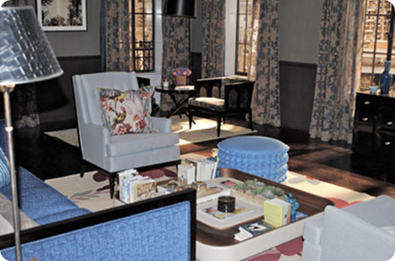
From here though things go downhill faster than an Olympic skiier. This view of the sitting room is a cluttered and fussy as a pair of Queen Victoria’s bloomers.  There are just too many little pieces of furniture, too many patterns and too many little splashes of colour against horribly dark and serious walls.


sitting area 2


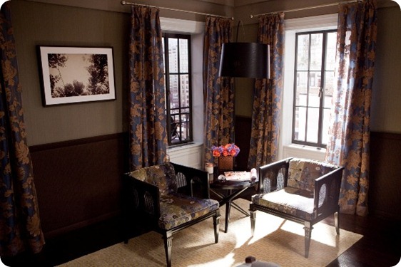
This little seating area seems especially ridiculous. Are Carrie and Big really going to sit here as if they were in doctor’s waiting room taking afternoon tea? Isn’t this the perfect spot for a huge comfortable reading chair facing out towards the view?


Sex and the City 2

 Sex and the City 2


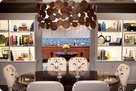
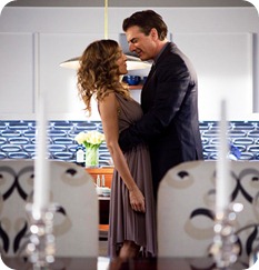
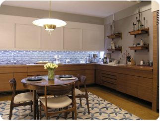
I like the lighter fresher feel in the formal dining area. The Lee Jofa fabric works well and the light fitting is wonderful, though shelves could do with a bit of editing. It goes through to what I think must be the kitchen, though it seems rather impractical to cook in, and I would never, ever, EVER put a rug, however pretty, in space for cooking.  But maybe that’s just me.


050410-satc-one-383 Picture 13

entryway2


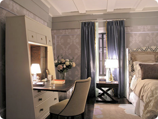
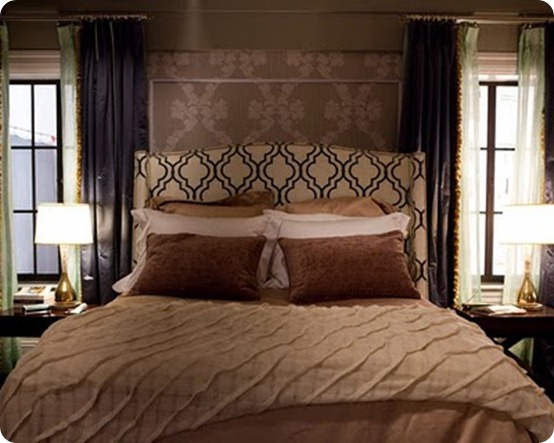
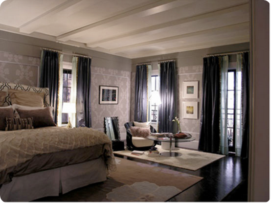
Looking to the left from the entrance hall we catch a glimpse of the bedroom, with another fabulous light fitting in the small library and beautiful Cole & Son wallpaper on the bedroom walls, which echoes the paper in the hall.


bedroom3


Carrie makes a huge amount of fuss in this movie about Big’s purchase of a big TV for their bedroom, thus confirming a) that we were right that the big TV in Carrie’s old apartment was incongruous and out of character and b) the TV product placement people have a lot of money.


bedroom1


The bedroom feels a bit ‘hotelly’, but I do like the way they’ve echoed the pattern on the wallpaper with the headboard.  And below we’ve got another lovely rug/useless seating area/boring artwork situation happening.


Picture 12


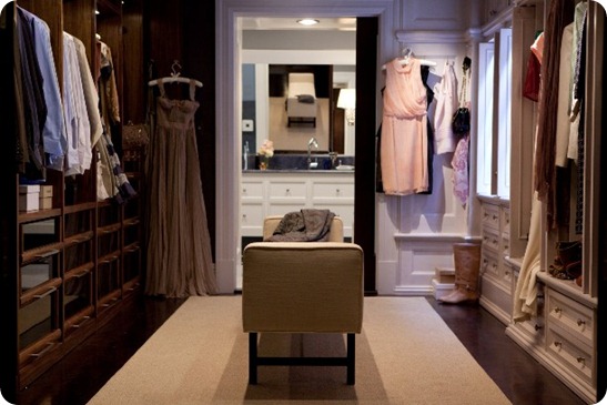
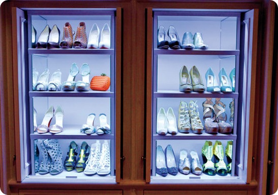
The piece de resistance is naturally the closet, with ridiculously twee ‘his and hers’ sides.  I know people have been charmed by this conceit, but to me it looks as ludicrous as having two different his and hers sinks, one ‘feminine’ and one ‘masculine’ side by side in a bathroom. 


Sex and the City 2


Not bad shoe storage though. 


gal_sex7


(By the way Habitually Chic has put together a great post on where to source many of these pieces, including identifying the books that Carrie and Big are currently reading.)


So what do you think?  Additional comments hugely encouraged.


Share

Carrie Bradshaw’s Apartment – Love or Hate?

CropperCapture[1]

Love TOO Wallhanging by Paul Smith (seen hanging inside Carrie’s entrance hall, I haven’t been able to find a photo of this in situ)

So there’s been lots of chatter recently about Carrie’s apartment makeover in the movie.  It’s not too much of a spoiler (and by now the the whole world and her girlfriends have seen the movie anyway) to say that Carrie is apparently earning enough from her books to be able to afford an interior decorator to makeover her apartment.

It’s no secret that the producers of the show go to immense trouble to reflect the characters’ personalities and lives in their clothes and surroundings, so it does make sense for Carrie’s apartment to get an update as she becomes more successful and ‘grown up’.

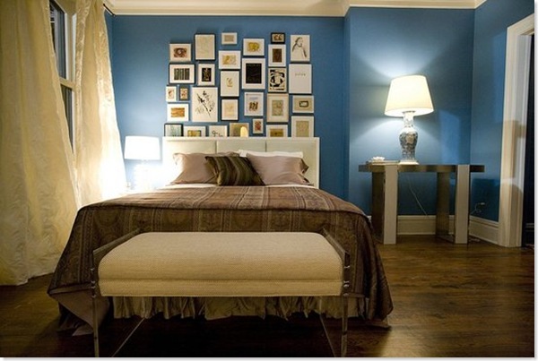
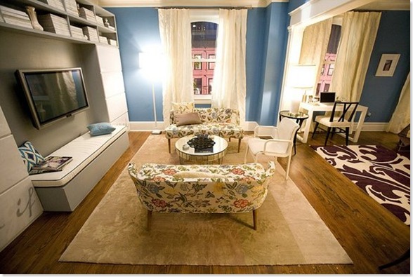
The most obvious change – which really stood out in the cinema – is the colour of the walls throughout the apartment (custom-mixed, but apparently a close relation of Benjamin Moore’s Electric Blue). It’s a pretty colour but I thought it was just a bit too much. I’d have gone for something very slightly more muted and soft and not quite so, er, electric. (It also looked brighter in the film I thought than it does here).

SC_07833_preview

Carrie’s apartment AFTER

Her bedroom has been hugely smartened up.  The blue walls and white trim really bring out the brown floors, which again unify the space throughout the apartment and stop the blue from being too overwhelming. I also really like the billowy curtains, which soften the space and, because they are hung to each side of the window, really make the windows seem more imposing. However I really don’t like that bedspread, which looks like something you’d find in a seedy hotel.

I also don’t like the artwall.  Firstly aren’t art walls a bit over done now? And where did all this art come from?  Does Carrie have a secret Etsy/Ebay addiction which has never been mentioned? She’s never shown any interest in interior decor before. Or, heaven forbid, did the decorator just buy up all this art in one day?  And why is some of it tucked behind the headboard of the (rather uninspiring) bed?

carrie_bedroom

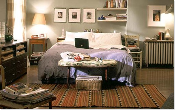
Carrie’s apartment BEFORE

SC_07840_preview

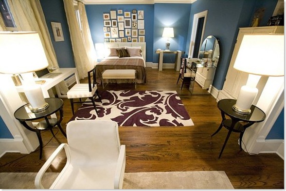
Big kudos to the Rug Company – one of my favourite UK design companies – for providing the rugs.  Such a good way of building up their profile in the US.  A big thumbs up from me for the purple one they’ve used here, which is the Overleaf by Marni. However I don’t think it really goes with either with the bedspread or with the little chintzy floral couches.  I’m all for mixing patterns – and on their own the couches are lovely –  but these patterns don’t have any relationship to each other at all, and if you’re mixing patterns I think there needs to be some sort of unifying thread (and throwing in a blue ikat pillow doesn’t really help matters).

SC_07829_preview

The huge TV seems hugely out of place here.  When does Carrie ever watch telly? Unlike Miranda, when you see her on your own she’s reading a book or magazine, which brings me to another bugbear.  Where are Carrie’s books? How is she going to reach her magazines? And where is the hugely comfortable chair/sofa for curling up and reading? Those floral couches are meant for perching, not snuggling.  And if she is going to settle down and watch the enormous telly, is she really meant to sit bolt upright on that incredibly uncomfortable-looking white chair?

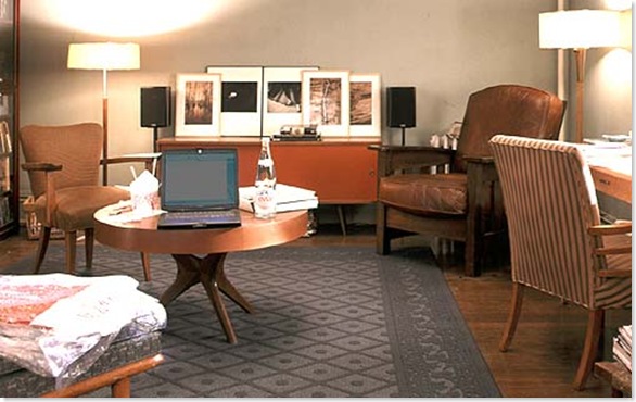
I also wished that they would have kept a few of Carrie’s familiar old things around.  One of the key components of her personal style has always been her ability to mix new and vintage stuff. So wouldn’t she have kept that great coffee table and credenza?  And was it callous or inevitable that she ditched Aidan’s chair? And why not keep the fabulous Bakelite phone?

carrie_livingroom 

I suppose ultimately my complaint is that while it is definitely a much more beautiful apartment, it ends up not being Carrie’s apartment. All the personality has been sucked out of the place and replaced with interesting decorator pieces (and product placement opportunities).

What did you think?

Share