Blogging Your Way : NYC Road Trip Part 1


Very early a couple of Fridays ago I crept out of the house and set off on a little adventure


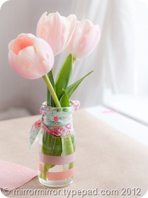
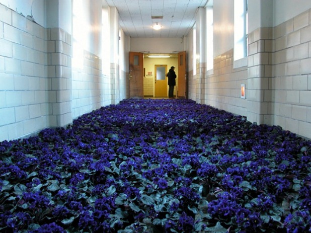
tulips (3) hollybecker

moodboard


When Holly Becker first announced that she was coming to New York to teach her hugely successful online Blogging Your Way’ class in person, my initial instinct was to think that it was a crazy idea; then I remembered how much fun I’d had at Holly’s book signing; then Holly started a persuasion job on me on Facebook (and goodness that woman can be persuasive) and before I knew it I’d booked a place on the class, a ticket to New York and a room at the Ace Hotel.

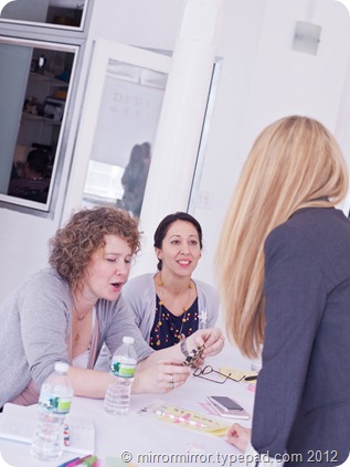
The weekend was split into two parts: Holly taught the ‘Creative Business of Blogging’ on the Saturday and then Leslie Shewring of A Creative Mint followed on Sunday with a more active workshop on styling and photography.  Since one of my goals for the year is to finally get serious about both my blogging and my food photography, it seemed like a great way of killing several birds with one stone. The fact that it was in NYC might have influenced my decision a leeetle bit too.

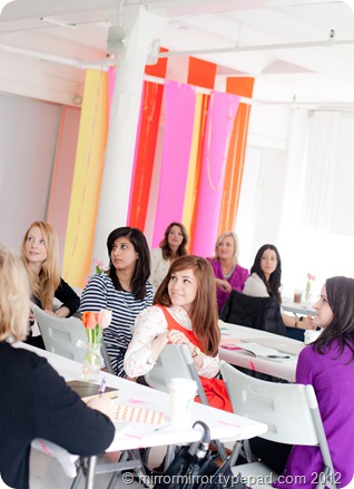
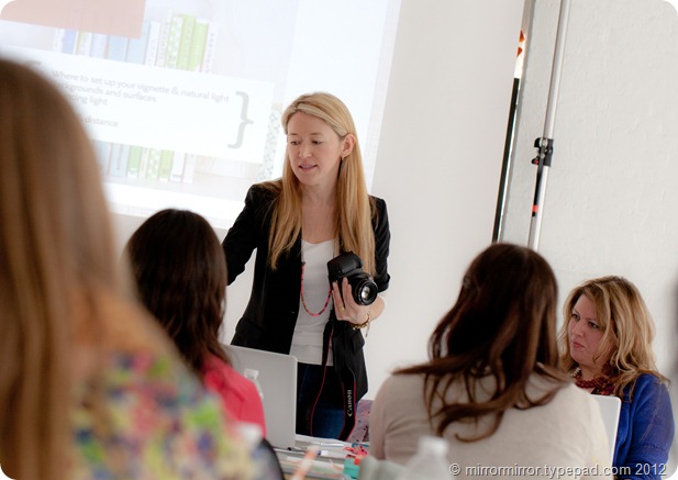
One of the things we talked about a lot during the Saturday workshop with Holly was uncovering and keeping true to your own personal style, aesthetic and voice. The quote on the slide above Holly’s head in the above picture is ‘to thine own self be true’ and she certainly practises what she preaches, as I discovered on the Friday night.
 

divinestudio divinestudio (2)
                       Friday night                                                                                      Saturday morning
   

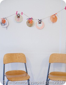
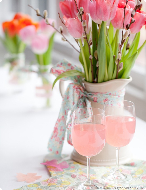
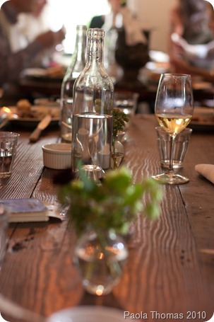
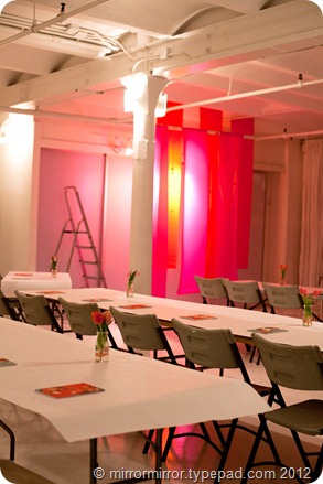
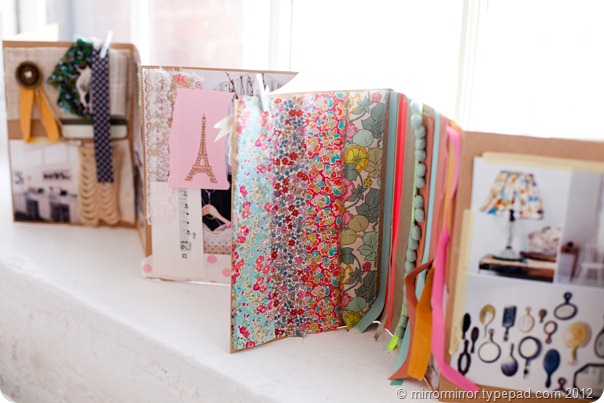
Since I was three hours behind New York time and wide awake on Friday evening, I was happy to help Leslie Shewring as she styled Divine Studio in the East Village to turn it from its bare white bones into a creative and inspirational space.  We moved tables, covered them with plain white paper, hung rolls of crepe paper, decorated jars with washi tape, arranged tulips and pretty notebooks. By the time Holly had added Liberty print ties and round tags and floral banners she’d made herself on the plane, being in the studio was like being within the pages of Holly’s blog – all white with pops of colours, lots of pretty pastels and florals, with the odd homespun, crafty touch. 

It’s not exactly my aesthetic, but seeing a coherent look being pulled together with some cheap accessories, a deft touch and a focused styling eye, was one of the most fascinating aspects of the weekend for me.
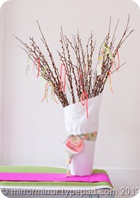
 

tulips (2)


libertyprints (2) libertyprints garland
                                                                                   Holly-isms everywhere
   

Aside from lots of practical advice about blog design, how to build readership, how to use social media successfully and how to monetize your blog, there was lots of stuff on finding your own authentic voice, focus and niche.  Focus is one of the things that my blog has suffered from a lack of over the years (you don’t say! – Ed) so this really resonated with me. I did a lot of soul-searching, both during the class and on the plane on the way home and I think I came to some conclusions.  I’ll share them in a separate post.

 

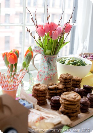
citybakerycookies citybakerycookies2

citybakerycookies (2)

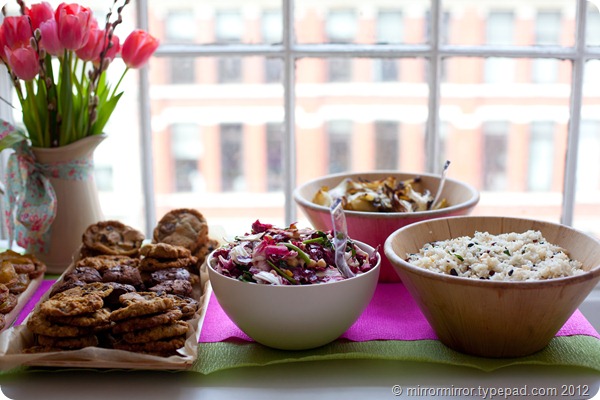
Even the food, from City Bakery, was both beautiful and delicious
   

The thing you need to know about Holly is how authentic she is.

She’s had a lot of success but that has come about because she has stayed true to herself, her passion and her vision.  The whole weekend was an object lesson in ‘walking the walk’. From the décor, through the food, to the one-on-one attention, the course materials and the great team of helpers Holly had pulled together (Leslie, Michelle and Melissa below and Julie, whom I sadly don’t have a picture of), everything reflected Holly’s style and the fact that she is so utterly and ridiculously nice. This is a woman who really cares about her readers and the people who attend her classes and workshops, which is why they are so darn fun, creative and inspiring.

And that was probably the most inspiring, thought-provoking and fabulous thing of all.
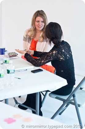
 

hollybecker (2) melissamichelleleslie


I’ve got so many pics that I’ve decided to split this post into two parts.  Tune in tomorrow for more about Leslie Shewring’s fabulous styling and photography class.
   
Share

Go Love Your Room: Circles, Rectangles and Stripes Edition


One of the things we talked about at the weekend was the idea of constantly exploring and questioning and thinking about your aesthetic and why you are drawn to certain things – using your blog as a way to explore your own creativity and as a catalyst to live your best life.

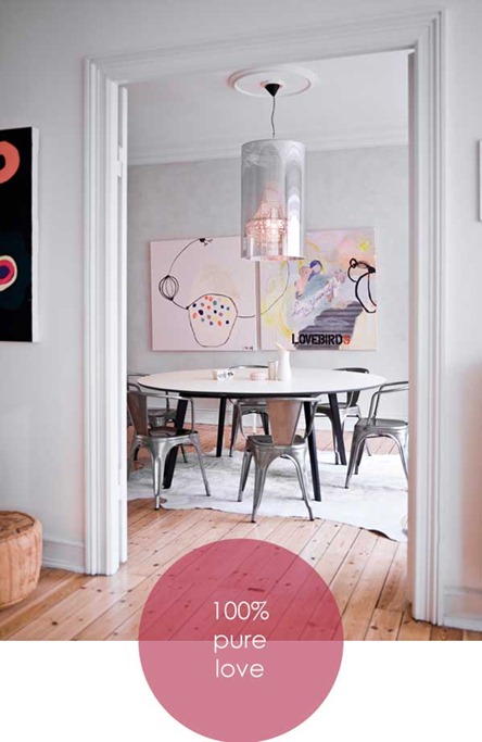
I saw this apartment a few weeks ago, and it really resonated with me, so I thought I might try and work out WHY I like it so much.


smykkedesigneren

This room is gorgeous.  The beautiful focal point of the paintings sort of goes without saying, but the designer has also used texture subtly and cleverly–  the smooth table and hard metals contrasted with soft leather rug and pouffe and the natural wooden floor. 
I’ve noticed in my photography that I’m really drawn to complementary shapes and I love how the designer has used  the large square art pieces to emphasise the rectangles of the doors and walls, while the circle of the ceiling rose is echoed by the cylindrical light, the round table, the cylindrical pouffe and even the spots and circles on the paintings.


Smykkedesigneren_11


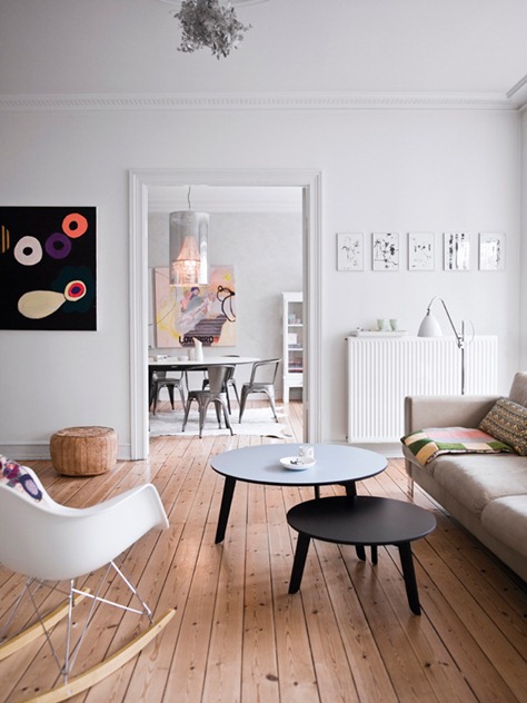
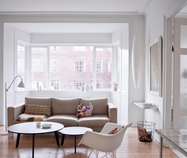
Pull out into the lounge area and you’ll see more use of shape and texture.  More rectangular pictures, more circular tables and a Tord Boontje metal light shade (which I don’t think is quite big enough).  You’ll know through all my ‘Go Fug Your Room’ rantings that I don’t like uncomfortable chairs, and I think the seating in here could be a little more cosy (and maybe a rug would have helped), but my goodness, it’s still a lovely space.


Smykkedesigneren_55


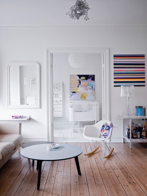
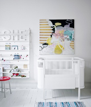
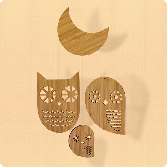
Looking in the other direction the stripy art picks out the lines of the floorboards (love how they go in opposite directions), and echoes the stripy art and crib slats in the nursery. I also like how the curved top of the mirror reflects the curves of the Eames rocker and stops everything from feeling too square and boxy. And there’s a most beautiful stuffed owl with circular owly eyes.  And we all know how much I like those.


Smykkedesigneren_88 Smykkedesigneren_66


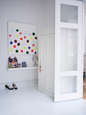
Rectangular shelves, a round stool and a stripy rug complete the nursery and there are more circles and a whole family of round-eyed owls in the entrance hall.


Smykkedesigneren_44-695x587


Smykkedesigneren_22 Smykkedesigneren_77


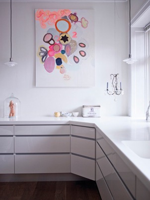
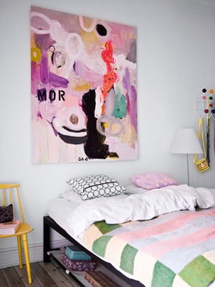
More stripes in the bed cover and through the kitchen cabinets and more circles through the art, the cushions and in the Nelson coat rack.

Wow. To be perfectly honest, I hadn’t noticed how thoughtfully the designer had organised the shapes in the apartment until I was half way through writing this post.  I thought at first it was the colours everywhere speaking to me, but I think it’s the underlying sense of organisation that is making my soul happy (unfortunately this is not reflected in my own home).  This house makes me want to tidy up and buy art.

What do you guys think?  Do you like it or is it too structured and sterile for you?  Does anyone know who did those amazing paintings or where I can buy those FABULOUS owls?  And where do the people who live here put their stuff?

This apartment belongs to Norwegian jewellery designer Stine A. Johanssen. More details are here, translated from the Norwegian.

   
Share

Go Fug Your Room? – Ines de la Fressange in Provence


Does that title send shivers down your spine?  

Given that Ines de la Fressange is the person I’d most like to be when I grow up, and Provence is the place in the world that I’d most to live (yeah, how original am I ), and her apartment in Paris has already been given the coveted mirrormirror seal of approval,  I can’t express how excited I was to see that my Elle Décor international edition was featuring Ines’ house in Provence.

inesdelafressangeprovence

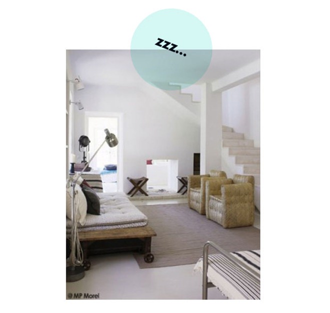
Until that is I actually opened the magazine. Was this cold, spare, almost industrial, snoozefest of a space REALLY the home of the most stylish woman on the planet?  Or has my beloved Ines been kidnapped by space aliens and replaced by some sort of robot?


inesdelafressangeprovence1


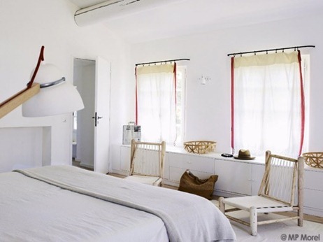
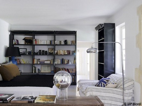
My first issue is with all the white.  I spent one of the happiest years of my life living in the South of France and the light there is warm and golden and oozes like butter, made for the sunset colours of painted plaster, terracotta tiles and warm, rich woods.  This harsh, clinical whiteness might work in Scandinavia, or Britain, or even Paris, but it doesn’t begin to say Provence to me.


inesdelafressangeprovence3


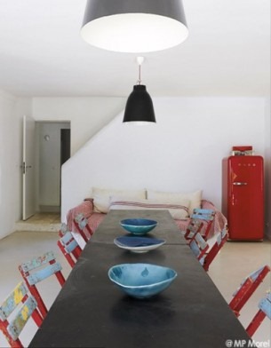
And then there are the chairs.  Is it me, or does every single chair with the exception of the daybed look supremely uncomfortable? Either the sort of chair you have to perch on or a somewhat creaky flea market sofa with the sort of smelly upholstery you have to cover with a throw?


inesdelafressangeprovence4


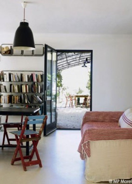
I could almost cope with the white if it had been enlivened by some brilliantly contrasting colours, but black?  I think black is quite difficult to live with at the best of times, but the black and white, with the stiff metallic lamps and stark, shiny floors, just seems cold, uncomfortable and unfriendly in Provence.  And I can’t even begin to explain how many sorts of wrong the depressingly coloured Union Jack cushion is.


inesdelafressangeprovence5


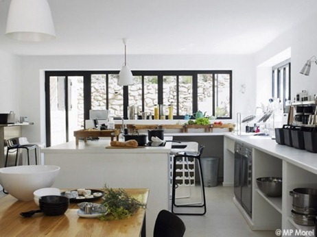
The kitchen is by far the best room in the house and shows what might have been if more colour had been included.  But it still all seems rather brutal to me.


inesdelafressangeprovence6


But what do you guys think?  Is this house fugly or not? As usual tell us how you reached your decision in the comments.


I was astonished to find out that an amazing 74% of you agreed with me about Diane von Furstenburg’s Manhattan penthouse. I do hope you’re not just sucking up. 

   
Share

What Do You Think? – Open Kitchen Shelves


One of the projects we’ve got lined up for this year is remodelling our horrible downstairs kitchen. 

The good news is that we have two kitchens in this house.  The bad news is that they’re each as ugly as each other – the downstairs one is a relic from the seventies, complete with crumbling cabinets, laminate countertops, ancient linoleum, probably an asbestos problem. I’ll show you pictures one day when I’m feeling especially mean.

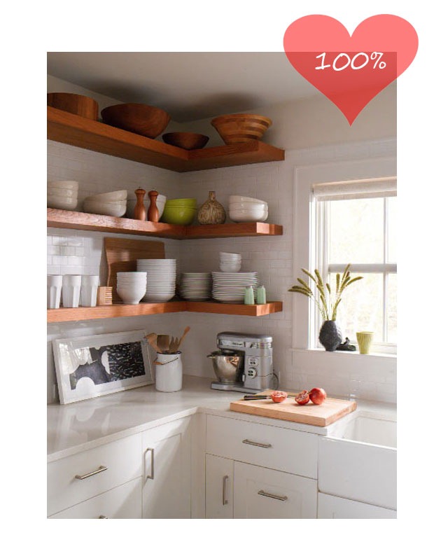
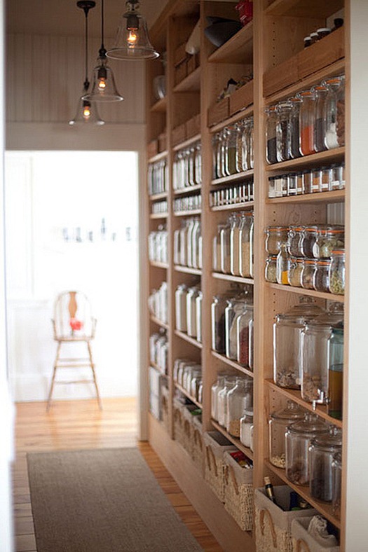
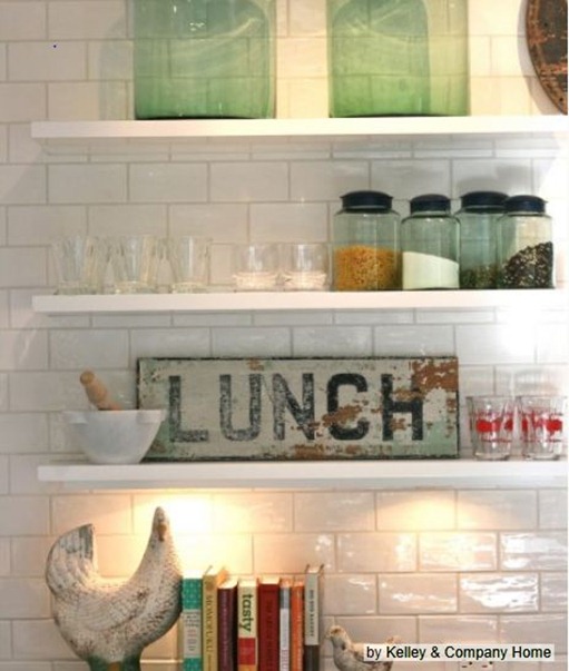
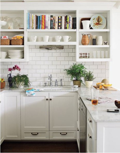
I’m starting to consider design ideas and am very tempted to include lots of open shelves. They look good and of course are WAY cheaper than cabinets. openkitchenshelves

From a gorgeous house tour on Design Sponge. My kitchen is NEVER this neat..

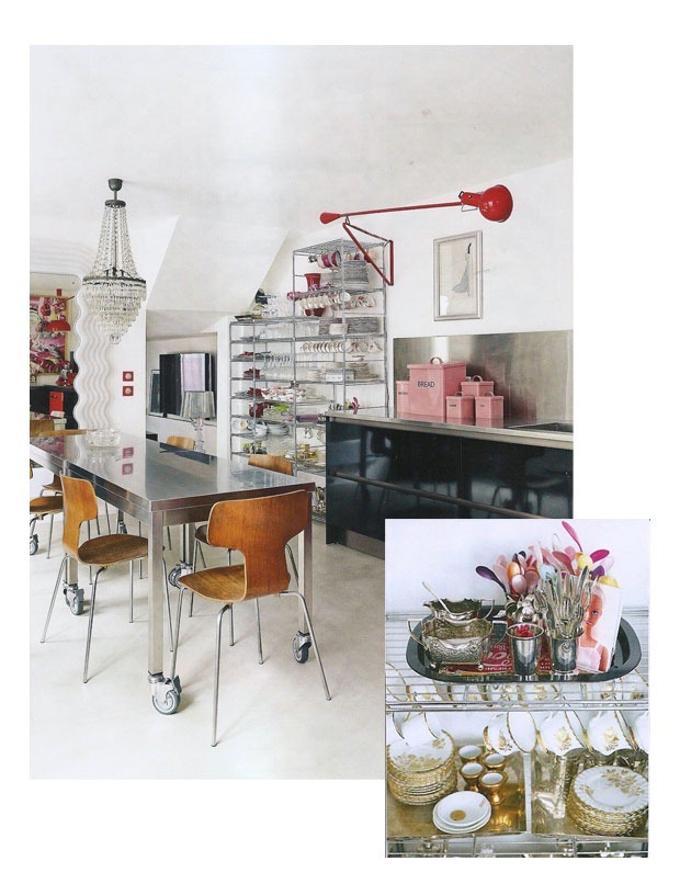
stainlesssteelshelves

I’m loving these open steel shelves shown in last month’s Livingetc. I suspect they only look this good though, because they’re carrying half a ton of gorgeous vintage tea plates and spoons.


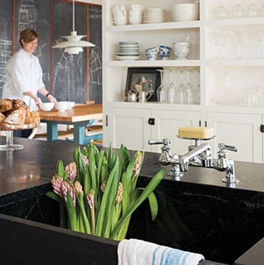
openshelves1


Source unknown.  Love the juxtapostion of white shelves with dark wood counter tops.


openshelves2


I could never keep shelves as tidy and uncluttered as these. From a this tour on Houzz.


openshelves3


It would be nice to have a least some of my two hundred and fifty-odd cookbooks on display. From The Kitchn.


I am, however, intrigued to know what open shelves are like to live with.  How easy is it to keep everything clean?  Do you have to go out and buy tons of fancy plates and crockery to make them look good?  (This is not necessarily a problem).  Is it easy to keep them tidy or do they end up with piles of stuff just shoved on them? What are your tips and tricks for keeping them organised?

Tell me all your deepest, darkest, most sordid secrets.  No one reads this blog anyway.


openshelves


The above is from the Seattle house of the architects we’re hoping to use, which I previously blogged about here.


openshelves4


This pantry makes my inner Martha squee with delight.  However I have more chance of flying to the moon than achieving such perfection. From here.

   
Share

Go Fug Your Room? – DvF’s Manhattan Penthouse


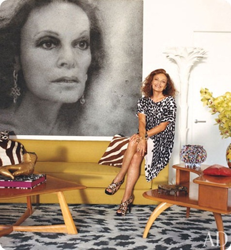
I hugely admire Diane von Furstenberg’s fashion style and her inspired use of prints and colours, even though, as I don’t have much of a waist, her iconic wrap dress is just not flattering on me.

So I was fascinated to see online previews of a spread in March’s Architectural Digest featuring her incredible penthouse apartment in Manhattan’s Meatpacking District.


diane-von-furstenberg-01-portrait


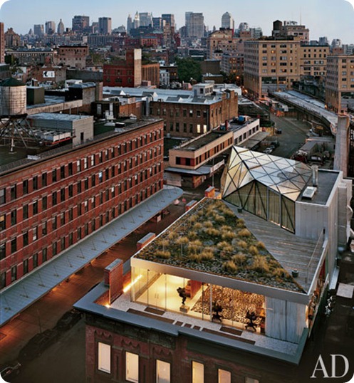
The penthouse, built over DvF’s design studio and flagship store, is absolutely stunning, with apparently incredible views through its transparent glass walls.


diane-von-furstenburg-new-york-apartment-02-exterior


But inside? Well, it all strikes me as just a bit too MUCH.


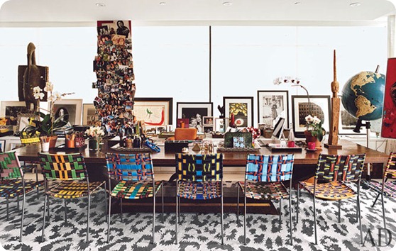
diane-von-furstenburg-new-york-apartment-03-living-office-area


Those chairs are gorgeous, the art is apparently priceless, but it all feels as if it just can’t breathe. The backdrop of the leopard skin rug really doesn’t help matters.  And who sticks art, however exquisite, on the windowsill, thereby obscuring the billion-dollar views?


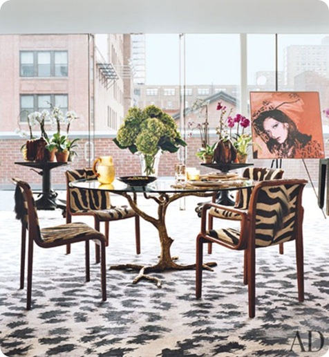
diane-von-furstenburg-new-york-apartment-04-dining-area-warhol


I love the Andy Warhol portrait, dislike  the table and am meh on the clashing animal prints. Again, I think this would have looked a whole lot better with a more neutral rug.


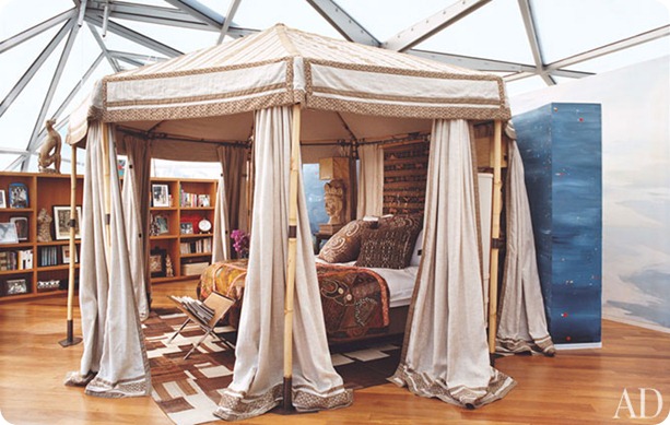
diane-von-furstenburg-new-york-apartment-05-master-suite


I sort of admire her for attempting to recreate a pasha’s boudoir in her big glass eyrie -  just because the structure is ultra-modern, you don’t necessarily have to go ultra-modern with the décor. But I just don’t think this works, the attempted grandeur is overwhelmed by the ceiling and it just looks incongruous.


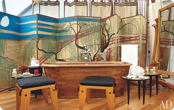
diane-von-furstenburg-new-york-apartment-06-bath-area


Those screens round the bath are lovely, as is the bathtub itself, but I would be terrified of knocking over all those little tables and stools when I emerged dripping wet from my ablutions.  But maybe DVF is not as clumsy as me.

Although I can see that one would want to create private areas in such an open space, overall all the clutter and clashing patterns and different styles and objets seems to fight with the open space rather than celebrating it.  She’s tried to make it cosy, but I don’t think it’s the sort of space that works with cosy.

But what do I know?  She’s is DvF after all.

What do you think? Please show your workings in the comments.

   
Share

Fuck Your Noguchi Coffee Table


The best new Tumblr ever, well at least since Unhappy Hipsters, Fuck Your Noguchi Coffee Table calls out all the design clichés we all know and love from blogs and shelter mags. 

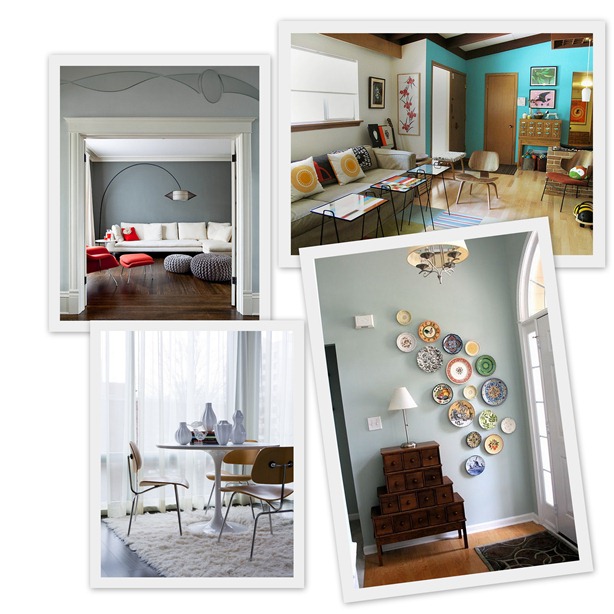
Fuck Your

Clockwise from top left: ‘Fuck your… knit pouf…card catalog…plate cascade… Saarinen tulip table’

I am happy to report that, with the exception of graphic pillows, I have none of the things they mention in my house, though that’s mostly due to lack of budget. I have to confess to having wanted most of these things at one time or another and I’m still determined to knit a pouffe one day.

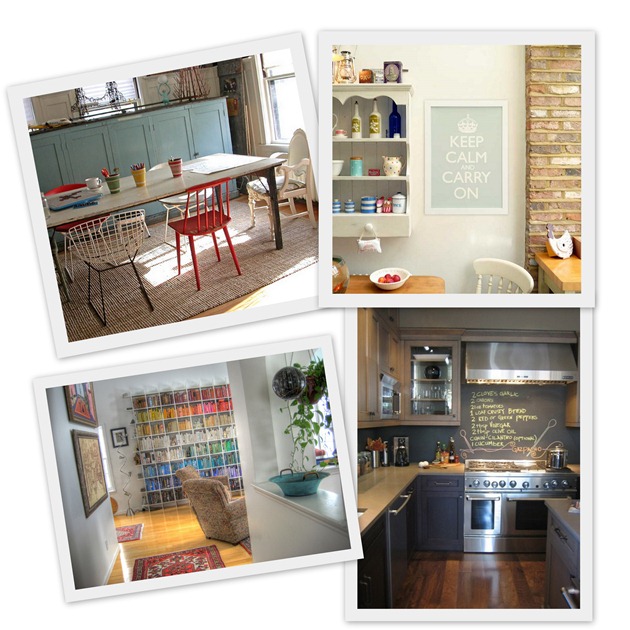
Fuck Your1

Clockwise from top left: ‘Fuck your…chair hodgepodge,,,  Keep Calm and Carry On poster…chalkboard backsplash…bookshelf with the books arranged by colour’

How many do you have in your house?  Are there any that you would still secretly covet?  How many of these trends were started by Domino? What other clichés should be on the list?

I would also respectfully ask the author if writing your blog in faux typewriter font isn’t one of the oldest design clichés in the book.

   
Share

Hotel Pelirocco – Knitted Hotel Room


I nearly put my back out straining to love this hotel room, which has received a bunch of publicity in recent months, but somehow I just CAN’T. 

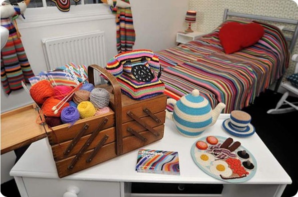
The hip Hotel Pelirocco in Brighton commissioned fibre artist Kate Jenkins of knitwear and crochet brand Cardigan to create a knitted hotel room, and this is what she came up with.


fss Capfsfture


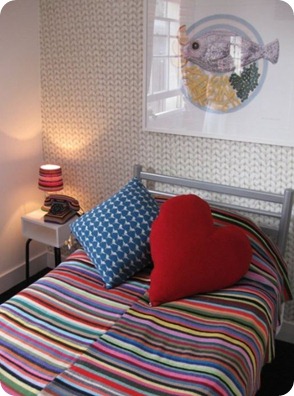
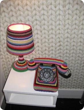
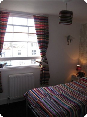
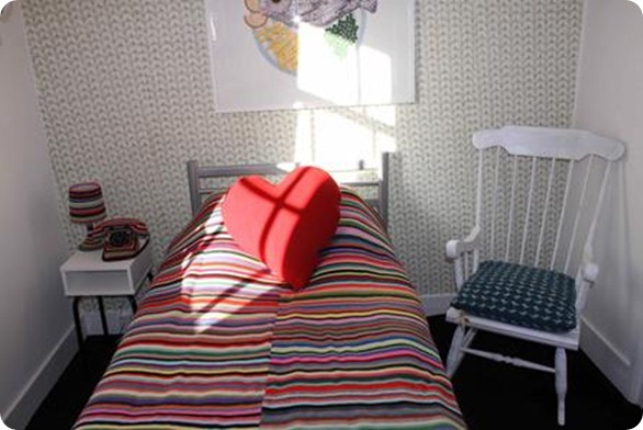
The ‘Do Knit Disturb’ room features a hand-crocheted bedspread and curtains, knitted cushions, a crocheted lamp and telephone and other whimsical crocheted artifacts appropriate to the seaside location, such as seagull soft toys, a knitted picture of fish and chips above the bed and a crocheted full English breakfast.


Cssfapture


Capture Captgsgure


I don’t like it because it just seems so expected somehow – all cosy and grannyish and whimsical and about as sexy as a pair of well-worn bedroom slippers.  Heck, the room is even a tiny single room because of course someone who liked knitting would never have a boyfriend.


cardi-8-349


When you think of some of the cool and innovative knitted homewares other craftspeople are making out there, I can’t help thinking that they really missed an opportunity to do something contemporary, textured and elegant; something modern and abstract or even something downright sumptuous and glamorous. 

What do you think?  Do you like it? Would you stay there?  Is it the best job they could have done with knitting and crochet?  What sort of thing would you have done?

Share

Advent Calendars


It’s the first of December so we’re allowed to start talking Christmas (or ‘the holidays’ if you prefer).


christmastreebokeh (1 of 1)


The Minx’s advent tree, which is yearly supplied with small treats by one of the Minx’s godmothers, will go up tonight and I thought it might be fun to round up some other advent type things I’ve come across in the last few days.

One of the Minx’s other godmothers (yep, we did a good job picking those) has sent her a link to this gorgeous-looking online advent calendar by Jacquie Lawson featuring Christmassy London scenes. I don’t seem to be able to share the demo, but do click on it, it’s really charming.  I don’t care about the Minx, I’m excited enough to start open the first link when she comes home from school tonight.

Also tonight, we’re off to see the Christmas Ships as they set off on their nightly December odyssey round Seattle’s waterways. Rain has always conspired to stop us seeing them before, but it looks like it will be OK tonight.  Hopefully pictures tomorrow.

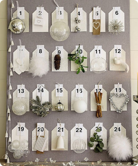
The Daily Suze found two beautiful, more grown-up, advent calendars.


whitecompany5


This from the White Company (how I miss that shop).  I love this idea of having a tasteful tree decoration for every day and transferring them one by one from the calendar to the tree. Maybe when we get back to having tasteful trees again we’ll do this.

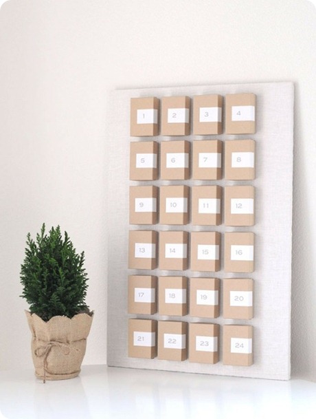
This calendar is also minimalist and lovely, and even I wouldn’t have trouble making it.  It could be made to fit into any décor too, if you changed the colour of the boxes.  I still don’t quite see the Minx appreciating it yet though.


xmas2011_advent-calendar_kraftboxes_adventcalendar


If you want an advent calendar for yourself go along to Paper Coterie where they are doing a project called ‘Picture the Holidays’. Every day you will be emailed a prompt to take a photograph and at the end you will get the chance to put all your gorgeous images together into a photo book.  Facebook friends who have done one Paper Coteries’s Prompt Me projects before have said that it’s very fun, so I’ve decided to sign up.  Let’s see how it goes.  I’ll put more details up in dedicated posts as the month progresses.

Finally, if you’re into shopping rather than photography, Abigail*Ryan, purveyors of beautiful homewares, are doing a 12 Days of Christmas Sale. Search for the snowflakes on one of their gorgeous handprinted teatowels or cushions and get it on sale for one day only. And if anyone wants to buy me one of their teatowel gift boxes, please feel free.

Share

Scary Things In Bedrooms


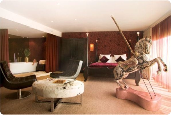
Remember when I posted this nightmare-inducing room from MyHotel in Brighton earlier this year? 


myhotelbrighton


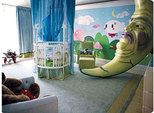
Well, I was reminded of it yesterday when I caught a glimpse of the nursery Christina Aguilera had decorated for her son Max. (I know this is old, but I didn’t see it when it came out).


christinaaguileranursery


That child is going to need years of therapy.  Is this a trend?

Share