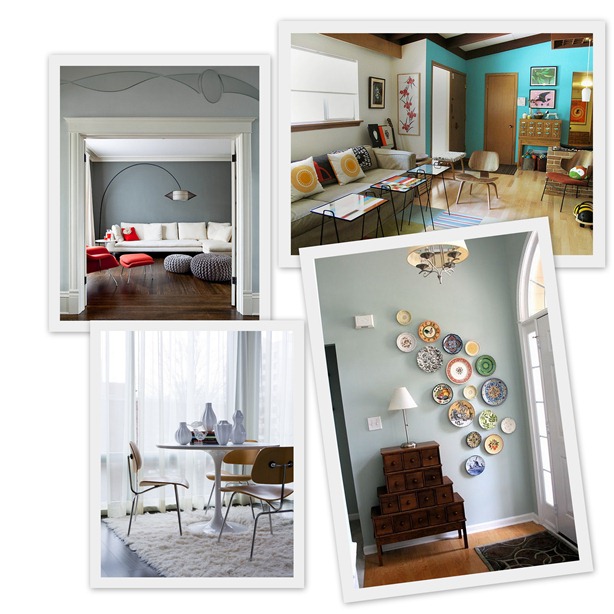
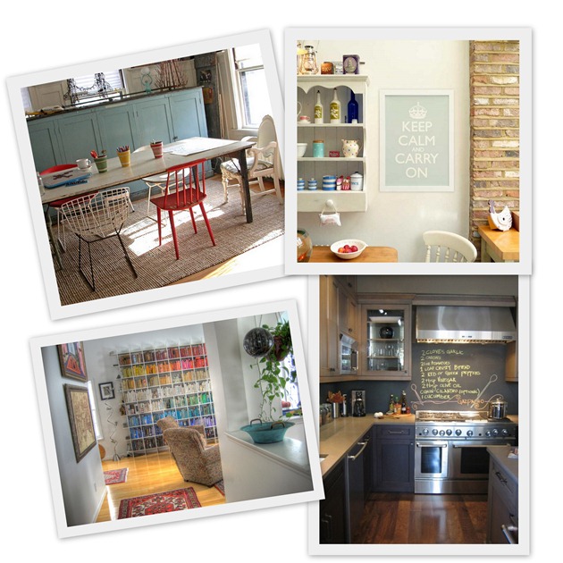
The best new Tumblr ever, well at least since Unhappy Hipsters, Fuck Your Noguchi Coffee Table calls out all the design clichés we all know and love from blogs and shelter mags.
Clockwise from top left: ‘Fuck your… knit pouf…card catalog…plate cascade… Saarinen tulip table’
I am happy to report that, with the exception of graphic pillows, I have none of the things they mention in my house, though that’s mostly due to lack of budget. I have to confess to having wanted most of these things at one time or another and I’m still determined to knit a pouffe one day.
Clockwise from top left: ‘Fuck your…chair hodgepodge,,, Keep Calm and Carry On poster…chalkboard backsplash…bookshelf with the books arranged by colour’
How many do you have in your house? Are there any that you would still secretly covet? How many of these trends were started by Domino? What other clichés should be on the list?
I would also respectfully ask the author if writing your blog in faux typewriter font isn’t one of the oldest design clichés in the book.



I have none of those in my house now, but I will inherit a few of them some day.
I grew up in a mid-century modern house that my architect father designed. As a kid, I didn’t think our furniture was anything special, but I know better now. My parents’ collection is heavy on Mies (including Barcelona chairs) and Bertoia (like the side chair in the chair hodgepodge), with some Eames, Breuer and Panton (check!) mixed in. I love all of it… and I’m happy to wait to have it.
I wonder whether FYNCT’s author misses the distinction between classic furniture that has become repopularized and trendy decorating ideas that become clichéed…
Kimberly, I want to come back as you in my next life…that sounds completely awesome and I wish my parents had had your parents’ taste and foresight.
I also agree. The classic furniture is beautiful and I hate that it’s become cliche’d. In fact I’ve admired pretty much every single one of these ideas over the years and wish they weren’t so overused now. Cool ideas seem to become hackneyed so fast nowadays…the downside of all the design blogs and magazines I suppose…
My mother-in-law had a plate cascade in her French country style kitchen. The colourful plates accented the white cabinets and birch bench.
How else would you display them?!
I think it’s just a question of authenticity. Sounds like your ma-in-law’s plate collection has been built up over many years and fits perfectly in its space – so yes, a plate cascade sounds fab. But don’t go and buy a job lot of ho-hum plates in one go just so you can have a plate cascade. Ditto a picture wall which we’ve talked about before…http://mirrormirror.typepad.com/mirror_mirror/2008/04/art-for-arts-sa.html
Cliches I seem to see over and over: lucite dining room chairs, ceramic (?) garden stools as side tables, the beach house that is decorated in all blue and white, and speaking of white, white slip covered furniture that the homeowner always claims is so easy because you can just pop them into the wash when there is a spill (I have a white slip covered couch and can vouch that THIS IS NOT TRUE! THEY GET STAINED AND LOOK BAD!), framed children’s art work, picture walls (which I like along with the plate wall), and books stacked vertically (dot hose people actually read books?) and vases with big tropical plant leaves.
Agree! It should be organic and meaningful.
Ciao, Paola! I’m not a modernist but I have respect for mid-century modern or pretty much any interior in any period if it’s done right. I love it for them. Conversely, I hate design magazines that speak of items or décor stylings that are “on trend” as if this is what we should all run out and do.
However, I’d much rather put up with some tired design clichés and I’ll take the graphic pillows, plate cascades, rainbow arranged books (thank God, they weren’t all destroyed a la Fahrenheit 451) etcetera, etcetera, then have to be exposed to what’s mass produced for the average consumer today. I don’t get it! Beautiful design doesn’t have to be expensive.
What I really shrink back from, are the masses and masses of poor design pieces, such as: poufy, Jabba-the-Hut style recliner chairs and sectionals that middle America (and also up here in Canada) litter their living rooms with in the name of comfy-ness; the same over-reproduced images of wistful cherubs and roman figures that pass for artwork; matched 9 or 12 piece bedroom sets and great, big, humongous TV screens hung over fireplaces that give you a stiff neck and huge physical therapist bills.
I could go on and on…but I’ll stop here if everyone promises to take down their “Keep Calm…” poster. Even the Queen is tired of that one.
B
I don’t see what the big deal is. All those rooms were beautiful, and isn’t that all that matters? Who cares if your house has all the latest trends if you love it. I personally have a very eclectic taste and I love changing things up very frequently in the least expensive way possible. Thrifting for me is an inexpensive way to do that, and it means my house will look nothing like Joe blows who purchased everything from a popular chain.
fuck Kimberly…just kidding, i had the same reaction
I hate design magazines that speak of items or décor stylings that are “on trend” as if this is what we should all run out and do.
All of us today recognize the true potential of the self-effacing coffee table. A star in its own right, a coffee table is now considered to be a crucial piece of furniture that sets the tone of living room decor.
I love the way you decorated your place,so simple yet looks so organized and wide space too.
Love this post! Those plates on the wall in a crescent shape are divine!
Bianca: You are part of the problem.
“Fuck Your Noguchi Coffee Table” is great because it’s NOT just critiquing interior design cliches in general. You will never see a cherub, a piece of furniture designed to be comfortable, or anything created with “average mass middle America” in mind given the fuck-you on that site. Any hazards as to why?