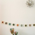
Remember the Wrist Worms?
Isn’t this just the perfect place to create them? It makes me want to dive for my crochet hook.
{Image of Sandra Juto’s studio from her blog www.sandrajuto.com }

Remember the Wrist Worms?
Isn’t this just the perfect place to create them? It makes me want to dive for my crochet hook.
{Image of Sandra Juto’s studio from her blog www.sandrajuto.com }
‘It became their routine. And so the evenings stretched out before him: still, gray, and gravel-strewn’
From Unhappy Hipsters, the most fabulous new blog since Stuff White People Like. And yes, I know this has been three times round the design blogosphere already.
Writing grumpily about ghastly interiors is actually quite exhausting, so let’s move on to something altogether more charming and uplifting.

You know what a big fan I am of Amy Ruppel.
Well she has just produced a beautiful print for The Working Proof, an online print gallery and shop with the mission of promoting both art and social responsibility through a series of limited-edition prints.
Amy was inspired by the forests near her home in Portland, Oregon to produce the above print. Buy it from the Working Proof for $45 and 15% of the proceeds will be donated to American Forests.
The forests of Washington and Oregon are so very beautiful. I feel like getting the above print for the Minx, who will, I’m sure, miss pine trees enormously if and when we get back to the sparse, deciduous forests of southern England.
Well, I was very much liking the idea of a shop window decorating competition, until I actually saw the results.
Three designers, three windows in Bloomingdales NYC, three boring as hell rooms.
First up The Urbane Traveller by Eileen Joyce for Bloomingdales.

What is it about Americans and brown interiors? It’s something that has really struck me since I’ve been living here. In the UK brown went out with the Victorians – thank goodness as it really doesn’t work with British light – but here it still seems to be the safe colour of choice.
This so bland, so dull, and so generic that words fail me. Except to wonder why a ‘sophisticated travel magazine editor’ would want to have two highly impractical stone orbs on her highly impractical coffee table. Let me know if you see anything interesting in this snoozefest because it’s eluding me.
Next up The Writer’s Romantic Supper, by Maxwell Gillingham-Ryan for Apartment Therapy.

This is where I destroy all my (fortunately nonexistent) chances of winning a ‘Homie’ next year.
It is criminal, yes, criminal, what Maxwell G-R, whose taste I normally quite like, has done to that absolutely gorgeous Neisha Crosland paper (speaking of which, we used to stock Neisha Crosland accessories in the shop and we must get some more in).
He has totally ignored all the very wise advice on feature walls you give below – covering it up with two truly horrible portraits, overwhelming it with an astonishing amount of fuss and clutter and turning the whole into some dingy Victorian drawing room, complete with a quite spectacularly horrible repro armchair. I know M G-R said he was going for a ‘steampunk-y’ vibe but honestly it’s because of rooms like his that minimalism was ever invented. And if my beau turned out to have an apartment like that I would feel too agitated and uncomfortable for any ‘romance’.

And finally we have The Modern Woman by our old friend Eddie Ross.
And, much as it pains me to say it, I like this window by far the best of the three, though that’s not to say that I actually like it. But at least we can be grateful to him for avoiding brown.
It’s a more modern style than we’ve seen from him before and I really like what he’s done with the cushions, (except for the Miles Redd-ish faux leopard skin), colours and artwork, though the paint speckled walls and everything else leaves me pretty cold.
And of course he has to include his signature Kelly Wearstler–esque bust which seems to follow him around everywhere (see the link above for his house in Lonny magazine). Somewhat unnervingly the muse for this room is described as a ‘media mogul and mother of two’ and yes, every mother I know would just love to have half a hundredweight of statuary teetering on a precarious pedestal with kids around. It’s a lawsuit waiting to happen. Do young gay interior decorators actually ever meet kids?
Anyway, I was too bored/disappointed to bother voting, but if you’re inspired, full details of all three rooms are here. Do you like them?
Our old friend, uber-hyped US interior decorator Miles Redd apparently designed this Manhattan apartment for a young couple with kids. And yes, the love children of Marie Antoinette and Santa would probably feel quite at home here.

Miles, honey, there are, however, a few things I feel I need to point out.
a) Just because your surname is ‘Redd’, it doesn’t mean that firetruck red is necessarily the most calming or even attractive colour for interiors. And believe me, interiors containing kids need calming.

b) I know you’re American, but that still doesn’t make firetruck red, cobalt blue and stark white a particularly appealing colour palette. Or were eyepopping primary colours your one concession to the ‘kids’ thing?

c) I know you can’t be expected to know much about kids, but surely even a young gay man about town knows that lots of tchotchkes/knickknacks + silk upholstery and curtains + felt wall coverings does not an entirely kid-friendly environment make. I suspect they have a very ferocious nanny.

d) Have you realised yet that it’s the 21st century? The only thing that isn’t either an antique or some dreadful piece of repro is the kid’s Ikea bed.


Elle Decor US calls the apartment an ‘ode to 30s elegance’. I have noticed that in a US decorating context ‘elegant’ does not signify ‘quiet, spare, refined beauty in an Audrey Hepburnesque way’ as I used to think of it in the UK. Instead, it is code for ‘we added as many frills and furbelows and trims and ornaments and shiny things and golden bits and things we think might look French as we possibly could before the credit card exploded’.
What do you all think?
…picking a posy…

I’m so excited! The hellebores are coming out, also the the beautiful sarcococca with its shiny, shiny black berries as you can see to better effect here.

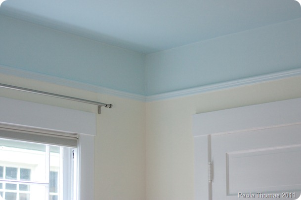
Please note that this is the first time in forever that I’ve not been embarrassed by a picture that shows a bit of the background paint colour in our house. Speaking of which, and not to be comment whore or anything, but I’d REALLY appreciate your thoughts on the below. Particularly as to whether I should paint the sitting area the same colour or just go with white…
Those of you who’ve spent a long time around these parts will remember that when we moved into our house the living room was painted a rather gaudy egg yolk yellow (with a bright red fireplace, but that’s another story) that turns into a rather nasty mustard-y colour in the evenings under electric light.

For the past three years I have been agonizing about what colour to paint instead. You may remember that I’ve considered every permutation of pink and green but couldn’t find anything that worked.
A big problem is that we’re contending with three very different sorts of light – bright, bright sunlight throughout the summer (the room faces southeast and has windows on two sides); the sort of grey murky gloom that only Seattle can produce the rest of the time and yellow tungsten light in the evenings.
I finally got to thinking that maybe yellow was actually the way to go, just not that egg yolk-y yellow. So I looked for a yellow the colour of lemongrass, just on the cusp between yellow and green.
And we came up with Benjamin Moore’s Cypress Grove – which is a cool lactic yellow, the colour of unsalted butter, in the tin

but ends up having a distinct greenish tinge on the wall.

The green looks particularly pronounced in the soft grey light Seattle does so well.


And it looks sophisticated and interesting in tungsten light

And not too overwhelming in bright sunlight.

What do you think? The Husband loves it but I’m not 100% convinced, though I can’t quite put my finger on why. It seems a little too wishy-washy for me, though I have absolutely no idea what I’d replace it with.
I’m going to keep going with it for the moment as at least it’s hugely much better than what was there before. And it’s difficult to tell as the ceiling is now all wrong and needs to be painted urgently and I think the white of the woodwork is too bright a white.

Anyway, questions for you
– What do you think?
– And would you take that same colour into the seating area or paint the walls there some sort of white?

How crazy is it that I’m seriously considering dropping $50 on a selection of cheerful packing tapes and a dispenser? And just when I’m thinking that the house needs a serious de-clutter?
The pictures are so cheerful and apparently hit exactly the same colour-loving sweet spot in my brain that beautiful yarn does - ‘ooh. pretty. colours. BUY’. And I know that the Minx, who is in the throes of a long and passionate love affair with Sellotape, would spontaneously combust with delight.
But for the moment, I shall content myself with the ogling the pretty pictures. Maybe I’ll get myself some as a reward if I ever manage to tidy my desk. All these beauties are available from Happy Tape’s shop here, please don’t tell me if you buy some.


You know how you suddenly remember a recipe and then go through a phase of cooking it ALL the time? Well, we’re currently going through a ‘pasta with leeks and ham’ phase, which we’ve been having once a week since Christmas. It makes a tremendously quick, easy and delicious weekday supper.
It certainly helps that in the grey tail end of the Seattle winter, when most other vegetables have invariably been flown in thousands of miles from Mexico, the supermarkets are full of beautiful white and green leeks.
For this recipe you need to slice thinly a heap of slim and pretty leeks (I think this was about five leeks).

Then melt a knob of butter and a slug of olive oil in a deep-sided saute pan. I use oil so I can pretend this is more healthy but it’s sadly one of those recipes which improves the more butter is added. If you just want to melt one ginormous lump of butter then I won’t stop you.
When the butter/oil has melted add the sliced leeks and stir until they’re completely covered in the butter, then add about a cupful (8 fl oz or 1/4 litre) of chicken broth or stock. Turn the heat right down and braise the leeks gently, uncovered, for about 30 minutes until the leeks are soft and sweet and the liquid is mostly absorbed. This is a very traditional Italian way of cooking leeks. My mother would do this, replacing the stock with white wine or vermouth and then serve the leeks as a side vegetable. But I digress…
Meanwhile cook some pasta (I like using rigatoni or penne – anything tube-y – with this).
When the leeks are done, add a few slices of cooked ham, chopped into matchsticks, and half a cup (4 fl oz or 1/8 litre) single cream (half and half). Heat everything through, stir into the pasta and then add as much grated Parmesan as your diet will allow.

Buon appetito!
A real life friend of mine is wondering whether to do a wallpaper feature wall, and I thought I’d put it to you guys as well to see if you could help.
Said friend is doing up a sixties cottage in Northern Ireland and is wondering whether to do a feature wall with wallpaper.
First up, I much prefer feature/accent walls with wallpaper rather than paint. A painted feature wall often looks like you’ve just run out of paint. But wallpaper feature walls are a good way of using pattern without getting too overwhelmed, and can let you indulge in expensive wallpaper on a budget.
For me a feature wall can be great as long as they’re used sparingly and for a reason. I grew up in London suburban semi-detached house with psychedelic seventies feature walls in every room, and that was definitely overkill.
Feature walls draw attention, so I think the key point is to think about what you’re drawing attention to and whether it’s actually worth focusing on. And of course they’re great ways of injecting colour and pattern into a room (though they might make it more problematic to use colour and pattern in other ways such with curtains or cushions). And you can use them to delineate space – such as separating out a dining area.
Here are some feature walls which I think work.

From Elle Deco UK (Jan 2010). I absolutely LOVE this New York loft. The feature wall here draws the eye upwards to emphasize the ceiling and injects a splash of beautiful colour. But note how minimalist everything else is.

From Ideal Home (Nov 2009). It delineates the dining area beautifully. But again everything else is incredibly spare.

From Graham & Brown’s website. This is quite subtle and mostly adds texture rather than emphasis.

This accent wall from Living Etc is reflected in a mirrored wall. It probably looks like a brothel in real life. But everything else is plain, uncluttered and subservient to the paper.

This comes from Decorpad.com though I’m not sure where it was sourced originally. The feature wall is nice, but it’s starting to clash with all the other clutter in the room.

This last is fabulous. It works because it is subtle despite the scale of the pattern, and again because everything else is kept so neutral and uncluttered. {From Colour Me Happy}.
What do you think? Would you do a feature wall in your home? If you’ve got a feature wall, do you have any advice for my friend?