Or, Miles Redd – WTF? So, another super fashionable decorator with whom Americans seem to be incredibly enamoured is Miles Redd. Domino describes him as the sultan of swank and his work is variously described as luxe, opulent, elegant, sumptuous, chic and glamorous, which all appear to be euphemisms for cluttered, ugly, muddled and like a dowager duchess on speed.
Like our dear friend Kelly Wearstler, he is another designer that I just do. not. get. So, in the words of Rachel Maddow, I need you to 'talk me down'. Tell me just what it is that makes this guy so amazing and so worshipped.
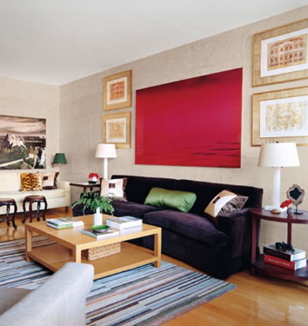
Here are pics of his latest photoshoot in Domino.
{All photos by Paul Costello from the Domino website}
I'm sorry, but this is ugly. The colour scheme of beige, grey, plum, pale blue, forest green and red is incoherent, dull and generally bleurgh and I don't like the over-emphasized symmetry; those lamps are pretty, but look all wrong here, and I'm really not keen on the arrangement of pictures of wall, which for some reason puts me in mind of space invaders.
{Photo by Paul Costello from Domino magazine}
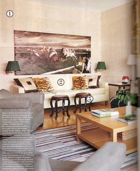
I had to scan this picture in from the magazine as it wasn't on the Domino website, so you could see the far end of the room in all its ugly glory. That picture is HIDEOUS, surely? And I just find all the beige, grey and forest green deeply depressing; and no, it's not jazzed up by the 'witty' animal skin cushions, which just look try-hard and out of place here.
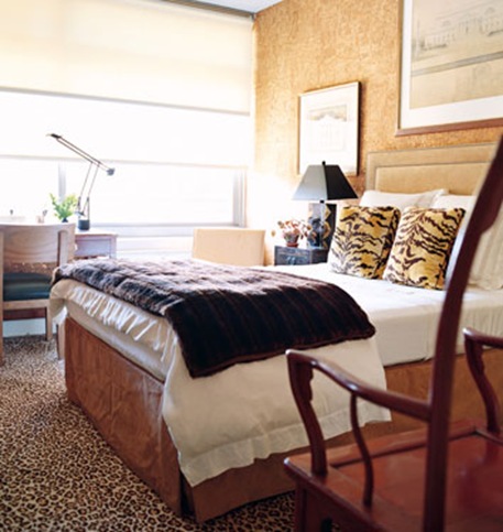
Inoffensive, dull, more 'witty' animal print, like a bad hotel bedroom. Move on, there's nothing to see here.
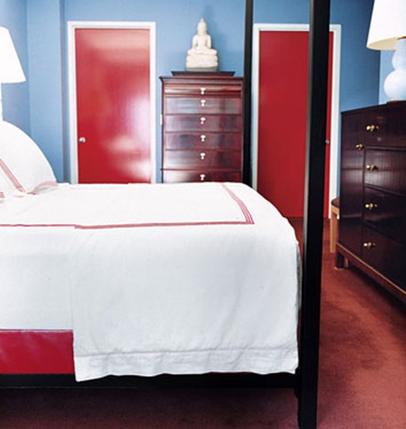
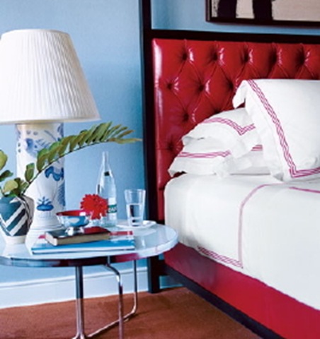
Well I suppose this is better. Not so cluttered with junk and I quite like the colours, though I'm not entirely sure about shiny red patent leather in a bedroom context (or in any context aside from little girls' party shoes). The lamp and bedside table arrangement is OK though.
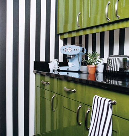
I like this kitchen as a concept. I'm not sure I'd like it so much in the early morning while fumbling for a cup of coffee with a hangover, or indeed if I was actually going to attempt some cooking. The coffee maker is aces though.
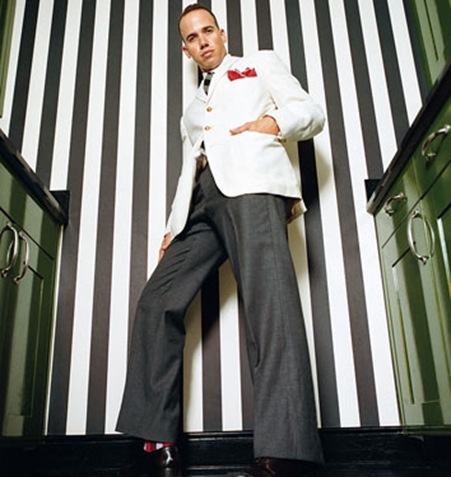
And here's the man himself. The Husband walked past my computer as I was pulling these pictures together and said 'he looks like a twat'. Well, quite. (I believe the North American equivalent of twat is 'douchebag', which is one of my all time favourite Americanisms).




I love that you tackled the issue of these designers-turned-celebs in the eyes of America. I am American myself but I agree with you totally on these designers. I just don’t get it! Sure, Wearstler and this guy may have a few eye-catching designs but it seems that many of the spaces are designed specifically for the photographs or are just. plane. ugly.
I love, love when you do these posts 🙂 Not only do they crack me up, but I agree with you 100%.
The Husband is right. Only a twat would allow such a self-satisfied photo to be published anywhere. Who decrees that this guy and his pedestrian or less design is so great?
Thank you for the in-depth analysis. When I got my Domino it was all I could do to shudder and say “ick” and move swiftly on. You’ve put the ick into words. On the bright side, it was one of the few times I’ve looked at a Domino photo spread and felt better rather than worse about my own home.
It was the WORST Domino issue to date. Loved your post on Miles as well as Megan’s about the tartan makeover at beachbungalow8 and the comments about it on decorno. I do think domino feels it has to feature Mr. Redd once per quarter.
becky
you are hilarious.
and so right.
you killed me with the twat comment 🙂