Or, Kelly Wearstler – WTF?
I know that American design sensibilities are different from European ones. Americans seem to like more fuss, clutter and ornamentation than Europeans are used to. I think this is because minimalism was a European thing and its philosophy of clean lines, simple shapes and less clutter seems to have permeated our culture a lot more, even if we wouldn’t consider ourselves minimalists.
Having said all that, I just can’t understand the American adoration of interior designer Kelly Wearstler. An ex-topless model, champion of Hollywood Regency style, author of many books, and judge on interior design reality pogramme Top Design, she’s probably the equivalent in status to a Kelly Hoppen or Tricia Guild in the UK (though with very different design sensibilities) and very much admired.
But I. just. don’t. get. it.
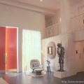
Here are pictures from her recent spread in Domino magazine. Am I really the only person who thinks this looks like a wealthy Arab just ran amok in an early 80s motel? (With apologies to all wealthy Arabs with taste). Isn’t all the gold and shiny stuff and horrendous layered pattern and blocks of marble and overstuffed leather and fussy knickknackery just, well, hideous? Can someone please explain what I’m missing here?
All images from Domino
By the way, these are the ways she chooses to wear her hair, in public, nay, even on telly. There doesn’t appear to be any coercion involved. Thank goodness she’s beautiful.
Image from www.tomandlorenzo.blogspot.com (the amazing Project Rungay boys also blog Top Design).
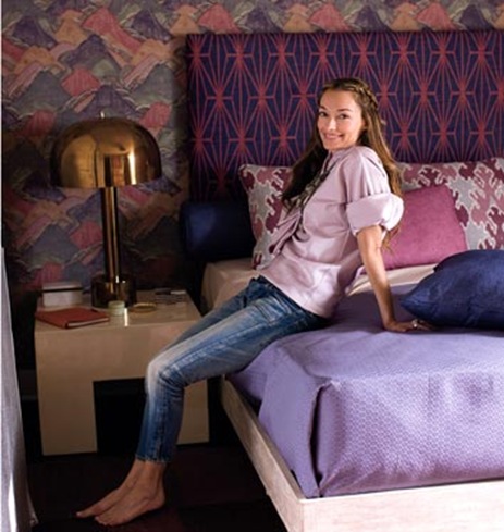
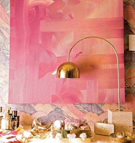
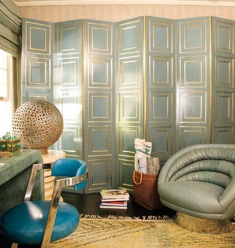
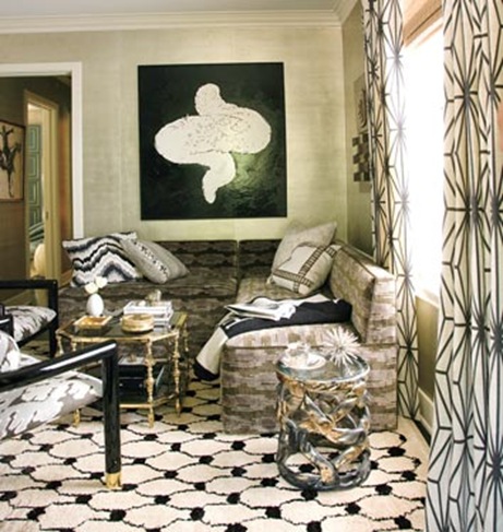
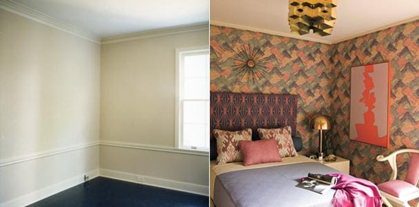




I am known to love gaudy with a touch of ugly. But this feels to me like an accumulation of stuff.
I am known for my ability to ignore less than ideal surroundings (orange and green bathrooms, for example) for extended periods of time. But that ‘mountains’ wallpaper is absolutely HIDEOUS. She should be outlawed.
I never heard of her before, but she looks like someone who takes her own idiosynchrasies too seriously. And if these rooms reflect her usual work, her taste is all in her mouth.
Don’t trust anyone with bony knees.
Hee Christine! That sounds like a good life lesson. Dana, I like your turn of phrase…
I like her. Sometimes her hair is the most creative thing on Top Design. Anyway, I didn’t get the Domino spread at all. I like that she’s moved on, and perhaps it’s before it’s time, or over my head, but the only thing I liked about it is that amazing screen, and the rug that looks a lot like the one in this Billy Baldwin room:
http://flickr.com/photos/71696744@N00/2885731288/
Does anyone else know “bravura modern” as a reference? It was the first time I’d heard of it, but that’s not really saying much!
The screen is nice, but not in that room. I too liked the carpet, though I think Billy Baldwin is another designer I don’t really get.
Perhaps ‘bravura modern’ just means ‘crap’?
Corine, I think I’m going to adopt ‘gaudy with a touch of ugly’ as my new design mantra.
I totally agree with you on Kelly. I gave up on even watching that show last season. Do you remember how annoying Todd was??? It sent me over. I don’t like any of the designers on the panel,so it is a miss for me. The pictures that you showed of Kelly’s spread in Domino are hideous, and gives me a very depressing feeling.
oh. my. god.
(sorry, i think i’m struck dumb.)
I don’t get her either. She is one of the first to complain about lack of editing on Top Design. Go Figure!
I only know of her via spreads like these. Personally, her decorating style is not my taste at all. But she certainly is well-loved!
Oh my god, cracking up at “bravura modern just means ‘crap'”!
Have you been watching Glam God on VH-1 at all? Philip Bloch has worse hair iterations than Kelly! He needs a stylist of his own! I do like it when people are at least original without the help of a stylist, which I think has become rare these days.
I just came across your blog – you are FANTASTIC! KW’s husband developed the Viceroy in Santa Monica and thats how she got her start. I don’t get it either. Look at any David Hicks books from the ’70’s and then you can see where her “designs” have come from. I agree that there aren’t really any “new designs” but don’t you agree that we have to give credit where credit is due. You are first person in the blogging world that has been honest enough to post your opinion.
Becky, stop it! I can’t watch ANY MORE reality TV…
So Lovely. I agree, from what I know of her she’s very David Hicksian. Jonathan Adler also has his David Hicks moments as well. I also think David Hicks did it better than either of them, certainly better than KW.
I’m so glad you blogged about this. Even though I’m not the super into design, a dear friend of mine sent me gift subscription to Domino Magazine earlier this year (hmm, maybe she was trying to tell me something?). Anywho, when I was flipping through this month’s issue I was laughing out loud at this shoot. It was just silly. It reminds me of my sister’s room when I was little, except I think hers was a bit nicer. I just figured I wasn’t hip or in touch enough with what is considered trendy in the world of decor. It’s nice to know I wasn’t the only one reading this and scratching my head.
It makes me wonder though how much she paid for some of these hideous finds. Oh and seriously, I think Kelly is quite pretty but she really need to eat a sandwich.
I blogged awhile back about how I literally decorated with actual HOTEL ART that was salvaged from a 1980s hotel in my confused youth. That wallpaper/brass fixture combo reminds me of that art.
Before I started watching Top Design this season (I never watched the other seasons, I don’t know if she was on it…) I had never heard of her.
And, the only picture in this series of photos that hits any positive chords with me is the vignette with the lamp and pink painting. Not my style, but I could see how someone else can appreciate it.
The rest look almost silly – but, more dated and messy.
I love some of the individual items in the Domino spread (blue and gold screen? yes, please). The whole effect is NOUVEAU RICHE EXTREEEEEME! It’s like you took a 15 year old heiress, fed them 25 cokes and set them loose with as credit card.
Some of her work I find to be fun but this is the ugliest stuff I’ve seen by her to-date. Yikes.
Well, I’m an American….and I think this is hideous. I was hugely disappointed with Domino for publishing this story. I can only imagine that their target demographic grew up in the late 70s and 80s. Having lived through this look, there’s no need to emulate it, now or ever.
I dig it. 😀
Clearly she’s into 70’s playboy mansionesque kitsch, and is trying to usher in a newish look, probably already popular in LA. But, noone would want to live here.
I’d write more but I must admit to finding it rather difficult typing when one’s mouth is full of vomit.
(And this whole multitude of looks that she’s sporting on Top Design is such contrived eccentricity! Drives me batty!)
I watched two episodes of Top Design last night and I could not believe how UGLY and OVERWROUGHT everything was . . . and, I LOVE clutter, kitsch, and eclectic rooms. What is wrong with these “designers” and judges???!!! Do they not have EYES!!! I guess after all the design eras we’ve been through, there is nothing left to do, but mix them all up and throw them on the wall to see what sticks. That is literally what these folks are doing. Throwing stuff on a wall, it makes me want to throw up. The problem is, these people will be designing for other people… and that is just wrong. To force someone to live with bad, bad design that has nothing to do with their own tastes and lifestyle is so, so sad. Any regular Joe or Jane could do better decorating themselves.
Baldwin’s room: Just spill a pint of blood on the carpet and I could snuggle in quite nicely…
These rooms are beyond hideous and her hair is in dire need of a hot oil treatment.
Yes WTF. I’m American and completely agree with the Blogger. I think Margaret Russell secretly wants to bitch slap Kelly. Go Margaret… Kelly’s voice is annoying as Fug. Ever since Goil left on the first season it’s been bland and the same old design recycled. Yawn. Jonathan Adler should reconsider his contract.
Is she perpetually on LSD?
Or does she wear kaleidoscopic contact lenses?
It seems more is more with her.
I bet she $hits potpourri.
Hugh Hefner meets Adnan khashoggi circa 1975 with a splash of elderly Floridian and a pinch of Miami Vice hotel suite – truly hideous.
My assessment: The emperor isn’t wearing any clothes. I hated her stuff the first time I saw it, and just to verify my first response, given all the fuss about her designs, I checked her book Domicilium Decoratus out of the library. Verdict: Her house looks horrible. All that hideous Chinese crap, and what an unappealing palette! The only room I can remotely tolerate is the kitchen. She is a hack. Thanks for giving me room to vent.
These rooms and everything in them are sooooo ugly…they look like they would even smell bad. 🙁
I don’t really agree .. I believe she is really creative and it needs a guts and the right eye ..
Absolutely hideous.
I purchased the latest edition of ELLE DECORATION just the other day (I live in Europe by the way), and they dedicated like a zillion pages to her and her work; that`s how I heard of her for the first time. I was shocked what kind of sh.. that woman produces and even more that a classy magazine such as ELLE DECORATION would do an article on her.
This woman is the epitomy of horrible taste and anti-design.
And it really infuriates me to see people like her getting paid heaps of money for their utterly crappy “interior design” and being idolized for their alleged “fabulous taste and eye for design” (which is clearly non-existent) while really talented people with years of training, experience and truly remarkable taste struggle in this business and can only dream of landing jobs like Kelly Wreastler…
Cool pictures, it was a very funny episode.
Kelly Wearstler has a fabulous talent to decorate houses, offices and whatever she wants to… also she is smart and so pretty, so I ask to myself? does exist a girl better than Kelly? I don’t think so.
I recently came across your blog and have been reading along. I thought I would leave my first comment. I don’t know what to say except that I have enjoyed reading. Nice blog. I will keep visiting this blog very often.
She’s a total joke to anyone who qualifies as a real designer…and by real designer I mean someone with a really good university education – several is even better -and who work with a very high end clientele who demand skills that attest to abilities and experience in construction and most of all – good taste and restraint. She’s raking it in — but at what a cost. She’s going to look pretty awful at 60 — and will hopefully come to her senses and realize it was just a moment in her life that she would rather not have had occur. Poor thing.
love love love! very unique and talented. it is nice to see someone with a different design sensibility than the masses. LOVE.
Her life story:
Grew up in trashy Myrtle Beach SC.
Went to Mass College of Art for Interior/Graphic Design
Moves to LA to become actress/naive I’ll-do-anything-to-be-famous star
Poses naked for Playboy to pay off school loans (lame)
Met her billionaire husband two yrs after posing nude for all the world to see
Marries him
Brands herself amongst all the rich and famous and basically takes “daddy’s” money to start her career
Thinks she has affluent, never before seen Hollywood trashy glamour (perhaps a throwback to her Myrtle Beach days)
Rubs elbows with all the rich and famous who think expensive, over the top crass cacophonous aesthetic is the only way to go.
Dresses their digs and builds her rep. riding on their coat tails. Apparently all you need is money to make it big as a designer on the west coast, Kelly Wearstler’s Lifetime Movie.
Good riddens and stay on the west coast please. Us NYC designers hope all you horrible designers stay in LA. Only LA could foster this type of design, the complete abandonment of all things founded on the Bauhaus movement. Whatever happened to dialing it back and building based on fundamental elements of design. Just because you drench it in glitter doesn’t mean you made it any better.
Gag.
It’s 2014 now and when this article came out in 2011 Wearstler was ahead of the curve pioneering what is now a huge interior design trend. All over shelter mags we see this color saturated and metallic heavy look. I loved it when she first did it and I love it now. I am sure she will soon revamp her look and millions will criticize at first but follow afterward (like good follower not leaders)
The furniture she designs is hideous in my opinion–the ottoman with human feet sticking out? The wrinkly leather things that look like they have too many pounds to the square inch? I call it “trying too hard” when designers do tasteless work just to be different or shocking without putting any critical thought into it. It won’t stand the test of time because there is no grace to it. Also in videos you can tell she’s in love with herself and needs attention. I think overconfidence got her where she is today.
I came across this blog post much later than it was originally posted and as a Designer I feel like I need to go on a tangent here to explain Kelly because the point of her designs is being misinterpreted and misunderstood. I thought this post was very mean spirited and judgmental towards her designs. You may not like her designs but she deserves our respect for her creativity and ingenuity.
The point of the more wacky designs (like these) are to create something new and different. It’s the same concept as Fashion, we aren’t wearing the crazy designs that come out on the runway, but they’ll eventually trickle down and influence the general population (ie: Mirandas speech from Devil wears Prada, interior design/architecture is very similar in that concept).
She’s not designing for the average consumer, these designs are pieces of living art meant to be ahead of their time. I just came across this post but you’ll see that a lot of the things from these images are now popular in 2022. Pink is back, layering of pattern on pattern is huge with Grand Millennial style this year. She may not be everyone’s cup of tea but her designs are ahead of their time and completely unique. They are not meant to be something you would buy at a typical furniture store for the average consumer, they are literally a piece of art like at a museum.
Someone posted about how the design is not timeless, & they are not meant to be. No design is timeless. I get this question a lot, clients want something they can do once and never change. You will never be able to find this unless you do something so vanilla is literally has style. Design is ever changing and nothing is going to be thought of as hip and cool 10/20 years from now. Think about things you wore 10 years ago and now they are out of fashion. Again, same concept with interior design.
Whether you like her or not, her designs are influencing products you see in your everyday life. It takes a while to trickle down to the average consumer but even things we see at Target all began with the more wacky designers breaking way for new trends.
We all have an opinion, but shouldn’t trash someone’s work just because we don’t understand it.
I found your blog by typing “ am I the only one who thinks KW decor is just ugly?”… my God she is so famous and the best paid interior designer in the world according to Google. I am an interior designer and I find it all horrible, I just don’t get it, it must be stressing to live sorrounded by all that stuff, the eye just doesn’t know where to look at. There is no harmony at all.