This will mean beans to anyone in the US, so I suggest you carry on trick or treating and come back again tomorrow.


Kelly Brook Edwina Currie

This will mean beans to anyone in the US, so I suggest you carry on trick or treating and come back again tomorrow.
Inspired by such Halloween geniuses as Nicole and Megan, the Minx and I set to work with a will yesterday to create our own fabulous pumpkin.
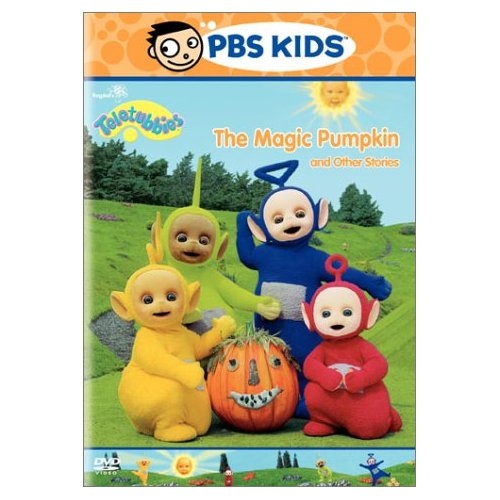 Actually we were even more inspired by that seminal work Teletubbies and the Magic Pumpkin which features a little video on how to make your own happy pumpkin.

Ours has a paper mouth and nose (mummy really couldn’t be bothered to procure bark and felt as in the video), marshmallows and raisins for eyes, raisins for teeth and nostrils, leaves for ears, cupcake sprinkles for ‘eyebrowns’ and pampas grass for hair. He is a very happy soul despite the fact that the morning dew made his marshmallow eyes rather soggy.
I knew Halloween was big in the States, but had no idea it was THIS big. The Minx has taken to trick or treating like a duck to water (surprising, not).
On Sunday evening a small witch (last year’s costume still fits hooray!) met up with an even smaller crocodile belonging to an Instant Hausfrau for a Pumpkin Prowl at Seattle’s Woodland Park zoo.


It was spooktacularly well done – we were almost as mesmerised by set pieces such as dry ice and ghosts hanging over a pumpkin-laced pond as the Minx was.
The Hausfrau has become a great friend since we arrived in Seattle and has taken it upon herself to educate us in the ways of the pumpkin.
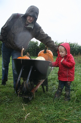
Here is a picture of the Minx and the Husband er, enjoying themselves hugely, as we all hunted for pumpkins in their natural habitat at The Farm, just north of Seattle, as the rain lashed down and the corn maize nearly drowned in a sea of mud.
Actually the day at the pumpkin patch was fab. Whereas in England everyone would have stayed in with tea and toast and telly, the whole of Seattle appeared to have turned out in the rain to go sliding down bales of hay in the barn, play with new kittens, learn geography in the map of Washington corn maize and thrill to the story of the three little pigs acted by real pigs.

Some of you may have seen this on my Flickr.
It’s a photo I took at Kew Gardens ooh, about eighteen months ago, but I was wondering if it might work blown up big and printed on canvas. I’m a bit worried that it might be too blurred and/or too pink. What do you think?
Hehe – thought I’d take advantage of all the people visiting from Design*Sponge to get lots of free decorating advice…
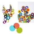
I love every sort of colour (and am a colour/word synaesthete, which sometimes makes life interesting) and so found these colour games from Livelygrey (via Hue Consulting) a very fascinating and enjoyable way to procrastinate, instead of writing yet another email about Christmas for our press list.
One of the nicest things about food shopping in September and October here in the States are the ‘heirloom’ tomatoes which can be found everywhere in the supermarkets and farmers’ markets.
Traditional varieties of lumpen, misshapen, thin-skinned tomatoes all bursting with juice and flavour, and all such beautiful colours. I have no idea why such things are not available in the UK.

As a result we have been eating a lot of ‘pappa al pomodoro’ (which translates as ‘tomato gloop’, the word ‘pappa’ is also used for baby food). Most cookbooks translate this as a soup, but it is much more filling than that. Use it instead to replace a pasta first course and follow it with a bit of cheese or prosciutto and a salad or a side dish of spinach with butter and nutmeg.
We use the recipe from the first River Cafe cookbook which we’ve adapted a bit (mostly because the original recipe serves 10). It’s definitely one of those recipes which is much more than the sum of its parts and highly recommended if you have a good supply of tasty tomatoes. The recipe’s use of huge quantities of olive oil is, however, not for the faint-hearted. It is necessary to give the dish its creamy, rich texture but I doubt if it’s going to be showing up on Weight Watchers any time soon.
Pappa al Pomodoro
2kg tomatoes
2 sliced cloves garlic
4 fl oz (ish) olive oil
salt & pepper
1 loaf ciabatta (large) or similar well-structured bread
basil
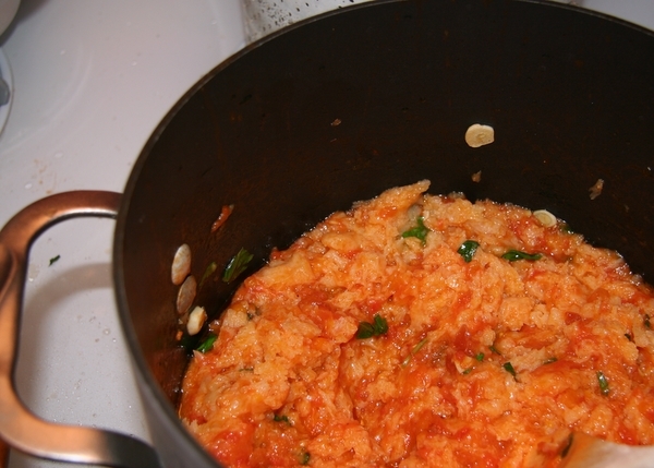
Take about 2kg of delicious-looking tomatoes, drop them in boiling water to skin them and remove the seeds. You can also add some tinned chopped tomates if you don’t have enough gorgeous fresh ones. And take ‘2kg’ as a guideline, it should just read ‘a lot’.
Chop the fresh tomatoes into bits. Here’s the Husband chopping ours at the speed of light.

Put a very generous chug of good olive oil in a pan and gently soften two sliced cloves of garlic. Don’t let the brown. Add the chopped tomatoes and simmer gently for about 40 minutes or until the tomatoes become concentrated.
Add salt and pepper and 1/2 pint of boiling water and bring every thing to the boil. Cut most of the crust off the bread and then add it in chunks to the soup, with a handful of torn basil leaves.
Add another very generous slug of olive oil, turn it off the heat and leave it to cool slightly. Add a bit more boiling water if it’s too thick.
Serve in bowls. Add a bit more olive oil to each bowl if you’re very thin.

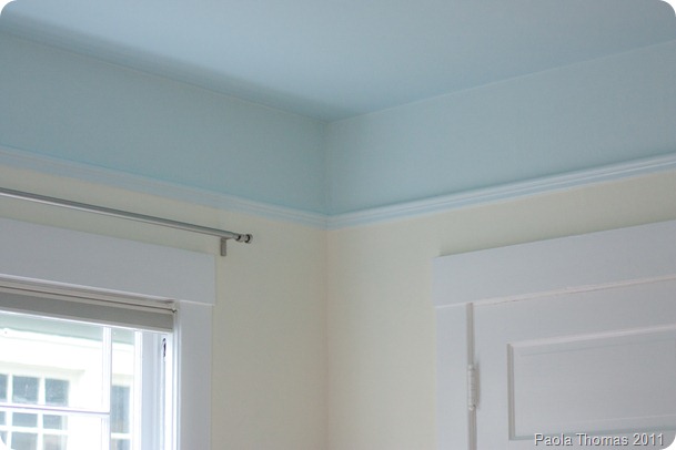
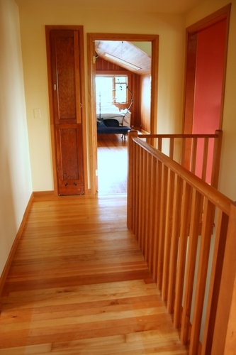 OK, first of all I want you to imagine that the landing has walls painted this sort of colour (which is currently the colour of the Minx’s playroom and the only colour in the house I like very much – though I’m going to change it to give her a jollier colour scheme).
 Then imagine all the woodwork/millwork (?) painted white and no horrible burnt orange wall visible in the kitchen and the ‘Spray’ rug (which should be arriving fairly shortly) visible in the bedroom beyond. Oh and the ghastly panelling in the bedroom painted dove grey or something. (Yes, I realise that this would all be a lot easier if I just photoshopped it for you, but time is money round here).
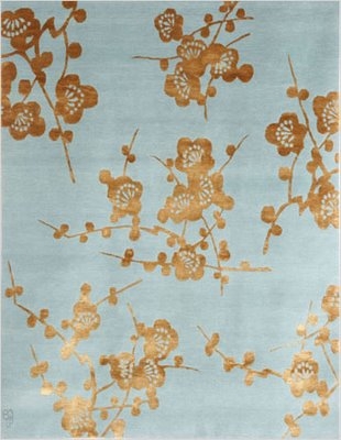
And then tell me what you think of our new runner – a custom colourway of Emma Gardner’s Orbs design.

Yes you were right. We did indeed choose option 3 (see the poll here) of the custom options we were given.
What you can’t see is how utterly blissful and soft the rug is. Even though it’s the least expensive of their three quality options, it feels wonderful underfoot.
 Now I need you to tell me where I can find a ironing board cover which will work with this runner, for our rather funky built-in genuine 1909 ironing-board, which, yes, is hidden 99.9% of the time (I’m not big on ironing). I think this might be the interiors equivalent of making sure your collar and cuffs match.
Yes, yes, I know. We are going to be talking to painters soon, so can get the whole house done and I don’t have to keep telling you how much I hate all the existing colour schemes.
OK, you’ve all got about half a day to vote for Interior Design’s Best Products of the Year.
Lots of lovely eyecandy, though I was a bit surprised at how pedestrian some of the products were and thought the actual voting site could have been better designed *cough* larger thumbnails *cough*.
Anyway here are just a few things which caught my eye

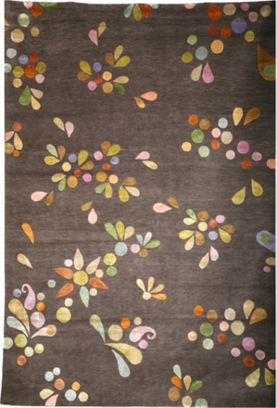
Patrick from Emma Gardner Rugs wrote to let me know about this because he’s hoping that you’ll all scurry along and vote for their gorgeous ‘Jewels in the Sand’ rug, which is indeed very voteworthy.
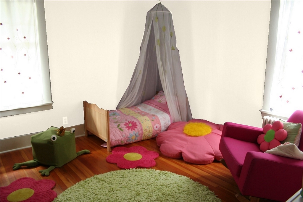
The colour scheme for the Minx’s bedroom was pretty much decided after we got a good deal on the pink Nurseryworks ‘Storytime’ rocking chair.
I decided to incorporate green so that it wouldn’t all end up too Barbie, but still be fun for a little girl. And then we found a strange inflatable ‘Frog Prince’ at Ikea and decided to build him a ‘lily pond’ with little flower mats from Target and a cheap and cheerful flower bean bag, which sort of dictated a daisy theme. (Note that in the end we settled for an embroidered quilt from Pottery Barn, which is currently much too big for the Minx’s todder bed.)
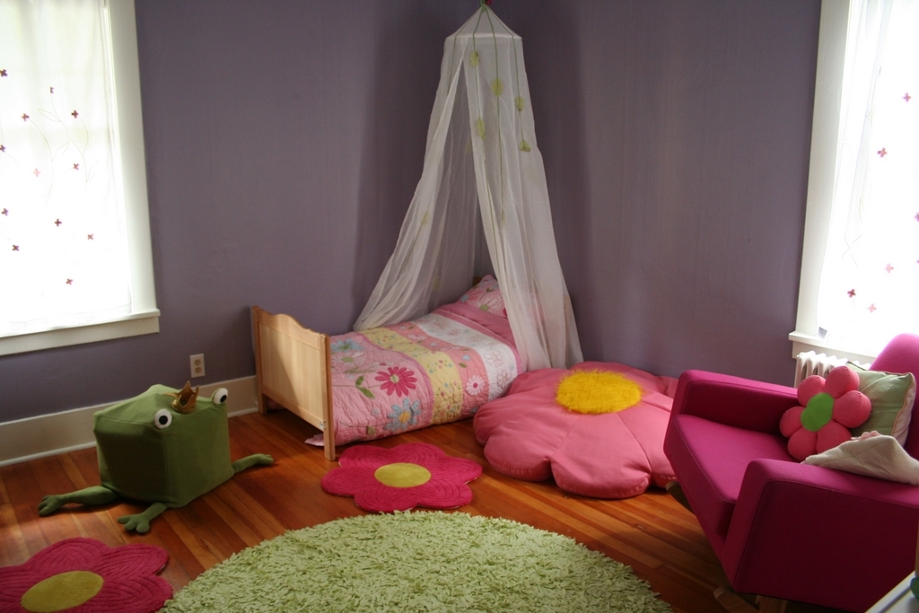
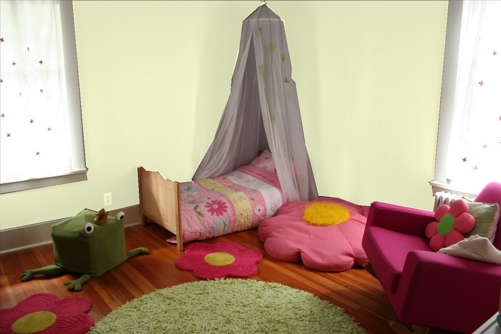
So this is where we are today. You will notice that the existing purple walls don’t quite fit in. The main problem with them is that the room is north west facing and so is quite dark during the day so I want to lighten them up quite a lot.
These are the options I’m toying with at the moment.
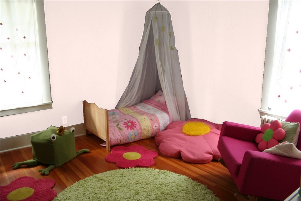
I’m worried that either pink or green would be too ‘matchy matchy’ and the white will be too boring.
What do you think?
I’m also thinking of getting enormous daisy decals from Apple Pie Designs to funk up the walls a bit, either in silver on a coloured wall, or coloured for a white wall. (Check out great posts on Apple Pie Designs on Decor8 and Designers’ Block).
As you can tell I’ve been playing a lot on the Benjamin Moore site today, and was amused to note that they actually have a paint colour called ‘Seattle Grey’.
Which, funnily enough, is exactly the same colour as the view out of our bedroom window this afternoon.

Yesterday and today have been good days.
Two of my Emma Gardner rugs have arrived (pictures to follow shortly).
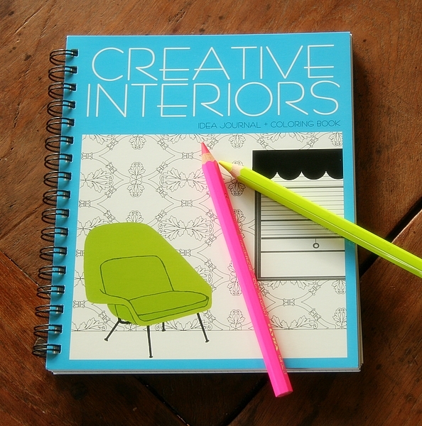
I’ve just got an exciting new product on the site. Now, I love all the products we have, but I’m feeling a particular frisson of childish glee about this colouring book for grown-ups! (Although they call it an ideas journal.)


And today an interview with yours truly appears on the Design*Sponge guest blog, courtesy of Megan Not Martha.
If you’re dropping by on your way from Design*Sponge, I do hope you’ll pull up a chair, have a cupcake and stop for a chat.
I’ve been spending a lot of time over the last few weeks or so on product photography and had an interesting chat with Megan Not Martha about it a few weeks back, so I thought it might be useful for those of you with Etsy or Ebay shops to put together a list of things I’ve learned through trial and error about photographing and styling.
I don’t pretend to be any sort of an expert, but since the initial mirrormirror photoshoot where we did the styling and a photographer friend came and shot the images, I’ve done the styling and product photography for mirrormirror myself.
Most of what I’m going to say below is nothing but common sense. But these are all mistakes I’ve made not once, but several times. (Mind you, it’s possible you’ve got more common sense than I have.)


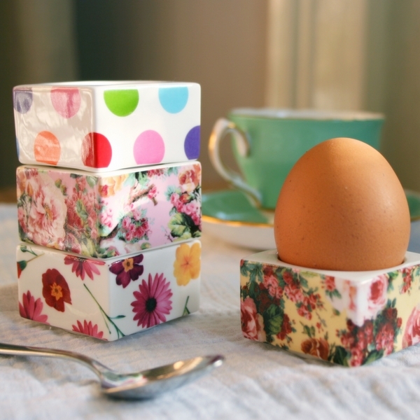


Oh and check out Abigail, Ursula and Corey for very different, but wonderfully effective ways of styling products.
Has anyone got any more tips they’d like to share? Or seen other great online stylists?