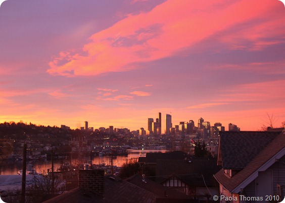
Come Into My Garden – February

I’m going to do this series of monthly blog posts again as I do like looking back on them when the weather is gloomy and it’s lovely to see the garden developing year by year. I’ve also found them enormously helpful for thinking about what else needs to be done. So these posts are mainly for me.

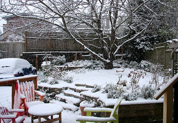
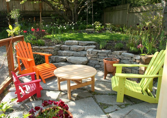
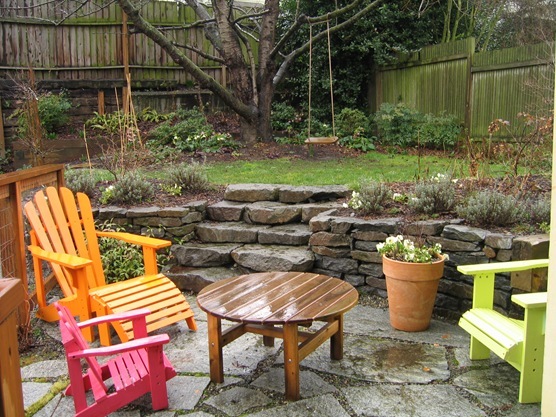
If you’re still reading, here for comparison, is what the garden looked like last February (about six months after it had been installed) and here is what it looks like now.

IMG_9068_thumb9

Everything’s filled out a lot more, and even in the depths of winter it has more structure to it than last year. And I’m pleased with how the chairs brighten up even the gloomiest of days.

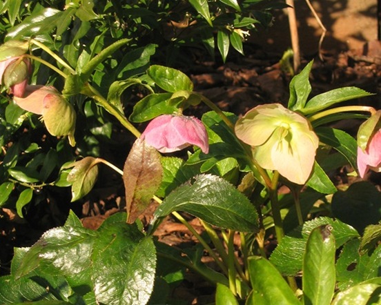
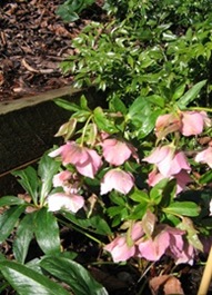
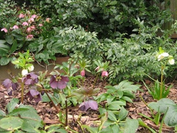
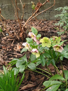
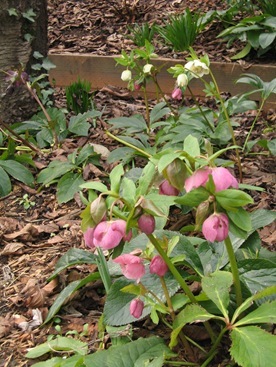
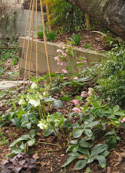
We’ve had a lot of snow by Seattle standards this winter and spring seems much further away than it did this time last year, so thank goodness for the hellebores which are romping through the shade garden at the back under the tree and looking truly amazing. I think they may be my favourite plants in the world (they certainly are at the moment).

IMG_8921_thumb3

IMG_9036_thumb3  IMG_9858_thumb2

IMG_9863_thumb4 IMG_9867_thumb3

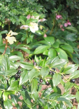
The garden designer paired them with sarcococca ruscifolia or sweet box, which this year has beautiful glossy evergreen leaves and shiny black berries – a truly inspired plant pairing. The flowers of the sarcococca are small, white and insignificant, but also give off a most beautiful scent.

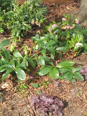
I’m also liking the way the hellebores work with the pink-edged heucheras and tiny pink cyclamens I planted last year. Unfortunately the heucheras to the other side of the tree don’t appear to have made it through the winter – a shame as they also work hugely well with geranium Anne Folkard in the summer and only one little snowdrop of all the ones I planted last year has so far appeared.  A flurry of snowdrops below would be perfect, so I will buy some more in the green now and try and get them established next year.

IMG_8911_thumb6 IMG_8910_thumb4

IMG_8912_thumb3

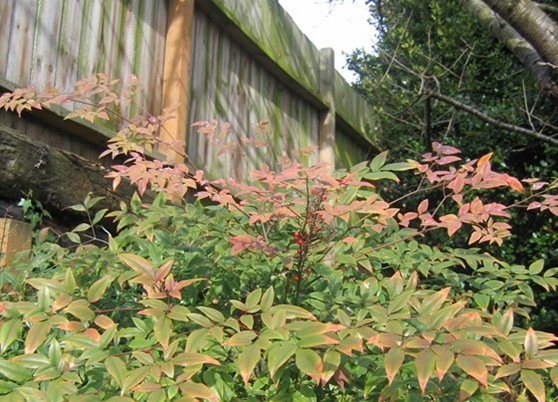
The nandinas have also been in berry and really quite pretty, though I was intrigued to note that this time last year they appeared to be in flower.  The vegetable patch is looking a bit sorry for itself with only the rocket and a few tiny carrots showing through, whereas this time last year we had broccoli and lettuces. Last year we already had tiny narcissus in flower, and this year they’re hardly poking up above the ground.

And, finally, in really sad news, I think the snow has done for the beautiful mature orange tree which had been put in by the previous owners. (There appear to be two trees – I’m assuming a male and a female – the one that seems to have died is the female fruiting one).

683_thumb[3] IMG_9870_thumb[4]

             Last February                                                              This February

But really this February, it’s been all about the hellebores.

IMG_9868_thumb3

Notes to self: Buy couple of extra hellebores. Plant more snowdrops and tiny cyclamens in pink and white.  Replace dead heucheras next to daphne. Replace orange tree?
Share

Fabulous Lampshades – Insatiable Studios

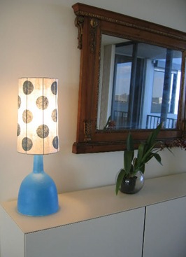
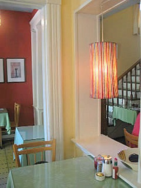
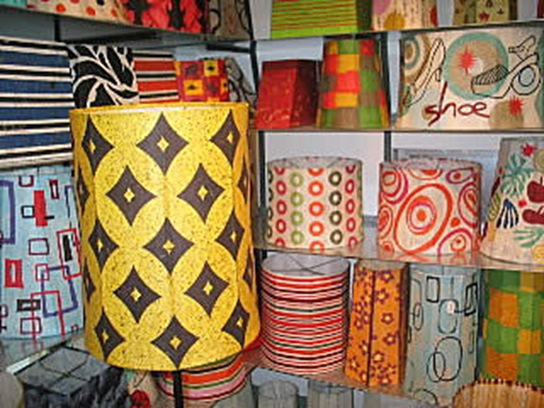
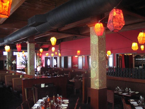
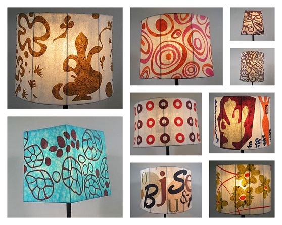
The wonderful lampshades in the house featured below are handmade by Seattle-based designer Jill Smith, owner of Insatiable Studios.

insatiable lamps

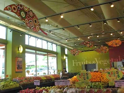
The shades are all meticulously crafted using a papier-mâché process and then decorated with found papers. Her lampshades are available to buy online and her work also adorns several commercial spaces, such as PCC and the Dahlia Lounge here in Seattle and Nordstroms in Chicago.

CIMG_191620(1)_jpg FIMG_157420(3)_jpg

C-IMG_1406_jpg

AIMG_166320(2)_JPG

ELeaves_Hang120(1)_jpg

Two of my favourite places to go – the Dahlia Lounge and PCC 

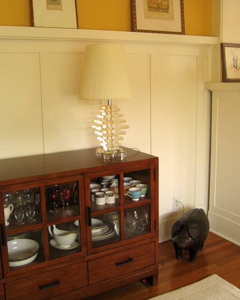
I really want one for the lucite lamp base I found on Ebay last year which is currently adorned by a VERY dull Ikea lampshade.  It’s going to have to wait a bit though as I’ve just had a nasty bill for camera repairs.

IMG_9066

This is NOT a fabulous lampshade
Share

Go Love Your Room – Seattle Craftsman

I was flicking through last month’s Sunset (which just gets better and better), when what did I see? A Seattle Craftsman house very much like ours, even down to the need for kid-friendliness. 

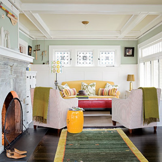
play-house-living-room-l

Loving the furniture placement here.  Unfortunately we can’t emulate it because of our built in bookcases.

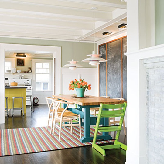
play-house-dining-l

They’ve even got a Tripp Trapp! And I like the way they’ve done the lighting over the table.  I’ve been contemplating doing something like this, but am wondering about maintaining the symmetry in the room.  Need to think about this.

play-house-kitchen-sink-l

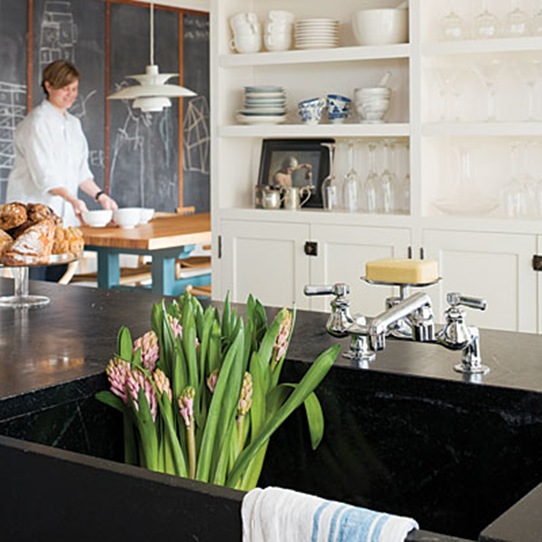
Nice kitchen, for when we ever have the money to do ours.  I like how the cabinets and shelves look modern, but completely fit in with the look of the house.  

play-house-adult-friendly-l

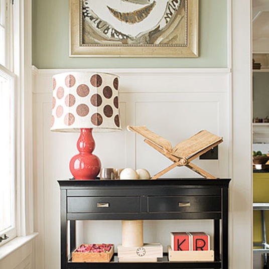
I ADORE this lamp. The house is owned by an architect couple, and from their website it seems that they’ve done some very sympathetic renovations of Craftsman properties in Seattle.  I’m keeping them on file just in case we ever win the lottery and can afford to remodel our basement and downstairs kitchen.

Share

Pink or Green? Or Something In Between?

I’ve been going through agonies of indecision about the paint colours for our main living room. I can’t tell you how many different sample colours I’ve tried out and rejected.

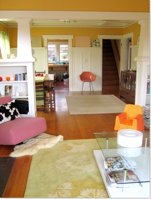
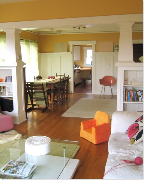
Just to bring you up to speed, we’re looking for a colour to replace the egg-yolk yellow walls in the downstairs living room. There’s a bit of a crazy colour scheme developing in here of chartreuse and white with raspberry sorbet, cranberry, dark brown and er, orange accents (see pictures below) and I need a paint colour to pull it all together.
And before you say anything, yes, I am well aware that this room needs lots of ‘editing’, though at least it is mercifully free of the toys which are normally scattered about with gay abandon.

IMG_8729

IMG_8730

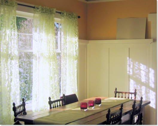
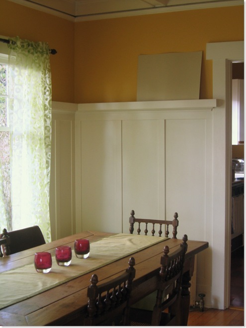
The sitting area is going to be a white, though a white which will pick out the mouldings and the white fireplace which you can see better here.  This white is TBD. However I’m looking for a colour to go above the panelling in the dining area.  The colour needs to be sufficiently bright to withstand the grey Seattle winter light; sufficiently deep to emphasise the panelling, but not so pastelly that it looks like a little girl’s bedroom in bright sunshine (the room has lots of south and east facing windows, so can get very bright).

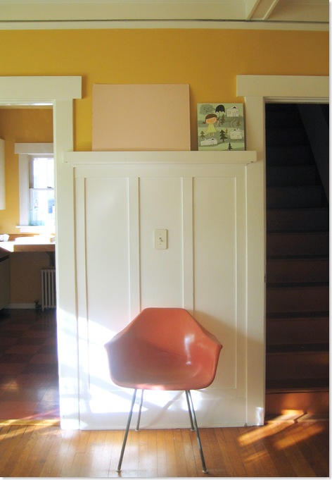
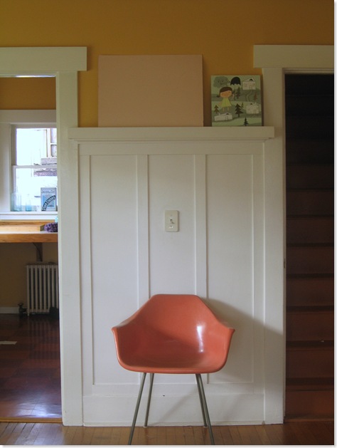
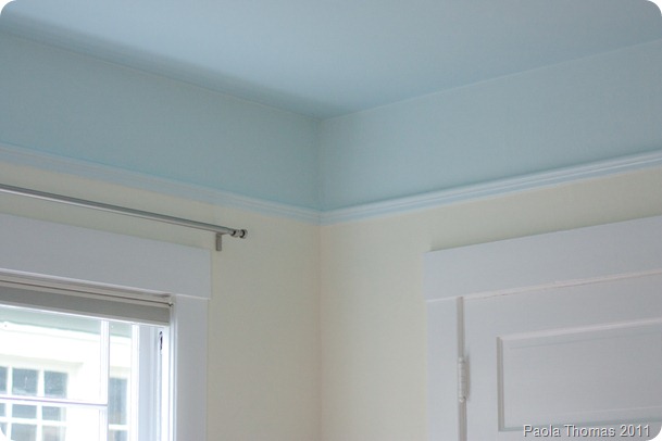
After much deliberation I have narrowed it down to this green (Greenwich by Ralph Lauren) or a pink.  The pink in the sample is actually the pink of the sample board itself which I rather like, but I don’t actually have a paint identified.  I wanted your input before I go searching further though.

First up the green.  It is a beautiful colour and I think it’s the right green if we decide to go the green route. I’m just a bit worried that with green curtains and a green table runner and a green rug the room is just going to end up being rather er, green. 

Here it is in strong sunlight

IMG_8712

And here it is when the light is more subdued.  I’m pleased that it doesn’t go too grey.

IMG_8721

On the other hand here is the pink in strong sunlight

IMG_8716

And here it is when the light is more subdued which is when I like it best. Subdued light happens a lot in Seattle.

IMG_8720

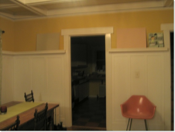
Here finally are both colours in tungsten light. The green stands up well, but the pink goes a bit too ‘bubblegum’ for my taste. Sorry about crappy blurred photo – my little point and shoot doesn’t do well in low lighting conditions and flash would have defeated the object.  I do miss my camera!

IMG_8725

Anyway, shall I go for the green? Or keep looking for the right pink? If so, do you have any suggestions for pinks I should try? Or should I do something completely different entirely?  

Share

Our New Lamp

Bought at Christmas from Habitat in the UK and shipped to the US at vast expense.  There are some shops I just can’t live without.

 IMG_8655

IMG_8656 

IMG_8657

One day that wall and wood trim will be painted a different colour.  However, I really wouldn’t hold your breath.

Share

Making a Chandelier?

One of my resolutions this year is to finally get the house sorted out.  The major remodeling of the basement and kitchens that we planned will have to wait because of George Bush and Gordon Brown, but we ought to at least be able to get the house PAINTED.  I mean, we’ve only been here two years.

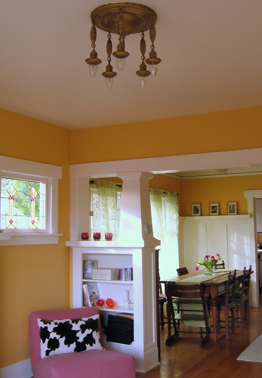
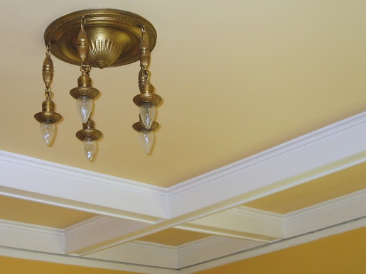
Two things which really need to go are the two brass light fittings in the main downstairs living room.  I presume they’re originals in the house and so must date from about 1912.  This doesn’t stop them looking like strange brass jelly fish hanging from the ceiling.

IMG_8629

As a Brit I’ve been taught to be respectful of original features, but I really can’t cope with these and the Husband loathes them. I mean look.

IMG_8623

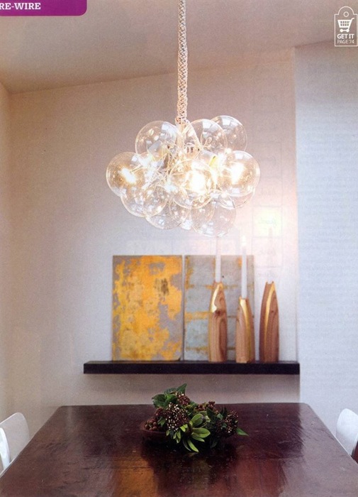
I would obviously like to spend several thousand dollars on two groovy light fittings but George Bush put the kibosh on those as well (he’s got SO much on his conscience). And then I saw this in Ready Made magazine.

readymade1_jeanpelle-full;init_

Assemblage2_jeanpelle-large

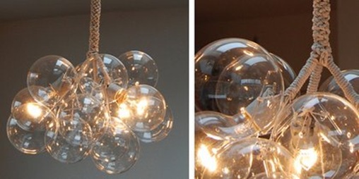
Designed by Jean Pelle, they’re made from three light fittings, round glass bulbs and these gorgeous handblown ‘bubble’ balls from CB2.  All tied together with bits of string. I even have an electrical engineer (turned online advertising guru) for a Husband, so we shouldn’t even get electrocuted.

My questions for you are as follows:

– Should I ditch the original fixtures?

– Where’s the best place to sell the original fixtures?

– Will someone really pay MONEY for them?

– Am I really going to have the patience to put these together?

– Should I even bother?

– Are they going to look like expensive fixtures?

– Or just like a hopelessly homemade bundle of balls tied together with string?

Answers on a postcard please.

We’ll be talking paint colours next. FINALLY, we’re going to ditch the icky egg-yolk yellow.  Am beside myself with excitement. Some colour samples arrived in the post today.  I just have to paint them onto boards and then we can have a chat. 

Share

Colour Therapy

I just wanted to point you guys in the direction of this fabulous giveaway on Shelteriffic. This nifty Color Helper machine lets you scan colours in from walls, fabrics or magazines and then either tells you the closest match from its inbuilt palette of manufacturers’ paint colours or suggests complementary colours for you to use.

All you have to do is prove to Shelterrific how much you need one by sending them a photo of a room that needs help and the worst will win the prize.

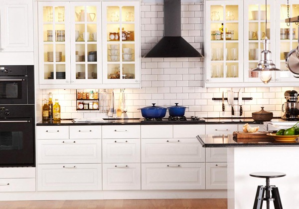
Fortunately for you guys, I’m not going to be sending in this photo of our famously horrendous kitchen – yep, after living here nearly two years we still haven’t painted the house and the kitchen still looks like this, though considerably more cluttered. Luckily for me, Mary T from Shelterrific is going to lend me her one of these machines, so I’ll do an indepth review when I can.  And yes, doing up the house is VERY high on the list of resolutions this year.

412_thumb[8]

Share

Let It Snow, Let It Snow, Let It Snow…

IMG_9308

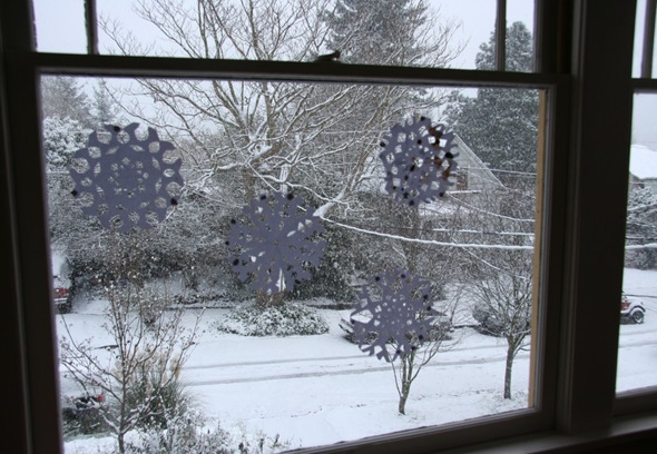
This was the snowscene inside…

And this was the snowscene outside…

IMG_9297

IMG_9295

IMG_9299

Very early this morning we were woken by a ‘thundersnow’ – a thunderstorm and blizzard in one.  All very rare for Seattle and particularly for us being so close to the lake.  Seattle is now of course completely paralysed with more snow expected at the weekend- will we be able to escape for Christmas?

Share

The Sincerest Form of Flattery – Part II

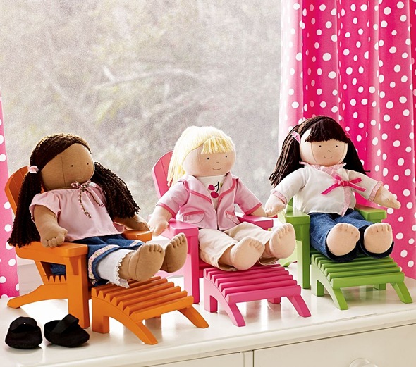
Well, we are already well aware that Pottery Barn is not averse to a bit of plagiarism, but this time they’ve really gone too far and plagiarised ME.  And believe me, it hurts.

Remember the three chairs we painted back in April?

489

Well here are the Pottery Barn versions.

img78l

Any lawyers out there who fancy assisting me in my multi-billion dollar lawsuit?

Share

La fin

For about twelve short but glorious weeks of the year – from the end of June to the middle of September – Seattle is the best place to be on earth. 

For the last couple of weeks we’ve been enjoying the most glorious Indian summer, temperatures in the mid-to-high 70s (around 25 degrees) and cloudless clear blue skies.  This weekend was another such but with added poignancy.  The slight chill on the breeze in the morning and the leaves starting to turn red round the edges told their own story.  The weather is supposed to turn colder by next weekend, so this weekend was full of small goodbyes.

IMG_8119 IMG_8144 IMG_8138

The last sandcastles on the beach

IMG_8148

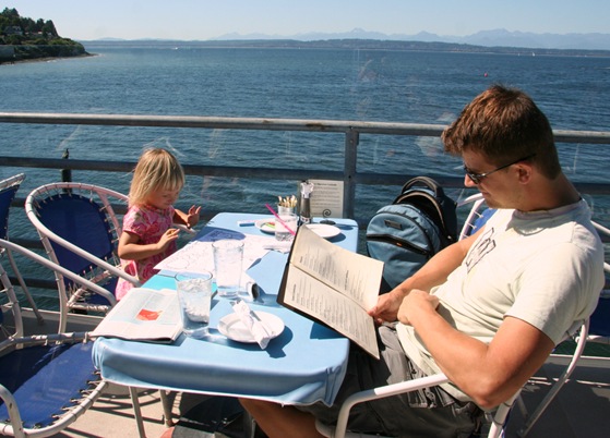
The last lunch by the sea

IMG_8149  IMG_8070

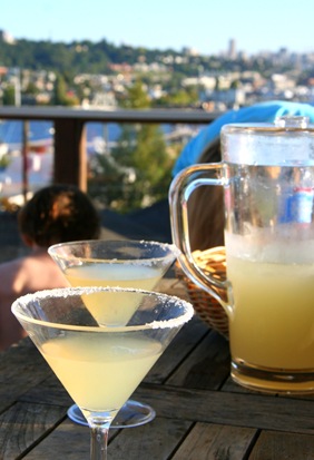
The last strawberry lemonade                                                  The last margaritas on the deck

IMG_8077

The last popsicle princesses

IMG_8163

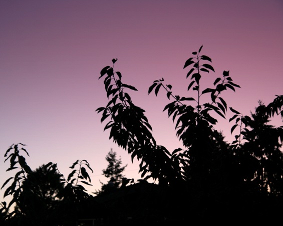
The last vestigial sunset through the trees

IMG_8096-1

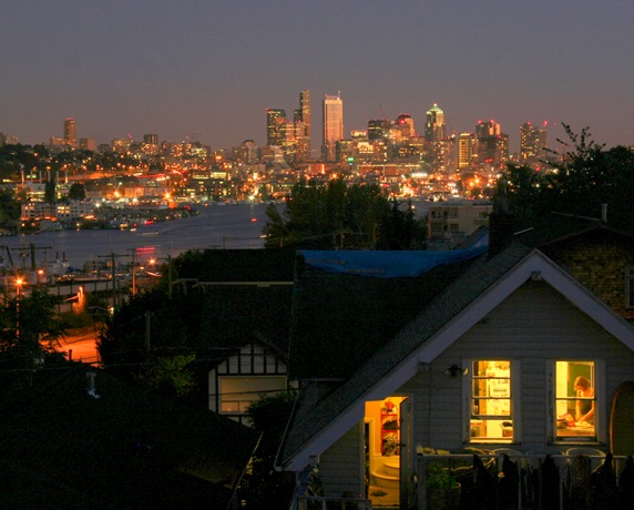
The last chance to watch the lights come on over Seattle and the sun glinting off the downtown buildings

IMG_8110-1

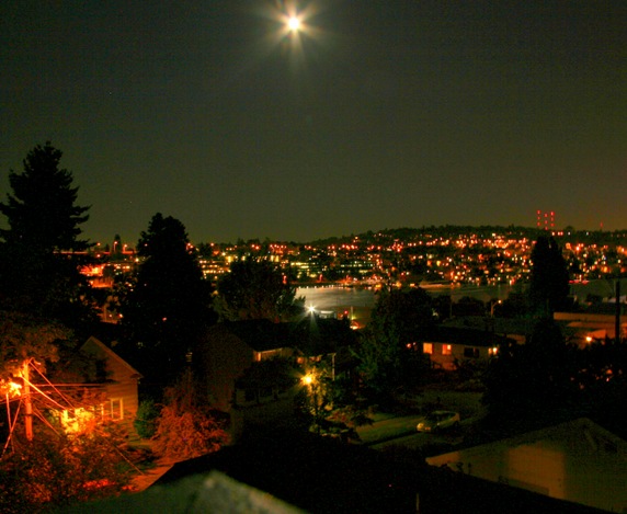
The last chance to watch the moonlight on the water

IMG_8101-1

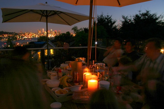
The last chance to have a candlelit dinner with friends

It was also the last chance for some crazy drunken dancing under the stars but I’ve decided to spare you the photos

Share