I’ve been going through agonies of indecision about the paint colours for our main living room. I can’t tell you how many different sample colours I’ve tried out and rejected.
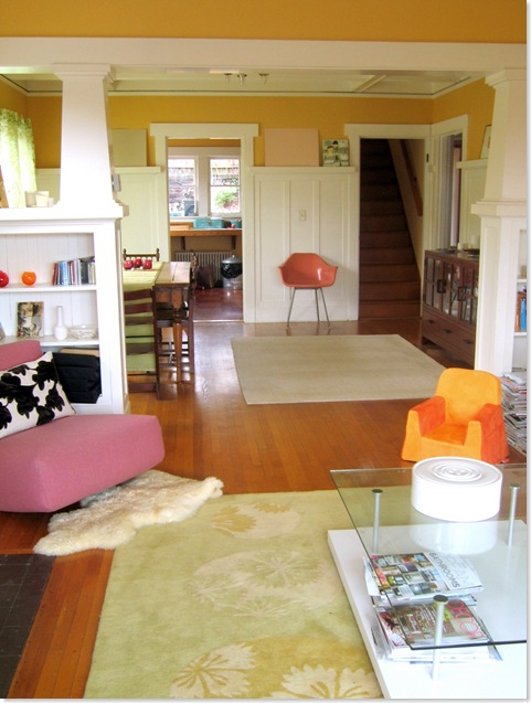
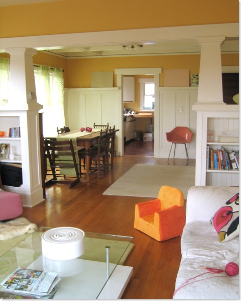
Just to bring you up to speed, we’re looking for a colour to replace the egg-yolk yellow walls in the downstairs living room. There’s a bit of a crazy colour scheme developing in here of chartreuse and white with raspberry sorbet, cranberry, dark brown and er, orange accents (see pictures below) and I need a paint colour to pull it all together.
And before you say anything, yes, I am well aware that this room needs lots of ‘editing’, though at least it is mercifully free of the toys which are normally scattered about with gay abandon.
The sitting area is going to be a white, though a white which will pick out the mouldings and the white fireplace which you can see better here. This white is TBD. However I’m looking for a colour to go above the panelling in the dining area. The colour needs to be sufficiently bright to withstand the grey Seattle winter light; sufficiently deep to emphasise the panelling, but not so pastelly that it looks like a little girl’s bedroom in bright sunshine (the room has lots of south and east facing windows, so can get very bright).
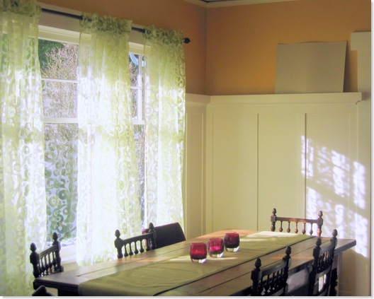
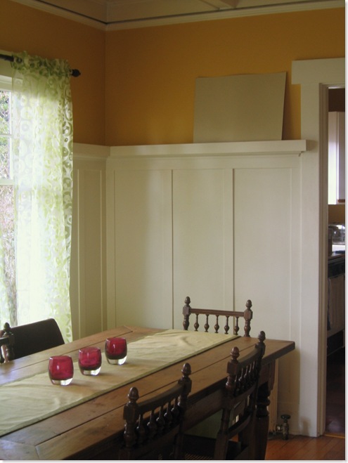
After much deliberation I have narrowed it down to this green (Greenwich by Ralph Lauren) or a pink. The pink in the sample is actually the pink of the sample board itself which I rather like, but I don’t actually have a paint identified. I wanted your input before I go searching further though.
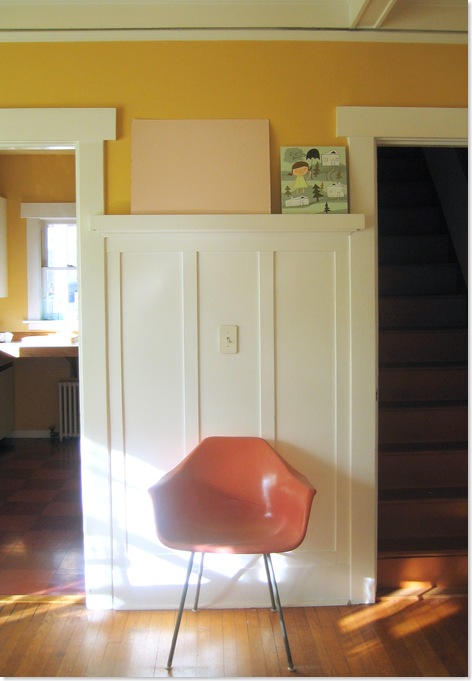
First up the green. It is a beautiful colour and I think it’s the right green if we decide to go the green route. I’m just a bit worried that with green curtains and a green table runner and a green rug the room is just going to end up being rather er, green.
Here it is in strong sunlight
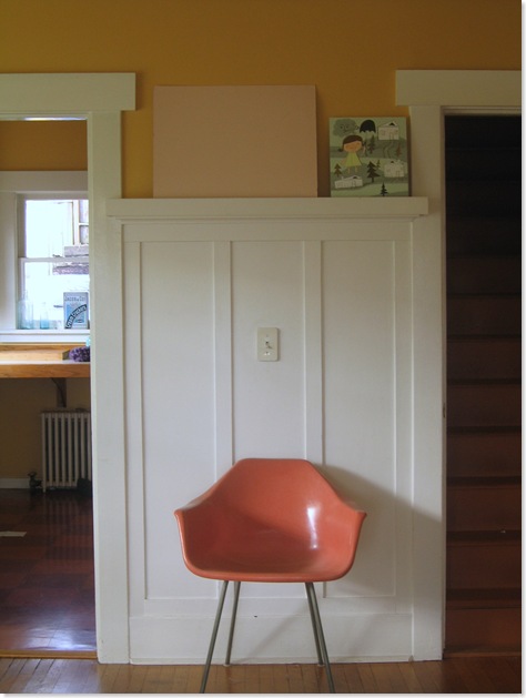
And here it is when the light is more subdued. I’m pleased that it doesn’t go too grey.
On the other hand here is the pink in strong sunlight
And here it is when the light is more subdued which is when I like it best. Subdued light happens a lot in Seattle.
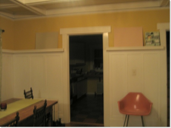
Here finally are both colours in tungsten light. The green stands up well, but the pink goes a bit too ‘bubblegum’ for my taste. Sorry about crappy blurred photo – my little point and shoot doesn’t do well in low lighting conditions and flash would have defeated the object. I do miss my camera!
Anyway, shall I go for the green? Or keep looking for the right pink? If so, do you have any suggestions for pinks I should try? Or should I do something completely different entirely?


i say green all the way. looks really good in all the different shots and i don’t think just the curtains and table runner will force green overload 🙂
I prefer the pink in every photo except the last. The green is more dull and sort of fades into the background. The pink would stand out. Just depends on which you prefer…
You two sound like my brain… I think I feel a poll coming on…
I would skip both these colors and go for a bright fresh apple green. It looks amazing with a white trim.
That green looks a bit too Farrow and Ball to be sufficiently funky, though it may be the light… but like the idea of A green more than the pink..
PS Where did you find the lovely curtains?
I LIKE F&B 🙁
The curtains were from Ikea but don’t seem to be on their site any more…
I love the green colour itself but preferred the pink for your room – except in the last photo!
Meant to add – how about a soft dove grey? The kind of grey that has really pink tones in it?
I am firmly on the side of green! And I love that green, especially with the brighter green of the curtains to accent it.
Out of interest, were you forced at gunpoint to buy that small orange chair?
Cal, I’ve tried very greyed out pinks. They look great in sunlight and artificial light, but very grey when it’s overcast outside and since this is Seattle that happens A LOT. It’s why I’m really struggling with finding a pink.
Small orange chair is amazingly well-designed, useful and practical. Unfortunately orange was the only colour they had that remotely fitted into the color scheme. I’m relying on you guys to find a paint that pulls it all together 🙂
Have you tried making your own pink by adding bits of artist pigments to white emulsion? We made up the colour for our living room walls from basic white and cheap poster paints – possiby with a dash of powdered umber, I can check if you like. Saved a fortune and got the exact shade we wanted. Probably could not do that for green, but pink is an easy one. I think.
PS That little cartoony thing up by the pink board is cute, too… it’s rather nice to be able to poke around your pad like this. Isn’t the internet just wonderful?
I will blog shortly about ‘little cartoony thing’ – and yes the internet is FABULOUS 🙂
I LOVE the yellow! I wish you would keep it. I never thought of it being “egg yolk” until you mentioned it. Since our choices are only green or pink. I will vote with the commentor that said APPLE green. I think you need a STRONG color to contrast with that white and to combat all those grey days in Seattle.
Hmmm. I did consider a softer, more lemony yellow (the egg yolk goes almost mustard in the evening and mustard is probably my all time most hated colour). Maybe I should think about yellow again?
As for strong, bright colours – the room has large windows to the south and east and when it IS sunny is absolutely flooded with light at the brightest times of the day. So I don’t want things to get too dazzling.
I think that’s why I’m having so much trouble – the colour has to work under such very different lighting conditions.
Well, I can’t wait to see what you end up with. The yellow you have now looks fantastic on my monitor…reminiscent more of tangerine than egg yolk. Anyhow, I LOVE color and yet inevitably end up hating what I choose.
We moved into a house with the same climate troubles that you have and have left the paint color we found–a neutral just-barely yellow. It is glorious in the sunshine but takes on a hideous, depressing gray-green cast at night and on cloudy days. Someone needs to start a paint line specifically for Pacific Northwesterners. They’d make a killing.
Your monitor is way off – it’s DEFINITELY a golden yellow, not tangerine. Maybe tangerine would be the way to go if it looks good?!
I think Devine Paints http://www.devinecolor.com/index.html were formulated with the Pacific Northwest in mind. Unfortunately I don’t much like the colours.
Green definitely….the pink on my monitor has flesh qualities to it, very unappealing but I’m sure in person its not that way. You can keep the green runner, rug and curtains – just use colors for accents like vases and what nots…..i suggest blues as your accent color.
looking good!
Christine
Normally I would say green because I am not at all into pink, but that 3rd picture with the pink in the subdued light next to that cute green picture really works. I’m thinking that they look really good together and that’s what your room would look like with pink walls and your green accents.
However, if you did go a green that is close to your lovely sitting room rug, I think it would be good as well because then pink and orange become your accent colors which I think might be more suitable to the Minx’s chair (which I love by the way, I need it for my orange room).
I would pay money to have this dilemma, living in a rental I”m stuck with dingy cream walls.
Hi Paola:
Oh, I like the idea of Pink and Devine Poodle is the one that fits in beautifully…. You have several pinks going on different chairs and accent pillows like cherries on your cake. But there are several other color in the various rooms (living, dining, kitchen) such as orange, gold, deeper berry, and greens. To tie all these colors together as a palette that makes not only the pinks look beautiful but also look balanced with the rest of the colors that co-exist in the same spaces, this is how I would play it: Devine Poodle http://www.devinecolor.com/collections.php?collection=flora-fauna&palette=Collection+%231&color=Poodle&palpic=ff1.jpg&colpic=1/DGPoodle.jpg in the living room, Devine Flamingo http://www.devinecolor.com/collections.php?collection=flora-fauna&palette=Collection+%231&color=Flamingo&palpic=ff1.jpg&colpic=1/DGFlamingo.jpg in the dining room and Devine Cactus http://www.devinecolor.com/collections.php?collection=flora-fauna&palette=Collection+%232&color=Cactus&palpic=ff2.jpg&colpic=2/DGCactus.jpg in the kitchen! Having the 2 different pinks and the green splash at the end will be a great way to wrap up a stunning environment!
I love to help every chance I get!!!! MY PLEASURE….
Devine Flamingo is BRIGHT—like the colors you have in your accents! You know you don’t have a lot of wall space in your dining room. The bright color would literally be an “accent strip” of color above all the BEAUTIFUL white. The dining room is virtually all white! Flamingo would pop the white like the pillows pop on your sofa! As a neutral I would use Devine Custard: http://www.devinecolor.com/collections.php?collection=Trend-Proof&palette=Pebbles+%26+Creams&color=Custard&palpic=pebbles.gif&colpic=pebbles/Custard.jpg, a creamy, yummy neutral that picks up the rest of the golden colors in your home! Do me a favor, look at the paint pages on your sofa, not on the painted wall! Here is a blog article about how to test wall color with comes really handy information: http://blog.devinecolor.com/article/81/how-to-test-wall-colors. I can’t wait to see what you think!
Great site ,this information really helped me , I really appreciate it.Thanks a lot for a bunch of good tips. I look forward to reading more on the topic in the future. Keep up the good work! This blog is going to be great resource. Love reading it.
i think the green, Green is a color, the perception of which is evoked by light having a spectrum dominated by energy with a wavelength of roughly 520–570 nanometres. In the subtractive color system, it is not a primary color, but is created out of a mixture of yellow and blue, or yellow and cyan; it is considered one of the additive primary colors.
Beatiful and comfortable house.
I love your sheer green curtains! Could you tell me where you got them?
tea