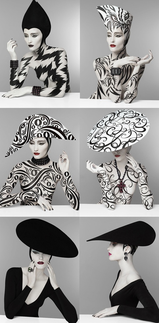
With les Rita Mitsouko. Just reminding myself of one of best songs/videos of the 80s (she says dating herself horribly).
A Day In Wallingford
So last Saturday we just hung out in the nabe.
Watched naked people cycle past.
Went for ice cream at the new and very fabulous Molly Moon’s (had the balsamic strawberry which was extremely delicious and the salted caramel which was too salty).
And then came home to watch the setting sun bounce off the downtown buildings from the deck.
I’m so glad we moved to this part of Seattle.
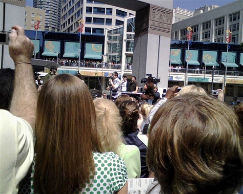
Speaking of which, very long time readers may remember me blogging ages ago about Matt whose videos of him dancing all over the world are some of the most watched on You Tube. What I didn’t know then is that Matt lives in Seattle and always finishes his videos by dancing near a Seattle landmark (the 2006 video finishes at the Troll which is also just around the corner). The final scene of his latest effort was filmed in Gasworks Park, which is just on the other side of the trees which you can see at the bottom of the picture above.
Unfortunately I found out about the filming a couple of days too late (via the new and very excellent Wallingford Seattle Blog) or else the Minx and I would have been there with bells on (in the figurative sense of course).
Watch the new video and be strangely moved. And look out for the very nice colourful houses in Buenos Aires.
Carrie Bradshaw’s Apartment – Love or Hate?
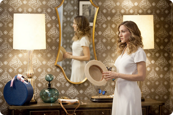
Love TOO Wallhanging by Paul Smith (seen hanging inside Carrie’s entrance hall, I haven’t been able to find a photo of this in situ)
So there’s been lots of chatter recently about Carrie’s apartment makeover in the movie. It’s not too much of a spoiler (and by now the the whole world and her girlfriends have seen the movie anyway) to say that Carrie is apparently earning enough from her books to be able to afford an interior decorator to makeover her apartment.
It’s no secret that the producers of the show go to immense trouble to reflect the characters’ personalities and lives in their clothes and surroundings, so it does make sense for Carrie’s apartment to get an update as she becomes more successful and ‘grown up’.
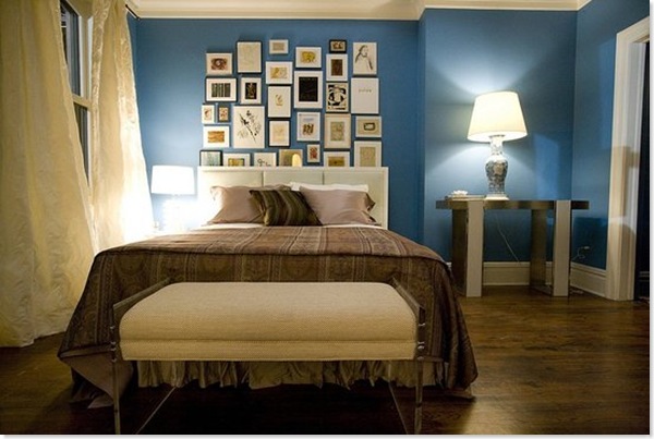
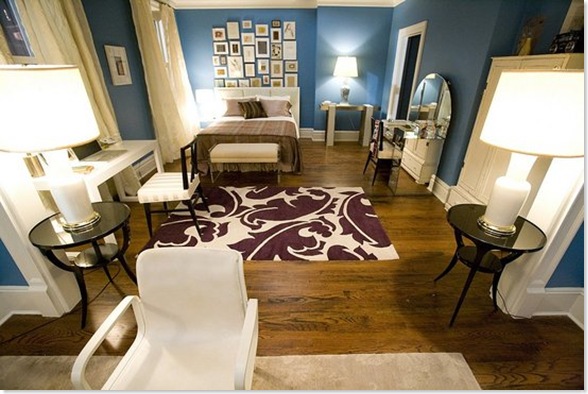
The most obvious change – which really stood out in the cinema – is the colour of the walls throughout the apartment (custom-mixed, but apparently a close relation of Benjamin Moore’s Electric Blue). It’s a pretty colour but I thought it was just a bit too much. I’d have gone for something very slightly more muted and soft and not quite so, er, electric. (It also looked brighter in the film I thought than it does here).
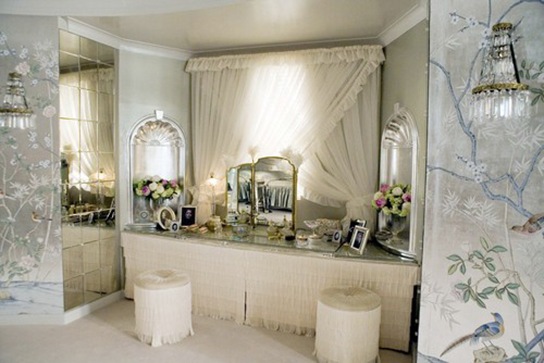
Carrie’s apartment AFTER
Her bedroom has been hugely smartened up. The blue walls and white trim really bring out the brown floors, which again unify the space throughout the apartment and stop the blue from being too overwhelming. I also really like the billowy curtains, which soften the space and, because they are hung to each side of the window, really make the windows seem more imposing. However I really don’t like that bedspread, which looks like something you’d find in a seedy hotel.
I also don’t like the artwall. Firstly aren’t art walls a bit over done now? And where did all this art come from? Does Carrie have a secret Etsy/Ebay addiction which has never been mentioned? She’s never shown any interest in interior decor before. Or, heaven forbid, did the decorator just buy up all this art in one day? And why is some of it tucked behind the headboard of the (rather uninspiring) bed?
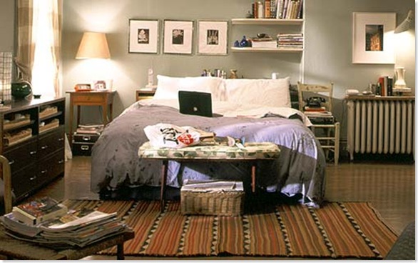
Carrie’s apartment BEFORE
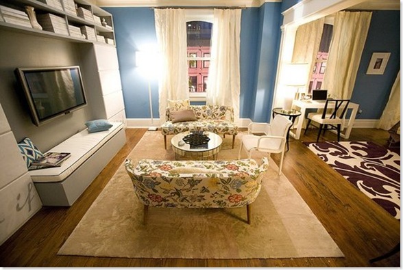
Big kudos to the Rug Company – one of my favourite UK design companies – for providing the rugs. Such a good way of building up their profile in the US. A big thumbs up from me for the purple one they’ve used here, which is the Overleaf by Marni. However I don’t think it really goes with either with the bedspread or with the little chintzy floral couches. I’m all for mixing patterns – and on their own the couches are lovely – but these patterns don’t have any relationship to each other at all, and if you’re mixing patterns I think there needs to be some sort of unifying thread (and throwing in a blue ikat pillow doesn’t really help matters).
The huge TV seems hugely out of place here. When does Carrie ever watch telly? Unlike Miranda, when you see her on your own she’s reading a book or magazine, which brings me to another bugbear. Where are Carrie’s books? How is she going to reach her magazines? And where is the hugely comfortable chair/sofa for curling up and reading? Those floral couches are meant for perching, not snuggling. And if she is going to settle down and watch the enormous telly, is she really meant to sit bolt upright on that incredibly uncomfortable-looking white chair?
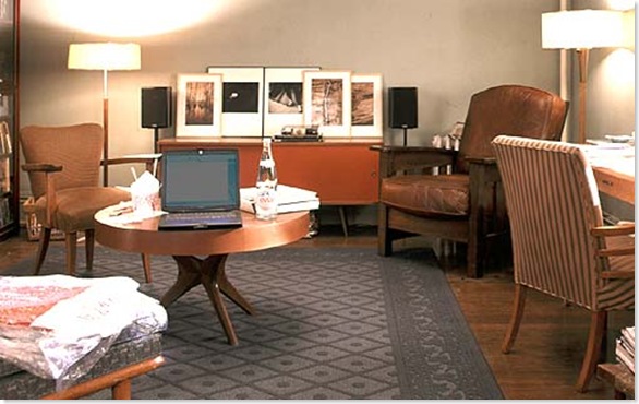
I also wished that they would have kept a few of Carrie’s familiar old things around. One of the key components of her personal style has always been her ability to mix new and vintage stuff. So wouldn’t she have kept that great coffee table and credenza? And was it callous or inevitable that she ditched Aidan’s chair? And why not keep the fabulous Bakelite phone?
I suppose ultimately my complaint is that while it is definitely a much more beautiful apartment, it ends up not being Carrie’s apartment. All the personality has been sucked out of the place and replaced with interesting decorator pieces (and product placement opportunities).
What did you think?
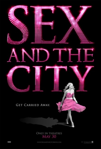
Sex and the City – The Movie
Things I Learned Last Night (Only Very Tiny Spoilers)
– The movie is like watching five previously undiscovered back-to-back episodes with a much bigger budget. No more. No less. Which is my idea of bliss. I note the reviewers who thought the movie was too long are mostly male.
– The plot is so creaky it should be in an old people’s home. I have no idea how they’re going to rehash things again to make a sequel. This doesn’t actually matter.
– Judging by the packed-out cinema and queue for tickets (in fabulous monsoon-like conditions – how I love Seattle in June), there will definitely be a sequel
– As we suspected from the photos which have been all over the Internet, green feathers and bright red lipstick (especially lipstick which is feathering round the edges – too much smoking Carrie!) does not work
– The blue Manolos in the lead role are totally upstaged by these fabulous Dior Extreme Gladiator Platforms, which I would buy tomorrow if they a) didn’t cost $770 b) wouldn’t cripple me in about 5 secs c) wouldn’t give me appalling cankles.
– J Hud is woefully underused
– As is Stanford. More Stanford please!
– Charlotte is fabulous when she’s angry
– The movie included a completely gratuitous trip to Mexico which suited me just fine
– I still think Miranda could do better than Steve
– However, Miranda and Steve made me cry
– As did Charlotte
– Carrie didn’t
– The interiors throughout the movie are fabbalicious. I may have to see the movie again to focus on them more closely 🙂
– Carrie’s iconic apartment gets a makeover. I’m not sure about it, but it deserves a post all of its own
– Samantha is a fool
– Cynthia Nixon is looking stunning
– Smash in Wallingford was a surprisingly great place for a pre-match cosmopolitan
– For all the critics bitching and moaning about the lack of reality in the film, this is PORN, girl porn, pure unadulterated fashion, accessories and interiors porn (and some lingering shots of hot Italian male totty which were not exactly unpleasant). And since when have porn films been realistic?
Evidence that movie moguls don’t read blogs…
So SATC – The Movie generated opening weekend receipts of $55.7 million in the US alone and a further $39.2 million overseas, which has apparently shocked movie execs everywhere, who were predicting an opening more in line with The Devil Wears Prada’‘s $27 million.
Well, colour me surprised. OF COURSE it was going to do well. Anyone who even reads blogs just a little bit would have hooked into the palpable anticipation surrounding the film and noticed just how many people were planning to go and see it.
If you read the news articles today it seems that finally all the male (of course!) moguls are acknowledging that maybe there is a market for films for grown-up women which deal, even obliquely, with grown-up issues and which are genuinely witty and funny; instead of the usual dreadful slapstick Cinderella remake starring J-Lo or Kate Hudson. Or heaven forbid all the CGI-ed superhero claptrap aimed at teenage boys.
Which has to be a good, if somewhat belated, news to start the week.
I. just. can. not. wait
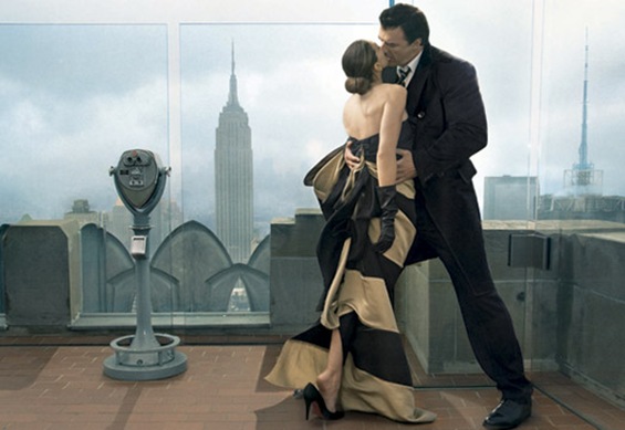
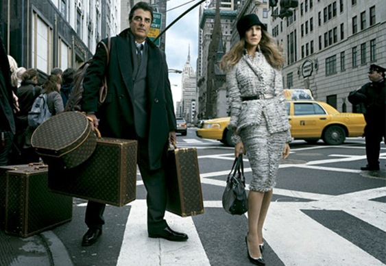
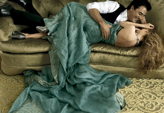
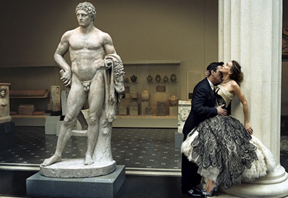
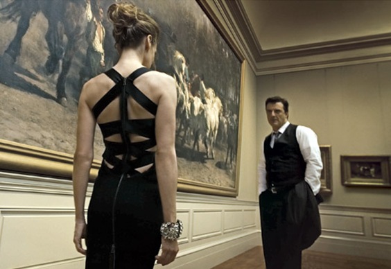
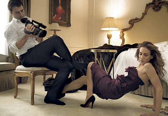
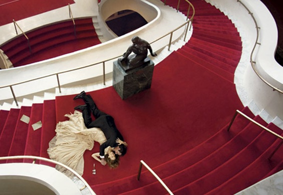
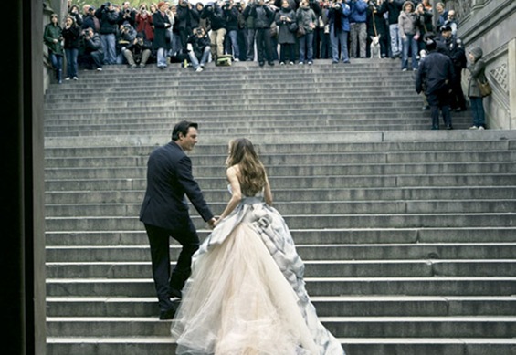
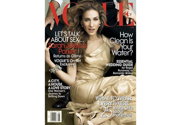
I know we’ve recently been very rude about US Vogue, but this month’s issue features one of the most gorgeous photoshoots I’ve ever seen in honour of the upcoming release of Sex and the City – The Movie. (All photos by Annie Liebowitz for US Vogue from Vogue.com).
Even though the cover is still pretty crap.
The gorgeous boys at Project Rungay (one of the all time great blogs) have done some great detective work tracking down the catwalk origins of most of the frocks. (They are so going to LOVE my Heidi Klum holiday goss).
I have just two questions. Why don’t we see epic dresses like these on the red carpet (including SJP to her own premieres) instead of all the boring fishtails we saw at the Oscars this year? (The green Nina Ricci is what I will wear when I win my Oscar and have extensive liposuction). And could Mr Big, whom I’ve always loved as a character, but who has never done it for me as a lustbunny, look any hotter?
Also check out this vid, via Perez Hilton, which conclusively proves that this is one of the biggest ever product placement opportunities for women (I’ve heard the movie called the ‘Superbowl for women’ in terms of its advertising potential). I just love how all the accessories are just piled up as if they were in the rummage bin at Primark.
The hot mamas of Seattle have booked out the evening of June 3rd to see the movie and drink too many cosmopolitans. Back with an actual film review then. (The only thing I don’t like is the fugly ass decor in that hotel bedroom).
The Lab – Design Blogging in Seattle
The next Lab is on Wednesday 28th May from 6-8pm (though the last one went on longer) at Velocity’s showroom at 251 Yale Avenue N (opposite REI) and is starring ME!!! Talking about design blogging.
Actually I’m feeling like a bit of a fraud, but fortunately there will also be Seattle bloggers on hand who actually know their stuff, namely Megan Not Martha; Elaine Decorno and Mary T from Shelterrific.
So come and have all your questions about the ins and outs of design blogging answered; find out if we’re really all rampant egomanics or just to sample some fab drinks from sponsors Dry Soda and have a nose around Velocity. Remember the Lab is open to men and women and everyone who has even the vaguest interest in design. And if you’re a Seattle blogger yourself we’d be hugely grateful if you could spread the word on your own blog.
If you do come, please be gentle with us.
I’m in a jolly mood today. Have just discovered some superfab ambient house music podcasts by a Swedish DJ – DJRiver (also available for download on iTunes), sort of high end Buddha Bar meets Hotel Costes. Not that this will be remotely of interest to anyone in Seattle, where hairy white rock music reigns supreme.
Britain v America – Book Covers
Here’s our next look at British v. American design sensibilities.
Last time round we hugely preferred the uncluttered British approach to magazine cover design, though we did stop to note the American fondness for glitz and glamour, as exemplified by Gwyneth Paltrow in a ballgown on the cover. Immaculately groomed movie stars and celebrities are everywhere here, all over the TV and on the covers of every magazine.
The British on the other hand are notoriously bad at glamour and polish. We can very rarely pull it off and so regard deliberate attempts at glamour with suspicion, resorting instead to cheerful eccentricity which often tips over into untidiness or even dowdiness. Brits like to call this ‘reality’.
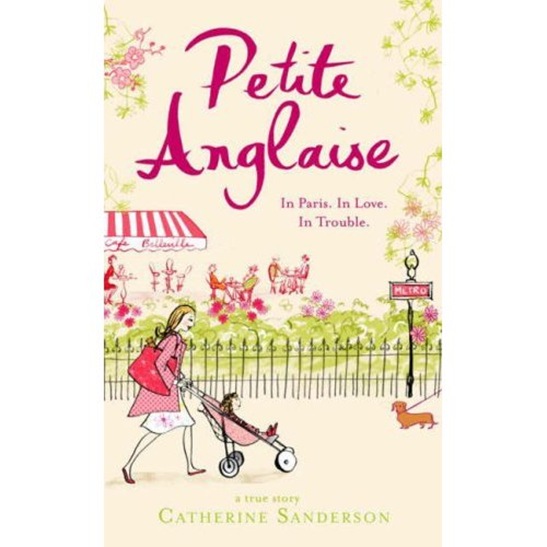
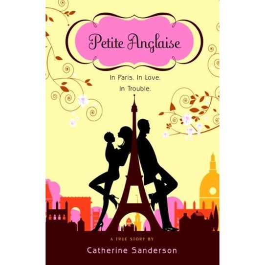
Compare if you will the UK and US covers for the book Petite Anglaise.
I got hooked on ‘petite’s’ blog a couple of years back, just as she was leaving her live-in partner and father of her child for someone she’d met in her comments box. The blog is hugely well-written and for a while was as suspenseful as a daily soap-opera. Petite (Catherine Sanderson) became globally notorious last year when she was ‘dooced’ for blogging at work – the first high-profile European blogger to whom that had happened. As a result though she managed to snag a big book deal for global publication of her story.
Until I came to live in the US I didn’t realise to what extent books etc. are repackaged for different geographic markets. Sanderson writes amusingly here about how much the text has to be ‘translated’ from English to American. The covers are also COMPLETELY different.
Sanderson’s book is half about her dissatisfaction with her day-to-day ‘metro, boulot, dodo’ routine, her unsatisfactory relationship and the difficulties and sometimes loneliness of bringing up a young child.
This is the half of the story which the British cover very clearly focuses on. Have you ever seen anything more mumsy and dowdy? You just know that there’s going to be dog poo/poop (see how good I’m getting at this English/American translation business!) somewhere in that picture. Note the flat shoes and huge nappy/diaper bag. And I bet her nail varnish is chipped and her legs are hairy. And yes I know that’s how most mothers dress, but do you really want to see that on a book cover? And no sign of the various menfolk in the book. Indeed it’s unlikely, despite appearances, that the woman on the cover has ever had sex.
The dowdy, old-fashioned, feel carries through into the design. Note all the sugary pink, serif fonts and pretty pretty flowers. Though maybe the layout, aside from the fussy illustration, is, in true British style, a little cleaner.
UK cover art for Petite Anglaise
The other half of Sanderson’s story on the other hand is about the illicit thrill of flirting on the Internet via blog comments and emails, meeting this stranger in real life and her subsequent mad affair. Her blog at the time this was happening fairly crackled with sexual excitement. And guess which half of the story the American cover focuses on?
US cover art for Petite Anglaise
Look at those heels! Is she even wearing any clothes? Note the cinema posterish layout. On this cover Petite has been turned into Angelina Jolie and Brad Pitt is lurking behind the Eiffel Tower. This woman has sex all the time, NEVER has chipped nail polish and probably doesn’t know one end of a stroller from another.
And yes, I know real life is not like this, but really, if you’re feeling mumsy and badly put together, do you need to be reminded of it in a book cover? The only thing I don’t like about this cover is the actual title where the curly font and fiddly border reminds us of the American love of excessive ornamentation.
So,
Glow in the Dark – Kanye West
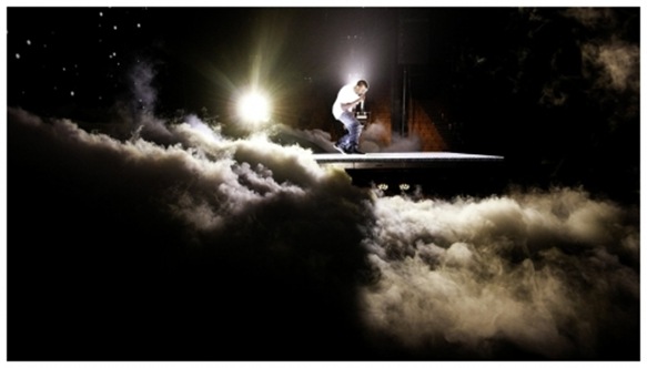
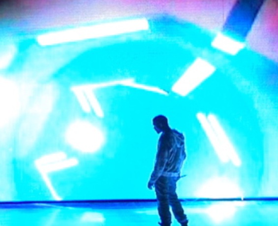
Kanye West in rehearsal at Seattle’s Key Arena (all pics from Kanye’s EXTREMELY cool blog)
One of the CDs I listened to while I was in labour was Kanye West’s The College Dropout. The midwife kept asking if I’d like to listen to something different (I think she hated it) but I found all the expletives to be just the thing.
Notwithstanding the fact that it brings back memories of the most hellish hours of my life, I’ve always liked Kanye’s music (yes, I know he himself can be a bit of a jerk). So when I found that he was opening his Glow in the Dark tour in Seattle, and was promising the mother of all stage shows, with lights by the same guys who had created Daft Punk’s kickass pyramid then I just had to get tickets. I’m a sucker for a good light show.
The support was pretty awesome too – Lupe Fiasco, N.E.R.D and Rihanna. We arrived in time to catch the last bit of N.E.R.D’s set (Pharrell Williams is SO pretty and She Wants to Move was banging ) and all of Rihanna. She looked like a supermodel – all black PVC with dayglo pink and green accents and the most amazing neon pink lipstick. She can actually sing too and Don’t Stop the Music and Umbrella were pretty hot.
Then we had to wait for about an hour for Kanye to hit the stage – he obviously doesn’t have to worry about paying babysitters. I have to add it wasn’t because he was being a prima donna, but because they were clearly having issues with the set.
When the show started, we could see why there’d been issues. The set was indeed incredible – a raised stage like the rolling hills of an apocalyptic landscape, the most enormous back screen and a hydraulic platform that tilted and moved up and down. All accompanied by pyrotechnics, smoke machines, underlighting, overlighting, everywhere lighting, giant lit up globes, an anime blow up doll, a gold painted stripper hologram, a sexy computer and….just Kanye – the self-proclaimed brightest star in the universe – alone on stage for ninety minutes.
In a act of either extreme hubris or bravery, what was apparently a huge contingent of musicians and backing singers (all his tracks have been reworked for the show) were dressed in black, hidden under the stage in an orchestra pit and practically invisible, leaving Kanye on his own, acting out a (very, very silly) hip-hop space soap opera with all the technology.
I’m not sure it entirely worked for me – call me old-fashioned but I like seeing musicians perform – but it almost did, and Kanye is the only hip-hop artist with enough ego and charisma to get anywhere close to pulling it off. And it all got very moving when he appeared to be close to tears after a stripped down version of Hey Mama. And there really is nothing that compares with seeing a state-of-the-art, money-no-object, no-technology spared stage show.
Just to bring this post vaguely close to on-topic for this blog, do check out Kanye’s surprisingly fabulous blog – full of his design and creative inspirations. He’s got some really cool stuff on there. Oh and couple of reviews of the show here and here. And goodness, the sound system at the Key is cr*p.
Bee with Fern
Or, how the rich get richer…
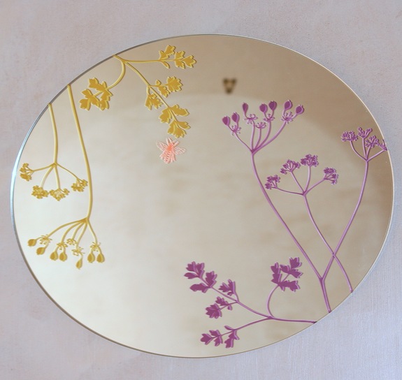
Regular readers will remember that earlier on this year, there was much temporary excitement round these parts when This Morning (which, for American readers, is a major networked morning TV show in the UK) called in the Atelier LZC Bee mirror for a feature.
The excitement quickly abated when the mirror wasn’t mentioned at all during the feature and indeed only a tiny corner of it was fleetingly visible during the programme, resulting in absolutely no sales whatsoever.
This is pretty much par for the course, I would say of everything that is called in by journalists etc. only about 25% is actually used in any capacity. As is also par for the course the mirror was never returned to us.
Most journalists are really bad at returning stuff. In theory they’re meant to return it, and some are very good about it, but many seem to assume that you’ve just given them a generous gift, whether or not they actually use the item in their publication. The mythical Vogue accessories closet is not just a myth (and yes, one of their staffers managed to ‘acquire’ a couple of scented candles a year or so back, though they had at least featured them in the magazine). And it doesn’t seem to matter to them whether the company they’re ‘acquiring’ things from is a huge multinational behemoth, or a teeny tiny online shop.
The reason I’m writing about this scam now is that when we emailed This Morning to enquire as to the whereabouts of the mirror, we were told by the researcher that it had been ‘passed on to Fern’. For the uninitiated Fern Britton is the main anchorwoman of the show, one of the very few women on TV that I actually like, and one of the highest paid women on UK TV.
While part of me is pleased that Fern liked it enough to ‘acquire’ it, she has gone down a long way in my estimation. Though to be fair, This Morning did say we could invoice them (but only after we’d emailed them).
The temptation to write “as ‘acquired’ by Fern Britton” on the mirror product page is almost too strong to resist. At least that way we might get SOME publicity out of all this.
And with this post all chances of ‘mirrormirror’ ever being on the telly have just disappeared….






![CropperCapture[1]](/images/various/WindowsLiveWriter/CropperCapture%5B1%5D_thumb.jpg)
