Here’s our next look at British v. American design sensibilities.
Last time round we hugely preferred the uncluttered British approach to magazine cover design, though we did stop to note the American fondness for glitz and glamour, as exemplified by Gwyneth Paltrow in a ballgown on the cover. Immaculately groomed movie stars and celebrities are everywhere here, all over the TV and on the covers of every magazine.
The British on the other hand are notoriously bad at glamour and polish. We can very rarely pull it off and so regard deliberate attempts at glamour with suspicion, resorting instead to cheerful eccentricity which often tips over into untidiness or even dowdiness. Brits like to call this ‘reality’.
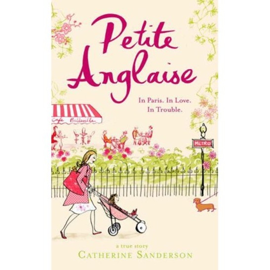
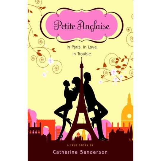
Compare if you will the UK and US covers for the book Petite Anglaise.
I got hooked on ‘petite’s’ blog a couple of years back, just as she was leaving her live-in partner and father of her child for someone she’d met in her comments box. The blog is hugely well-written and for a while was as suspenseful as a daily soap-opera. Petite (Catherine Sanderson) became globally notorious last year when she was ‘dooced’ for blogging at work – the first high-profile European blogger to whom that had happened. As a result though she managed to snag a big book deal for global publication of her story.
Until I came to live in the US I didn’t realise to what extent books etc. are repackaged for different geographic markets. Sanderson writes amusingly here about how much the text has to be ‘translated’ from English to American. The covers are also COMPLETELY different.
Sanderson’s book is half about her dissatisfaction with her day-to-day ‘metro, boulot, dodo’ routine, her unsatisfactory relationship and the difficulties and sometimes loneliness of bringing up a young child.
This is the half of the story which the British cover very clearly focuses on. Have you ever seen anything more mumsy and dowdy? You just know that there’s going to be dog poo/poop (see how good I’m getting at this English/American translation business!) somewhere in that picture. Note the flat shoes and huge nappy/diaper bag. And I bet her nail varnish is chipped and her legs are hairy. And yes I know that’s how most mothers dress, but do you really want to see that on a book cover? And no sign of the various menfolk in the book. Indeed it’s unlikely, despite appearances, that the woman on the cover has ever had sex.
The dowdy, old-fashioned, feel carries through into the design. Note all the sugary pink, serif fonts and pretty pretty flowers. Though maybe the layout, aside from the fussy illustration, is, in true British style, a little cleaner.
UK cover art for Petite Anglaise
The other half of Sanderson’s story on the other hand is about the illicit thrill of flirting on the Internet via blog comments and emails, meeting this stranger in real life and her subsequent mad affair. Her blog at the time this was happening fairly crackled with sexual excitement. And guess which half of the story the American cover focuses on?
US cover art for Petite Anglaise
Look at those heels! Is she even wearing any clothes? Note the cinema posterish layout. On this cover Petite has been turned into Angelina Jolie and Brad Pitt is lurking behind the Eiffel Tower. This woman has sex all the time, NEVER has chipped nail polish and probably doesn’t know one end of a stroller from another.
And yes, I know real life is not like this, but really, if you’re feeling mumsy and badly put together, do you need to be reminded of it in a book cover? The only thing I don’t like about this cover is the actual title where the curly font and fiddly border reminds us of the American love of excessive ornamentation.
So,


The British cover makes me think of the Madeleine series of childrens’ stories (“In an old house in Paris covered with vines lived twelve little girls in two straight lines.”) I would rather read that sort of book, so I would more likely choose the British cover. It does sound like the American cover may by more true to the tenor of the actual story however. American advertising uses sex to sell everything, so its hard to judge a book by its cover.
The British one looks friendlier to me. I’d buy the British version as well, I love to read things in actual British vs. American especially if it takes place in Britain or Europe, it makes it so much more authentic.