Ever since I moved from London to Seattle, I’ve noticed that there is a very different design sensibility between Britain and the US, not just in interiors but in every aspect of life.
So I thought it would be fun to launch a series of posts where we can compare and contrast everyday elements of British and American design and just have a chat round the differences.
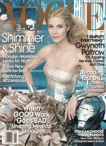
First up, here are the May 2008 covers for British and American Vogue, which to me exemplify the two different design aesthetics (even though American Vogue is famously edited by a Brit).
May 2008 cover of British Vogue featuring Natalia Vodianova
The cover of British Vogue is simpler and cleaner, with far fewer words and simple fonts (though note the use of the serif font). Colour though is brought into the typeface.
The focus is very much on the model. Note it’s a model not a celebrity – celebrities do appear on the cover of British Vogue but comparatively rarely. Though admittedly the lines get a bit blurred with celebrity models such as Kate Moss, who seems to be on the cover of British Vogue all the time. The colours are very bright, clean and fresh and to my eyes very English. The whole thing seems much more uncluttered and spare.
May 2008 cover of American Vogue featuring Gwyneth Paltrow
American magazine covers – and this is no exception – seem to have a lot more going on. There are more words and more different font sizes (though only one sans serif font is used throughout). There are more emphatic caps and italics and a quote is included. All the words mix lower case and upper case.
The image used is much busier (and more obviously photoshopped?) – more Gwyneth, more dress, more background. There’s a lot more Hollywood glamour – a movie actress, big hair, silver and sequins. And with the mask, even obvious movie product placement (for the Iron Man movie, starring, you guessed it, Gwyneth Paltrow). The colours, though, are more muted and soft than on the British cover.
So, which one do you like best? Which one would you buy? Do you prefer the cover from your ‘home’ country? Does the other cover seem very different and/or strange? Does the British cover seem scarily uninformative and gaudily bright? Does the US cover seem more old-fashioned (as it does to me)? Or does the serif font on the UK cover look old-fashioned to American eyes? If you’re neither British nor American which one stands out for you? Am I the only person who thinks Gwyneth look strangely like she’s been carved out of wax?
Discuss.
(Just adding a poll, because your answers are intriguing me.)
So the thing that’s intriguing me, is that not a single person has said they prefer the US cover, but surely Anna Wintour et al must do focus groups and stuff about this sort of thing? And must think that the US-style cover will sell best? Can anyone out there explain?
By the way is the poll working properly? I’ve had all sorts of trouble getting it up.





Being British I am amused by the irony of Gwyneth proclaiming that she simplyfies everything while wearing an evening dress and looking quite the opposite of simplified….
Loved this post and can’t wait to read more, I am from the UK and much prefer the style of the English Vogue. It is understated even though it is brighter, less brash? I have often thought about the difference in US and UK cover aesthetics.
She looks so freaking weird. It looks more like Juliet from Lost than like Gwyneth Paltrow.
http://images.google.com/images?q=juliet+lost&ie=UTF-8&oe=utf-8&rls=org.mozilla:en-US:official&client=firefox-a&um=1
I am American and LOVE the British cover and hate the American cover (yes hate). British style, to me, speaks of understated elegance, style and taste. American style seems so brash, flashy, or trendy (I am searching for the right word). These covers prove the point beautifully. There is no depth (generally speaking) to American style. It may catch your eye for a quick minute but it is just as quickly forgotten. It only goes skin deep. To me there is no comparison–Brits have it over the Americans when it comes to aesthetics–you seem to understand and appreciate timeless beauty, whether it be in architecture, textiles, etc. I could go on… It will be interesting to hear from other Americans.
british version! although it does seem weird not to have headlines all over the front. 🙂
Interesting post. I have always preferred British Vougue to US Vogue – nd not just the covers. US Vogue seems to take itself too seriously (perhaps Ms. Wintour has something to do with this). To me, British Vogue is more fun and has a touch of whimsy. Plus Tim Walker regularly contributes.
There’s no competition really – is there?
Well there doesn’t appear to be. Shall I drop Anna Wintour an email? 🙂
British – without a doubt. It’s not only the covers of American magazines, but the whole cluttered layout of the interiors too. What’s their big problem with a bit of white space?
Well, one thing that I think is more favorable for the American cover is that it displays a woman – a movie star, true – but the girl on British Vogue looks like a child, reminds me of the girls in the movie “Blow-up.”
I can find the prayer I want. I thank God for this website.
I praise God for answering my prayers. God, you are so wonderful, majestic. Jesus Christ, I adore Your Sacred Heart.
Thank for making this valuable information available to the public.
Magnificent collection of prayers – and I haven\’t begun to explore the rest of the website!
keep up the good work!
Dear web-master ! I looked your site and I want to say that yor very well
Actually, this is quite problematic topic. I’ve been a subscriber of American Vogue for a year. I used to be stunned by the image that Vogue sends to the world. The problem is, that some issues are incredibly thin and flooded with boring advertising (mainly cosmetics). British Vogue is designed better, better articles and far more photo shoots. On the other hand, Annie Leibovitz’s work is mainly seen in the US Vogue so in this field the US wins. I am quite mad at the US Vogue, although they employ good editors the final product is poor. I am opting for British Vogue.
I think the British cover is lovely, I’d collect it in a second. I don’t mind Gwyneth on the American cover and like the colors, but what I detest is the crass commercial inclusion of the Iron Man mask – that has No place on the cover. This was a huge lapse in taste and propriety and makes me believe Wintour does sell out her covers.