
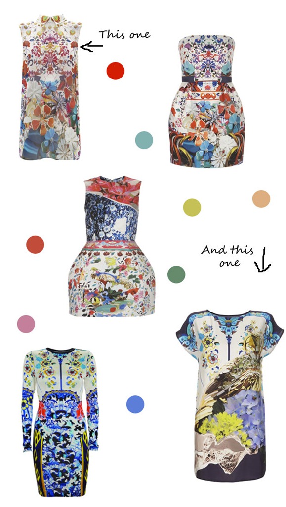
Today’s Teeny Trend features the newly-unveiled Team GB kit designed by Stella McCartney and a cushion I’ve recently had my eye on.
I do like the idea of using portions of the Union Jack in designs – it’s still iconic and cool without going full on into Rule Britannia territory. And thank goodness the Stella McCartney designs, while a bit dull, aren’t hideously embarrassing, unlike the godawful Olympic logo. I still have no clue what they were thinking with that one.
We’ve booked our flights out to London for the Olympics! We don’t have tickets to any events, but I still wanted to be there to join in the party. Can. not. wait.

The 2012 Olympic symbol is Lisa Simpson giving a blow job. As indecent as it is that’s what it is and once you know that you will never see anything else. That’s how I’ve found it anyway! Sorry.
I know, I read that too and I can’t unsee it either. Oh the shame, there actually are some good graphic designers in London. (And I remember when we were told back in 2007 that the logo would improve over time – has it for anyone? It hasn’t for me.)
They did say it was going to improve didn’t they?! But no, it’s just some crazy logo stuck in 1990 wearing fluroescent bike shorts and going to raves. Shame, there are some amazing graphic designers through the whole of the U.K.
@bridie THAT is the perfect description of the logo. Thank you! The article I linked to above calls it the logo equivalent of ‘dad dancing’. Not cool…
It is outrageously bad. How did that happen? And the mascots? I just don’t understand who signed off on those choices.
Don’t even get me started on the mascots…
Oh no I forgot about the mascots.