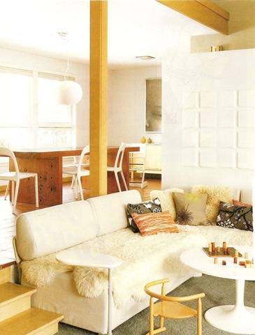
There’s a great quiz here on Sproost {found via Esthetic Eclectic} which will help you find your decorating style. Mine is apparently 100% Cottage Chic, which, while I hate the name, seems to be pretty much spot on.
What’s yours?
![CropperCapture[37]](/images/old/6a00d8341c7dce53ef0111688b2dda970c-pi.jpg)
![CropperCapture[38]](/images/old/6a00d8341c7dce53ef0111688b2dde970c-pi.jpg)

There’s a great quiz here on Sproost {found via Esthetic Eclectic} which will help you find your decorating style. Mine is apparently 100% Cottage Chic, which, while I hate the name, seems to be pretty much spot on.
What’s yours?
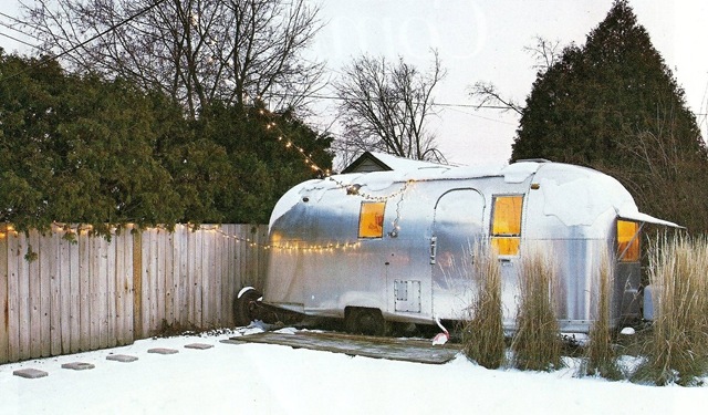
I’ve always wanted to have an office in the garden and in my dreams that office is a vintage Airstream. This month’s Readymade featured a young couple in Minneapolis who are living my dream with an Airstream they bought for $4,500. I wouldn’t mind the rest of the house either (with maybe a bit more colour and pattern in the main rooms).
What special things would you have in your dream house? Mine would also have a a turret with a completely circular room. And be in Provence not Minneapolis.


Or in this case go love your yacht. I’ve realised that I don’t post enough pictures of rooms I find inspiring, mostly because I don’t come across them all that often.
Everything about this boat though – which belongs to superstar (in the UK at least) DJ and producer Norman Cook, aka Fatboy Slim – is utter perfection. It’s even moored in Sardinia, of which, as you know, we are very fond.
The only teensy problem is the price tag, as it will cost you £20,000 (approx $30,000) to rent the four spacious cabins for a week. Oh, and the name Barracuda, which now reminds me of a certain governor of Alaska.
For more details and pics, including what music they have on the fully stocked Ipod, go here. If you want to hire it more details are here.


![CropperCapture[13].Bmp](/images/old/6a00d8341c7dce53ef0111685e8c13970c-pi.jpg)

![CropperCapture[14].Bmp](/images/old/6a00d8341c7dce53ef0111685e8c24970c-pi.jpg)

{via the ever fabulous Style Files}
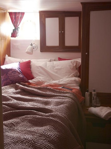
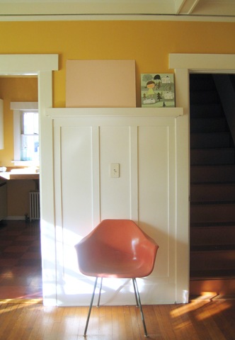
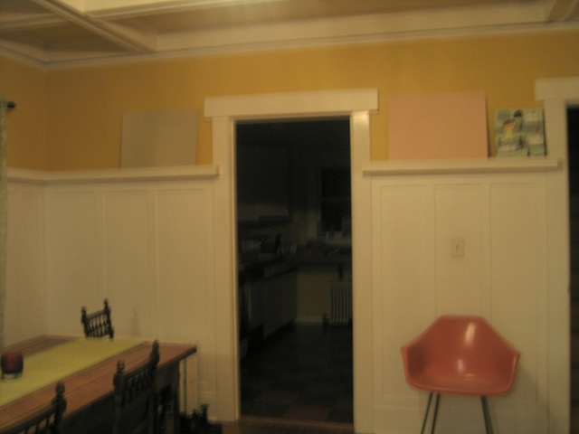
I’ve been going through agonies of indecision about the paint colours for our main living room. I can’t tell you how many different sample colours I’ve tried out and rejected.
Just to bring you up to speed, we’re looking for a colour to replace the egg-yolk yellow walls in the downstairs living room. There’s a bit of a crazy colour scheme developing in here of chartreuse and white with raspberry sorbet, cranberry, dark brown and er, orange accents (see pictures below) and I need a paint colour to pull it all together.
And before you say anything, yes, I am well aware that this room needs lots of ‘editing’, though at least it is mercifully free of the toys which are normally scattered about with gay abandon.

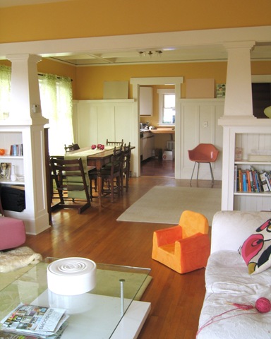
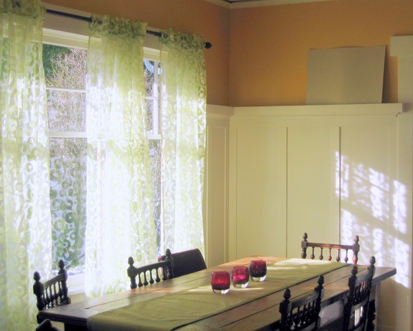
The sitting area is going to be a white, though a white which will pick out the mouldings and the white fireplace which you can see better here. This white is TBD. However I’m looking for a colour to go above the panelling in the dining area. The colour needs to be sufficiently bright to withstand the grey Seattle winter light; sufficiently deep to emphasise the panelling, but not so pastelly that it looks like a little girl’s bedroom in bright sunshine (the room has lots of south and east facing windows, so can get very bright).
After much deliberation I have narrowed it down to this green (Greenwich by Ralph Lauren) or a pink. The pink in the sample is actually the pink of the sample board itself which I rather like, but I don’t actually have a paint identified. I wanted your input before I go searching further though.
First up the green. It is a beautiful colour and I think it’s the right green if we decide to go the green route. I’m just a bit worried that with green curtains and a green table runner and a green rug the room is just going to end up being rather er, green.
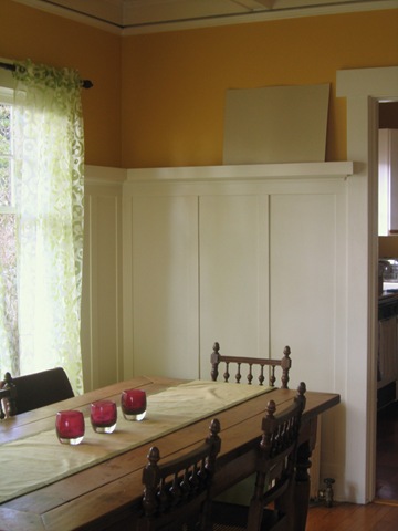
Here it is in strong sunlight
And here it is when the light is more subdued. I’m pleased that it doesn’t go too grey.
On the other hand here is the pink in strong sunlight
And here it is when the light is more subdued which is when I like it best. Subdued light happens a lot in Seattle.

Here finally are both colours in tungsten light. The green stands up well, but the pink goes a bit too ‘bubblegum’ for my taste. Sorry about crappy blurred photo – my little point and shoot doesn’t do well in low lighting conditions and flash would have defeated the object. I do miss my camera!
Anyway, shall I go for the green? Or keep looking for the right pink? If so, do you have any suggestions for pinks I should try? Or should I do something completely different entirely?
Bought at Christmas from Habitat in the UK and shipped to the US at vast expense. There are some shops I just can’t live without.


One day that wall and wood trim will be painted a different colour. However, I really wouldn’t hold your breath.
This is why I won’t miss Domino.
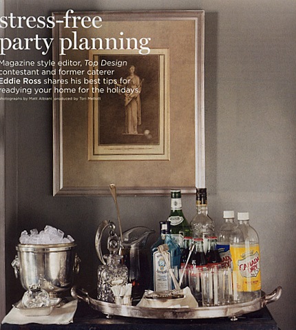
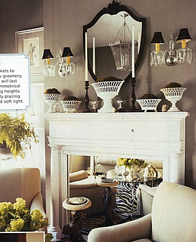
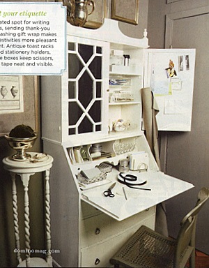
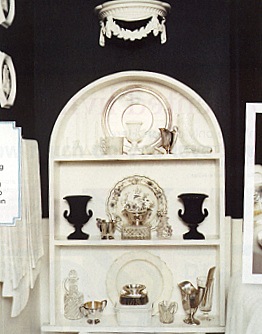
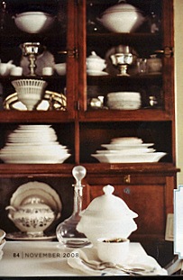
For some reason they decided, at the tail end of last year, to give a feature to Eddie Ross, a former Martha Stewart Living editor and very-full-of-himself losing contestant on Top Design who seems to be trying to set himself up as some sort of lifestyle guru.
Now Eddie, if you’re reading, I’m sure these are all carefully collected and treasured antique pieces and there’s not a SINGLE PIECE of repro in amongst all this clutter, but where is your flair and imagination? Where are the quirky, original pieces; the unexpected combinations; the touches of wit and personality? And why on earth is everything so fussy and maiden-auntish? You’re only about 30 I believe but there’s not a single thing here that suggests you have had any contact with this century whatsoever.
I say this with love, but piling antiques onto every available surface in a vaguely symmetrical fashion does NOT good design make; Canada Dry bottles and huge rolls of brown paper are not very decorative and I can’t believe you’re still using zebra. And Domino, I can’t believe you thought this was worth showing to us.
I do, however, very much like the colour of the wall around the fireplace.
No poll today. I’d just like the answers to two questions.
1) If you’re a young, happening guy about town, why would you feel the need to decorate your house as if you were Martha Stewart’s GRANNY?
2) When is America going to join the rest of the world in the 20th (never mind the 21st) century and give up its love affair with fuss, clutter and ornamentation? This is a young, vibrant, dynamic country and yet I see so many rooms in magazines and blogs where Queen Victoria would feel right at home. Is it because you just all love dusting?
UPDATE: There’s a discussion going on in the ‘Comments’ as to why Domino is going to be so missed. Can anyone who will sincerely miss Domino explain why? And was it really better in the good old days?
One of my resolutions this year is to finally get the house sorted out. The major remodeling of the basement and kitchens that we planned will have to wait because of George Bush and Gordon Brown, but we ought to at least be able to get the house PAINTED. I mean, we’ve only been here two years.
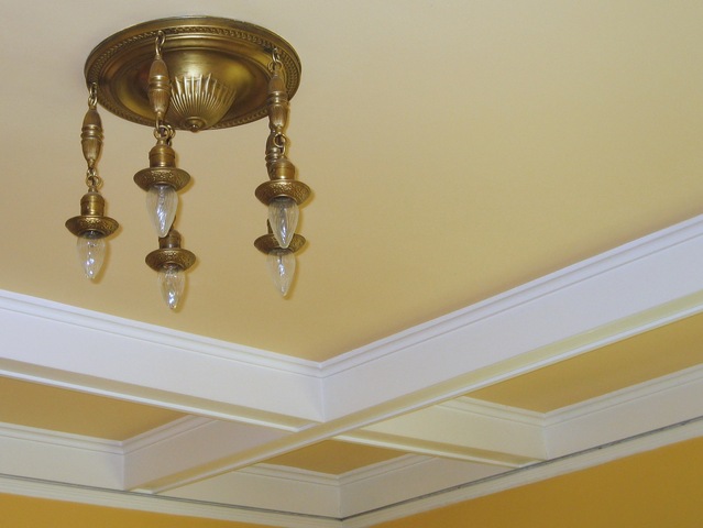
Two things which really need to go are the two brass light fittings in the main downstairs living room. I presume they’re originals in the house and so must date from about 1912. This doesn’t stop them looking like strange brass jelly fish hanging from the ceiling.
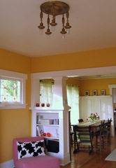
As a Brit I’ve been taught to be respectful of original features, but I really can’t cope with these and the Husband loathes them. I mean look.
I would obviously like to spend several thousand dollars on two groovy light fittings but George Bush put the kibosh on those as well (he’s got SO much on his conscience). And then I saw this in Ready Made magazine.
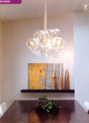
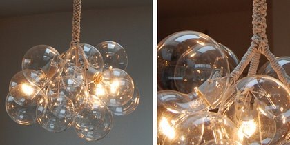
Designed by Jean Pelle, they’re made from three light fittings, round glass bulbs and these gorgeous handblown ‘bubble’ balls from CB2. All tied together with bits of string. I even have an electrical engineer (turned online advertising guru) for a Husband, so we shouldn’t even get electrocuted.
My questions for you are as follows:
– Should I ditch the original fixtures?
– Where’s the best place to sell the original fixtures?
– Will someone really pay MONEY for them?
– Am I really going to have the patience to put these together?
– Should I even bother?
– Are they going to look like expensive fixtures?
– Or just like a hopelessly homemade bundle of balls tied together with string?
Answers on a postcard please.
We’ll be talking paint colours next. FINALLY, we’re going to ditch the icky egg-yolk yellow. Am beside myself with excitement. Some colour samples arrived in the post today. I just have to paint them onto boards and then we can have a chat.
I’m not so sure about some of the textile choices in this English Victorian house – a bit too old fashioned for my taste – but I love the owner’s use of colour and the use of contemporary furniture contrasted with the house’s old bones. A couple of great Ikea hacks too.
![CropperCapture[27]](/images/old/6a00d8341c7dce53ef010536fe7844970c-pi.jpg)
![CropperCapture[28]](/images/old/6a00d8341c7dce53ef010536f5546a970b-pi.jpg)
![CropperCapture[29]](/images/old/6a00d8341c7dce53ef010536f5547a970b-pi.jpg)
![CropperCapture[30]](/images/old/6a00d8341c7dce53ef010536fe7854970c-pi.jpg)
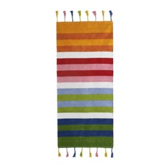
The stair runner is made of Barnslig Rand rugs sewn together.
![CropperCapture[31]](/images/old/6a00d8341c7dce53ef010536f5549a970b-pi.jpg)
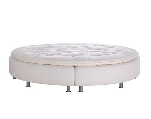
The round bed was apparently sold in Ikea but I can’t find it on the current website. There’s one for sale here. The owner of the house made the round headboard for her teenage daughter’s room. I would have KILLED for this bed when I was a teenager (except for the surprisingly nasty Lulu Guinness bed linen).
{All house photos from Living etc.)
Look here (though I can’t read the full article Decorno links to as I’m not a subscriber to WWD).
I can’t say I’m surprised. It’s been really dreadful recently and the articles have only been good for ‘Go Fug Your Room’ posts. I’ll miss the website though.
I do wish the editors of shelter magazines stateside (which are all closing rapidly) would take a look at their British counterparts, such as Living etc, Elle Deco and even Ideal Home. All fabulous, and none, as far as I know, in danger of closing.
Living etc. there’s a huge gap in the US market now. Come and launch here!
UPDATE: Here’s the full text of the WWD article, again courtesy of Decorno.
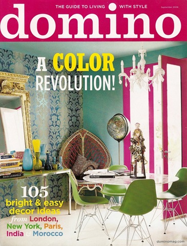
Domino magazine will cease publication, it was announced today by Charles H. Townsend, President and CEO of Condé Nast. The final issue will be published in March 2009.
“This decision to cease publication of the magazine and its website is driven entirely by the economy,” Mr. Townsend said. “Although readership and advertising response was encouraging in the early years, we have concluded that this economic market will not support our business expectations.”
Domino was launched in April 2005. The magazine’s current ratebase is 800,000.
Condé Nast, a unit of Advance Publications, includes twenty-three consumer magazines, Condé Nast Digital, the Fairchild Fashion Group, Parade, the Condé Nast Media Group, and the Shared Services Centers.
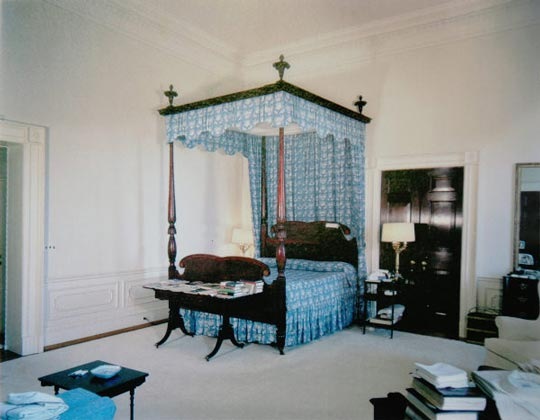
It has been reported on the extremely fabulous Mrs O blog that Michael Smith, the Obamas’ decorator, ordered the bed below (though not the rest of the furniture) to be sent to the White House. The bed is an 1820s tiger’s eye maple king size four poster from Leonards of New England.

If so, it fits in very well with Michael Smith’s, dare I say it, somewhat boring style. Here are some examples of beds he’s done from the Domino website.
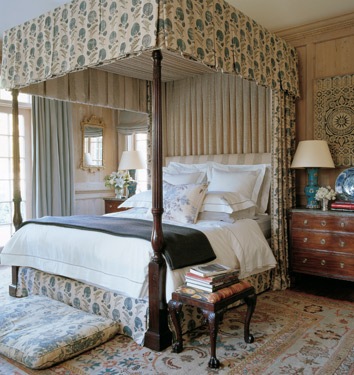
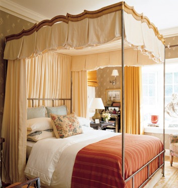
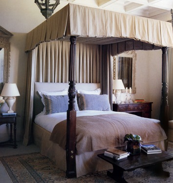
I know the White House is a historic house and he can’t go too funky and modern but I do hope the Obamas are getting something that doesn’t look like it belongs in a cluttered Cotswolds B&B.
While we’re on the subject of White House bedrooms the below made me laugh.
This is Jackie Kennedy’s fabulous bedroom – elegant, sophisticated, timeless and quietly sexy.

And here is the bedroom she created for her husband Jack Kennedy – frilly, awkward (what’s with the bedside table in front of the door?), uncomfortable looking, it’s hardly a shag palace is it? He must have been SO embarrassed bringing Marilyn Monroe back here for a session.