Mad Men Barbies AND Furniture

Be still my beating heart. (And poor exhausted credit card).

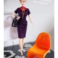
It’s been announced that Mattel will be bringing out a range of four ‘Mad Men’ Barbie and Ken dolls to promote the show’s return in July.  Full details here and here. You just know these’ll be all over every blog by lunchtime.

fss


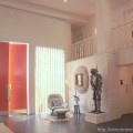
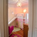
If you do buy some, why not get them some furniture they’d really enjoy as well? Designer Maryann Roy builds one of a kind interior room sets for her collection of vintage Barbie dolls, which she also restores. Full details from her website here. All roomset images also from her website.


Cafdfsfpture

mcmmono

Capture

Captfdfdure

LuxLivingSuite

UPDATE:  They’ve just gone up for pre-order HERE.  I’ve just ordered a Joan to be mirrormirror’s new office manager.  Now I need to get her a suitable retro chair so she can sit on my desk.

Share

Go Love Your Room – Raina Kattelson

One of the very best things about the Blogging Your Way course has been the opportunity to ‘meet’ a bunch of really fab bloggers.

One such is Raina Kattelson, a fashion and interiors stylist from the Hudson Valley in New York state.

Her blog is full of interesting find and thoughts, but I was most blown away when I saw pics of her house. Which I completely adore.  It’s already been featured on Design*Sponge and Poppytalk, but I wanted to share it here as well.

raina1

Loving the green on the walls – works because everything else is simple and monochrome.

raina2

Well, except for the stunning collection of vintage ceramics. Absolutely loving how she’s styled these shelves. 

raina3

Love the little touches such as the place settings drawn on the table.

raina5

Another great collection of vintage knitting needles – MUST get myself on Ebay – and great desk inspiration for the Office Project.

raina6

Next job for us is getting the radiators stripped, though these are much lovelier than ours.

raina7  

raina8

Favourite bit of the whole house = the stencil on the floor. 

raina9

Her daughter’s bedroom.  First ever use of chalkboard paint I actually like.


Isn’t it fantastic? Go and say hello to Raina over here. I’m feeling most inspired to finish painting the living room now.

{all pics courtesy of Raina Kattelson}

Share

Fancy Hotel of the Week – the Wickanninish Inn


aka (by the uber-geeky Husband anyway), the Restaurant at the End of the Universe.

IMG_4107

This is where we were lucky enough to stay last week in Tofino. The Wick is a 4* Relais et Chateaux hotel perched on the most glorious and enormous beach way out on the westernmost tip of Vancouver Island. There is something utterly beguiling and sobering about looking out to sea and knowing that the next stop is Japan or something.

IMG_4130

The view from our balcony

We went in February with the intention of hunkering down and ‘storm-watching’, instead, we had the most incredible sunny weather and were truly able to enjoy the beach and the stunning natural surroundings.

Which you can do without ever leaving the bar thanks to the amazing nearly 360 degree views from the restaurant.

IMG_4237

The other thing which sets this place apart is the food, which was insanely good, some of the best I’ve eaten in North America.

Everything we had, from different freshly squeezed juices every morning, to the homemade breads, to the wonderful seafood, to spaghetti and meatballs for the Minx was utterly delicious and clearly made with only the freshest and best ingredients.  And it was so nice to come back from a grubby afternoon at the beach and drink paradisical cocktails/hot chocolate. 

IMG_3954

Breakfast! Just the best smoked salmon bagel I’ve ever had in my life

As for the decor, it’s all pretty standard North American ‘lodge’ stuff  – all hewn timber and earth-toned textiles (which frankly were looking a little tired round the edges, why not replace them and add some colour next time?) – which, as you know, is not exactly my cup of tea.

However, this was really well done for the genre, with lots of local art and thoughtful touches everywhere – art glass, Native American wood carving,  driftwood furniture, a soaring copper fireplace, stone statues of local wildlife and a gorgeous copper screen of swimming salmon.

Sleeping Beauty

As an aside, and for those of you who care about such things,  the hotel was also super child-friendly, but in a very grown up way.  The staff could not have been friendlier and kinder to the Minx, who fell in love with the hotel the minute she found the basket of beach toys they had thoughtfully supplied in the room. Best of all they provide complimentary babysitting, so parents can go and have dinner in the restaurant. Other hotels please take note.

But at the end of the day it was mostly all about this

IMG_4168

and this

IMG_4162

and this

IMG_4197 

and this

IMG_4229

Share

The Office Project

I’m horrified to admit that this is the current state of mirrormirror’s intergalactic headquarters.

 IMG_3720

I’m the first to admit that I’m not the world’s tidiest person, but even I can see that this is ridiculous and severely hampering my productivity.

IMG_3723

IMG_3724

I’m giving myself three weeks to sort this out and turn it into a haven of tranquillity and humming productivity and doing little blog updates along the way.  Does anyone care to join me?  Just think how much happier you’ll feel. Link to a ‘before’ post on your blog below, and let the tidying and filing begin!

If you need inspiration take a look at Nicole Making It Lovely’s office.  I’m just going to read that and weep. 

If this gets a lot of interest, I’ll see if I can sort out a prize for the tidiest and most beautiful office.

Share

Lonny Magazine – or The Art of Arranging Clutter on Trays


So I peeked at the latest issue of Lonny magazine this morning. The good news is that it is better than the first issue. The bad news is that it still isn’t very good.

The layout and general design has improved and is cleaner and crisper. They’ve got rid of the fussily ornate boxes round various paragraphs and all the different fonts.  The houses featured are perhaps slightly more varied and eclectic – though they’re not exactly ground breaking in their originality. The photographs remain fabulous, and now you can click through to the stockists. They’ve got rid of the execrable fashion pages and the cover is slightly more appealing. In short they’ve worked on many of the things we pointed out when it first came out

But some major problems remain.  Firstly no one is editing the photos. They’ve still got a bad case of the  ‘just because it’s online we’ve thrown in every picture we took and you can choose which ones you like best’. Caagapture

OK, so it’s Prada, but why exactly is this arty close up of someone’s makeup bag doing in an interiors mag? Are you inspired by it? Or could the fact that you can click through to Saks Fifth Avenue from it be making for some clumsy product placement?

And the stylist has been working overtime – everything has been ‘styled’ to within an inch of its life. And I use the word stylist in the singular advisedly, because, with the exception of the Kelly Wearstler hotel spread (which is actually, incredibly, almost OK), every house ends up being full of exactly the same stylists’ tricks.

First up there’s, ARRANGE PRETTY CLUTTER ON TRAYS.

Capereture

The stylist even points that one out for us, and yes, it can be useful trick round the house. But there is such a thing as overkill. (And yes, these carefully styled images of pretty clutter on trays are all supposed to be from different houses).

 Lonny3

Another trick is PILE UP BOOKS AND MAGAZINES, PREFERABLY ON SOMEWHERE IMPRACTICAL LIKE A CHAIR OR WITH SOMETHING HEAVY LIKE A PLANT ON TOP SO THAT THEY CAN NEVER BE READ. (On this basis my bedside table is a work of stylistic genius).  Again this trick is somewhat overused, and again these are supposed to be different people’s houses.

Lonny31

Other tricks I noticed.

ARRANGE LOTS AND LOTS OF LITTLE PICTURES IN CUTE GALLERIES ON THE WALLS

COVER EVERY CHAIR OR SOFA THAT ISN’T COVERED WITH BOOKS WITH CUSHIONS

HANG LOTS OF NECKLACES ON THINGS

but I’ll leave you to find examples of those for yourselves.

In other amazing coincidences. Most of the people whose houses are featured seem to have a penchant for turquoise necklaces.

Lonny32

And Lonny people have very similar drinking habits. (Bar trays or ARRANGE PRETTY BOTTLES ON TRAYS is obviously a subset of ARRANGE PRETTY CLUTTER ON TRAYS).

Here are three different bar trays in three different houses. Notice any similarities?

Lonny33

Other spooky similarities include the astonishing love of Ikat shared by the owners of different houses (particularly for Madeline Weinrib Ikat pillows it seems), the love of lucite lamps and light fixtures,  and the fact that they share many favourite brands, such as Diptyque and Louis Vuitton.

And therein lies the crux of the problem – Lonny is the product of a husband and wife team (and kudos to them for putting it together), but ultimately it shows. It reflects one person’s taste in interiors, one person’s photographic style, one person’s (somewhat cliche’d) approach to styling, and one person’s hamfisted approach to product placement, which ends up giving it a very bland uniformity throughout. They desperately need to get other stylists and photographers involved pronto quick (preferably ones that don’t have such a love of clutter, even if it is arranged prettily).

Having said which flicking through the pages finding all the amazing coincidences has been the most fun I’ve had with a shelter mag in a long while.  What stylistic cliches did you spot?

Share

Interior Styling – January Challenge

IMG_3273

So here’s the photo I finally ended up with for Holly Decor8’s January challenge in her Interior Styling group on Flickr. The challenge was as follows

‘Put 3, 5, or 7 of your favorite things on a tabletop. Only 3, 5 or 7, no more, no less. Arrange them in a triangle style – highest in the middle and work your way down. Try using a framed picture leaning against the wall for the middle, or a tall vase, lamp, flower arrangement, or anything else that is tall and centered.’

I don’t think what I came up  with is too great – it’s trying too hard and doesn’t have that effortless throwaway chic that the very best stylists achieve. But it was fun to do and it’s making me realise how difficult styling really is. I’d welcome all constructive criticism. I want to get better at this and you’re all so discerning.

For the record, this grouping features a little bird picture by Amy Ruppel, a vintage teacup and saucer from a beautiful harlequin teaset we were given as a wedding present, a wooden candlestick from Jean Pelle, a vintage glass soda bottle and my knitting (see below).

Share

Today I Am Mostly…

…watching things unfurl

IMG_3560

It is ridiculous how excited I am that last year’s orchid has taken it upon itself to bloom again.  My orchids never ever ever rebloom despite a lot of cajoling. It has been overwintering in our bathroom and of course I have no idea what triggered it off this time.

If you’re not a green fingered orchid growing genius such as myself (ha ha!) then you may want to take a look at this comment thread on Shelterrific, which has loads of wonderful orchid advice.

For advice as to whether orchids have any place in interior decorating at all, I refer you to Decorno here.

And I can’t work out whether I like these Boskke sky planters available from Velocity – (I think I’m coming down on the side of ‘like’).

The images, from Sunset magazine, sure are pretty though.

image

image

Share

Unhappy Hipsters

It became their routine. And so the evenings stretched out before him: still, gray, and gravel-strewn.
(Dwell, November 2006)

‘It became their routine. And so the evenings stretched out before him: still, gray, and gravel-strewn’

From Unhappy Hipsters, the most fabulous new blog since Stuff White People Like. And yes, I know this has been three times round the design blogosphere already.

Share

Go Fug Your Windows

Well, I was very much liking the idea of a shop window decorating competition, until I actually saw the results.

Three designers, three windows in Bloomingdales NYC, three boring as hell rooms.

First up The Urbane Traveller by Eileen Joyce for Bloomingdales.

bloomingdales-420

What is it about Americans and brown interiors?  It’s something that has really struck me since I’ve been living here. In the UK brown went out with the Victorians – thank goodness as it really doesn’t work with British light – but here it still seems to be the safe colour of choice.

This so bland, so dull, and so generic that words fail me. Except to wonder why a ‘sophisticated travel magazine editor’ would want to have two highly impractical stone orbs on her highly impractical coffee table.  Let me know if you see anything interesting in this snoozefest because it’s eluding me.

Next up The Writer’s Romantic Supper, by Maxwell Gillingham-Ryan for Apartment Therapy.

at-420

This is where I destroy all my (fortunately nonexistent) chances of winning a ‘Homie’ next year.

It is criminal, yes, criminal, what Maxwell G-R, whose taste I normally quite like, has done to that absolutely gorgeous Neisha Crosland paper (speaking of which, we used to stock Neisha Crosland accessories in the shop and we must get some more in). 

He has totally ignored all the very wise advice on feature walls you give below – covering it up with two truly horrible portraits, overwhelming it with an astonishing amount of fuss and clutter and turning the whole into some dingy Victorian drawing room, complete with a quite spectacularly horrible repro armchair.  I know M G-R said he was going for a ‘steampunk-y’ vibe but honestly it’s because of rooms like his that minimalism was ever invented. And if my beau turned out to have an apartment like that I would feel too agitated and uncomfortable for any ‘romance’.

elle-420

And finally we have The Modern Woman by our old friend Eddie Ross

And, much as it pains me to say it, I like this window by far the best of the three, though that’s not to say that I actually like it. But at least we can be grateful to him for avoiding brown.

It’s a more modern style than we’ve seen from him before and I really like what he’s done with the cushions, (except for the Miles Redd-ish faux leopard skin), colours and artwork, though the paint speckled walls and everything else leaves me pretty cold.

And of course he has to include his signature Kelly Wearstler–esque bust which seems to follow him around everywhere (see the link above for his house in Lonny magazine). Somewhat unnervingly the muse for this room is described as a ‘media mogul and mother of two’ and yes, every mother I know would just love to have half a hundredweight of statuary teetering on a precarious pedestal with kids around. It’s a lawsuit waiting to happen. Do young gay interior decorators actually ever meet kids?

Anyway, I was too bored/disappointed to bother voting, but if you’re inspired, full details of all three rooms are here. Do you like them?

Share