The colour scheme for the Minx’s bedroom was pretty much decided after we got a good deal on the pink Nurseryworks ‘Storytime’ rocking chair.
I decided to incorporate green so that it wouldn’t all end up too Barbie, but still be fun for a little girl. And then we found a strange inflatable ‘Frog Prince’ at Ikea and decided to build him a ‘lily pond’ with little flower mats from Target and a cheap and cheerful flower bean bag, which sort of dictated a daisy theme. (Note that in the end we settled for an embroidered quilt from Pottery Barn, which is currently much too big for the Minx’s todder bed.)
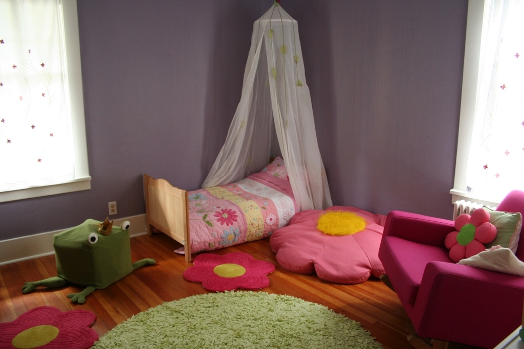
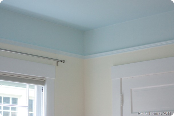
So this is where we are today. You will notice that the existing purple walls don’t quite fit in. The main problem with them is that the room is north west facing and so is quite dark during the day so I want to lighten them up quite a lot.
These are the options I’m toying with at the moment.
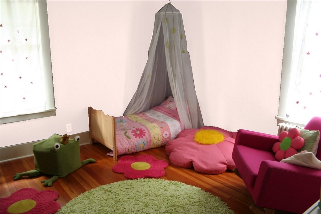
A pale, not too girly pink
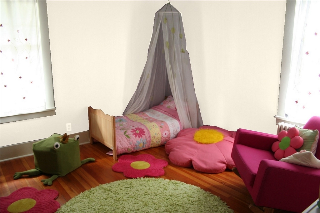
A pinky white
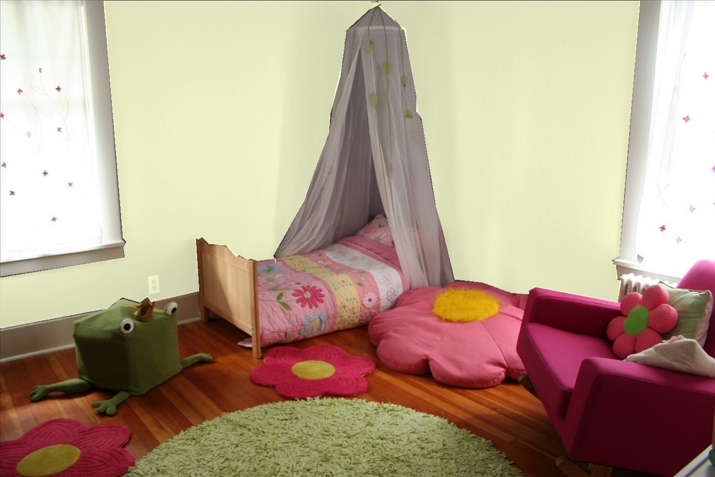
A light celery green
I’m worried that either pink or green would be too ‘matchy matchy’ and the white will be too boring.
What do you think?
I’m also thinking of getting enormous daisy decals from Apple Pie Designs to funk up the walls a bit, either in silver on a coloured wall, or coloured for a white wall. (Check out great posts on Apple Pie Designs on Decor8 and Designers’ Block).
As you can tell I’ve been playing a lot on the Benjamin Moore site today, and was amused to note that they actually have a paint colour called ‘Seattle Grey’.
Which, funnily enough, is exactly the same colour as the view out of our bedroom window this afternoon.


Maybe yellow might be a good choice for the wall too? Give it a try with the programm.
I did try yellow, but couldn’t find one that worked. But yes, I think I need to try again…
Strangely enough, although I detest the colour yellow, that’s what I was thinking too. Or a v pale coffee colour.
I like the pale green but was going to comment that it was almost yellow so not too matchy matchy….
xx
Baby blue… making it like a sky for the garden =)
Baby blue… making it like a sky for the garden =)
Ooooh, pale blue is interesting. That hadn’t even occurred to me.
I’ll mock up yellow and blue and get back to you.
pale orange? I’m going through an orange phase right now, but if not orange then I say the green.
Lavender…a clean pinky lavender
Did you ever get the colour sorted? (in case you’re wondering why you’re getting comments months later, you’ve just been posted on apartmenttherapy — ohdeedo, actually).
Personally, I’m for the light blue. A couple of years ago, I fell in love with some fabric at Old Navy — It was on children’s pyjamas, so I bought a number of them, all the way through the age of 4, so my daughter still wears them today. Anyway, I always wanted to paint a wall in her room in the pattern of this fabric — it was lots of pink, yellow, pale orange and green (flowers) on a light blue background. Would be perfect here.
Hmmm…I hadn’t thought of light blue. That sounds nice – a robins egg or periwinkle blue. I was going to suggest a light lavendar on the blue side like periwinkle. Of the colors you’ve put up, I like the green or the light white pink. But the soft lavendar or blue would be nice dreamy and soothing bedroom color too! 🙂 What is your daughter’s favorite color? You might show her the samples and see which she picks.
Oh, the rug! The green rug! I love it! Please tell where you got it. I’ve been looking for a small green nubby circular rug (smaller than yours) for a little reading nook.
Thanks so much for all your comments.
I can’t use my daughter’s favourite colour. It would be red! Fire engine red! We went to the paint store today and she picked up all the bright red paint chips.
We’ve pretty much decided on sky blue though – thanks so much to all who suggested it – which will tie in with the rest of the house, enhance the ‘garden’ feel and pick out the blue flowers on the Pottery Barn quilt. I’m wondering whether getting someone to paint fluffy white clouds on the ceiling might be a step too far along the road to kitschness… I’ll be writing an update blog post on it later this week.
The green rug is from Target
http://www.target.com/T-Shirt-Shag-Rug-Green-Round/dp/B000LRMYJW/ref=sc_ri_2/601-9863681-5892944
as were the little flower rugs
http://www.target.com/Flower-Rug-Pink-Shaped/dp/B000BKYWKI/sr=1-10/qid=1201995141/ref=sr_1_10/601-9863681-5892944?ie=UTF8&index=target&rh=k%3Arug&page=1
Nice blog!
quite informative, love to read this blog. We are also dealing with all shorts of mirrors such as bathroom mirrors, wall mirrors,
overmantle mirrors witch gives a sensationl looks to bathroom.
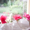
wow great interior i like ink colour, and the pink flowers on the floor increases the attraction…
ya it great work done good colour match and have attracting interior.
i will suggest light blue or ligth green textures to the wall.
Good Idea
For more detail Info Visit: sofa advert
I actually quite like the purple! Have you considered yellow??
James