When we bought our rug from Emma Gardner we ordered the largest we could afford – all the while suspecting that it was really too small for the space. It certainly didn’t work with the extremely heavy curved glass coffee table which we brought from the UK, which we were afraid of even putting on the rug for fear of digging irreparable grooves deep into the pile.
YUKKY ‘BEFORE’ ROOM
So a new coffee table had to meet quite a long list of requirements. Child-friendly obviously – the old glass one had been great for that – and wipe cleanable. Also preferably not wood as I’m not sure how child-friendly that is over time and we already have a lot of wood in the room. And ideally white, as we already have quite a lot of dark wood in the room. I also quite wanted something curvy to detract from all the various rectangles.
After much fruitless trawling round the Internet, we went trawling round some Seattle shops and were amazed to find something we could actually afford in Ligne Roset – heavily discounted because it was a discontinued piece (you can take the girl out of Europe, but you can’t take Europe out of the girl). And remarkably it fit all of our criteria, except the curviness, though that was less of an issue since we’d just acquired such a nice curvy pink chair.
But it was also BIG and we were worried that it would make the rug seem even smaller and more inadequate in the space.
I’m hoping we’ve solved that problem by placing the table half on and half off the rug in what we fondly hope is a Rothko-esque sort of way. What do you think? Does it work like that, or just look odd?
Here’s Rothko’s interpretation of our living room. Which would look extremely fab over our not so fab sofa. Apparently it’s a snip at a mere $72.8 million, or the Husband has just offered to paint me one himself.
Here’s my list of what still has to be done in this room.
- Get rid of the egg yolk yellow walls. We have a couple of quotes from painters to paint the whole house, so I just need to finalise the colour palette and we’re set.
- Replace ugly front door that opens right into the room.
- Do something about all the ugly TV and stereo equipment
- Get cushions for the sofa (I’ve got some ideas for cushions I want to make)
- Sort out curtains for the front window
- Sort out the lighting
- Organise the beautiful built-in book cases a bit better.
- Find beautiful piece of artwork to go above the sofa, unlikely to be a Rothko
Unfortunately, because of a certain someone, we can’t replace the more-shabby-than-chic sofa just for the moment.
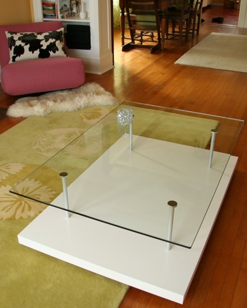
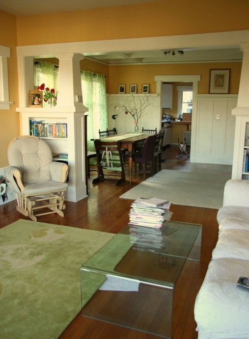
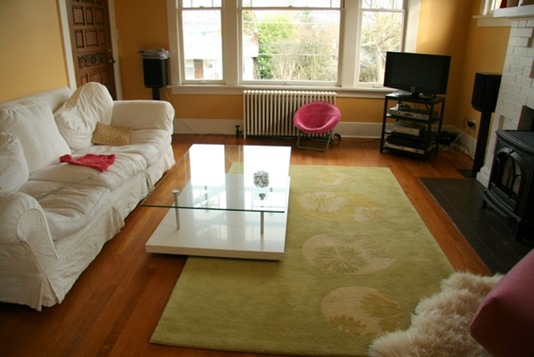

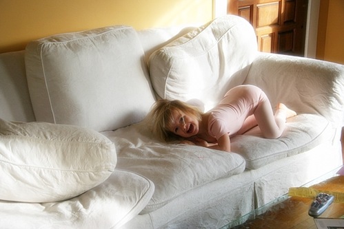

err, odd. Just my opinion.
And please don’t get rid of sofa. It’s just about the only remaining thing I recognise.
Lxx
In one of my design classes, the prof was adamant that furniture must either ALL be on the carpet or ALL off of it. As in, you couldn’t even have one chair on if the sofa was off and so on. The class went apeshit when this was discussed, but she was firm.
So, yes, I think she would take particular issue with this placement, but if it’s working for you – all the better. Have to know the rules to break ’em, etc. and amen.
Also, just curious as I have no kidlets, how is that new, gorgey table of yours child-friendly? Seems mighty sharp-cornered to me, but again – I have no kids and live in fear.
Yes, I’ve heard the ‘all on or all off’ rule before, but the thing is, when I’m actually in the space it seems to work – something about all the overlapping rectangles, which makes it interesting. Which is why I’m intrigued to get everyone’s thoughts on it. And knowing it’s a RULE does make me want to break it all the more if I can… 🙂
As for the child-friendliness, I wouldn’t have the table if the Minx were at the cruising stage ie. pulling herself up by the furniture and using it to prop herself up as she walks, you’re right, too much danger of banged heads. In fact the curved glass table above was what we bought the minute she started moving around the room and it worked brilliantly – no sharp corners, completely immoveable and also easy to wipe clean of food, spilled drinks, pens and dribble. We had the odd bonk, but the only way to avoid that would be to have no furniture at all.
Now the Minx is three though, she’s pretty much as steady on her pins as an adult and three times the height of the table so my worries are more for the table than for her 🙂
Anything wood would have ended up scratched and stained in no time, whereas glass is easy to keep clean. And the Minx is able (as she frequently proves) to slither between the top or bottom of the table and climb all over it without damaging either it or her.
Your room is coming together beautifully – well done
That rug looks nice and thick to me – doesn’t it mean table is uneven? It’s keeping me awake at night…
I love your rug!!
Regardless of “the rule” and since you asked… I think position appears odd. As in uncomfortable, not quirky. Due to thick rug. In the photo, it feels like if you are sitting on the sofa with a cup of tea and/or book and place either or both on the coffee table (side closet to sofa), the coffee table would tip over.
But I really do love how the place is coming together, Paola!
Just so Lissie can sleep – yes the rug is thick and the coffee table was uneven when we first arranged it like that, but we solved the problem by putting castor cups under the castors on the edge closest to the sofa. It’s now completely flat and very stable, though I realise that my camera lens has somehow made the whole room look curved in the third pic down.
Well, I have to agree with the other comments and though I am not a “stickler” for rules, I think the table location is distracting. It makes me feel uncomfortable and my eye is drawn only to the table instead taking in the room as a whole. It looks as if someone moved the table in order to clean the rug and forgot to put it back properly.
Maybe if I saw the room in person, it would look better than what is captured on camera. I still think the most important thing is that if feels right to you!
Perhaps you could use this fabulous rug at a different location and buy an affordable one to fit the space in front of your couch. That is probably not what you want to hear if you have built your decor (for this room) around this rug. It’s just a thought…
No really thanks for the feedback. That’s why I asked!
It’s not going to change any time soon – but at some stage we’re going to have to do something about the grotty rug in the dining area (I was thinking of Flor tiles) and there might be scope to move things about a bit then.
The rug is beautiful! And I love the lived-in sofa…great for watching TV 🙂
Curious what you decide to replace the yellow walls with…?
Thanks Bhavna – lived-in is definitely the right word!
Robin, I’m as curious to know as you are. I still haven’t found THE colour. Definitely the subject of a future blog post.
so what are you going to do with the old the old coffee table…is it for sale perhaps….:)
I have to confess, I loved the earlier coffee table, and I’m not even a lover of lucite furniture.
(And I note it didn’t need any odd positioning, explanations, coasters, etc.) It just fit in gracefully with no fuss at all.
I think the rug is so beautiful it deserves a table equally beautiful and simple.
If you get a vintage wood table, you won’t have to be nearly so distressed by minor scratches, etc., that accumulate in the course of normal living. Anyay, those thing just give wood character. And you are living in a vintage home.
The problem with the earlier coffee table is that it wasn’t lucite, it was a solid piece of glass and thus extraordinarily heavy and would have DESTROYED the thick pile on the rug. If we could have put it on the rug we would have definitely have kept it.
As for wood, unfortunately with the Minx it wouldn’t have beeen a case of ‘minor scratches’ but lots of spilled drinks, smeared on food and felt pen stains which would have given the wood more than character I think. It is amazing how much mess a three year old can generate.
I think mixing modern things and vintage homes is a much more Brit thing – contemporary design is bigger in the UK and since we very often live in homes which are over 100 years old we just mix up styles with gay abandon. I’ve noticed that Americans are much more respectful of vintage character and more likely to keep everything to a particular period or style. I’m definitely going to write some blog posts in the near future about the differences between UK and US interiors.
Thank you for all your comments – I’m finding this discussion really interesting and helpful – and please don’t feel you have to be ‘Anonymous’ if you want to post something critical.
nicoNicole, I’ve emailed you…
It’s not that the new table is “modern” and the house is “vintage”–both tables are “modern”; I just loved that first one. It had a natural, graceful quality that I think the new one lacks. But safety first, definitely.
If you get an old enough piece of wood furniture, it will withstand food, pen stains, all that stuff–in fact, it will be more impervious to them than new wood furniture. It the real old stuff, that’s been through decades of polishing and cleaning and patinizing, that is the toughest.
This looks great. I don’t suppose you kept your old coffee table and are interested to selling it to someone in Seattle also? Funny, huh — that’s one I’m looking for!
(This is Mary T. from Shelterrific via my pseudonymous Typekey account!)
New coffee table is great! Can I ask what make it is? would love one….
Excelent blog If you want Quality Castors of any sort, just visit Us here at http://www.internationalcastorcoltd.co.uk
i like the look of your decorating if u need any more work doing on your house checkout the tradesmen on our site
the new table look much better, i really like the nice big old style radiators u have too very retro!
Your coffee table seems to be missing the proverbial coffee table books – you can easily create your own. I’ve used http://www.familymemories.com/ photo book software to create 5 books – the quality of the printing is amazing and I would fully recommend them for creating a coffee table book, wedding book, family photo book or whatever. Great stuff!
Hi
i recently visit your post i found some great designed of table which is very impressive me i want to buy but i have no idea how to do this please help me.
http://www.wood-orangery.co.uk/
It really looks comfortable in your room. The design was very eye-catching and for kids. Thanks for the post. I love it.
To protect your floors from any scratches and damage consider appliance movers and other floor protector to preserve the beauty of your floor and able to last for a long time.