Kitchen Wizard

Skaelskoer01

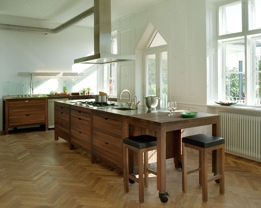
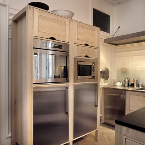
I’ve just found the kitchen (and bathroom) cabinets of my dreams over on Scrappy Girl’s blog.  Danish design company Hansen Living has apparently just made it to New York.

hansenbademoebel01 

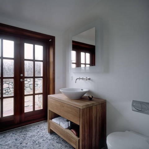
On the assumption that these are as expensive as they look, has anyone got any good ideas on how I can get my hands on a huge amount of money very fast?   (I would imagine getting them to Seattle wouldn’t be exactly cheap either).

hanseninstantkitchen01  hansenindbygningsskab01

Share

glassybaby glasses

I’ve posted about fabulous Seattle-based company glassybaby a couple of times before – I absolutely adore their little votives – so you can imagine how thrilled I was to see in the latest issue of Seattle Magazine that they are now branching out into glassware proper.

These glasses just reek of summer.

image0

I wasn’t so thrilled by the price though. Unfortunately the glasses are going to cost $50 each, so I can’t see me collecting many any time soon. If they are anything like the votives though they will be handblown and of exquisite quality.

(Image from Seattle Magazine).


They also don’t seem to be up yet on their website. In the meantime here are some gorgeous pictures of the original glassybabies to drool over.

(Images from the glassybaby website).

CRW_2964v2_web

brown_multi

fertile-067  

It appears from their blog that next Saturday(21st June) they’re holding one of their regular ‘seconds’ sales.  Just don’t buy the colours I’m after. 

Share

Carrie Bradshaw’s Apartment – Love or Hate?

CropperCapture[1]

Love TOO Wallhanging by Paul Smith (seen hanging inside Carrie’s entrance hall, I haven’t been able to find a photo of this in situ)

So there’s been lots of chatter recently about Carrie’s apartment makeover in the movie.  It’s not too much of a spoiler (and by now the the whole world and her girlfriends have seen the movie anyway) to say that Carrie is apparently earning enough from her books to be able to afford an interior decorator to makeover her apartment.

It’s no secret that the producers of the show go to immense trouble to reflect the characters’ personalities and lives in their clothes and surroundings, so it does make sense for Carrie’s apartment to get an update as she becomes more successful and ‘grown up’.

The most obvious change – which really stood out in the cinema – is the colour of the walls throughout the apartment (custom-mixed, but apparently a close relation of Benjamin Moore’s Electric Blue). It’s a pretty colour but I thought it was just a bit too much. I’d have gone for something very slightly more muted and soft and not quite so, er, electric. (It also looked brighter in the film I thought than it does here).

SC_07833_preview

Carrie’s apartment AFTER

Her bedroom has been hugely smartened up.  The blue walls and white trim really bring out the brown floors, which again unify the space throughout the apartment and stop the blue from being too overwhelming. I also really like the billowy curtains, which soften the space and, because they are hung to each side of the window, really make the windows seem more imposing. However I really don’t like that bedspread, which looks like something you’d find in a seedy hotel.

I also don’t like the artwall.  Firstly aren’t art walls a bit over done now? And where did all this art come from?  Does Carrie have a secret Etsy/Ebay addiction which has never been mentioned? She’s never shown any interest in interior decor before. Or, heaven forbid, did the decorator just buy up all this art in one day?  And why is some of it tucked behind the headboard of the (rather uninspiring) bed?

carrie_bedroom

Carrie’s apartment BEFORE

SC_07840_preview

Big kudos to the Rug Company – one of my favourite UK design companies – for providing the rugs.  Such a good way of building up their profile in the US.  A big thumbs up from me for the purple one they’ve used here, which is the Overleaf by Marni. However I don’t think it really goes with either with the bedspread or with the little chintzy floral couches.  I’m all for mixing patterns – and on their own the couches are lovely –  but these patterns don’t have any relationship to each other at all, and if you’re mixing patterns I think there needs to be some sort of unifying thread (and throwing in a blue ikat pillow doesn’t really help matters).

SC_07829_preview

The huge TV seems hugely out of place here.  When does Carrie ever watch telly? Unlike Miranda, when you see her on your own she’s reading a book or magazine, which brings me to another bugbear.  Where are Carrie’s books? How is she going to reach her magazines? And where is the hugely comfortable chair/sofa for curling up and reading? Those floral couches are meant for perching, not snuggling.  And if she is going to settle down and watch the enormous telly, is she really meant to sit bolt upright on that incredibly uncomfortable-looking white chair?

I also wished that they would have kept a few of Carrie’s familiar old things around.  One of the key components of her personal style has always been her ability to mix new and vintage stuff. So wouldn’t she have kept that great coffee table and credenza?  And was it callous or inevitable that she ditched Aidan’s chair? And why not keep the fabulous Bakelite phone?

carrie_livingroom 

I suppose ultimately my complaint is that while it is definitely a much more beautiful apartment, it ends up not being Carrie’s apartment. All the personality has been sucked out of the place and replaced with interesting decorator pieces (and product placement opportunities).

What did you think?

Share

Go Fug Your Room

image0-1

This room graced the March cover of Elle Decor magazine and I hesitate to include it as a Go Fug Your Room candidate because I like the unusual colour scheme very much indeed.

But I looked more closely and realised that I didn’t really like any item in this room.  Every piece is just that bit too ornate and fussy for my taste. Too much piping, gilding, carved wood, embroidery, stuffing, inlay, pattern and stuff.  Each of these pieces would probably work fine on their own as accents amongst plainer pieces, but together for me they all add up to just, well, too much.

I’m intrigued to know what you think, as I suspect that this room is really more  ‘American’ in taste and I’m planning some blog posts about the differences between US and UK interior design. 

Here’s the poll – if you feel like saying where you’re from in the comments that would be great.

Share

Go Fug Your Room – Betsey Johnson

This next room should please the 84% of you who thought that the Kelly Hoppen-designed room was too bland and soulless and lacking in colour and nicknackery (which begs the question how on earth is Kelly H so successful?).

US fashion designer Betsey Johnson’s maximalist apartment was featured in last August’s UK Elle Deco and has since garnered a surprisingly positive reaction around blogland.

I have no real idea who she is, beyond what I’ve read on Wikipedia though I did like what I saw of her last collection.  She looks like she’s trying to be ‘zany’ in a Zandra Rhodes-ish sort of way and ‘more is more’ is definitely her byword, when it comes to home furnishings at least.

image0-1 image0-2

image0-3  image0

image0-5 image0-6

I do like the mix of romantic French and vintage mid-century pieces and love the idea of accenting pink with yellow, but surely this is TOO pink? It’s not even a tasteful pink but bubblegum pink.  Mixed with fuschia.  With a pink shag carpet.

And am I the only person feeling sorry for the person who does the dusting? And who is getting mightily bored with Arco lamps? (Though I presume Betsey might have acquired hers from Andy Warhol rather than Ebay).

Is this room fugly?


Share

Go Fug Your Room – Kelly Hoppen

With apologies to the Fug girls.

I have been discussing with Elaine from my new BFF blog Decorno the importance of having opinions, of which she has many very forthright ones.

As a cynical Brit I do find the ‘hearts and puppies’ stuff you find on some other blogs a bit difficult to cope with, so I’ve been thinking for some time of doing a ‘rooms I hate’ series on here.  Though I was gutted to find that Elaine already does this (and much better), if you want more snark.

But I digress. Today’s room is from the doyenne of British interior design Kelly Hoppen.  Ms Hoppen has built an empire on designing rooms for people with so little personality that even colour is considered to be freakishly avant garde.  She has even produced a range of beige paint. Her rooms shriek ‘good taste’ so loudly that they end up having not much taste at all.

  image0-1image0

This example from Homes and Gardens is apparently part of a new London house built for an American client.

I have to say that I do like how she plays with different textures within the neutral palette, and her signature black wenge floors and the subtle pleated pelmets at the top of the curtains which work in a room this big and imposing.

But everything, from the immense table, to the huge black armoire and the heavily bevelled mirror is just so stolid; and a room without colour would drive me me mad in about thirty seconds (just one little hot pink flower arrangement somewhere PLEASE); and I hate that this is a brand new house but filled with repro details; and the way the knick knacks have clearly been bought in by the yard and there’s not a single thing in here that is treasured or has history. And most of all I hate that the chairs are wearing dresses.

Didn’t chair dresses go out in the 80s?  Weren’t they just things in ‘Ideas for Soft Furnishings’ books that no one ever made?  Or if you did make them it was to disguise the fact that your chairs were all mismatched and rickety and came from a junk shop?  Which I hardly think is the problem here, since the table apparently costs upwards of £50,000. And the wonky seam on that chair with its back to us is driving me nuts.

What do you all think?  Get dissing discussing in the comments.

Share

Atonement

I finally got to see Atonement last week.

A great film, which stayed with me for days afterwards – always a good sign.  A wonderful performance by the girl playing the young Briony Tallis and even Keira Knightley managed not to set my teeth on edge too much.  And James McAvoy is of course very easy on the eye. In fact the whole film is ravishingly shot – it must win Oscars for cinematography if nothing else.

It was also a very faithful adaptation of Ian McEwan’s book and managed to conjure up the same atmosphere with images and sound that he does with words.

The evocation of a hot, humid, sticky, oppressive English summer’s day is particularly well done in the film. This article is well worth reading as it explains how the set designers went about creating the atmosphere of an overblown, high summer day, just tipping into decay, by adding lots of green to the set (including, obviously, Keira’s iconic green dress).

Stokesay Court was the house used, unusually, for filming both interior and outside shots, and it appears to be a fabulous example of Victorian nouveau riche excess and lack of taste. 

Every single surface is overloaded with pseudo-Elizabethan, Jacobean, Gothic, you name it ornamentation and really serves to heighten the sense of brooding oppression and of a rigid class system which the war is about to tear apart.

This article from the Daily Mail gives a really interesting history of the house and also tells how production designer Sarah Greenwood chose the house for its dark, stolid wooden inner hallway – the dark heart of the house and evocative of the story’s dark heart.  (Cue lots of scenes of Cecilia and Briony swishing up and down the staircase).

It also explains how one whole (ugly) wing of the house was photoshopped (or whatever the movie equivalent is) out in the film.

All photos from the Stokesay Court website.

Share

Hardcore Real Estate Porn

I bet that title increases my blog traffic…

Here’s a gratuitous pic of Coutney Cox-Arquette’s Malibu beach house which has apparently recently be sold for $33.5 million.  Picture fromThe Real Estalker.

One of the very nicest things about getting comments here is that I get introduced to commenters’ blogs and thence to fabulous gems like the Real Estalker where I have just been wasting an hour or so of the Minx’s precious nap time researching new house ideas.  Many thanks to Audrey for the new blog fix.

Share