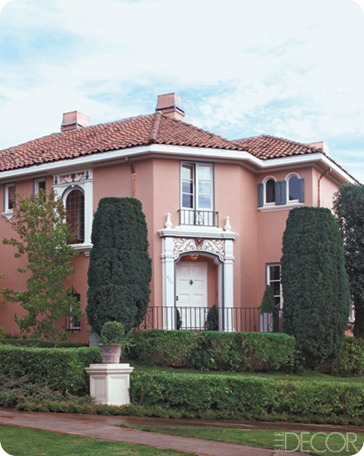
Elle Decor recently created its first showhouse in a San Francisco suburb – working with ten different Bay Area interior designers to ‘turn a classic 1920s Mediterranean-style home into a showcase for contemporary style’.
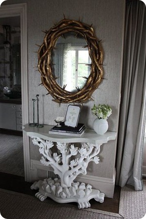
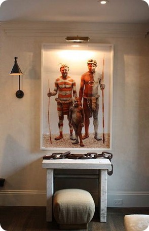
That’s some beautiful house isn’t it? Unfortunately these designers seemingly run the gamut of decorating styles from boringly humdrum, via fussy and old fashioned through to suicidally depressing, and managed to transform the house into something not only monstrously ugly, but, to my eye at least, not remotely representative of San Francisco style.
I’m really interested to here what Bay Area peeps in particular think of this.
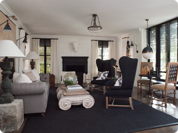
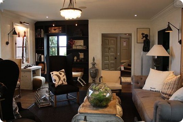
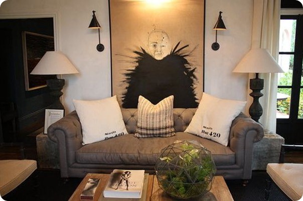
The living room was created by Gary Spain, and all the heavy, gloomy clutter, weird artifacts and strange cross-cultural references makes it look like a junk room at the British Museum. And those dark wing-backed chairs would make even the Dowager Duchess of Downton uncomfortable. In fact the whole thing looks about as relaxing as a dentist’s waiting room. Like the black fireplace though.
 |
 |
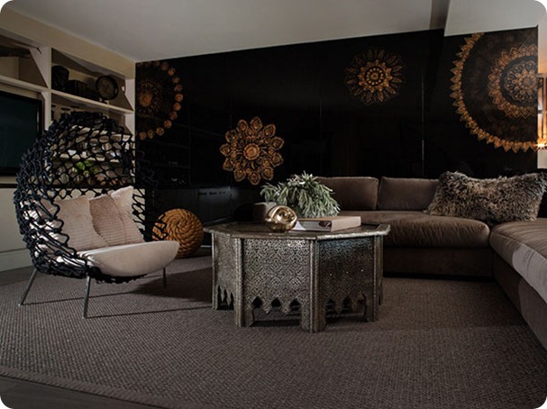
The TV watching area of Erin Martin’s media room below at least has some wow factor – I like the screen and that curved chair - but all the darkness is making me want to switch on my lightbox. Does all the black really say San Francisco to you?
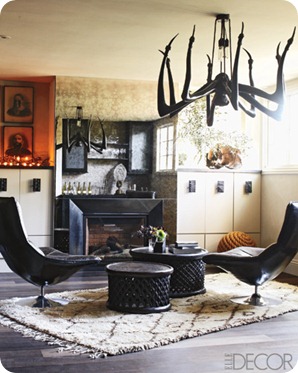
The other end of the room with its huge spider (is that what it’s supposed to be?) light fitting and hideously uncomfortable seating area and mirrored fireplace is, however, the stuff of nightmares.
 |
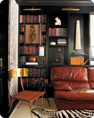 |
If the unremitting terror and gloom is getting too much then you can always escape to Will Wick’s library. Except that is probably the most scarily gloomy and depressing room of all. AND it has a zebra-stripe rug. Seriously didn’t that decorating ship sail a very long time ago? But no matter, it also features a helpful saw thingy in an alcove, making it super easy to kill yourself, or at the very least add authenticity to games of Cluedo.
 |
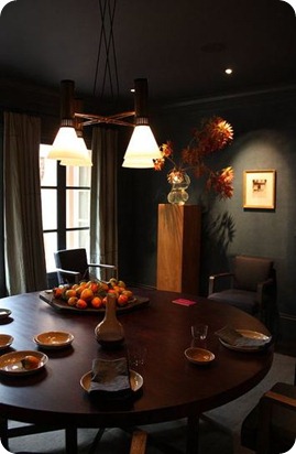 |
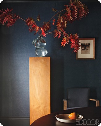
Steven Volpe’s dining room is another unremittingly cheerful place – you can just hear the stylist yelling for ‘oranges’, ‘maple leaves’ ‘ANYTHING’ to relieve the gloom. But at least you know that extra light bulbs would make a thoughtful hostess gift.
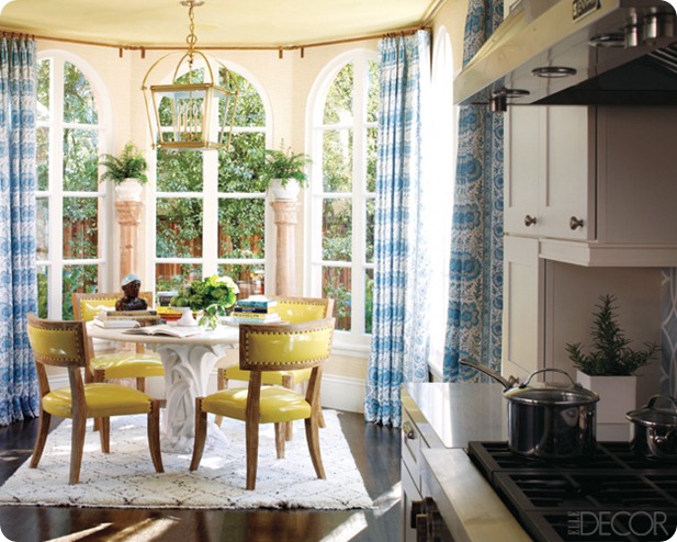
The house’s vampires should avoid the breakfast nook decorated by Palmer Weiss, as here at least the sun is visible and the chairs are lovely. But the birdcage light, ferns on columns and busy curtains make this look contemporary to 1911 rather than this century. Or is Downton Abbey spearheading an Edwardian revival?
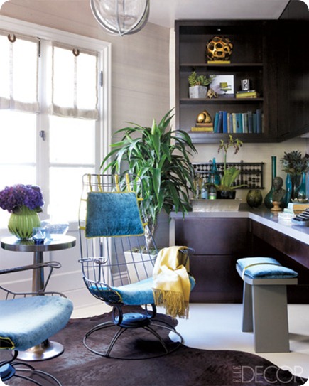
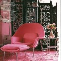
And I’m so relieved to see a little bit of colour in this home office designed by Kendall Wilkinson, that I’ll forgive it its totally impractical and uncomfortable seating.
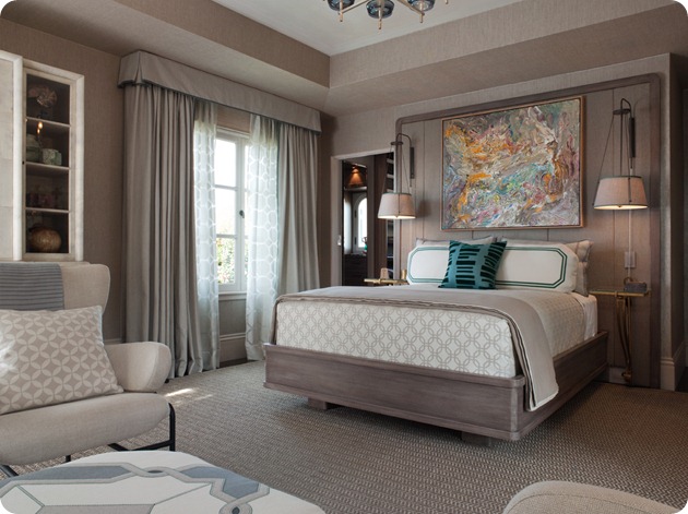
I suppose Jay Jeffers master bedroom is not too bad in a personality-free luxury hotel sort of way. I do like the artwork above the bed and the interesting bedside lamps. Note that the turquoise bench at the foot of the bed provides a little pop of colour, but mysteriously disappears in the image below.
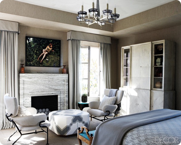
While the Dowager Duchess would be right at home in this guest bedroom by Suzanne Tucker. Contemporary style, really? Really?
 |
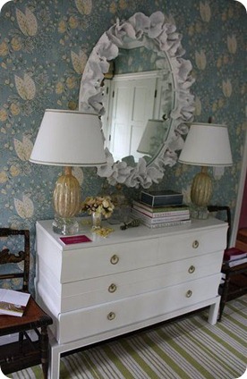 |
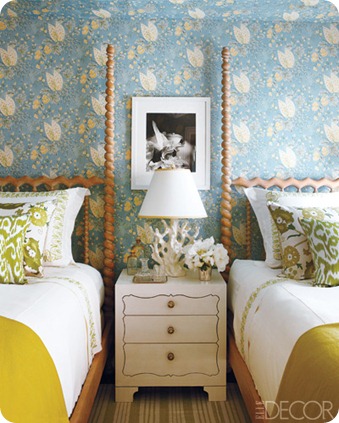
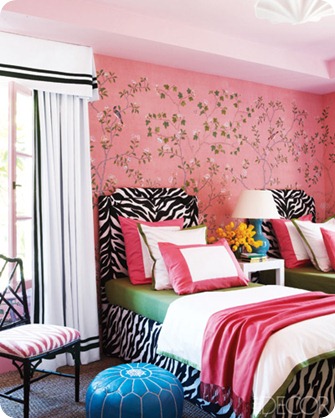
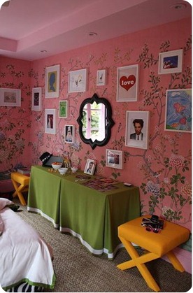
The decorating cliches are back in force in this room for a teenage girl, with more zebras, and a brightly coloured Moroccan pouf. And I’m sorry, but covering up a stunning De Gournay wallpaper with framed pictures of RPatz has to rank as one of the worst possible decorating crimes against humanity.
 |
 |
So what say you? Does this house showcase the best contemporary design in San Francisco and the US? Or is it just fugly?
Pictures from Elle Decor, Casa Sugar and Merida



I totally agree…I’ve been seeing this house around the blogosphere and I can’t stand any of it. That spider light thing would make me leave the house.
Gotta agree – I wouldn’t want to live in any of these rooms. Although, it would be pretty easy to fall asleep in that beyond boring bedroom but, it wouldn’t be a comfy, cozy sleep.
Wow…before I read your post…I thought WHAT has happened to this woman …I thought she had style…Phew!
I think you nailed the not-SF vibe in this house. Have the designers never been to the area (in winter) before? Yikes!
I fiercely despise every single room. Is hideous the new gorgeous? Unforgivable what they did to this place.
I get the dowager part, but does she know her creepy macabre son has turned the rest of the house into an haute sex dungeon? My grandmother, who lived in Pacific Heights with matching curtains and bedspread in a tasteful green and white pattern for 40 years, is rolling over in her grave right now.
Yikes! I do like some of the furniture pieces though, like the yellow kitchen chairs and the curved chair and coffee stand in Erin Martin’s design.
But yikes!
You ladies are FUNNY. Tiffany, I bow to your superior knowledge of haute sex dungeons…
Gaudy & ghoulish.
Crap like this is why I stopped reading design blogs. That and owls.
Grim, and I love black. I live opposite De Gournay’s shops and have my own personal drool patch on the pavement outside, but don’t feel that is their best example.
How is it that you keep reading my mind? I was so excited to see the exterior of this house when reading my issue of Elle Decor (I grew up near Santa Barbara and always dreamed of living in a 20’s Mediterranean/Spanish Revival house) and I was appalled to see what they did with it inside. What a crime.
You know, every designer house I have ever been in has made a mess of (usually) a lovely building. When interior designers try to showcase their talents they usually go around the bend. I think they need the discipline of making real rooms for real use in real life. Just an opinion.
Dana, I think you may have a point. This smacks of too many sponsors paying to have their wares showcased. And yes, there’s not much designer self-discipline on display here.
Marquise Lansing
I cannot thank you enough for the article post.Much thanks again. Much obliged.