So I peeked at the latest issue of Lonny magazine this morning. The good news is that it is better than the first issue. The bad news is that it still isn’t very good.
The layout and general design has improved and is cleaner and crisper. They’ve got rid of the fussily ornate boxes round various paragraphs and all the different fonts. The houses featured are perhaps slightly more varied and eclectic – though they’re not exactly ground breaking in their originality. The photographs remain fabulous, and now you can click through to the stockists. They’ve got rid of the execrable fashion pages and the cover is slightly more appealing. In short they’ve worked on many of the things we pointed out when it first came out.
But some major problems remain. Firstly no one is editing the photos. They’ve still got a bad case of the ‘just because it’s online we’ve thrown in every picture we took and you can choose which ones you like best’. 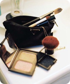
OK, so it’s Prada, but why exactly is this arty close up of someone’s makeup bag doing in an interiors mag? Are you inspired by it? Or could the fact that you can click through to Saks Fifth Avenue from it be making for some clumsy product placement?
And the stylist has been working overtime – everything has been ‘styled’ to within an inch of its life. And I use the word stylist in the singular advisedly, because, with the exception of the Kelly Wearstler hotel spread (which is actually, incredibly, almost OK), every house ends up being full of exactly the same stylists’ tricks.
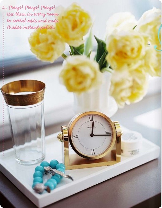
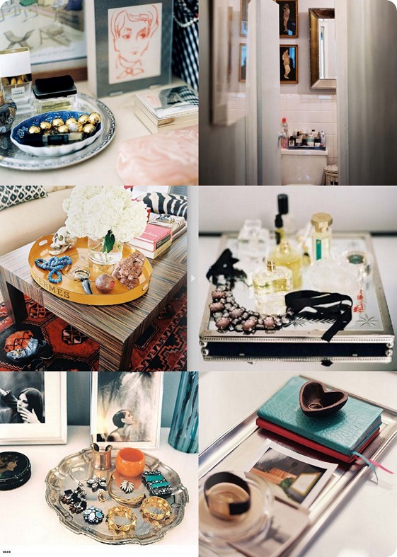
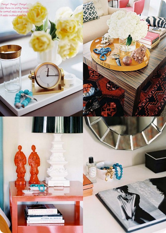
First up there’s, ARRANGE PRETTY CLUTTER ON TRAYS.
The stylist even points that one out for us, and yes, it can be useful trick round the house. But there is such a thing as overkill. (And yes, these carefully styled images of pretty clutter on trays are all supposed to be from different houses).
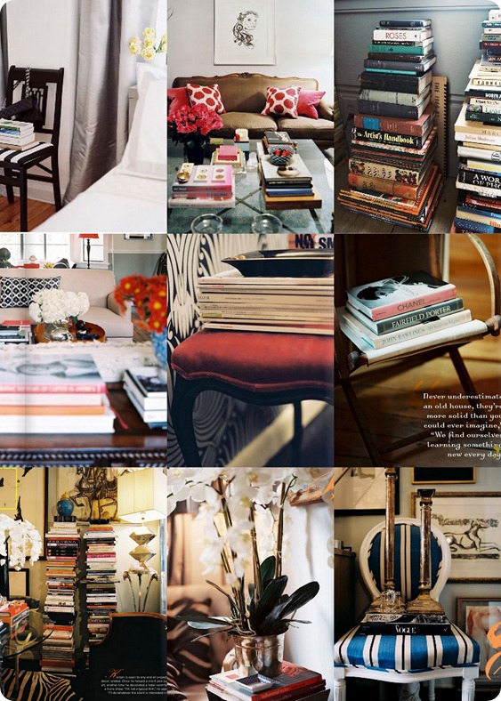
Another trick is PILE UP BOOKS AND MAGAZINES, PREFERABLY ON SOMEWHERE IMPRACTICAL LIKE A CHAIR OR WITH SOMETHING HEAVY LIKE A PLANT ON TOP SO THAT THEY CAN NEVER BE READ. (On this basis my bedside table is a work of stylistic genius). Again this trick is somewhat overused, and again these are supposed to be different people’s houses.
Other tricks I noticed.
ARRANGE LOTS AND LOTS OF LITTLE PICTURES IN CUTE GALLERIES ON THE WALLS
COVER EVERY CHAIR OR SOFA THAT ISN’T COVERED WITH BOOKS WITH CUSHIONS
HANG LOTS OF NECKLACES ON THINGS
but I’ll leave you to find examples of those for yourselves.
In other amazing coincidences. Most of the people whose houses are featured seem to have a penchant for turquoise necklaces.
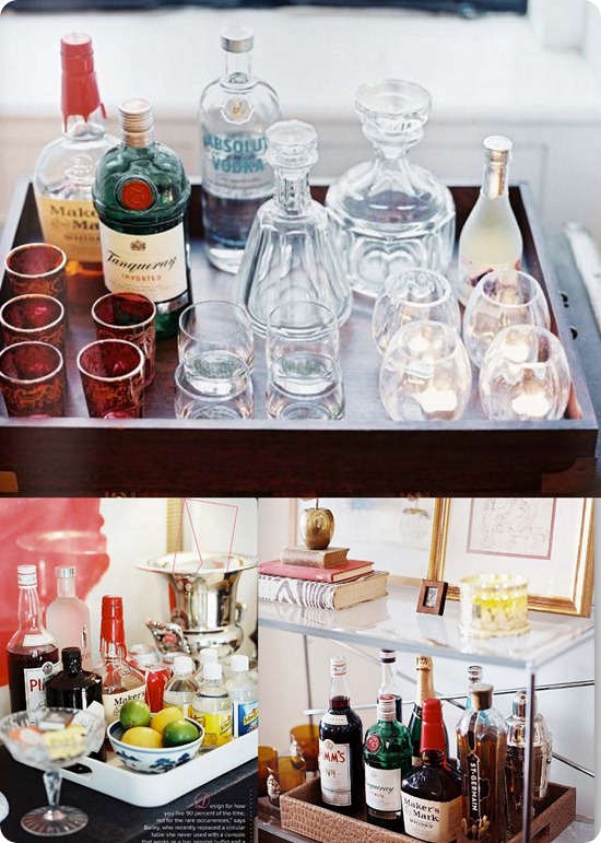
And Lonny people have very similar drinking habits. (Bar trays or ARRANGE PRETTY BOTTLES ON TRAYS is obviously a subset of ARRANGE PRETTY CLUTTER ON TRAYS).
Here are three different bar trays in three different houses. Notice any similarities?
Other spooky similarities include the astonishing love of Ikat shared by the owners of different houses (particularly for Madeline Weinrib Ikat pillows it seems), the love of lucite lamps and light fixtures, and the fact that they share many favourite brands, such as Diptyque and Louis Vuitton.
And therein lies the crux of the problem – Lonny is the product of a husband and wife team (and kudos to them for putting it together), but ultimately it shows. It reflects one person’s taste in interiors, one person’s photographic style, one person’s (somewhat cliche’d) approach to styling, and one person’s hamfisted approach to product placement, which ends up giving it a very bland uniformity throughout. They desperately need to get other stylists and photographers involved pronto quick (preferably ones that don’t have such a love of clutter, even if it is arranged prettily).
Having said which flicking through the pages finding all the amazing coincidences has been the most fun I’ve had with a shelter mag in a long while. What stylistic cliches did you spot?


Amen. Good eye on the turquoise necklaces!
Oh Paola, I swear to god, we all know you like British mags better than you ever liked Domino 🙂
HA! I was very impressed with this Lonny, I found it much improved, mostly because I didn’t see that awful hateful Eddie Ross in it. I like putting a bunch of crap on trays! It’s very Hadley to me.
I have noticed EVERY home mag has some bar set up like that lately – I’m gonna say the latest wave of this can be pinned on Tom Filicia. Personally, if I had all my liquor out like that I’d be an alcoholic, b/c looking at it would make me want a drink. But that may be another issue of my own!
I dig the lack of photo editing, I think it’s one of the advantages of the online format – we get to see it all and then do the editing in our heads.
OK, all that being said, I always love to see your take on these things and it makes me laugh!
Becky
OH, PS, I hate all that disfunctional book stacking too. I actually saw a desk somewhere recently where the “legs” of the desk were stacked books – ugh. I do, however, have a penchant for turquoise necklaces…
He he! I figured new readers round these parts may not be familiar with my anti-Domino rantings 🙂
The thing is, it’s not the things on trays (which I do at home), or turquoise necklaces (which I also love) or the bar trays or Ikat cushions per se. It’s that every single home is styled in exactly the same way with the same stylists’ cliches and the same brands and artefacts. They just need to get some different stylists in to stop it all looking so samey…
Pretty cool site! Just got a great deal from this site on a laptop. Very easyily laid out site too.
Very nice site indeed. Love the clock.
HAYDEN
The bag is lovely! I so look forward to your blog…I read it everyday while I am drinking my cup of tea…I would like to wish the the Happiest of Christmases…Hug the kids, enjoy the day and I am SO happy that you are on the downhill of this Attic 24 Bump!!!Can’t wait to see that new little one!!! Thanks for all the joy you bring to us in blog-land!!
Just stumbled over your blog and think it is hilarious. Especially loved this article about Lonny, though I really love Lonny. I always thought the same especially about the look of the photos and the styling. Already looking forward to hear what you think about the next issue 😉