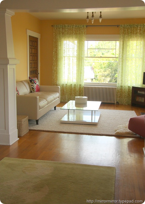
Those of you who’ve spent a long time around these parts will remember that when we moved into our house the living room was painted a rather gaudy egg yolk yellow (with a bright red fireplace, but that’s another story) that turns into a rather nasty mustard-y colour in the evenings under electric light.
For the past three years I have been agonizing about what colour to paint instead. You may remember that I’ve considered every permutation of pink and green but couldn’t find anything that worked.
A big problem is that we’re contending with three very different sorts of light – bright, bright sunlight throughout the summer (the room faces southeast and has windows on two sides); the sort of grey murky gloom that only Seattle can produce the rest of the time and yellow tungsten light in the evenings.
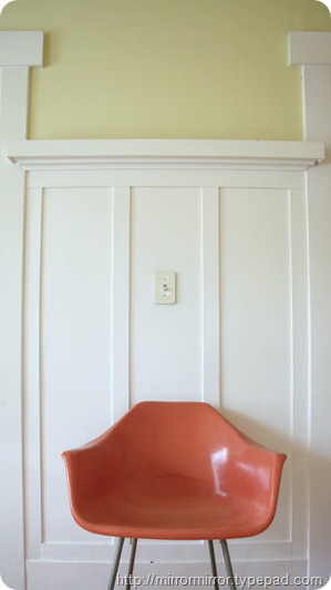
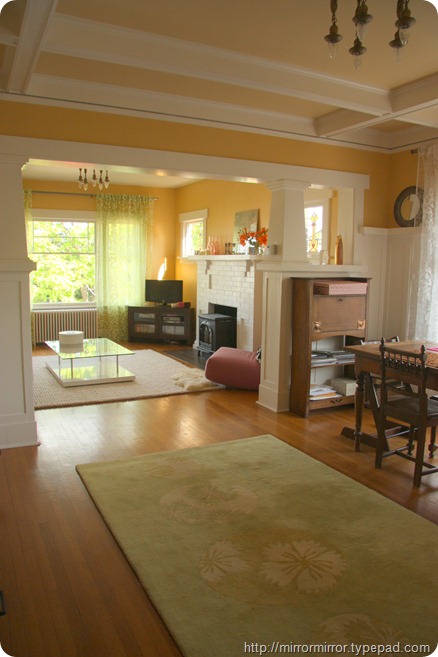
I finally got to thinking that maybe yellow was actually the way to go, just not that egg yolk-y yellow. So I looked for a yellow the colour of lemongrass, just on the cusp between yellow and green.
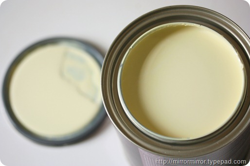
And we came up with Benjamin Moore’s Cypress Grove – which is a cool lactic yellow, the colour of unsalted butter, in the tin
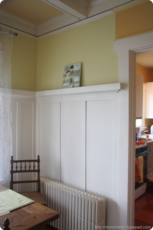
but ends up having a distinct greenish tinge on the wall.
The green looks particularly pronounced in the soft grey light Seattle does so well.
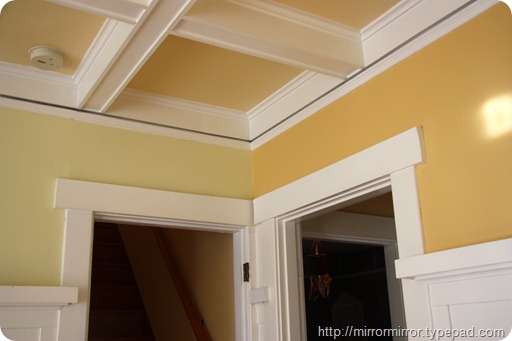
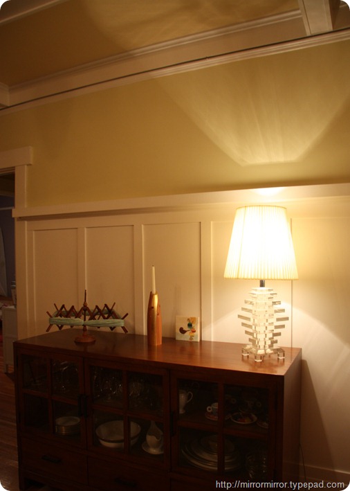
And it looks sophisticated and interesting in tungsten light
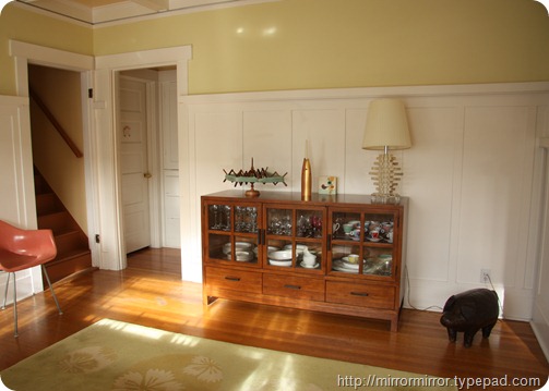
And not too overwhelming in bright sunlight.
What do you think? The Husband loves it but I’m not 100% convinced, though I can’t quite put my finger on why. It seems a little too wishy-washy for me, though I have absolutely no idea what I’d replace it with.
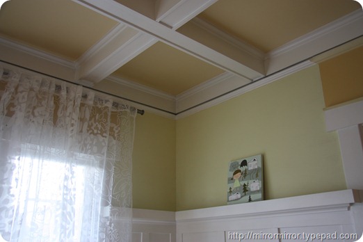
I’m going to keep going with it for the moment as at least it’s hugely much better than what was there before. And it’s difficult to tell as the ceiling is now all wrong and needs to be painted urgently and I think the white of the woodwork is too bright a white.
Anyway, questions for you
– What do you think?
– And would you take that same colour into the seating area or paint the walls there some sort of white?



I like it. I actually like the green tint too. I am over in West Seattle and went with a green shade because it does so well with the extreme changes in light we have. I like that when it is sunny, the color looks fresh and clean (almost like spring). Then when winter hits, the color warms up and feels comforting.
I don’t know if I would go with this color on the ceiling. I seems a bit off….maybe a shade darker?
Looking good!
I really like it – it’s very buttery. I’m a huge fan of the right yellows on walls, and miss my old jonquil yellow kitchen. Right now it’s a sage green that was popular about seven years ago, when my brother went nuts and painted this house in all restoration hardware colors.
BTW, the mouldings in your house are spectacular!
I love that color, and congratulations on finally choosing one. Getting the right color can just be a pain.
I’m with Mr T on this one. V much like the new colour, particularly in the tungsten light when it looks more yellowy. Don’t think it’s too wishy-washy at all. Am not a fan of white rooms so I’d go with the taking the colour right the way through option – esp. as there is such a lot of white with the woodwork. Also agree a softer white would be rather lovely (though not a small job to tackle!).
Thanks all for your insights.
I think it’s growing on me. I actually like the green tint too. It’s exactly what I was looking for,the colour where yellow and green meet. And it does seem to work incredibly well in all the extremes of Seattle light.
Next on the agenda is finding the ceiling colour. Amanda, I was thinking of going almost white there, but your suggestion of a darker colour is intriguing…
i like it because it is an improvement on the colour you already had? not an expert on colours to be honest, but i have to say, love your living room!
If I had a ceiling as lovely as yours I would want it to stand out. The white on white is safe but doesn’t bringout all of the detail of the molding. The yellow is really light and airy but may lose some of that great contrast you have going. A bit dark would be fun. Plus, since the white molding is so wide, the slightly darker/deeper color shouldn’t overwhelm you or make the space feel small.
Hmmm, I do want the ceiling to stand out and definitely see where you’re coming from re. white on white (I had the same thought myself). I’ll do the rest of the walls and then have a think.
A clever friend of mine on Facebook pointed out that the colour is similar to Farrow & Ball’s ‘Hound Lemon’. From my F&B colour card I’d say it was somewhere between Hound Lemon and Pale Hound. F & B are good with palette suggestions, so I may ask them (and Benjamin Moore) for advice.
I like the greenish tinge and would extend it into the other room as well, but you might want to enliven it somehow. Corner details? Dunno – but something. White on white’s an abomination. Agree – the ceiling also needs some color and you could go darker there than on the walls since the molding is substantial.
Can I ask what colour you chose for the white wood work. Is that WImbourne white ?