Well, I was very much liking the idea of a shop window decorating competition, until I actually saw the results.
Three designers, three windows in Bloomingdales NYC, three boring as hell rooms.
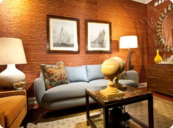
First up The Urbane Traveller by Eileen Joyce for Bloomingdales.
What is it about Americans and brown interiors? It’s something that has really struck me since I’ve been living here. In the UK brown went out with the Victorians – thank goodness as it really doesn’t work with British light – but here it still seems to be the safe colour of choice.
This so bland, so dull, and so generic that words fail me. Except to wonder why a ‘sophisticated travel magazine editor’ would want to have two highly impractical stone orbs on her highly impractical coffee table. Let me know if you see anything interesting in this snoozefest because it’s eluding me.
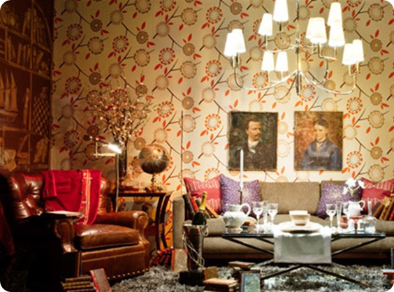
Next up The Writer’s Romantic Supper, by Maxwell Gillingham-Ryan for Apartment Therapy.
This is where I destroy all my (fortunately nonexistent) chances of winning a ‘Homie’ next year.
It is criminal, yes, criminal, what Maxwell G-R, whose taste I normally quite like, has done to that absolutely gorgeous Neisha Crosland paper (speaking of which, we used to stock Neisha Crosland accessories in the shop and we must get some more in).
He has totally ignored all the very wise advice on feature walls you give below – covering it up with two truly horrible portraits, overwhelming it with an astonishing amount of fuss and clutter and turning the whole into some dingy Victorian drawing room, complete with a quite spectacularly horrible repro armchair. I know M G-R said he was going for a ‘steampunk-y’ vibe but honestly it’s because of rooms like his that minimalism was ever invented. And if my beau turned out to have an apartment like that I would feel too agitated and uncomfortable for any ‘romance’.
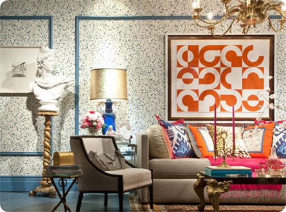
And finally we have The Modern Woman by our old friend Eddie Ross.
And, much as it pains me to say it, I like this window by far the best of the three, though that’s not to say that I actually like it. But at least we can be grateful to him for avoiding brown.
It’s a more modern style than we’ve seen from him before and I really like what he’s done with the cushions, (except for the Miles Redd-ish faux leopard skin), colours and artwork, though the paint speckled walls and everything else leaves me pretty cold.
And of course he has to include his signature Kelly Wearstler–esque bust which seems to follow him around everywhere (see the link above for his house in Lonny magazine). Somewhat unnervingly the muse for this room is described as a ‘media mogul and mother of two’ and yes, every mother I know would just love to have half a hundredweight of statuary teetering on a precarious pedestal with kids around. It’s a lawsuit waiting to happen. Do young gay interior decorators actually ever meet kids?
Anyway, I was too bored/disappointed to bother voting, but if you’re inspired, full details of all three rooms are here. Do you like them?


I like your “Go Fug” features. None of those rooms is pleasing to me. My living room is painted greyish brown though (and I chose the color). You made me think about whether it was boring. But I still like it. I guess Americans do like brown.
I hope you don’t think I’m criticising you! I just find it interesting, as it’s one of the most striking differences I’ve come across between American and European decorating styles. There is lots of brown and ‘earth tones’ used over here, but not so much in the UK. I’m not sure why. Maybe you guys are closer to nature or something. You also use a lot more natural wood and stone in your decorating than Europeans.
What I WAS criticising was the creation of such a very typical room for the window display competition. I was expecting something which pushed the envelope a bit more but instead this is just a very generic and impersonal American sitting room.
Hi! I’m having fun reading your blog, and discovered you via BYW!
I always thought brown interiors were an obsession of the French provinces, my mother in law (with highlight touches of olive velour upholstery) and north american half basement rumpus rooms, lined in faux walnut laminate wall panels.
Whilst traducing my mother in law, when we took Hamish (age 5) to the Imperial War museum mock up of a mid-30s house he loudly piped “This feels very like Granny Edna’s house”, and he’s right – she has artfully layered 1930s drabness onto 1970s lack of character. Perhaps she could help Bloomies out too..
Thanks for posting this, I was searching all over for something like this. Love the wallpapers. Million thanks.
All of a sudden I feel very secure in my skills as an interior decorator. 😆 If they can do it, so can I! rofl
Ha! I tweeted something about how all three looked like a hot mess to me when someone linked to that contest on Twitter. UGH on all of them. (On the plus side, my currently whirlwind-of-crap-on-rye office is apparently high style?!)
Love your site I have added it to my bookmarks.
This is a hilarious blog!
The windows are all 3 quite ugly, although I can appreciate all the artistic risk taking that is clearly going on.