This is why I won’t miss Domino.
For some reason they decided, at the tail end of last year, to give a feature to Eddie Ross, a former Martha Stewart Living editor and very-full-of-himself losing contestant on Top Design who seems to be trying to set himself up as some sort of lifestyle guru.
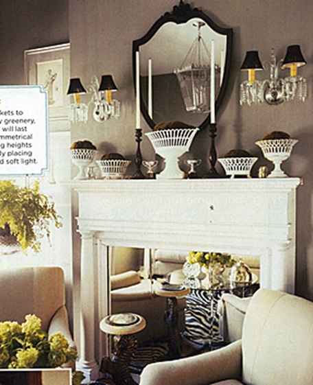
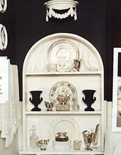
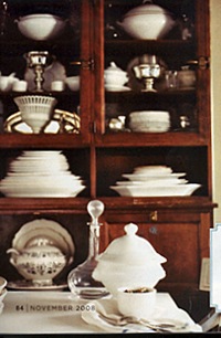
Now Eddie, if you’re reading, I’m sure these are all carefully collected and treasured antique pieces and there’s not a SINGLE PIECE of repro in amongst all this clutter, but where is your flair and imagination? Where are the quirky, original pieces; the unexpected combinations; the touches of wit and personality? And why on earth is everything so fussy and maiden-auntish? You’re only about 30 I believe but there’s not a single thing here that suggests you have had any contact with this century whatsoever.
I say this with love, but piling antiques onto every available surface in a vaguely symmetrical fashion does NOT good design make; Canada Dry bottles and huge rolls of brown paper are not very decorative and I can’t believe you’re still using zebra. And Domino, I can’t believe you thought this was worth showing to us.
I do, however, very much like the colour of the wall around the fireplace.
No poll today. I’d just like the answers to two questions.
1) If you’re a young, happening guy about town, why would you feel the need to decorate your house as if you were Martha Stewart’s GRANNY?
2) When is America going to join the rest of the world in the 20th (never mind the 21st) century and give up its love affair with fuss, clutter and ornamentation? This is a young, vibrant, dynamic country and yet I see so many rooms in magazines and blogs where Queen Victoria would feel right at home. Is it because you just all love dusting?
UPDATE: There’s a discussion going on in the ‘Comments’ as to why Domino is going to be so missed. Can anyone who will sincerely miss Domino explain why? And was it really better in the good old days?
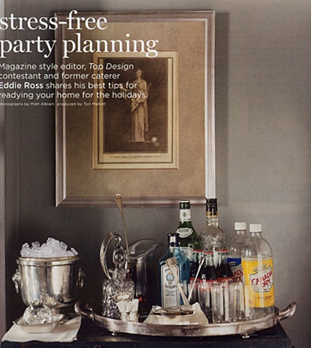
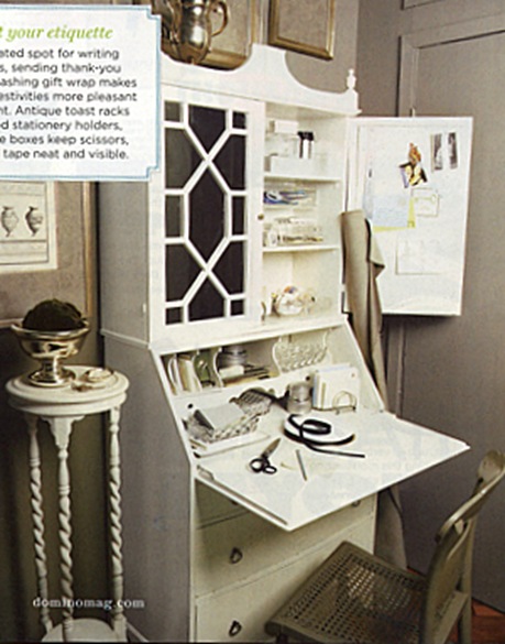


HA! I almost canceled my subscription when I saw they had featured this hot mess of a jackass. The kind of man who gives a judge the finger and spits “SIT AND SPIN.” Who says that, besides a third-grader in 1982?
Every fussy piece in here was personally endorsed by Martha – transferware, collecting white soup tureens, milk glass, silver. I think each one had its own “collecting” column in a MSL issue.
By the way, this place has had a dramatic makeover since Eddie’s Top Design audition tape.
To answer your question, the original clutter aesthetic comes from wanting to display nostalgic items that we did inherit from our real grannies. I think Martha is the ultimate example of someone whose granny did not leave her that stuff, and she very seriously studied the items that Connecticut WASPS had around their homes and emulated the look. I highly recommend “Just Desserts” an unauthorized Martha biography.
I MUST get the Martha book. She fascinates and appalls me in equal measure…
ha! i love you paola.
eddie’s design is super snoozy, however, i do remember him being able to cobble together a decent flower arrangement on top design. that said, he was truly an unsavory contestant. i wonder if martha dumped him after that.
Ha ha ha ! I concur 1000%
I agree re: overdone Victorian “style” and any other overly chintzy/frilly/twee decor that seems to reign supreme in certain houses in North America.
I’m an expat Brit living in Canada and share your pain. I’m not saying that the UK is the paradigm of style (hey plenty of folk in old Blighty still have wallpaper borders!), but I have yet to see a tastefully decorated bed and breakfast establishment in over 6 years this side of the pond !
But from what I’ve seen interiors in Canada are SO much better than on this side of the border (don’t tell them I said so though)… Ah, the wallpaper border…
i never liked Domino, and have never purchased a copy as anything worth seeing is/was posted on the blogs… and it often didn’t impress me
I’ve seen so many posts around the internet in the last week or so lamenting the demise of Domino. Why oh why??
A sad imitation of Martin Miller’s “maximalist” approach to design. If any of you ever get the chance then check out his new hotel in Somerset – Millers at Glencot – for a truly awe inspiring experience. Mirrors and chandeliers hanging from the trees outside start things off with a bang and it just gets better and better. They do a great cream tea to boot!
Lottie, I think it was nostalgia more than anything… Apparently when it first started up(before I got here so I never really saw it) it was much more original in its approach, focusing on real people’s homes and with a fresh, eclectic style that you just don’t get here at all. Mixing old with new and store bought with thrift shop finds is not very usual here.In the last year or so though it had become much more mainstream, with more celebrity designer spreads and beauty and fashion news.
Even in its recent incarnation though it was still the best shelter mag around, if you can believe that. Elle Decor over here is like a more uptight version of UK House and Garden, House Beautiful is full of the maximalist stuff above and Metropolitan Home is just dull. There’s also something called Dwell which I quite like though that is rigidly modernist in its approach.
Lucy, I just looked online at pictures of that hotel online and though it made my skin crawl, I could see what he was doing. Is there really a stuffed stag that swivels its head and sings ‘Sweet Home Alabama?’
I think he was trying to get the Canadian Dry bottles to match the faux candelabras above the fireplace in the second picture 😉 God what a mess!
hah! guess what? i got here randomly by googling ‘go fug’ x
Hi there,
Can i get a one small pic from your blog?
Greatings, Thank you! I would now go on this blog every day!
I like you on facebook and follow through google reader!