As you know I was never a big fan of Domino - I’m becoming more American every day, but nothing has come remotely close to replacing the British shelter magazines such as Living etc and Elle Deco in my heart – but I was looking forward to the launch of Lonny, the online magazine brainchild of former Domino Market Editor Michelle Adams and photographer Patrick Cline.
Issue 1 was launched today and I’m afraid you’ll just have to colour me rather disappointed.
First the good news.
– The online reader tool is fantastic – clear, fast and making it very easy to flip between the pages (though it seems strangely old-fashioned to just duplicate a print magazine online – if you can add hyperlinks, for example on the shopping pages, why not just do it?)
– The photographs are aces.
– The styling, though completely not to my taste, is generally excellent.
– There’s lots to read, with plenty of home tours and not too many ads.
The bad news, unfortunately, is that the whole magazine is a celebration of the fussy, over-ornate, grandma’s old knickers style that dominates American interiors magazines and which I’m sure led partially to Domino’s demise.
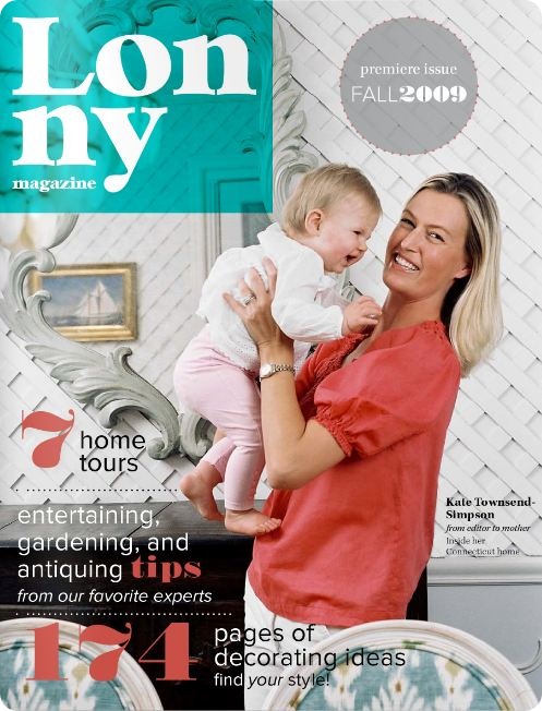
The front cover is spectacularly meh. I know it doesn’t have to stand out on a newstand, but really couldn’t they do better than this? If the cover of a magazine is supposed to tell you what a magazine is all about then this says is ‘fussy’ and ‘mumsy’ (do Americans understand what this means? Should I be writing ‘momsy’ instead?), which is not a decorating style I aspire to.
Inside the layout is full of the multiple fancy fonts, strange dotty lines and fussy boxes which we’ve discussed before about American magazines, though it is less busy and better organized that some.
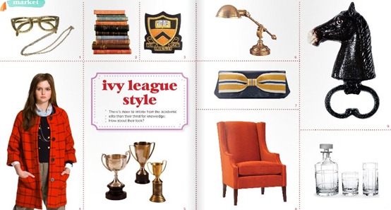
The shopping pages feature some quite spectacularly ugly stuff.
The fashion pages are EXECRABLE. I have no words.
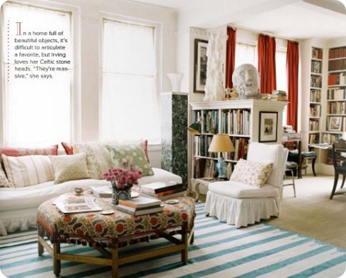
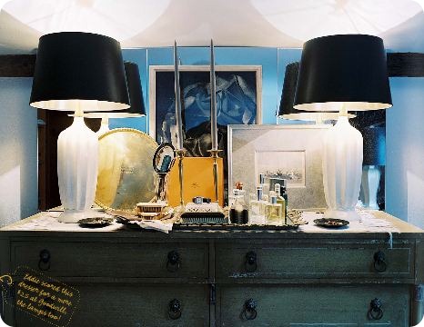
And there of course are loads of rooms cluttered with overdecorated repro furniture and table lamps in every direction (what is it with Americans and table lamps?)
Regardez
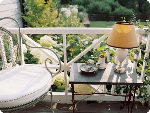
Table lamps outside? Seriously you guys are OBSESSED.
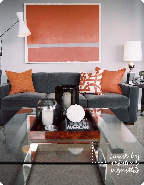
The one more modern home featured is about as imaginative as a Crate & Barrel catalogue
Even the home of Grace Bonney from Design*Sponge, whose taste I normally quite like, is made to look dull.
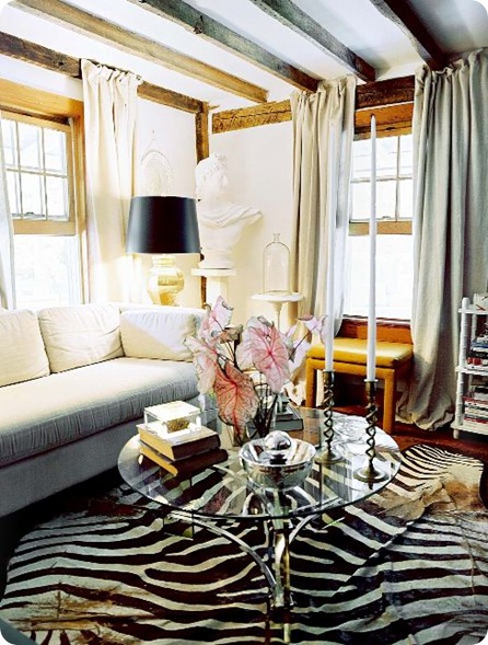
Finally our old friend Eddie Ross is back with his special brand of granny style, featuring even more zebra than he had in his New York apartment and a ton of fuss and clutter on every surface (a shame as the bare bones of his country house look absolutely amazing).
The very best news though is that we now have a great new source of ‘Go Fug Your Room’ fodder. I thereforewish Lonny Magazine many, MANY years of success.
And now, having offended most of the American online decorating establishment, I will go and do some real work.







I think you are right on in your assessment! Thank you for having the courage to say it. I am American and so admire Brit style. Wish we would could have it here in the US. I don’t get it either. Horrible magazine cover!!!
not wanting to be mean, but the layout design looks like it was done by a 1st year design student. with a few exceptions content wise i’m with you too. domino had its moments, but this pub is looks like a poor knock-off of the original.
OK, I was a big fan of Domino, though the last few issues sucked, but this magazine is not offering anything fresh or original, and it has freaking EDDIE ROSS in it – ARRRGGG! I LOATHE HIM! I hope he gets foot and mouth disease for hanging out barefoot around those goats. That stupid cabinet of milkglass and silver and other granny crap looked like a page out of Martha Stewart Living…FIFTEEN YEARS AGO!
Pro: I like the Ruby Green ads.
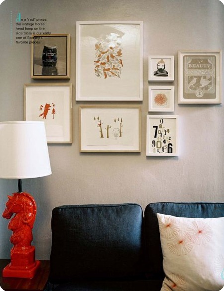
I am hoping to get a nickel for every time I see those black and white IKEA pillows. I mean, I admit, I have them, it’s just funny, EVERYONE has them, even on sitcoms and reality shows about models.
Way to go Lonny, on discovering Burt’s Bees. I mean, they are such a small little handmade indie product that Clorox bought for $925 million like two freaking years ago.
What’s up with the editor featuring herself so much? It’s a little odd. Right from the get-go, I thought “oh no, MOMMY BLOG!” (no offense to mommy blogs, they are awesome for mommies, I just don’t happen to be a mommy so I don’t care about things like diaper genies and nipples and cribs, as I’m sure they don’t care so much about True Blood, martinis and trips to Vegas).
Paola, it’s funny. I saw your post on Facebook, went straight to Lonny w/o reading this post first. Then I came over here and you had written everything I’d been thinking, but you said it much funnier – it totally cracked me up to read your voice. You’re hilarious!
Alright, I’m going anonymous on this one so that Eddie Ross does not find out where I live.
I am feeling bad about EDDIE. I’ll take it down from foot and mouth disease to big doses of ringworm and chiggers. Wishing someone a deadly disease is not my style!
Just simply have to agree with everything you’ve said, I too was not a fan of Domino and wondered why everyone fussed over it. I think I might be upsetting some friends..Oh well!
I was also surprised by how not-new Lonny seemed and blogged about it. Looking around the web I have been shocked at how much love it is getting. So fussy and even less modern than Domino (sometimes) was.
I hate lamps too.
I’m so glad I’m not the only one disappointed.
Snarky, you are a very bad girl – I shall tell Eddie Ross where to find you when he comes knocking on my blog. PS. I do not have the B/W Ikea cushions. PPS. I’m a mummy and I still prefer martinis and trips to Vegas.
apl. Loved your blog post. Everyone go read it, it’s very thoughtful and not as ranty as this one.
i will completely agree with you on two parts – the ‘finds’ pages (pretty boring, minus the leopard print coasters i featured on my blog. don’t as me why) and the modern bachelor pad which seemed very devoid of any character at all, although i do love the combo of grey and orange, and i did like the view from his window (and the fully stocked bar cart). half of it i flipped through fairly easily, but there were some great little details that i loved and i DO miss my domino for its simple, accessible fresh decor… so i’m likin’ me some lonny!
See, it’s the ‘great little details’ that I miss from the UK mags. I can flick through those and come up tons of new and refreshing ideas, but couldn’t find ANYTHING I really loved in Lonny.
But I think it’s mostly a reflection of different aesthetics. Lonny (and Domino) seem to me to be most like Homes and Gardens in the UK which I would consider to be quite traditional in its taste. Elle Deco, Living etc and Ideal Home have a more contemporary style, without veering too far into the aggressive modernism of say, Dwell. Nothing in the US seems to fit into that ‘contemporary with a twist’ niche at all (the closest I’ve found were Cookie RIP and ReadyMade but obviously they both have/had different agendas).
I love design and fashion but trends don’t rule my life. My taste and bank account rule my life.
Too much media design is just plain dull. So impersonal.
I don’t want to visit a show room when I go to someone’s home. I want to visit their home, see the things they love and cherish and see how they manage to get from point A to point B in the course of their day.
This Lonny spread is just blah. It has no character or personality..sorry, but really, how is this a satisfying interior? Where is its soul?
Love this blog by the way.
Hah, hah, hah.
Based on this post, I might forego reading future issues of Lonny and come directly here for your commentary.
To the Brit who opened with:
“Go Fug” your magazine, I say “Go F Yourself” If your favourite decorating magazines in the UK are Living Ect. and Elle Deco. Judging by your sad taste in magazine’s I hardly think you are in any position to be judging anyone’s magazine.
I mean please, Living Ect. I’ve never viewed a more frumpy magazine in my life. In fact the tagline should be “Living-for all the frumps out there” And as for Elle Deco an equally boring rag, it’s very success is predicated on the more well known magazine Elle. Have you heard of that one? I doubt it if your fav. mag. is “Living”. And finally the Brits invented “the granny style” as you put it. Are you familiar with chintz or perhaps Laura Ashley? If those are two “low brow” for you then perhaps Queen Elizabeth will put the whole thing in context for you.
BTW,There are many British magazines that are a joy to read. Red comes to mind. Beautiful photography and paper stock. Perhaps you should take a lot at it.
Finally, Domino was an inspiring magazine because it featured creative people in creative settings. It did something that no other shelter book did and that was to show how real people lived and how they decorated. It wasn’t overly staged.
Yes I have