I've put a question mark here as I actually rather like the very funky, very London, house belonging to British fashion designer Matthew Williamson, which has been featured in both September's Domino and now in January's Elle Deco UK. However I can understand if it's not exactly other people's cup of tea and would love to know what you think.
Personally I love the way he mixes old and new, ethnic sensibilities, colours and patterns and the whole seems very much a reflection of his personality.
I'm not saying I would choose to live here – I'm not convinced I could cope with mirrored armchairs, spinal cord wallpaper, that bright a colour scheme and all the Indian stuff doesn't do much for me – but in the end this is a very personal space, doesn't feel 'try hard' unlike the Miles Redd space below and contains quite a lot of stuff I absolutely adore. It's probably closest in feel to the Betsey Johson apartment we critiqued pulled apart earlier this year, though it seems much less cluttered and the colour scheme isn't so execrable.
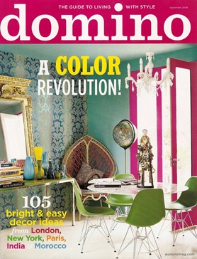
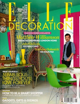
First up the two covers of the magazines provide an interesting Britain v America moment as both publications use exactly the same corner of the dining area on their covers.
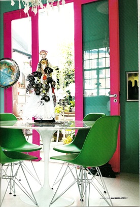
Elle Deco's styling of the room is much less cluttered – no cushion on the chair, nothing on the tulip table, no globe in the corner and less junk on the console under the mirror. The chandelier also seems to have 'disappeared'. I like the pretty boxes they've added on the console and the Fornasetti plate over the mirror is inspired. Interestingly though, Elle Deco has put Williamson on the cover, which they hardly ever do, whereas Domino, which is usually no stranger to cheesey celeb shots for once doesn't have a person at all. Note that Elle Deco has made the room seem far less 'white' by punching up the colour, having the coloured wall reflect in the mirror, cropping away from the white window and er, 'painting' the ceiling. Which cover do you prefer?
{Images from Elle Deco}
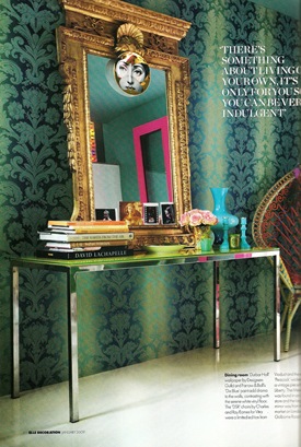
Funnily enough the globe and the table dolly return when Elle Deco shows some interior shots, suggesting that Domino stuck with the original styling. I quite like that Designer's Guild wallpaper and am a sucker for white vinyl floors. And I love the mix of the Eames chairs, the tulip table and that fabulous peacock chair. The mirror is a bit baroque for my taste, but has a nostalgia factor for me as it was apparently bought on the Golborne Road, just round the corner from where I used to live in Notting Hill.
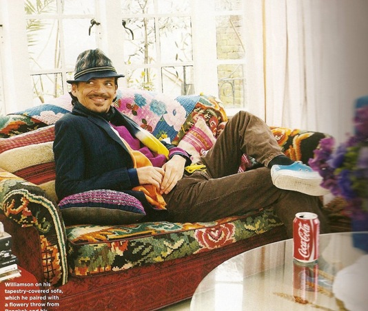
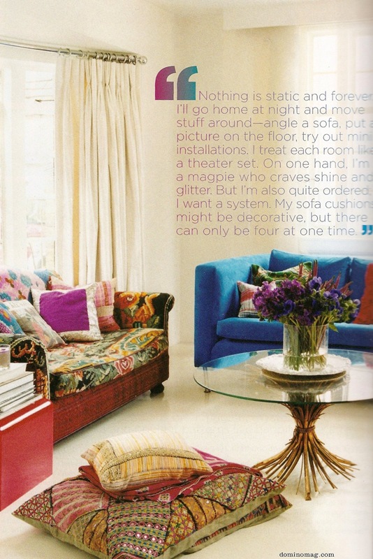
I love what he's done with this sofa. That is all. Curtain treatment is strangely boring though.
{Above images from Domino}
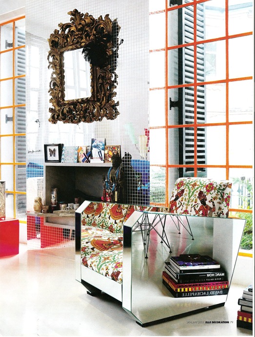
Mirrored armchair does NOT look cosy. Still loving the white vinyl floor. Love the windows and orange paint, not sure about the mirror mosaic fireplace, don't like the mirror, though I see what he's trying to do. Those books sure move around a lot.
Light installation in the stairwell. Best thing in the house. As Rachel Zoe would say, I die.
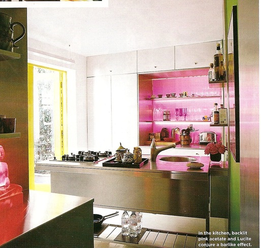
Fuchsia pink kitchen bar area. Personally wouldn't have done it quite such a girly colour. But still rather fabulous.
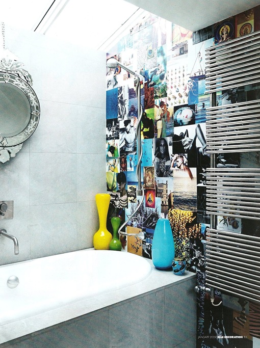
Ha ha! You can tell we're in London from the pokey bathroom. Thought Venetian mirrors with modern had been done to death by now, but like the collage on the wall. I used to do things like that in my teens. Haven't we see these vases before?
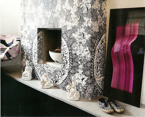
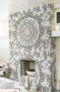 Lovely floral wallpaper in bedroom. Except it's not a floral. Wallpaper design is made up of spinal cords and ribs. I love the effect, but am far too squeamish to have this in a bedroom.





Best post Evah! To me, the fuglier a room the better. It’s conventions that i don’t like. I’d agree with your assessments. I don’t like the fireplace so much or the colors of the room chosen for the front page. I adore the couch and white floor, and everything else puts a grin on my face.
No, no, no! I saw this in Domino and I noticed my very sensitive gag reflex. This is too much. I am all for mixing styles, but this is overkill. I don’t think this makes him creative and inventive. I think it makes him a little crazy.
He he! I thought this would divide opinion…
I wonder if there’s an American/European divide here. This sort of eclecticism strikes me as a very English, even specifically London, thing to do…
Paola, I just love these design posts. Your comments are so entertaining. This one was hard for me to categorize, and none of the voting categories seem right. For me the color scheme in the dining room is way too complementary. Red and green yuck. The Elle picture punches the green to the point of madness, but the fuschia trim crosses my eyes in both pictures. Too. Much. The wallpaper is lovely though, and the combination of modern table and chairs with the William Morrisey print is interesting and fresh. Love the couch completely. It is oddly homey next to the mirrored things. I also love the colored muntins in the windows. The kitchen looks tres euro to me, compact and sleek, but you are right about the pink. The monochrome fireplace in the bedroom is wonderful, whatever the basis of the print, but the pink accents spoil the silvery effect by introducing memories of seventies disco wallpaper. To sum up: couldn’t live there, might steal something.
You know, I agree with you. This is really not my style at ALL, and I would probably get a headache within the first 10 minutes of living there. But he’s not trying so hard to be different, or wacky, or perfect…this is really a genuinely personal space. I can really appreciate it, even if it’s not for me.
Hello,
I’d appreciate if you can give me some feedback on our site: http://www.regencyshop.com and our item hanging Eames Lounge Chair.
I realize that you are home decor-modern design connoisseur 🙂 I’d like to hear your opinion/feedback on our products. Also, it’d be swell if you can place our link on your blog.
Thank you,
Sean
I LIKE IT! Arty & fun! Love the Eames chairs and the multi-coloured neon lights..
greets from France.
Flo
http://blog.reflexdeco.fr
Hey so interesting. I find Matthew plays around with our minds and souls in this space. It seems like a place were you can have some real fun. I am taking a class and want to use Matthews home what concept would you say matthew had when he designed his home?
I much prefer Elle’s tweaking the color. Originally, the teal was too vintage aluminum Christmas tree. The whole room felt — I can’t believe I’m typing this — drab. The dash of macabre and exotic touches reminds me of one of my favorite London museums, Sir John Soanes’ house. I agree that the Dan Flavin-inspired neon light sculpture is the star of this home.