One of my favourite things about the Architectural Digest Home Design Show, and indeed of the whole of #BlogTourNYC, were the DIFFA – Dining By Design show tables.

Every year designers and sponsors are asked to create fantasy tablescapes and then bids are invited to host a table in each of these magical party venues at huge closing gala, with all proceeds benefitting AIDS research.
There were several I would have loved to bid on, though with most I think you would want to keep the hallucinatory drugs and indeed the alcohol served to a bare minimum, because some of these spaces were seriously mind-bending in their own right.
So enjoy the craziness and I would probably suggest that you don’t try most of these at home.
Which are your faves?

I’m not entirely sure how you’re supposed to get at your food under the Perspex here, but this room by the New York School of Interior Design mentored by Shawn Henderson was possibly my favourite.

Mrs AllThingsColourful here also liked this one by Gensler + Herman Miller though the tableware looked a little dull. But the changing colours in the room more than made up for that (see the changes here).
You probably don’t need me to tell you that this was designed by Diane Von Furstenburg for Kravet.


Seriously no wine necessary in this one by Interior Design Magazine, designed by Ali Tayar with Alejandro Cabrera. Some plates would be useful though.


Loved this use of the classic Saarinen tulip table in this room by Knoll and HOK.

This room was designed by Geoff Howell Studio and sponsored by Ottawa, Canada’s Capital. And it showed.

This room by Ralph Lauren Home was dull but pretty in that typical Ralph Laurenish way.

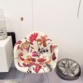
Gorgeous flowers in this room by Carlos Mota for Architectural Digest.

Another great use of flowers here by designer Marc Blackwell.


Loved this moody room designed by Kara Mann for Maya Romanoff, but wow those chairs look wildly uncomfortable.

Finally some cosy seating by Echo Design.

While this table by David Ling for DDC was almost TOO cosy and sort of shapeless. I love those furry chairs though. They look like little sheep.


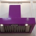
You better be looking good at this table by Skidmore, Owings and Merrill, because the solid gold reflections are EVERYWHERE.


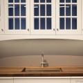
This table by Robert Verdi for Essie was one of the few that looked like it might fit into a home somewhere.

While this room for 3M Architectural Markets, designed by Rottet Studio, looked FIENDISHLY uncomfortable.

This table by Flexform by Soren Rose Sponcer for Manhattan magazine was just rather dull.

T Magazine had put together another paean to discomfort and noise.

The Design Within Reach room looked like a Design Within Reach shop. At least their branding is consistent.

While Barneys NYC missed the memo that they could actually use their imaginations.

I’m not sure why you would want to wear a dunce’s cap on your birthday in this room by the Pratt Institute, mentored by Ali Tayar.

Finally this tablescape by the Fashion Institute of Technology, mentored by Jes Gordone, showed us what dining inside a whale would be like.
I truly thought I had visited and photographed most of the rooms, but it seems I actually missed a lot. If you like these then here is the full slideshow, with some more gorgeous rooms and some different perspectives on the ones I shot (very difficult to take pics here with so many people milling about).


Thank you for posting these and the link to the more complete list. I always find table settings fascinating. It was nice to have pictures from your perspective as well as the official photos.
These tables certainly provide food for thought….mostly thoughts of wtf. I do like the shibori draped room by Kara Mann, although I agree about the chairs. There seemed to be a surfeit of metal legged instruments of torture/chairs in general. The flowers above the Ralph Lauren table also are spectacular….they create a bower all on their own. Overall though, these diningscapes come from the same sensibility that you see in designer show houses….self conscious dazzle without much beauty, comfort or real atmosphere. They are intellectual constructs, not authentic places. It is fun and can be inspiring to cut loose from the requirements and humdrum repetition of home, but few of these create spaces that I would invite my friends to share. They are mostly sterile design exercises quite divorced from the true essence of the table….nourishment of body and soul.
There….I said it. Thanks again for the chance to play in this sandbox.
Wow, what a great comment. And thank you for expressing what I was feeling but couldn’t quite articulate.
I enjoyed these as fantasmagorical art installations, but very few of them looked either comfortable or pleasant to sit at and there were very few places where it would be easy to share a meal or converse with friends. I would be fascinated to know what the people who bid on the tables at the gala auction thought of them after they had eaten in the spaces and entertained their friends.
But I don’t suppose that was really the point.
Right. What is the point? Art? I think it is advertisement, fed by the underlying insecurity of designers vis a vis artists.
I think the point was for designers to enjoy themselves and immerse themselves in the aesthetics WITHOUT having to worry about the practicalities. In fact I think the biggest failures were the ones who tried too hard to be comfortable such as the Barneys one and just ended up being dull.
I do think there’s room for conceptual stuff but it would have been wonderful to see more that worked aesthetically and conceptually, without totally sacrificing the ‘art of the table’.
But then they did also lead to this discussion, which has been fun…
I agree! Thanks again for the chance to consider this stuff out loud.