There’s a great exhibition currently showing at the Vancouver Art Gallery entitled ‘Grand Hotel: Redesigning Modern Life’. I saw it when I was in Vancouver last month and highly recommend it to anyone in the area who loves hotels like I do.
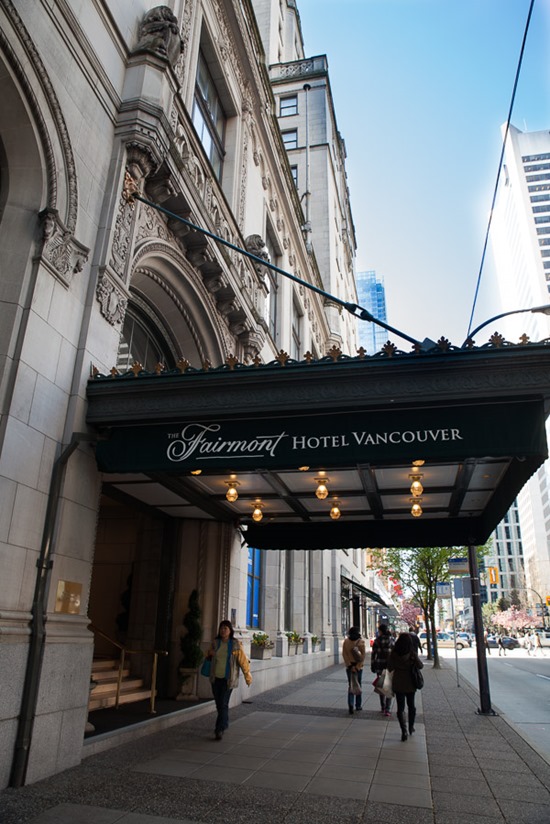
The exhibition traces the rise of the modern hotel, and celebrates hotel design, hotel life and hotel branding (lots of examples from the Ace Hotels funnily enough). It also, not surprisingly, makes a lot of mention of the venerable Fairmont Hotel Vancouver, just opposite the Vancouver Art Gallery and fabulously located in the heart of downtown, where we stayed on my recent visit to Vancouver.
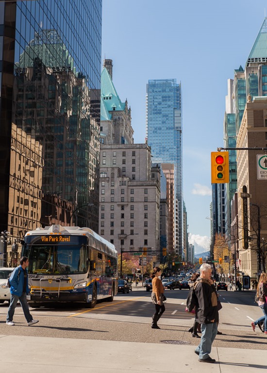
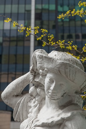
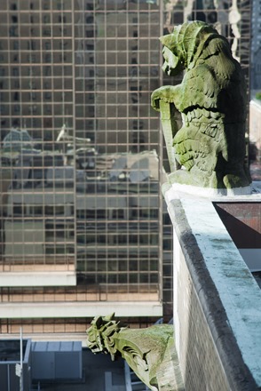
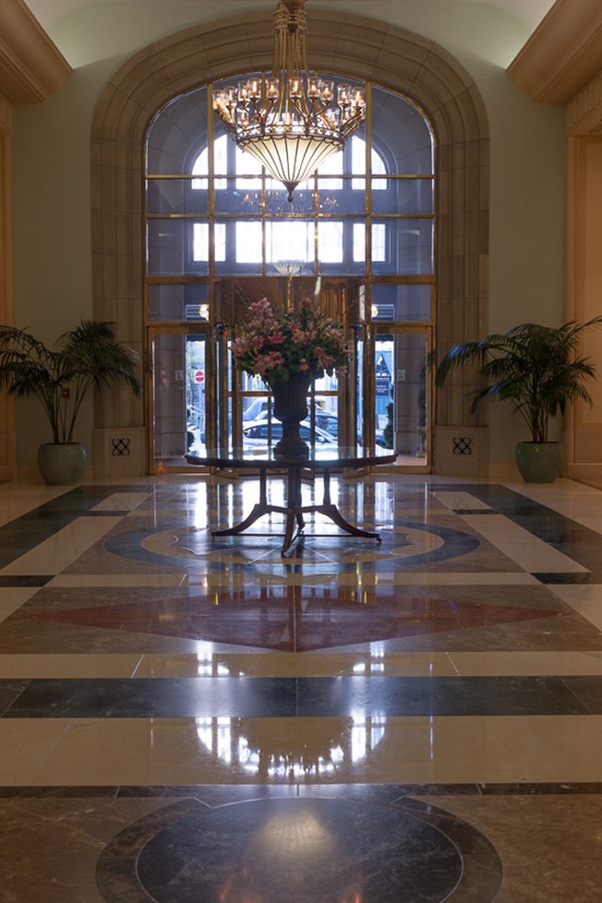
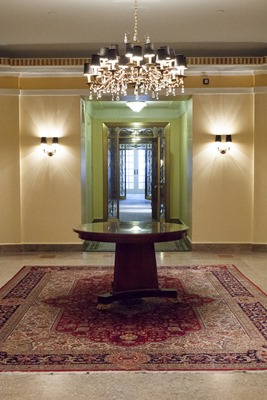
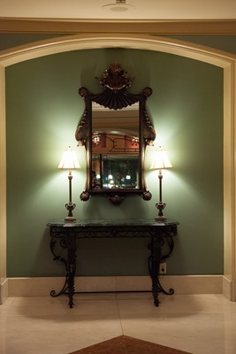
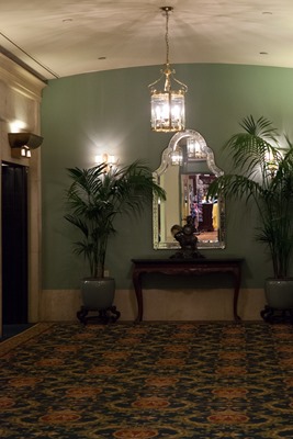
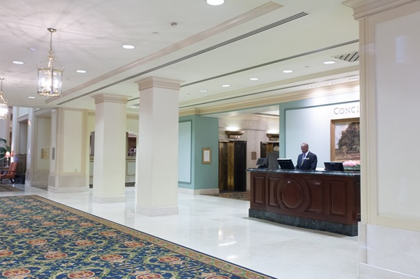
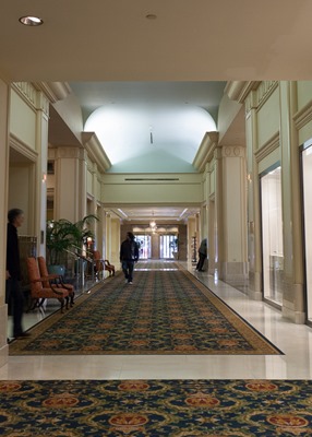
The iconic copper turrets of the ‘Castle in the City’ are nowadays somewhat lost among the other high rise buildings, and its gargoyles and statues look down on a sea of plate glass, but inside it’s just as you would expect – like its sister hotel the Fairmont Empress, it’s a gracious, elegant, timeless example of what hotel living really ought to be.
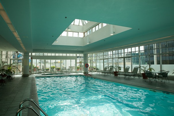
That’s not to say that they’ve forgotten all the modern requirements of a luxury hotel. The pool was one of the best hotel pools I’ve seen, and amazing for a tightly-packed downtown location, and the staff was kindness and helpfulness personified.
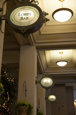
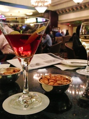
And on a Friday night the downstairs bar was hopping, and serving fabulous cocktails. I had the new-for-Spring ‘Royal Boulevardier’ cocktail, a heady mix of bourbon, vermouth, Aperol and maple syrup, which was delicious, but will get you royally somethinged if you’re not careful. (Click here for a PDF of Fairmont hotels Modern Classics cocktail menu, complete with recipes).
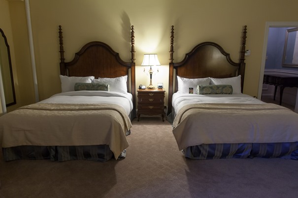
Our room was spacious, comfortable and supremely elegant.
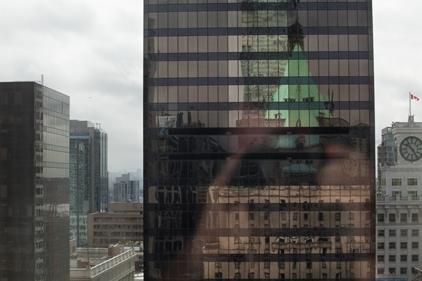
Reflection of the hotel from our upstairs window
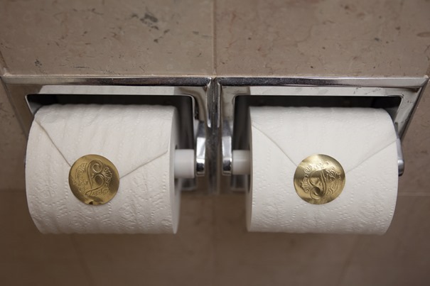
And the gold stickers on the loo rolls made me smile.
Full disclosure: We were given an upgrade to the Gold Lounge in return for a blog post. However, the hotel has has no influence on the contents of this post and all opinions are my own. We just had a right royal time here.
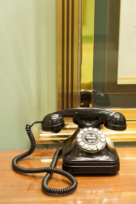
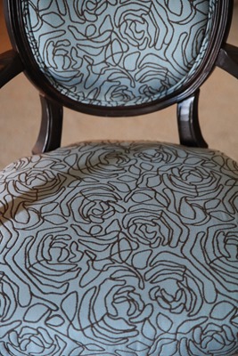
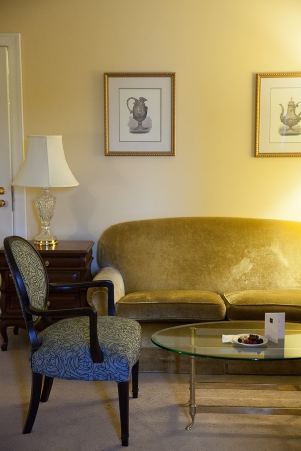
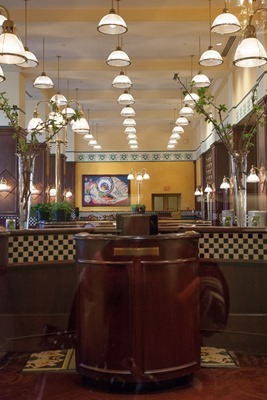

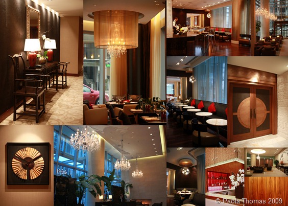

It’s a beautiful hotel, sorry I missed it last time I visited Vancouver. What I like most, was the retention of the original features respecting its age, and also the touches of modernity as with the upholstered chair (b+w squiggle rose patterned fabric) in the suite and the factory pendants hanging in the restaurant. Great photos!
Thanks Bianca!
Yes, I should have mentioned that in the post – I really liked how sensitively they have updated everything, so that everything is in keeping, but it doesn’t feel like you’re staying in a museum. That squiggle rose fabric is gorgeous.