Oh we haven’t done one of these for ages, have we? So let’s get our bitchpants critical thinking caps on and get to work.
My first name, courtesy of my Italian mother, has always been a source of great consternation to me – as so few people in either the UK or America have any clue how to pronounce or spell it (for the record, say ‘Pow-la’ in your best Italian accent and you’ll come pretty close) and I’ve had some pretty creative versions of both over the years.
Because my name is so unusual in English-speaking countries (Paolas are ten a penny in Italy) I’ve always had a soft spot for famous Paolas such as er, Queen Paola of Belgium and Italian product designer Paola Navone. In the latter case, it’s not just because of her illustrious name, but also because she designs some super cool stuff.
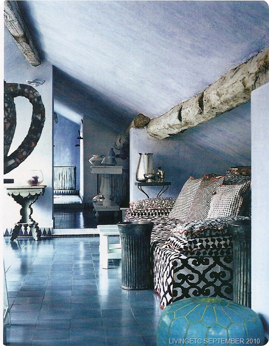
So I was very excited when September’s Livingetc featured her Milanese apartment – an old Parmesan cheese warehouse that was apparently in miserable condition until Navone recently rescued it.
 |
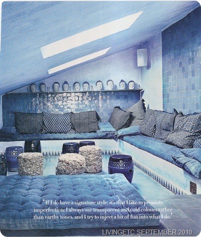 |
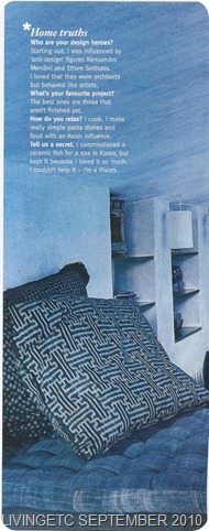
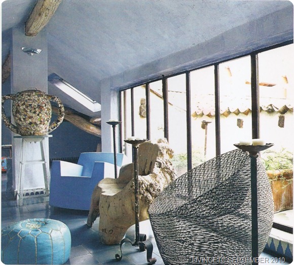
The problem is that I’m not exactly thrilled by the interior design. The overlapping blues and greys, are beautiful in and of themselves, but there’s just too darn much blue everywhere and, coupled with all the hard tiling on floor and ceiling, it just looks so cold and uncomfortable, like living inside an icecube.
That might be appropriate in Morocco, or Greece, but I’ve spent a lot of time in Milan, and in winter it is often as dank, cold and foggy as Sarah Palin’s brain. The ceramic Moroccan stools; smooth, shiny Moroccan pouffes and Asian ceramic busts only add to the chill. Am I the only person who wants to add some snuggly orange cushions or thick, shaggy deep red rugs to the mix?
Also, and this is probably just me, there’s just a bit too much Moroccan going on in here. Don’t get me wrong, I love Moroccan design in and of itself and I love combining elements from an eclectic mix of cultures in a single space, as Navone mostly does to great effect. But the pasha’s boudoir above has strayed into ‘theme-bar’ territory and the Asian busts just seem incongruous and out of place.
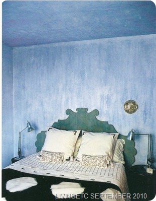
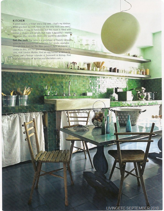
But the real story here is the monotone colour. The blue is absolutely unrelenting, permeating every room in the apartment, though she goes wild and adds a little green to the kitchen, which, I’ll admit, I would kill several close family members to have in my house.
 |
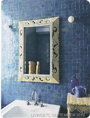 |
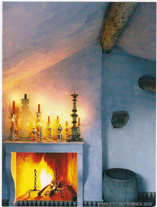
In isolation, each of these rooms is beautiful, as are many of the pieces in them. It’s just that the whole just seems so chilly and hard and the monotones are just well, monotonous. I don’t think it’s any coincidence that the stylist had to, both literally and figuratively, turn the fire on, so as to liven up the spread.
You may be interested in Paola Navone’s other houses. Her Greek island home, which is a study in white, is here and her stunning Paris apartment, which is mostly white, with pops of colour, is here. I am obviously not remotely insanely jealous of anyone who has homes in Paris, Milan and Greece.


Hi Paola! (POWLA!) I have an Italian name too that starts with a “C” and all my life people have called me Paula, Pascale, Gloria…….so join the club. My mother still won’t even admit she gave me an Italian name…..she has some fanciful story – but I digress.
Oh too bad you don’t like this one so much. I think the image processing makes the blue a little too gray, and I have to agree a little, it’s a little airless and claustrophobic. But it’s not actually SO recent. When it appeared in the NYTimes color mag several several years ago (pre-’05) it was JUST STUNNING. The blue (which I feel must be the real color) was reproduced as a very rich light reflective blue like being surrounded by ocean at sunset. And the color printing played up red accents in the room instead of greying them down.
Interesting too that the Paris apartment has been very recently reproduced in a magazine and again the colors are toned down and keyed closer to grey which is just very trendy at the moment.
Well thanks for letting me blab! I’m having a decorating moment I guess. And so passionate about PN couldn’t let you think she could let you down. Though I think the Greek house is a little ordinary. I thought she had a Hong Kong flat too which is truly one of a kind.
So I’m mostly commenting to say that that’s what makes PN so great. Because her work is SO individual and unique (I’ve posted on the Paris flat) that it STILL looks like a new idea.
Oh, now I’m racking my brains to work out what your Italian name is 🙂
I didn’t realise that this wasn’t newly decorated – I wonder why Livingetc decided to feature it now? Interesting what you say about the colour as well. I don’t think we can ever know what a colour is like. Don’t know if you saw this post when I made a side by side comparison of two articles on Matthew Williamson’s house? http://mirrormirror.typepad.com/mirror_mirror/2008/12/go-fug-your-room-matthew-williamsons-london-house.html
Would love to uncover the NYTimes version of Paola Navone’s house so we can see the differences.
And yep, the Paris flat is GAW-JUS.