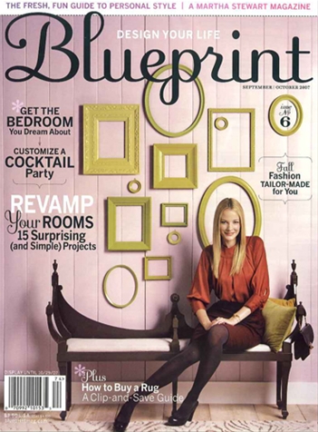
Much wailing and gnashing of teeth in blogland over the demise of Blueprint – Martha Stewart’s more upmarket guide to guide to stylish living, seemingly intended to be a rival to Domino and Real Simple.
I’m not entirely surprised. I was a subscriber, but mostly because magazine subscriptions are so ridiculously cheap here, but didn’t enjoy it as much as its rivals.
I can’t help wondering though whether it was killed by its font. Does it say ‘fresh, fun, stylish design’ to you? Because I think it looks prissy, fussy and dated and never really fitted in with the streamlined, uncluttered elegance I was sort of hoping for from the magazine.
I love that combination of chartreuse and lilac though – the bench not so much. I’m indebted to this blogger for finding out that the colour is Benjamin Moore’s Beach Plum. I’m thinking of a that sort of colour for our dining room, to complement our citron green rug.


The font was my favorite thing about the magazine outside of the home tours. 🙂
I actually think that it was one of the better designed magazines out there – credit to an obviously talented creative team as the visual identity is one of the things that really set it apart.
Different looks for different folks I guess! : )
Well, I loathe the font – I’d never pick up such a twee looking mag.!