This week’s Go Love Your Room – where I take a room, house or apartment and analyze why it really, really speaks to me – features French designer Vanessa Bruno’s apartment in Paris.
I actually blogged about this briefly back in 2007, but it has haunted me all this time and I recently came across a great set of photos. I thought it would be interesting to examine what I love about it, and see whether it has stood the test of time.
The space itself is cheating of course. It doesn’t take much design talent to make those high ceilings and rustic beams look good.
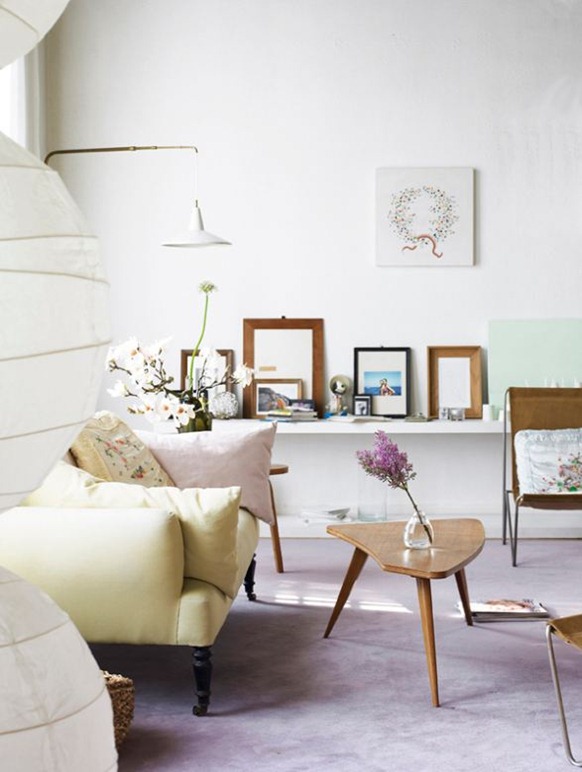
The sugared almond colour scheme of lilac, celery green and dusky pink is still very attractive and feminine, though a perhaps a little sweet for my taste nowadays. Though the colours, the sprigged embroidered cushions, the fresh flowers and the garland artwork are unashamedly girly, I love how Bruno keeps everything else spare and plain to avoid it tipping over the edge.
The low picture shelf is a lovely touch (that Diane von Furstenburg could learn from) as are the rustic wooden frames that echo the beams. And I like the echoing triangles of the side tables and the chair legs. And is that just a plain, pistachio green canvas propped up to give an additional hint of colour?
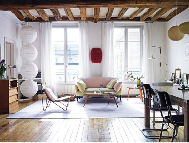
Pulling out a bit the red furry (beady?) artwork on the wall is a touch of genius, providing an emphatic focal point,, emphasising the symmetry of the room, dirtying up the colour scheme and providing a much needed touch of luxurious texture. I also like that, unlike last week’s room she’s used a huge floor rug to cosy things up a little and ground the spindly-legged and rather insubstantial furniture, even at the cost of covering up those marvellous floorboards.
The string of paper lampshades, which Bruno apparently put together herself, is also a fabulous touch.
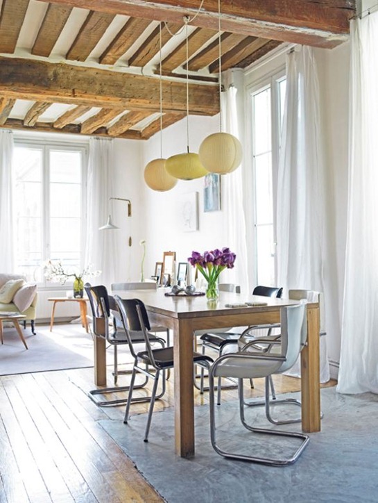
The coloured lampshades over the table are clever too, bringing the colour palette into the dining area and echoing the shades on the other side of the room. And I absolutely love how the central one is elliptical and not round to prevent a surfeit of balls everywhere (and that’s never a good idea).
The hefty wooden table and industrial chairs again counteract the girliness and the substantial table legs contrast well with the flighty nature of the surrounding pieces. I’m not sure about having the table and chairs half on and half off the rug though.
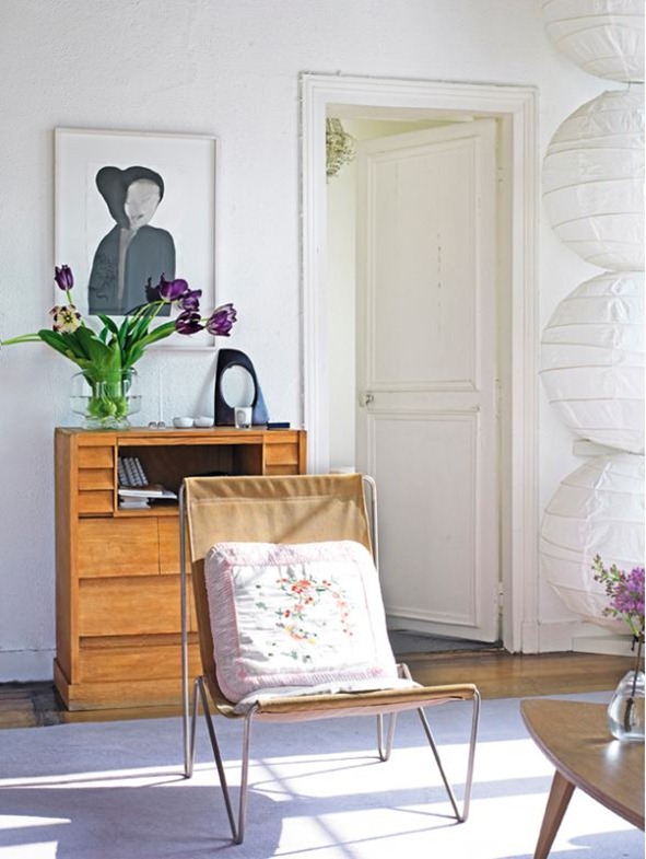
I like here how the sculpture on the secretaire reflects the painting above.
This room is another study in geometric shapes – it seems I’m a sucker for them – the aforementioned triangles, the square cushions and dining chairs, the rectangles of the windows and the big round balls. And also a study in contrasts – romantic v industrial, light v substantial, rough v smooth, spare v ornate.
Though I think nowadays I’d add a bit more punch to the colour scheme and maybe some more graphic elements, I think this has stood the test of time very well and I certainly wouldn’t mind moving in tomorrow.
What do you think? Too feminine or just right (or not feminine enough?) Do you think it looks dated? Where can I get a red fuzzy thing to hang on my wall?
See how the sun is streaming into the rooms above? It’s a photographer’s nightmare, but that’s what’s happening in Seattle at the moment. It’s going to be a great weekend. Have fun wherever you are.
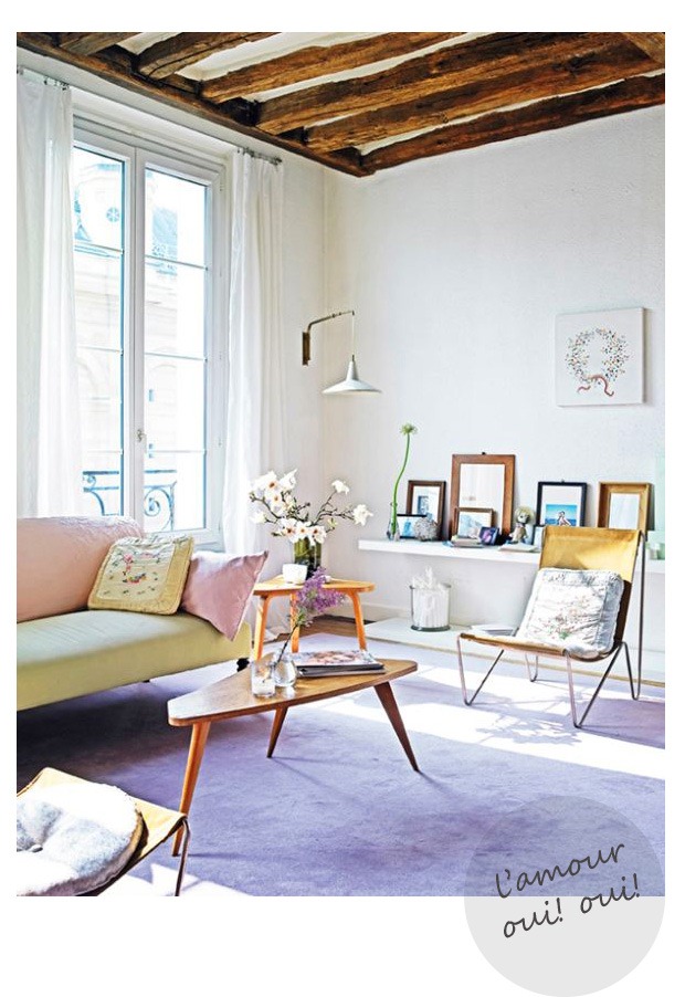

That space has such gorgeous bones, and the furnishings are a lovely mix of shapes and styles. The colors are too pale for my taste, but the look is feminine without being girly.
As you note, the rug helps anchor the conversation group, and I love the lavender color, though I’d choose one that was a bit smaller. It looks to me like the flooring under half of the dining table is concrete, not a rug; perhaps it’s a floor infill where there once was a stair, or maybe that area used to be a separate room?
I wonder if the colours are this pale in a regular exposure? It’s pretty overexposed (in a good way!) with all that light.
Like you, I am not a big fan of pastels but this works for me. I think it’s because the sugary sweetness potential of the pastels is cut by the wood beams and the caramel leather or fabric coloured chair. That being said, it’s definitely a feminine space.
I agree with Kimberly, I think the flooring beneath the dining room table indicates a separate room or a filled in staircase when the apartment was part of a multi-floor house.
But how can you EVER go wrong with those high ceilings….missing my Victorian 10′ ceilings!
@sandra I think the colours are less faded in a normal light. If you click through to the link for my original post, they’re more striking there. Though Elle Deco is known for punching up colour.
@kimberly That’s a good spot re. concrete, I think you might be right. I’m still ITCHING to move the table so it’s more centrally placed though.
Oh how lovely! I love the open space and the room to breathe, along with all that glorious natural light. Maybe it’s the lamps and the branches, but there’s something definitively Asian about this space.
I found your blog through the Seattle Bloggers Group — I’m an image consultant/stylist in Seattle. Great to connect!
Sarah
Cable Car Couture
this place is so cozy and peaceful looking. great post!