One of the things we talked about at the weekend was the idea of constantly exploring and questioning and thinking about your aesthetic and why you are drawn to certain things – using your blog as a way to explore your own creativity and as a catalyst to live your best life.
I saw this apartment a few weeks ago, and it really resonated with me, so I thought I might try and work out WHY I like it so much.
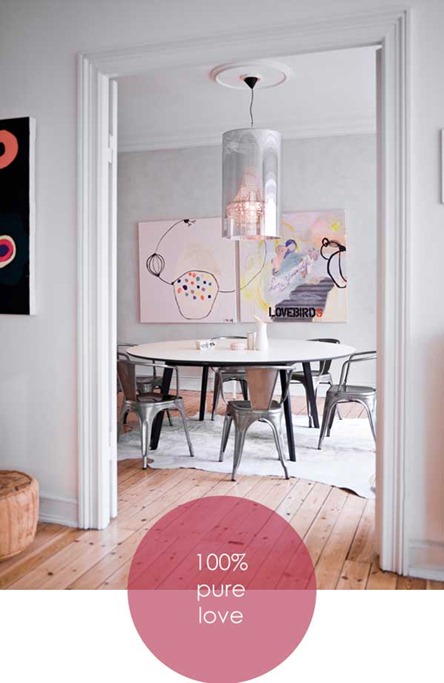
This room is gorgeous. The beautiful focal point of the paintings sort of goes without saying, but the designer has also used texture subtly and cleverly– the smooth table and hard metals contrasted with soft leather rug and pouffe and the natural wooden floor.
I’ve noticed in my photography that I’m really drawn to complementary shapes and I love how the designer has used the large square art pieces to emphasise the rectangles of the doors and walls, while the circle of the ceiling rose is echoed by the cylindrical light, the round table, the cylindrical pouffe and even the spots and circles on the paintings.
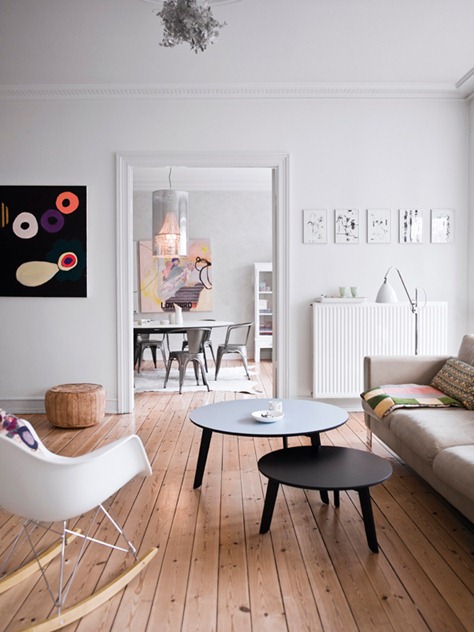
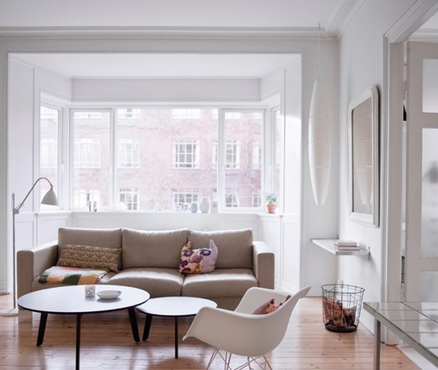
Pull out into the lounge area and you’ll see more use of shape and texture. More rectangular pictures, more circular tables and a Tord Boontje metal light shade (which I don’t think is quite big enough). You’ll know through all my ‘Go Fug Your Room’ rantings that I don’t like uncomfortable chairs, and I think the seating in here could be a little more cosy (and maybe a rug would have helped), but my goodness, it’s still a lovely space.
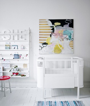
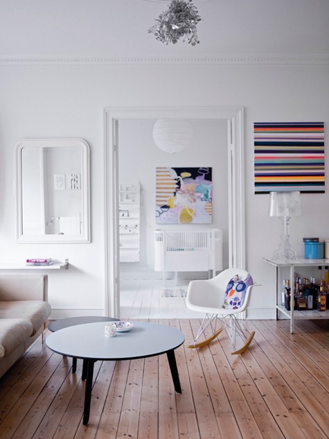
Looking in the other direction the stripy art picks out the lines of the floorboards (love how they go in opposite directions), and echoes the stripy art and crib slats in the nursery. I also like how the curved top of the mirror reflects the curves of the Eames rocker and stops everything from feeling too square and boxy. And there’s a most beautiful stuffed owl with circular owly eyes. And we all know how much I like those.
 |
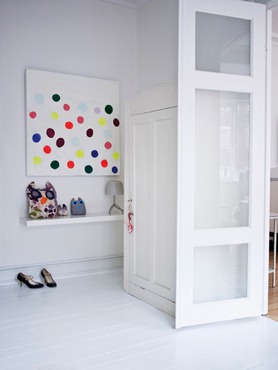 |
Rectangular shelves, a round stool and a stripy rug complete the nursery and there are more circles and a whole family of round-eyed owls in the entrance hall.
 |
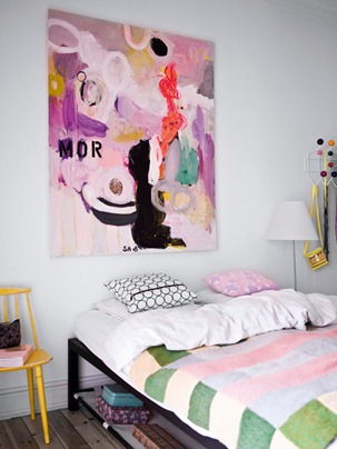 |
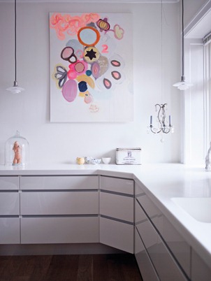
More stripes in the bed cover and through the kitchen cabinets and more circles through the art, the cushions and in the Nelson coat rack.
Wow. To be perfectly honest, I hadn’t noticed how thoughtfully the designer had organised the shapes in the apartment until I was half way through writing this post. I thought at first it was the colours everywhere speaking to me, but I think it’s the underlying sense of organisation that is making my soul happy (unfortunately this is not reflected in my own home). This house makes me want to tidy up and buy art.
What do you guys think? Do you like it or is it too structured and sterile for you? Does anyone know who did those amazing paintings or where I can buy those FABULOUS owls? And where do the people who live here put their stuff?
This apartment belongs to Norwegian jewellery designer Stine A. Johanssen. More details are here, translated from the Norwegian.



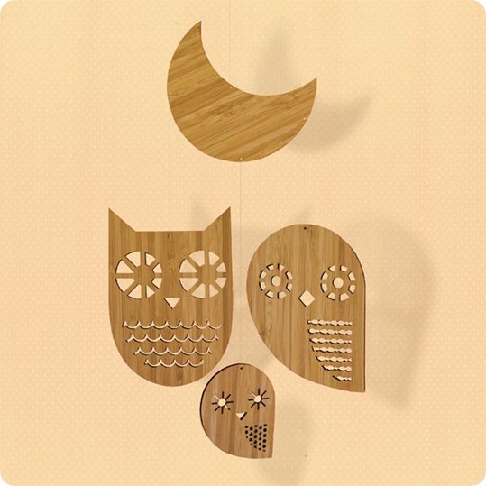
There are a lot of those owls around London right now, and their cousins, even in Peter Jones. Also in applique form on standard shapes. Can be a cute way to work different textures together, even if they aren’t robust enough to take a structural role in the cushion.
And yes, I find this a bit stark and the colour ways too acid, but then I am rather stuck in a rut interior-taste-wise and perhaps have to try to step out of it. Agree re shapes – v interesting and good investment design as could change colours around these bones over time happily.
Oh my, it’s ab-fab. This is exactly the style I would love to live with, but I’d have to get rid of all my stuff to be so tidy. I love the color palette, the airiness of it and the geometric shapes. I’ve often wondered if I am so drawn to Scandinavian interiors as a reaction to how cluttered and dismal my house is, whenever I see interiors like this I feel calm and happy. I think the only changes I would make are rug and chairs too. The living area needs a rug and those dining chairs need to be switched out for comfy ones or given seat cushions.
I love the coloUrs, but it feels cold and sterile to me. Something I love about your house style is that while you lean toward modern – it never feels cold, but rather cozy. Perhaps that is the fact that the house itself is old, or you have the odd ancient looking piece from some London junQUE shop here and there. I wouldn;t want to sit on those metal chairs for a whole meal and why are there no rugs? Even if there is radiant floor heating, the floors look cold. Here I don’t care for the large scale art work AT ALL – the pieces in the dining room in particular feel jarring to me. Don;t listen to me though – I have lived in my house over a year and have yet to hang a thing…
Bitter Biscuit can spell!
The white is too stark and pristine for me, very Scandinavian though.
I love the geometry (and the owls!) but how do they live in it? It lacks storage and what about toys for the child?
I’m too practical.
My favo(u)rite piece in this apartment is the crib – very Charles Rennie Mackintosh. While I tend to love white walls and minimalist spaces, I like a a bit more color than this… and the living room needs a rug, not only for warmth and texture, but to anchor all the thin legs of the furniture.
The artwork here is awesome!!! What great pops of color
Such a beautiful space! Thank you for sharing. I agree that the living room needs a rug. Its such a pet peeve of mine. A room, especially a living room, need a rug to ground it and pull it all together. Its that one element that without it makes the room look unfinished.
I really love how you have analyzed this space so thoroughly, often it’s hard to explain why we love a space and you have reminded me through this post to really dig deep into a space and ask myself what works for me. I am a huge fan of the simplistic scandinavian style but feel that it really only works in a space that has the right ‘bones’ and a little history/character – like this one. Cheers Nina
Oh, Paola…I love this post. Such a GREAT exercise…analyzing what you love about the space and that was totally fascinating to me. I agree with the things you loved about the room & with the things you saw lacking ( rugs…the chairs at the dr table) and I love the artwork. It isn’t a space for me but, then I know my space isn’t for everyone either! 🙂 Love.
xo
Melis
Great job Paola! You did a fab job explaining your thoughts!
What a lovely design. Thank you so much for inspiring me. Now I know what to do in my bed room. This blog is really helpful.
The dining space reads to me as incorrect proportion, particularly with the imbalance of the ceiling rose and the light shade, which is too large for the size of the table and the rose, and it and stunts the chairs. Tolix chairs are forced into so many spaces now and it’s expected that “industrial” will translate. Something upholstered here would help warm the room up a bit and connect the hide, instead of the cold metal. Noting that the artwork is a co-joined piece, I don’t feel it is suitable for this space as they are too close together against the scale of the wall, that is clearly larger than what you see through the doorway.
The practicality of the chairs themselves are questionable, as they are a similar height to the table and offer no presence, and may not sit properly under the table. The colour scheme makes sense, but this makes for an uncomfortable and cold setting in my opinion.