I hugely admire Diane von Furstenberg’s fashion style and her inspired use of prints and colours, even though, as I don’t have much of a waist, her iconic wrap dress is just not flattering on me.
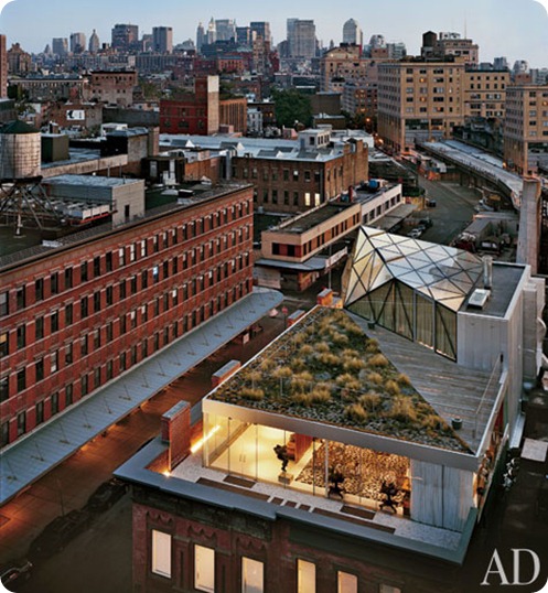
So I was fascinated to see online previews of a spread in March’s Architectural Digest featuring her incredible penthouse apartment in Manhattan’s Meatpacking District.
The penthouse, built over DvF’s design studio and flagship store, is absolutely stunning, with apparently incredible views through its transparent glass walls.
But inside? Well, it all strikes me as just a bit too MUCH.
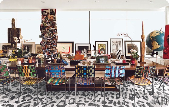
Those chairs are gorgeous, the art is apparently priceless, but it all feels as if it just can’t breathe. The backdrop of the leopard skin rug really doesn’t help matters. And who sticks art, however exquisite, on the windowsill, thereby obscuring the billion-dollar views?
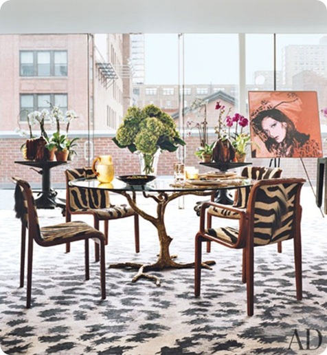
I love the Andy Warhol portrait, dislike the table and am meh on the clashing animal prints. Again, I think this would have looked a whole lot better with a more neutral rug.
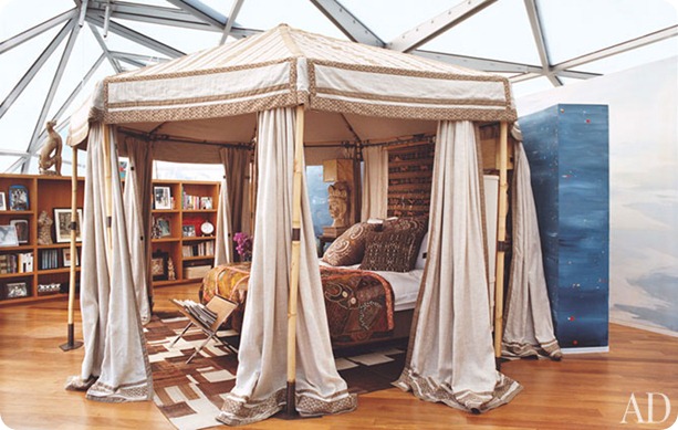
I sort of admire her for attempting to recreate a pasha’s boudoir in her big glass eyrie - just because the structure is ultra-modern, you don’t necessarily have to go ultra-modern with the décor. But I just don’t think this works, the attempted grandeur is overwhelmed by the ceiling and it just looks incongruous.
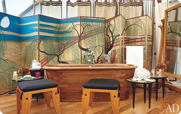
Those screens round the bath are lovely, as is the bathtub itself, but I would be terrified of knocking over all those little tables and stools when I emerged dripping wet from my ablutions. But maybe DVF is not as clumsy as me.
Although I can see that one would want to create private areas in such an open space, overall all the clutter and clashing patterns and different styles and objets seems to fight with the open space rather than celebrating it. She’s tried to make it cosy, but I don’t think it’s the sort of space that works with cosy.
But what do I know? She’s is DvF after all.
What do you think? Please show your workings in the comments.
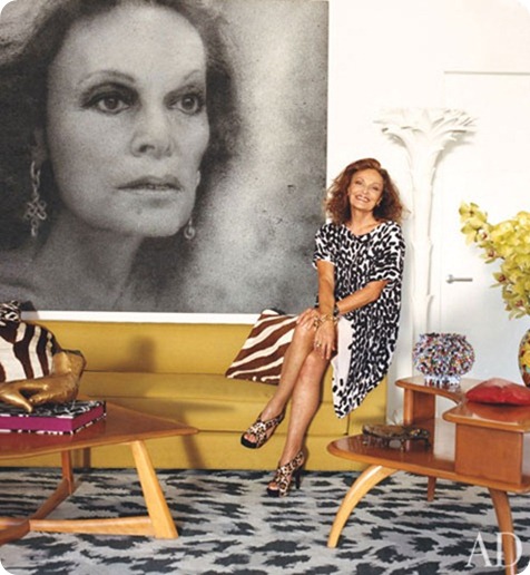


The space is phenomenal. But I think she has way too much going on in it. I love patterns, but she was too many that clash. And the huge pictures of her face everywhere=creepy. I know she has a famous face, but it’s her face in her house. That’s strange to me.
Paintings in the windows make me cringe. So much light damage! I love the idea of the bathroom, but don’t think it would work well in practice. And no matter how vintage and snappy they’re said to be, I just don’t like animal prints.
What a gorgeous space though.
Too much money and narcissism equals one hot mess. I’m sorry but this apartment is trying too hard to be talked about.
B
The bones of the place are spectacular, but the only space that comes close to working for me is the bath. Keep the gorgeous screen, tub, towel warmer, and ONE table to hold a glass of wine and a book. Move the mirror to the bedroom. Everything else goes.
One very large yard sale and one very serious decluttering and I may be impressed with this space. I never thought I’d see the day I’d be harking back to a more minimalist trend …
I’m sort of amazed that absolutely nobody out there seems to like this. I personally completely agree with all your comments, but I thought there would be at least some people defending it.
DvF where are you? Don’t tell me you don’t read this blog?
I think “incongruous” is the perfect way to describe the whole thing. There are some stunning individual pieces and the site is amazing. I would kill to be that close to the High Line! However, yeah, total mishmash that does not work at all, and bigger mishmashes have been successful. Also, there seems to be no understanding of scale whatsoever. That place is swallowing all of that busy crapola.
What nice things!! all these things looks too beautiful/ i like this things. for the home decoration all these furniture’s too essential. i will buy all these things as soon as.