I realise that recent ‘Go Love Your Rooms’ have been rather same-y – white backgrounds, pastel-y accents, eclectic mix of furniture and objects, yadda yadda yadda, rinse and repeat etc.
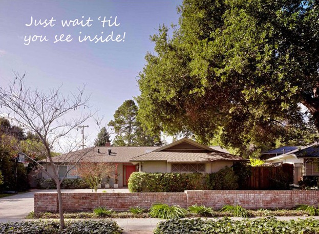
So loving a very modern house is a bit different for me. Once upon a time Adi Tatarko and Alon Cohen were doing up their long low modern bungalow in Palo Alto and bemoaning the lack of online resources to save and share remodeling inspiration. So they founded Houzz.com. As you do.
Warm and cosy
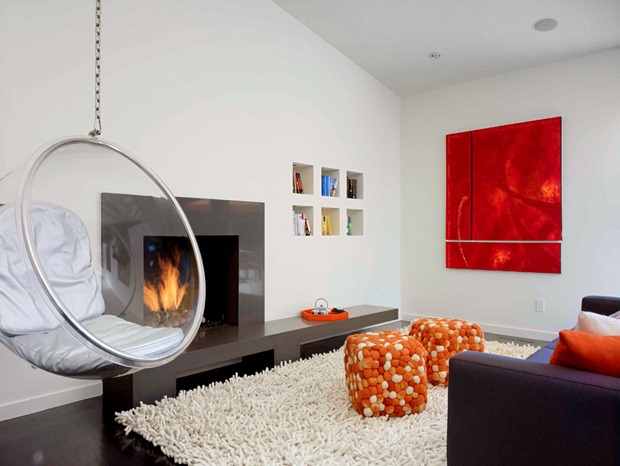
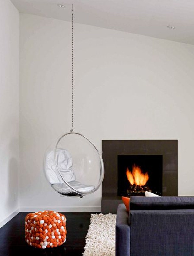
Several things strike me about this room.
Firstly modern houses can very quickly get ‘boxy’ – lots of square furniture in lots of square rooms – but in this house they’ve very carefully added circle shapes to add contrast. Not just with the awesome swing seat, but also by adding the circular tray and the circle pattern on the pouffes.
Circles and squares
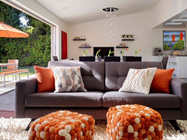
There are still a lot of squares in the room, but they are also made more interesting by playing with scale – the big square picture, the medium cube pouffes, the smaller cushions and the even smaller cubbie shelves inserted into the wall.
Next they’ve gone for texture and comfort. So many modern houses are beautiful but also seem sterile and cold. Here the cushions, the awesome rug, the pouffes and the swing make everything seem cosy, comfortable and FUN (though the pouffes do look as if you’d have to perch rather than lounge if you used them for seating).
The light in this room must be amazing
And finally there’s some colour! So many modern day architects seems to believe that the only colours available are black, white and brown, so the pops of orange, red and purple are extremely welcome. I like how the books in the cubbies are arranged by colour, there’s so much scope to change stuff in and out of those shelves to create different wall ‘art’. I’d love to know where their proper book storage is though. I’m assuming this house has a giant basement where all the crap is stored.
Needs more colour?
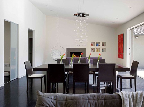
Pulling out more that amazing light fitting brings more circles and spheres into play, which is good as the dining table and chairs would otherwise be very angular and stark. I can’t help feeling that the dining area needs something more, maybe even something as simple as a coloured runner on the table.
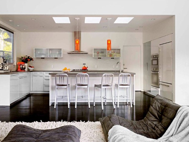
I’ve always loved those Ligne Roset Togo couches though I wish in this case they’d gone for the coloured version or maybe a coloured throw. But again, they look so deliciously lounge-y and comfortable. I like the pops of colour in the kitchen and the shiny black floor grounds the whole space wonderfully. The row of chairs finds echoes throughout the space too – the row of skylights, the row of vases on the dining table, the double row of book cubbies.
Still have no clue where all their STUFF is though.
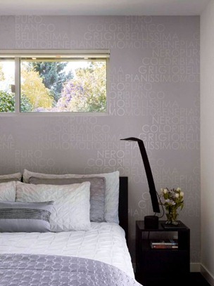
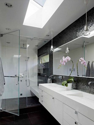
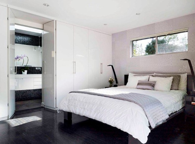
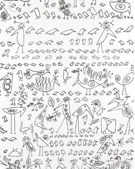
The bedroom is saved from monochrome minimalist boringness by the use of overlapping textures – bumpy mosaic, smooth shiny cupboards and embroidered throws – and by that phenomenal wallpaper. This feature wall – which adds texture rather than grabbing attention - is one I can definitely get behind.
 |
 |
All photos by Matthew Millman for The New York Times
What do you guys think? Too modern, too shiny, too stark? And tell me honestly, could you actually live like this? I know me and my family wouldn’t have a snowball in hell’s chance of being this tidy.
Back blogging now. Next time I know to get guest bloggers in to cover the couple of days after a trip when I’ve taken one look at the overflowing cases, laundry basket and email inbox and am lying gibbering in a darkened room.



Paola, you were right, didn’t notice in Europe but just saw on my timeline! I love it – just about fell off my stool in the diner the day I saw it in the NYTimes. The owners are the sweetest and smartest people I have ever met 🙂
P.S. Disclaimer: I work for Houzz!
Wow! Fantastico… Love the design of this room. Seems so relaxing.
Thank you so much for sharing this blog. I really, really appreciated it.