So, this Blogging Your Way course I’m doing with Holly Decor8 (highly recommended BTW) wraps up this week and we’ve been divided into teams to critique each others’ blogs.
I have been getting A TON of hugely useful feedback, which has got me thinking about a full redesign in the next month or two. And then it struck me that you, my lovelies, are also the perfect source of intelligent, thoughtful, insightful blog critiquing.
So could you please put your bitchpants on and let rip? If you were me, what would you change about the blog? How can I improve the layout? The content? Are there things you find distracting? Are there features you particularly love or hate? Why do you come here in the first place? What would you like to see more of? How can I make you love the blog more?
Please don’t pull any punches. I’m a big girl and can handle it. And if I’m doing a redesign, I want to make it as effective as possible. I promise not to hate you (much, haha!) though feel free to go anonymous on this if you prefer.


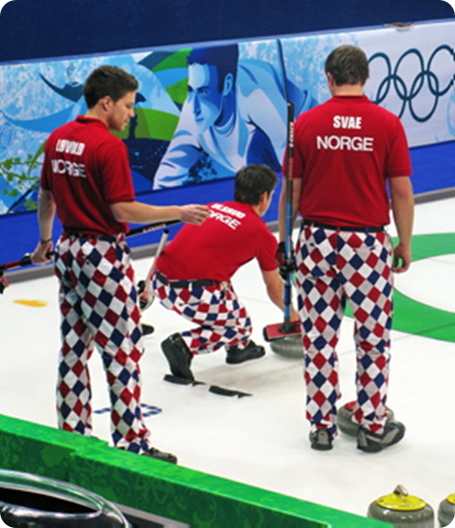
Sorry, this isn’t helpful about your design, but oh ho ho those Norwegian pants! Hilarious.
Very not helpful 🙂 But I do so agree…
ok, just a couple of things, but do keep in mind that i mainly view your blog on bloglines and rarely actually come to your blog (sorry!) first off i prefer darker blogs *if* they have a lot of photos. they usually make the photos “pop”. of course, i’m talking about template, not content. 😉 that said, i *don’t* like reading white text on black/dark background. (not that i’m trying to garner traffic for my blog–i assume most people use RSS feeds for reading–but my current template is a compromise of dark template, black on white text, if you want to see what i mean. oooh, but i don’t have any photos on recent posts. i should remedy that…)
i do like three columns–i wish i had that–but it bugs me when one side is longer than the other. i also think you have waaaay too much stuff on the right side, but i think that’s just a personal thing. there’s lots of neat stuff there, but i guess i like balance, and the longer it goes on, the more it bugs me.
i do like your template, though, lovely and simple. just very….white.
No! I much prefer the white, especially with photos. Black backgrounded blogs make my head hurt.
The only thing I would change is more cursing. I love when you curse. It makes me feel like I’m not the only one 😉
Thanks so much for stepping up…
Interesting about white v black background. Would love to make the photos pop more, but not sure if a dark background is the way to go. Anyone else got any thoughts on that? (Or other ways to make the photos stand out?)
However, fully on board with getting rid of a ton of clutter. And definitely up for more cursing 🙂
A dark background sounds scary to me… I love lots of white space.
I only have one problem, and it’s nothing to do with design. It can take a long time to download – I’m often watching as the web browser tells me it has 118 items left to download, 117 items etc, and I don’t think we have an extraordinarily slow connection at work. If I didn’t know and love you I might not always hang around 🙂 Maybe a little more needs to be archived a little earlier? Am out of my technical depth…
The photos in your central column are often so fabulous that I wish the side columns didn’t detract. I don’t know if they could be de-saturated slightly? Or the gutters widened slightly? I always want to cover them up so I can concentrate on the main images.
…today’s breakfast looks FAB! Am drooling…
Dxx
Now that IS interesting feedback. I know I’ve got it set up so that the pages are long, and it doesn’t take a long time to upload for me, but does anyone else have this problem?
Hearing loud and clear that sidebars are too cluttered so will address that.
Upload time fine for me too.
Oh, and while you are, presumably, bigging up the Norwegian curlers’ trousers, did you notice that one of their skippers looked just like a husky, complete with odd eyes?
Didn’t actually watch the Norwegians in action – the Minx became totally mesmerised by curling though so I could ask her…
I read your blog regularly and enjoy it so I hope you won’t mind the criticism.
Your banner just gets lost. When the page loads and the ads on the left appear, the name of the blog is not prominent. Maybe when you tidy the side bars, it will not fade into the background.Or maybe it needs to be bolder.
Rina – criticism is good, good, GOOD. And you’re not the first to mention the header (it came up a lot on the forum) so thanks for reinforcing that it’s indeed a problem.
Paola, please don’t make your blog over into something generic and trendy. I love your style. I love the white space. I love your photography. I don’t think you need to do anything to make your photos pop. Leave that to the lesser talented folk. Your subtlety and lack of brash gimmicks are much appreciated.
I do have to agree with the upload time issue tho. I wouldn’t mind if it were quicker–or if you updated more often. That is all.
(p.s. Sorry I misspelled your name in a previous comment.)
Charlie, thanks for your VERY sweet comments. Made my day 🙂
It certainly won’t get brash and gimmicky. If anything I’m going for even more white space…
Header def needs to be bigger. It doesn’t look like a header, really, but more like one more random image on the site. I have no probs with colored backgrounds, hence my own, lol, but I once read a very thought-provoking post by Felicity of the tragically now defunct All Things Bright and Beautiful (I think she guest posts around, on Absolutely Beautiful Things, etc), about professionalism in blogs, and how colored backgrounds, esp dark ones, usually tend to look way more amateur, over white ones. She was really spot on in what she said, and looking around the net, I notice the most professional, attractive blogs generally do have white, and then add color via headers, etc. I guess my point would be, make your own decision on which direction you want to go, and go from there. And like I said, I still have my colored background..I love it, and I want it, and it stays. :p
Oh, and I have zero issues with loading your page. 🙂
Aha! I thought of something else, and feel free to ignore me as an annoying git if you want. Why the frickety frick can’t I hit older posts, at the bottom of your page? I missed reading for quite a chunk of time, and now to catch up on everything, I need to keep going back up and remembering which month I am up to in your archives!
Like I said, feel free to ignore, and you DID say get your bitchpants on! I had permission! :p
MM – I promised not to hate you, so I’m trying not to 🙂 Actually you make some excellent points. Very interesting re. a white background looking more professional. I’ll try and find that post you mentioned. As for the ‘older posts’ I think that might be a Typepad thing (vis a vis Blogger). I’m hoping to do a big blog tidy up this weekend, so I’ll look into that agai
or even again…