Really my dears, she makes it all too easy.
I know we’ve been through all this before, but Ms W has a new book to promote, so therefore pics of the interior of yet another Hollywood home are doing the rounds (does she actually live in any of these houses?) and it’s the FUGLIEST yet! Quelle joie!
Ths sad thing is that from the exterior this is a beautiful LA house with a stunning pool, but now you couldn’t pay me to live amongst all this cold, hard, ersatz splendour. Money truly is wasted on some people.
Can anyone explain what I’m missing about this woman? I would genuinely love to know – at the moment it just looks to me like the Empress has new clothes.
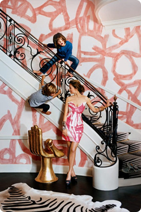
No, she didn’t let her boys scribble on the walls, apparently this is custom-made graffiti-inspired wallpaper. Which is not to say that the boys wouldn’t have done a better job.
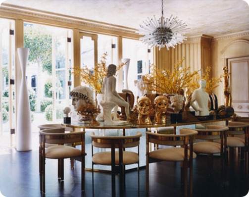
Like living in the British Museum, and about as comfortable.
Doesn’t it strike you as a little inconvenient to have to move half a hundredweight of assorted replica statuary every time you want to lay the table?
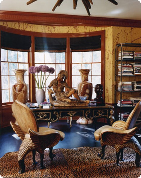
This is apparently Kelly’s study – such a practical place for a working designer n’est-ce pas? And those chairs would seriously freak me out.
Two further questions strike me.
– With the zebra skins and the faux decapitated heads, is Kelly channelling Eddie or could Eddie be channelling Kelly? (Though why either of them would wish to is beyond me.)
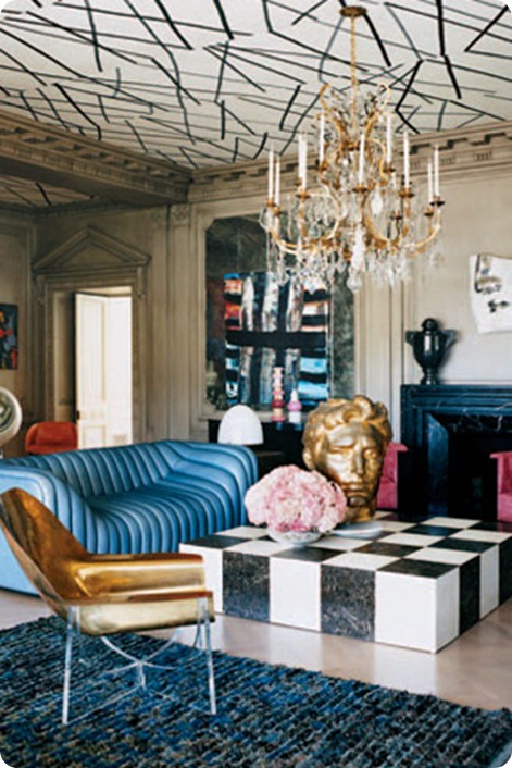
– And how on earth does a colour scheme of dark blue and dirty brass with some pink scribbles qualify one to write a book about colour (the subject of Kelly’s next magnum opus)?
Oh and for those of you in the UK and elsewhere, Kelly Wearstler is one of the most famous interior decorators in the US. I kid you not.



I so so so agree…her decor is insufferable and so is she. Did you read that profile of her in the New Yorker a few weeks back? Yikes.
I read the abstract online, but couldn’t get the full article as it is subscription only and I’m too stingy. What yikes-y things did it say?
Oh and will the person who voted ‘not fugly’ in the poll please let us know why they like it in the comments? I won’t bite – I’d genuinely love to understand her appeal…
I actually rather like it for what it is – fearless and 80’s crazy. I would never want to live in it, but if it were a boutique hotel, I would definitely say “HOLY SH*T” when I walked into the lobby, and for that reaction, I appreciate it. I don’t think she takes it too seriously, though I guess she does have to live in it! I do like that crazy pink wallpaper too. While this bravura modern is not my style, I really liked her Hollywood Regency projects a lot. Now that everyone is doing that, she’s moved on to the next thing.
That big gold hand got some press in the T Style magazine this weekend. I noticed Jonathan Adler had one on the cover of Met Home a few months back as well.
I mean, come on Paola, at least it’s not as boring as Lonny!;)
P.S. YOu totally beat me to this, I’ve been meaning to scan this out of my Vogue for weeks and I keep forgetting!
I would love to see the outside of this house because the inside is horrible. She should be ashamed to be called a designer.
Ha ha! You’re the brave person with no taste 🙂
I agree with you that it’s fearless, but I’m not sure I’d like it even for a boutique hotel. To me it looks hugely uncomfortable, cold and somewhat intimidating and creepy which are not things I generally like hotels to be – though I agree with you on the HOLY SH*T reaction. But yes, it IS better than all the blandness of Lonny.
Can you point me in the direction of some of her Hollywood Regency stuff that you like? I really want to understand.
Oh and JA had the gold hand back here http://mirrormirror.typepad.com/mirror_mirror/2008/07/jonathan-adler.html. I bet the Top Design judges just pass it amongst themselves for photoshoots…
The gold hand chair is an iconic piece by the famous Mexican surrealist Pedro Freideberg
blech, i feel queasy looking at these.
ohhhhhhhh that top wallpaper is SO bad. So very, very bad.
oh, ew ew ew. and this person is famous? *shrugs*
I love every square inch of it.
Have you seen her beach share in Malibu? You may hate that even more! I think it was in Met HOme recently. I can’t keep track, I get so many magazines.
Can anyone please tell me where the black and white stick wallpaper comes from? I’m trying to find the source.
Wow are you guys boring! This design was so ahead of its time – Kelly is one of the single most influential women in design of our generation. So many trends YOU love today have trickled down from this brilliant visionary. Y’all dumb!
What a terribly RUDE blog post. How boring this world would be if we all liked the same things, and had the same taste – the entire idea of style/fashion/taste is that we all have unique likes, and those should never be tortured the way that you just tortured this woman’s design style. The only feedback I have about your post is that you have too much free time, and are very small minded. I think it’s perfectly fine if you do not like it, but to write an entire post about it and be so rude, no thanks.