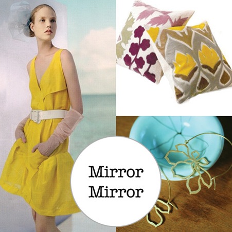
About a hundred years late as per usual – it’s already been extensively raved about elsewhere in the blogosphere – here’s what mirrormirror looks like on Ez’s fabulous illustrated blogroll on Creature Comforts – easily the most beautiful blogroll on the web.
I was intrigued to see which images she would choose from all the random pics I’ve posted up, and whether they would capture the ‘brand’ that mirrormirror has – in my own head at least.
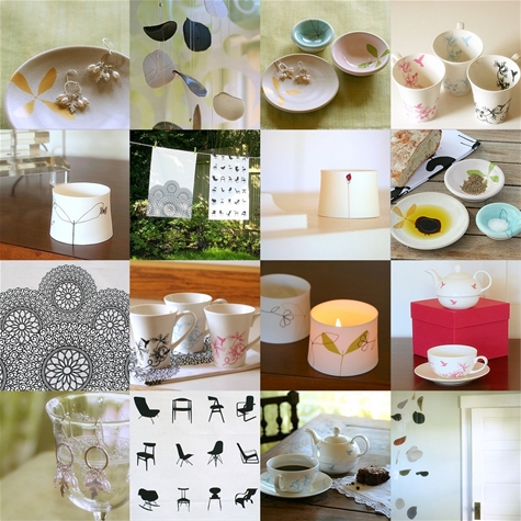
I LOVE what she’s put together, if anything it’s nicer than I would have put together myself. It’s very clever how she’s pulled together the yellow, aqua and grey colour palette (what a great and unexpected colour combination) and juxtaposed the silhouetted and cut-out leaf shapes
Interestingly I wouldn’t have chosen those actual images, but the use of colour and pattern, the mix of contemporary and girly and the clean lines are all what I would love mirrormirror to exemplify, so I’m so glad Ez picked up on them. A career as a ‘brand psycho-analyst’ clearly beckons for her.


She did one for me too, and it is as though she knew me better than I knew myself.