Or what makes this work?
Holly over on Decor8 put up a very thought-provoking post recently asking for styling tips and wondering how interiors stylists manage to achieve that sort of perfect lived-in dishevelment which just looks desirable and comfortable rather than messy and cluttered.
I thought it would be fun to take a look at rooms that ‘work’ and see if we could analyse what makes them look so good and try and pick up some styling tips of our own.
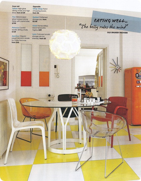
This room takes the city of Barcelona as its inspiration and comes from the Habitat-sponsored supplement in October’s Elle Decoration UK.
So, what makes this work?
Colour Editing
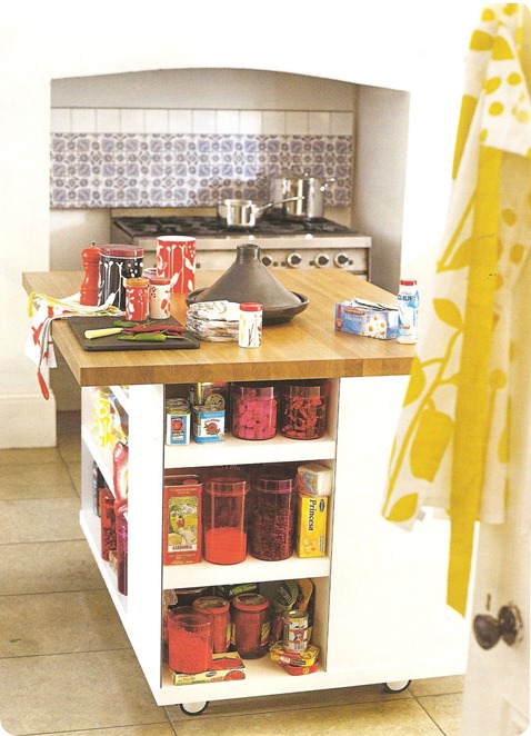
– The colour palette used is very limited – just splashes of red, orange and yellow against a white background. A few touches of blue and green are introduced in the kitchen and on the sunburst clock just to stop it all looking too ‘matchy matchy’ (and because I suspect the tiles were a permanent feature the stylist could do nothing about).
The colour values on the other hand are varied, from the dark red chair (and note that half-hidden but important black chair) to the medium values of the yellow and translucent orange and the lightness of the white.
Echoing Shapes
I love it when stylists do this. Look at how the orange rectangles in the windows are echoed by the orange fridge and how the straight lines of this quite boxy room are reflected in the large floor tiles. Then see how all those edges are softened by circles of the table and round chairs, which are again echoed by the lampshade. And how the rounded corners of the fridge are repeated in the rounded arms of the straight-legged chairs and the gentle curve of the fireplace.
Tchotchkes/Knick Knacks
The funny modern chess set on the table looks a bit incongruous I think, though I can see why something predominantly white, black and boxy was used for the scheme. I love the way they’ve used the beautiful tins that Spanish packaging is famous for but then mixed in some slightly less glamorous packaging with the salt and the teabags so that it looks like a real person might live there (though the salt pot echoes that little canister at the front and the colours of said salt and teabags match perfectly). Varying the heights and sizes of the canisters to the left also gives some visual interest.
I particularly like the artfulness of having front chair a little askew so that it looks like someone has just sipped their drink (note the perfect colour), got up from the chess game, and is lurking just out of shot. Though why this person needs sunglasses to play chess beats me.
Hidden Theme?
I think the theme here is ‘sun’. That’s certainly what this room makes me think of. The colours of course are part of it, but also the sunglasses and sunburst clock, the bright yellow daisy-like flowers in the tea cosy and wall art and the shape of the pendant shade say ‘sun’ to me.
What do you think? Does the room work for you? What other little pleasing tricks do you notice? What could the stylist have done better? Why has the enormous pepperpot shown in the main picture disappeared from the kitchen close-up?


I’ve been reading your blog for some time now…and I just thought I’d finally tell you how gorgeous it is.