With apologies to the Fug girls.
I have been discussing with Elaine from my new BFF blog Decorno the importance of having opinions, of which she has many very forthright ones.
As a cynical Brit I do find the ‘hearts and puppies’ stuff you find on some other blogs a bit difficult to cope with, so I’ve been thinking for some time of doing a ‘rooms I hate’ series on here. Though I was gutted to find that Elaine already does this (and much better), if you want more snark.
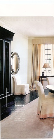
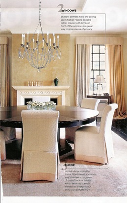
But I digress. Today’s room is from the doyenne of British interior design Kelly Hoppen. Ms Hoppen has built an empire on designing rooms for people with so little personality that even colour is considered to be freakishly avant garde. She has even produced a range of beige paint. Her rooms shriek ‘good taste’ so loudly that they end up having not much taste at all.
This example from Homes and Gardens is apparently part of a new London house built for an American client.
I have to say that I do like how she plays with different textures within the neutral palette, and her signature black wenge floors and the subtle pleated pelmets at the top of the curtains which work in a room this big and imposing.
But everything, from the immense table, to the huge black armoire and the heavily bevelled mirror is just so stolid; and a room without colour would drive me me mad in about thirty seconds (just one little hot pink flower arrangement somewhere PLEASE); and I hate that this is a brand new house but filled with repro details; and the way the knick knacks have clearly been bought in by the yard and there’s not a single thing in here that is treasured or has history. And most of all I hate that the chairs are wearing dresses.
Didn’t chair dresses go out in the 80s? Weren’t they just things in ‘Ideas for Soft Furnishings’ books that no one ever made? Or if you did make them it was to disguise the fact that your chairs were all mismatched and rickety and came from a junk shop? Which I hardly think is the problem here, since the table apparently costs upwards of £50,000. And the wonky seam on that chair with its back to us is driving me nuts.
What do you all think? Get dissing discussing in the comments.


I think the purpose of chair covers has basically been to convince brides that everything must have a price and must coincide with your colour scheme. £7 per chair cover x 150 guests – are you on crack?!??!?! I think it’s not so much that they look like they’ve got dresses/glasses or excessive bows on them. It’s that they all look like members of the Klu Klux Klan.
WRONG.
You know, I sort of get what you mean about the Ku Klux Klan… and now that room looks kind of sinister….
It looks like a hotel lobby, not a home.I would be scared to enter or make noise . . .
I have a bit of a thing about the increasing trend for homes that look like hotel rooms, and this is on parallel lines, it looks like the corner of a posh (read- personality free) hotel dining room.
I’ve even cancelled my subscription to Elle Decoration after buying since 1990, because the new (CRAP self obsessed) editor seems to favour the blow the budget glossy black and white hotel style homes. Some of them are actually ok when the people put interesting art or collections in them, but on the whole they just all look the same.
But hey, I’m a scavenger, I like unusual pieces and skip raiding so maybe I’m just out of touch, out of date, aging? I don’t care, I like homes that reflect the people who live in them and I’m afraid Kelly’s sameness is getting on my tits!
I just can’t articulate my feelings in a single word – that sounds like I am throwing up.