


Yesterday I fed my inner geek and sat down to watch the film Helvetica – a documentary film about a font.
I got very into fonts when we were designing the mirrormirror logo and spent ages searching through font libraries to find something to convey the sense of feminine yet contemporary that we felt the brand was all about (and we didn’t end up with Helvetica).
Still, it seemed difficult to imagine how on earth a single typeface could be the subject of a feature-length documentary, particularly when the documentary is very plainly shot, with no special effects or historical reconstructions, just lots of graphic designer talking heads and shot after shot of Helvetica logos and signage.
What I had never realised before is just ubiquitous Helvetica is, both in Europe and the US. It truly is the default font of the last half century.
Designed in the 50s in Switzerland, its spare lines and careful attention to proportion and negative space was very much a product of European modernism (the section about the font’s history is absolutely fascinating).
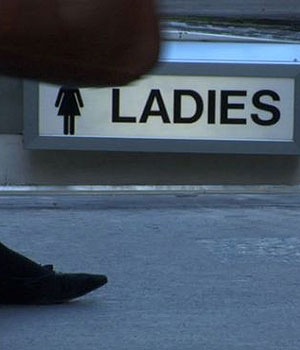
After changing its name from the unattractive Das Neue Haas Grotesk, to an easily pronounced name which celebrated its Swiss roots, Helvetica became hugely popular with both major corporations seeking to give a ‘modern’ feel to their image and with governments and municipalities who valued its clarity and legibility. As the film proves, the font really is absolutely everywhere – from the Dutch telephone book to the American Apparel logo – and pops up in the unlikeliest places
What gives the film its edge is the passion with which the graphic designers interviewed were either for or against Helvetica. For some it is the ultimate, unimprovable font – as plain and beautiful and necessary to the visual culture as water or air is to life. For others it is the symbol of globalisation and corporate dominance – one engaging female designer thought it was the typeface of the Vietnam and Iraqi wars.
Some designers loved the restrictions inherent in using it,seeking to refresh it with different spacing and weights; while others condemned the lack of imagination needed to choose it, saying, ‘if you’re not a very good designer, just choose Helvetica Bold for your typeface and it will look OK.’
In fact who knew how fascinating and funny graphic designers could be? I loved the chap who designed his wedding invitations in Helvetica and wanted to credit creator Max Miedinger on the order of service until vetoed by his wife.
Go see this film and spend the next few days spotting Helvetica everywhere you go – it’s not really about a font, but more a very entertaining conversation about how type and therefore visual culture affects our lives.
I thought I would write this post in Helvetica as a small homage. But Helvetica doesn’t exist on Microsoft computers. Instead you will have to make do with Arial, which was conceived as a copy of Helvetica and now, thanks to Microsoft, is as ubiquitous online as Helvetica is off.


Amazing. I didn’t realize they are all the same font. I just saw them for their logo.
Ah – I too am sad enough to be interested in such things… You might find this amusing:
http://youtube.com/watch?v=t87QKdOJNv8
Dxx (who finds herself using Rotis rather often….)
I too would love to watch something like that. Hmmm…
I forgot to mention that Helvetica was never on general release. It has been doing a ‘roadshow’ of special showings around the world but is now out on DVD. We got our copy through Netflix.
Diane, we LOVED that clip (and it’s very much in the style of Helvetica).
I found out not long ago that Helvetica is younger than I am 🙁
Actually, Helvetica is used by one other brand titan that you forgot to mention – mirrormirror. A version of it (Helvetica 33 Thin Extended) is used on the product category pages for the heading above the product images. Here’s the font:
http://www.myfonts.com/fonts/linotype/neue-helvetica/helvetica-33-thin-extended/
and here it is in place:
http://www.mirrormirrorontheweb.co.uk/products.asp?category=Pamper+%26+Treat
Well there you go.
Di, you and Helvetica are ageing just as elegantly. And you are a lot more rare and special 🙂