I’ve never had much of a desire to go to Miami, but all that changed when I saw this hotel. I totally adore the whimsy and wit of Marcel Wanders and his masterful use of shape and pattern, though the only thing I have that he’s designed are my gorgeous patterned storage boxes from Habitat.
The Mondrian Miami is still very ‘Miami’ with lots of shiny, lots of heavy columns and lots of huge curly chairs, but it does all look rather fun.
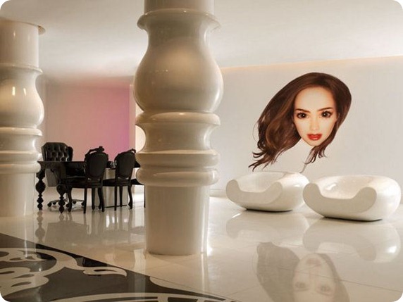
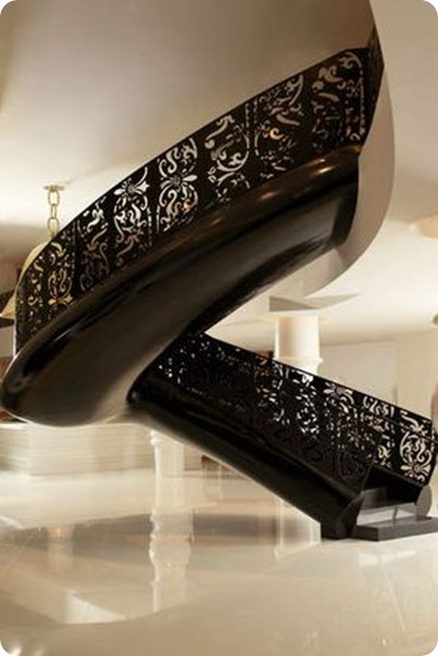
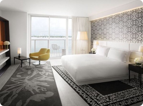
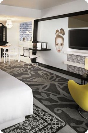 Design details I love include the faces on the walls, the shiny white floors, the layered monochrome patterns, the indoor and outdoor chandeliers, the strangely curving staircase and the funky modern chairs (not so keen on the faux French antique chairs, but I can see what he’s trying to do).
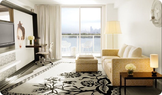
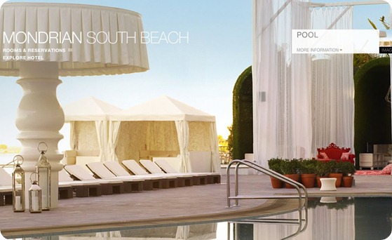
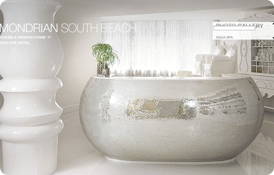
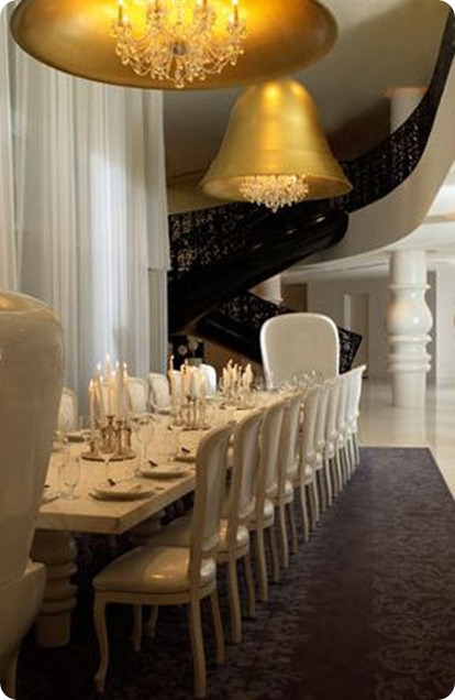
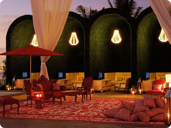


Now that is glam! Verging on transcendental! Makes Kelly W. look like a kindergartner with finger paints (yes I have been paying attention). The Bathtub! The serial chandeliers by the pool! Are those grass-upholstered arches?! I’m with you, ” vaut le detour”.
Oh it’s not a bathtub! It’s the front desk! That’s too funny. It SHOULD be the bathtub! Champagne anyone?
Do you mean the silver mosaiced thingy? I believe that is the front desk for the spa. But wouldn’t it make the THE most unbelievable bathtub?
Unbe@#$$*#@*ble bathtub. Would have to start a trend of wearing silver sequined headdresses while bathing.
i love Marcel Wanders! Is fantastic.
reminds me of a company I found the other day, Boca do
Lobo. Their furniture designs are like art pieces: http://www.bocadolobo.com/.
Love your Blog! Keep posting!
in Costa Rica there are a variety of hotelesde momtaña where you can enjoy hiking and all of nature
The interior design is totally superb! It’s a good place to stay at when you feel to live like a boss. One thing that mesmerized me the most was the shiny bathtub in the middle of the room. If I’ll ever bathe there, it will be dreamy and euphoric.
-Kristel Guise
Best places for fun Costa Rica surfing, nightlife, and nature travel. Awesome deatails on Costa Rica hotels and resorts.