Thank you, thank you, thank you for all your votes and comments on the fireplace poll. Tons of food for thought, though with ‘paint it white’ and ‘paint it and the walls toning colours’ running neck and neck, you’ve also confused me further.
Here’s where my thinking is heading so far, which is not very far.
I’m slightly reluctant to paint it white as there are already a lot of white-painted features in the room (bookshelves and wall panelling) and I feel the fireplace needs to be differentiated somehow. And I know that once it’s painted white it will stay white.
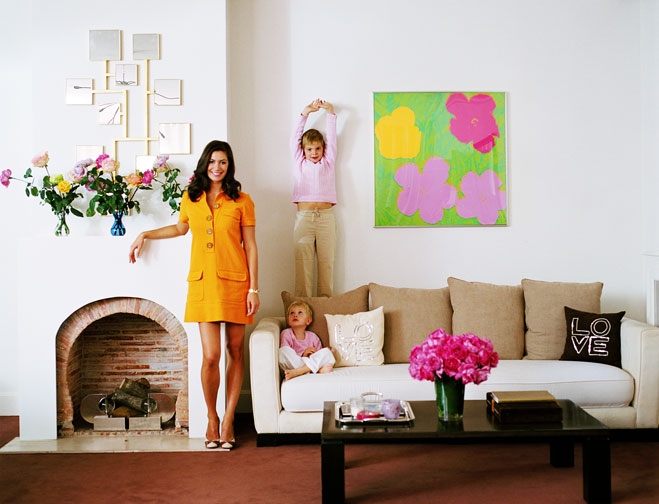
At the moment my thinking on this room is headed in one of two ways. To keep the basics of the room white or neutral, but then to furnish it with zingy, bright accessories as in this picture from the ever-inspirational Decor8 (though standing next to the fireplace all day wearing a tangerine minidress would surely get a bit boring after a while). In which case stripped (the fireplace, not me) as here, might be the best way to go. However, I’ve never done neutral before, and am wondering if I’d get a bit bored of it, however zingy the accessories. Also I’m a bit apprehensive about horror stories I’ve heard about stripping back paint, am worried about lead paint with a little girl around and don’t think my bricks will be as pretty as those below.
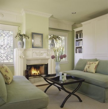 Option two in my mind is to paint the whole thing a lovely soft celadon green with white trim as here (pic again from Decor8) and keep things a bit more muted. In which case the fireplace could either go white, or a perhaps a slightly darker soft sage green.
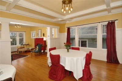
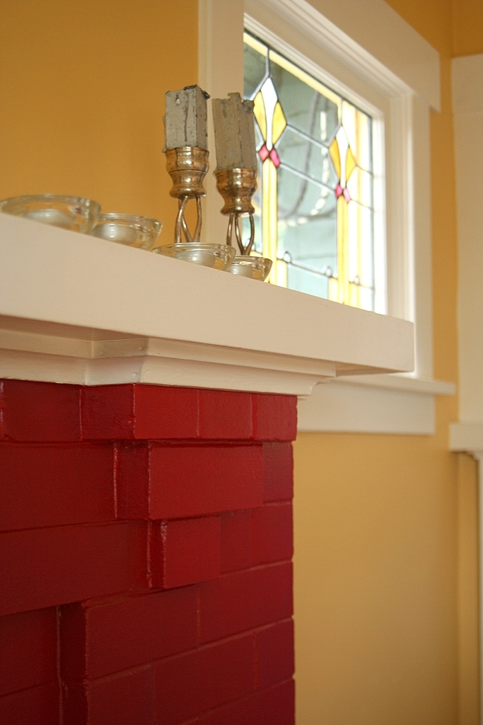
However, in the UK most of our fireplaces are white, so it would feel odd to paint it another colour. (Am I right in thinking that most people who voted for ‘paint it a toning colour’ are from the US?) The other problem here is the stained glass in yellow and raspberry, which I’m not sure will go at all (though maybe raspberry accents will help?)
Di and co, I hear you about changing the mantle. However the current mantle is, I think, original, and has been been beautifully crafted to work with the raised brickwork on the fireplace, so I feel I ought to be respectful of it.
Adding some texture to the inserts would be lovely. Does anyone know what sort of thing would have been added here originally? I was assuming tile, but there doesn’t seem to be any evidence of tiles having been applied.
Elizabeth, I know next to nothing about feng shui but am very willing to give it a go if it will make me happier and more prosperous! This room is to the bottom left of the grid, with the East facing wall running along the bottom (the wall with the fireplace and stained glass faces South). Any advice based on that?
Can you hear my confusion? I’m going to try and get my head round this over the next week or so and start getting a mood board together, at which point we’ll do another poll. I also need to pull together the key inspiration pieces I want to use in this room. In the meantime. any further thoughts or suggestions would be very welcome.

You could always use glass paint or film to change the look of the stained glass and to tie in with a different colour scheme.
Is this the main family room – if so i would maybe go for Option 1 if not Option 2 looks like a great adults hang out.
Good Luck!
I couldn’t get the thing to allow my comments on the fireplace Q, but good that you have narrowed your options now. Both ideas sound really nice. I (when not in mid construction) nearly always live with almost white (I mix pure brilliant white & magnolia cause they are always cheapest and in big sizes and it gives the same colour as Dulux ALmond white but a fraction of hte price).
Then I make my textiles seasonal, so I never get bored. greens and light bright in spring, brights and blues in summer, whatever I fancy in winter and warm reds and others over winter. People love that every time they visit they feel like they are in a new place as the feeling from the different colours dramatically alters the room.
I reckon the white option would work really well with the window if you are having a couple of things in the two colours, but if you wanted the green, how about using artists acrylic paint to change the yellow part of the glass to green!? When you leave it can just be scraped off with a finger nail. It wouldn’t be the soft green, but at least may blend better.
Paola, you don’t sound confused at all, au contraire.
(personally, I love the 2nd choice of celadon green–woot. That is go-gorgeous)
As for feng shui– if I understand you correctly (standing at the entrance of your house, this room is on the left–) then you are working in gua 8 of your home.
The 8th gua is knowledge. All about knowledge and self-cultivation. it’s about going inward to find peace and wisdom. the essence of this area is contemplation and its element is earth.
Things that support this gua: blue, yellow, squares, brick, slate, soil (anything earthy), soft rug, diplomas, academic certificates, BOOKS
Try to limit: metal, green, black, white, noisy or disruptive things (i.e. a cuckoo clock– not that I’m suggesting you have one *smile*), electronics–
the key of course is balance– if you want more info on this gua– let me know. if we have identified the wrong gua– let me know– cheers!
If you go all white you will lose the definition of the beautiful woodwork and beams, which are so lovely. You could do a white/cream combination if you decide to keep the background really light, but please don’t paint everything the same color. I love that green and white picture, especially the grayish sofas against the clearer background. Looks sophisticated to me.
Hi,
Ideas sound really nice.I reckon the white option would work really well with the window if you are having a couple of things in the two colors…