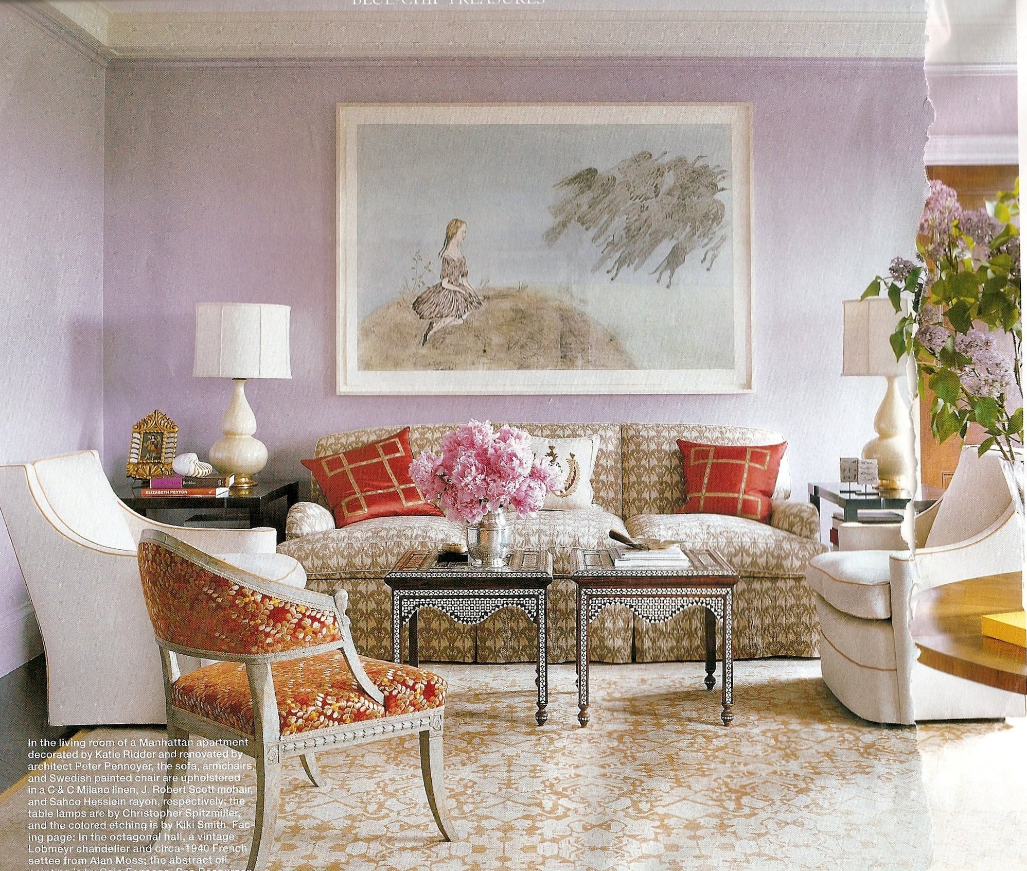
This room graced the March cover of Elle Decor magazine and I hesitate to include it as a Go Fug Your Room candidate because I like the unusual colour scheme very much indeed.
But I looked more closely and realised that I didn’t really like any item in this room. Every piece is just that bit too ornate and fussy for my taste. Too much piping, gilding, carved wood, embroidery, stuffing, inlay, pattern and stuff. Each of these pieces would probably work fine on their own as accents amongst plainer pieces, but together for me they all add up to just, well, too much.
I’m intrigued to know what you think, as I suspect that this room is really more ‘American’ in taste and I’m planning some blog posts about the differences between US and UK interior design.
Here’s the poll – if you feel like saying where you’re from in the comments that would be great.

maybe i’m not the best person to chime on on “american taste”, but i agree with you. the color scheme is lovely, but the furniture reminds me of my grandmother’s parlor, a shrine to late 1960s WASP taste. i do like the art and the moroccan tables though. in a different setting both could work quite nicely.
This room made me think of the fifties as the photo slowly revealed itself. Its the shape of the lamps against the plain wall and the shapes of the furniture. (I don’t remember many ethnic touches in fifties decorating though, except maybe African masks.) I like low contrast color schemes, so I was prepared to like it, but in the end I don’t think it works. It doesn’t really look like a space I want to spend any time in. I will be interested in your contrast and compare on American and UK design.
i’ve wandered over to your blog from comments on tertia’s, i hope you don’t mind! i voted that it was old-fashioned and cluttered, i am really disturbed by the vase of flowers on the table. then again, i have a house full of small children so that would never ever happen here. i do like all the chairs, but the couch is kinda eww.
I have a mad crush on hydrangeas so the flowers really work for me and I love the colour scheme. I think I *almost* love the chairs individually, but as a whole the pieces just seem to be fighting each other. And I have no idea what those tables are doing there… pretty tables but in this context? All wrong.
I’ll look forward to your UK/US comparisons as ‘spot the nationality’ is one of my favourite [design] games.
I agree that each of the individual pieces make me really happy. I like the use of antique style without the overall look being dark and forboding. It is rather fussy but it at least looks liveinable – I can’t bear the stark minimalism that frightens me into bringing a magazine in in case I create clutter! PS I’m from the UK. But then you knew that. xx
I totally agree w/you – the combination of rust + pastels is nice but the details are kind of oppressive. Love the lilacs though!
I voted for fugger-ly. I’m Canadian….
I like the lamps (with a more modern shade) and the white armchairs, but I agree that I’d like them much better in a plainer room. I also like the dreamy wall colour. But this is much more formal and fussy than what I aspire to myself.
I too would be interested in the U.K./U.S. decor comparison (I am a Canadian myself) as I really enjoy the aesthetic seen in LivingEtc. and think of that as the quintessential British look of melding traditional detailing (crown mouldings, bare floorboards) with modern furnishings and fixtures.
Love the walls, the end tables nextto the couch, the white chairs & occasional chair (and not all in the same room). The rest has got to go. Ok, the rug is ok. I would never survive having my children in this room and if I may say so – it doesn’t look particularly and culture to me. Snobby or moneyed maybe.
that is so interesting because my first reaction was i really love this – it is magical – upon closer examination – you are right! maybe it is the use of color that i like so much – i do LOVE that painting though!
That room is beautiful, I love so many things in it — particularly the painting over the sofa and those two white chairs. I don’t think it’s fugarific at all. 🙂
I completely agree with you. The colors are lovely, the pieces are not. On a quick glance, it looks good, but as I look closer, I don’t like any of the pieces either. Maybe the rug, and maybe the chair in the foreground, if it were reupholstered. All too ornate for me currently. (from seattle)