Monthly Trend Report: Metallics


Here’s the lovely Tina Ramchandani again with her monthly interior designer’s trend report.  This month spoke to me loudly since my favourite colour is SHINY and we’re sort of considering somehow making the space around the toilet in the bathroom gold or silver. (The Husband and I may have been drinking too much when we discussed this.)


Metallic interiors

{via from top left Interiors By Studio M; Trendir; Pinterest; Mimi and Meg; Pinterest; Pinterest; Pinterest}

Hello again! It’s Tina of Life in Sketch, here with your Monthly Trend Report. Spring is just around the corner and the weather is getting warmer. I’m in the mood to redecorate, and I’m sure you must be too.

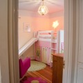
It’s always nice to see what’s in trend, and what trends are about to pop up so we can decorate our homes accordingly. After all, we want our spaces to be the envy of all our neighbors! Today I’m going to talk to you about metallics. While this isn’t exactly a new trend, it’s something that’s stood the test of time. We seem to see metallics popping up more in the spring and summer, don’t you think? I see more wood pieces in the winter, and maybe because metallics appear lighter they seem the pop up in interior design as the weather gets warmer.

You can use metallics in several ways. You can install a metallic wallpaper but if you decide to go this route be careful. Too much shine can be overwhelming, so you may want to install this in a small room or area, like at the back of a bookcase. I like to find metallic side tables, which will add a little bling to my room. Horchow has a great selection. If you’re willing to search, you may be able to find fabrics that have a little sheen, or metallic threads sewn in. This will give your room a very luxe look!

Do you have metallic accents in your space? What do you think of this classic look?

   
Share

Kitchen Remodel: Progress At Last


After a few weeks when it seemed like nothing much tangible was happening (though I knew a ton of stuff was happening behind the scenes) we’ve suddenly made huge progress in the last week.


upstairskitchen


The big news is that, not only do we have primed white walls and ceilings, but the floor has been laid. I am so pleased with it.  I was a little worried that it would be too dark but I think it is warm and inviting and will hopefully look even less forbidding when the whole symphony of white above it fully unfolds.


upstairskitchen-2 upstairskitchen-3


KitchenSampleBoard


Here is what the ‘symphony of white’ is going to look like.  I realise you can’t see any difference at all between any of them on your screens, though they are there.  I have to run off now to a meeting at the Minx’s school, so I think we’ll talk about whites in another blog post.


upstairskitchen-5


The other big news is the arrival of a jolly green giant this morning in the shape of our new Big Chill fridge (of which more too next week). And it fits into the space we left for it!  Much excitement all round here as it slid smoothly into the allotted gap.

Again I am delighted with it.  It was a ridiculous amount of money of course, and it’s huge design blogger cliché, but I do think it gives the room a focal point and the green reflects all the light in the kitchen and appears less sickly than it seemed from the sample.

All hugely thrilling, I am starting to see light at the end of the tunnel.

   
Share

How To Temper Chocolate


So today, chaps, we’re going to do some science (cue sound of frantic scurrying in opposite direction).


chocolatedippedstrawberries-8


Fortunately this science involves the melting and eating of chocolate, which makes me wonder why they didn’t teach this sort of science at school (though I was always quite partial to Chemistry, which is really just cooking for people who don’t like to eat).

But I digress.

Last month I was looking for a quick, easy and luxurious Valentines’ treat that I could make for my beloved family, which didn’t actually involve much, you know, actual work.

So I hit upon the idea of chocolate dipped strawberries. Obviously this was not a particularly original Valentines’ idea, so much so that even my local rather crappy supermarket was equipped with the right sort of hideously expensive, resolutely hothoused, absolutely gigantic, long-stemmed strawberries that you need (and that I never, ever saw in the UK).


chocolatedippedstrawberries-2


The only tricky thing about dipping strawberries in chocolate is that the chocolate needs to be tempered, so that the chocolate you end up with after melting and cooling remains glossy and has that perfect chocolate ‘snap’ to it, instead of being dull, mealy and soft.

This is because cocoa butter has a crystalline structure.  In properly tempered chocolate (like the stuff you buy) all the crystals are lined up neatly and in the same direction, which gives the chocolate its texture and sheen.  When you melt chocolate the crystals get all higgledy piggledy – the chocolate tastes the same, but the snappy texture and glossy sheen will have disappeared – UNLESS you bring it back into temper again.

There you go, the science is over.  You can take you fingers out of your ears and stop singing lalalalalala now.


chocolatedippedstrawberries-7 chocolatedippedstrawberries-5


Tempering chocolate is one of those things that sounds scary but really isn’t.  I’d never done it before making these and ended up with a pretty good result.  The one thing I’d say though is that if you’re a beginner, you’ll need a good food thermometer.  The temperatures have to be precise, and while it’s apparently possible to discern changes in the texture and look of the melted chocolate when it hits the right temperatures if you’re experienced, I really couldn’t see much difference.


chocolatedippedstrawberries-3


Method

And now that I’ve put the fear of God into you, here’s what you do.

First break your chocolate into chunks or, as I did, use Guittard chocolate wafers.  Chocolate chips made for cookies are not suitable for tempering.

Using a double boiler, or a glass Pyrex bowl over a pan of simmering water, bring your chocolate to a melting temperature ie. 115 degrees F (46 degrees C) for dark chocolate and 110 degrees for milk or white. Be super careful not to heat it too high otherwise it will seize.  Also WATER + CHOCOLATE = TROUBLE.  Don’t say I didn’t warn you.

At this point if you have a cold marble slab in your kitchen you can pour the chocolate out and start throwing it around so that it cools to the correct temperature. You’re on your own with that though.  I’ve never done it before.


chocolatedippedstrawberries-6 chocolatedippedstrawberries-9


If you’re not using a marble slab, grab a handful of unmelted chocolate wafers or chunks of chocolate and add them to the chocolate and stir as if your life depended on it. This is called ‘seeding’ and the fact that the crystals in this tempered chocolate are properly arranged will help the crystals in the melted chocolate to arrange themselves accordingly.  Keep adding a few chocolate wafers and stirring the chocolate until the temperature drops to the recommended temper point – 88- 90 degrees F (31-32 degrees C) for dark chocolate and 80-82 degrees F (27-28 degrees C) for milk or white.  This will take about 15 minutes and is hard work.

If the chocolate gets too cool and too stiff to work at this point you can reheat it a little with a hairdryer, but be careful not to take it warmer than 92 degrees or else it will be out of temper again.

Once you’ve got your melted tempered chocolate, things get much easier.  Dip the strawberries in the chocolate and lay them on a sheet of baking parchment or Silpat (I learned to my cost that the baking rack isn’t a good idea as things stick).

If you want to make artsy white chocolate dribbles, snip the corner off a small Ziploc bag, fill it with melted tempered white chocolate and wave the bag about over your chocolate covered strawberries.

And that’s it.  Easy peasy lemon squeezy.


chocolatedippedstrawberries-12


Share

Mad Men Season 6


I SO cannot wait. 

And aren’t these promo shots by Frank Ockenfels freaking GORGEOUS!


cast-mad-men-season-6

girls -mad-men-season-6

mad-men-season-6

megan-draper-betty-francis

peggy -mad-men-season-6

peggy-olson

trudy-campbell-pete-campbell

mm6


Sadly it looks like Megan Draper is going to be just as pouty and irritating as she was last season (she is SO high on my ‘irrational hatreds’ list she needs oxygen).

Here’s writer/director/producer Matthew Weiner talking about this season, a fascinating interview with photographer Frank Ockenfels about making the shots, and here’s my post on Megan and Don’s new apartment which was featured in the LA Times (thereby marking one of the pinnacles of my blogging career).

The show premieres on April 7th in the US.

   
Share

Project 52 PRO: A Weather Poster


This week’s Project 52 PRO challenge was to shoot a poster for the Seattle Chamber of Commerce advertising the weather in Seattle. 

Seattle is of course famous for its rain, but also has glorious clear bright days of sunshine, the most amazing sunsets and the most incredible cloudscapes it has ever been my good fortune to see anywhere.

For the entire week of the challenge though, we were blessed by unremittingly boring, flat, grey, overcast skies leavened by the occasional bouts of weak-willed drizzle.  Not even the rain was photogenic.

So plans had to be changed and this is what I ended up submitting.


mon-assign4-paola-thomas


Please ignore the amateurish graphic design – we weren’t being critiqued on that, though I’d love to improve my graphic design capabilities (can anyone recommend any good books or courses I could do?).

And although this isn’t at all the sort of photography I want to do, it was interesting and challenging to spend the afternoon with my coffee machine in the kitchen, trying not to get too many distracting reflections on the shiny bits.

   
Share

Kitchen and Bathroom Remodel: Paint Colours


So today is a momentous day in Kitchenlandia (and in Bathroomlandia too).

The whole shebang is going to be sprayed with white primer and we shall finally be rid of the burnt orange and baby poop coloured walls and the tongue and groove ceilings should fade into oblivion.

I am SO excited.

overhead


There hasn’t been much to report the last couple of weeks, as much time has been spent working on the electrics and plumbing and new shelving and drywalling etc. But now instead of destroying stuff, the contractors will actually start rebuilding and we should see it all start to take shape. 

We (by which I mean the Husband, with me backseat driving) have been using some fabulous free 3-D drawing and planning software called Google SketchUp and this is what we’ve come up with so far.


South wall


The floors are going to be a dark brown laminate.  I wanted to have something dark to ground the space and was initially drawn to dark cork, but was told that dark cork (which is simply dyed) was very susceptible to visible scratches and scrapes.  So laminate it is. We’ve chosen one which looks a bit knobbly and distressed, to go with the old fir floors in the rest of the house (though I couldn’t bring myself to match their horrible orange colour).


West walll


The counters will for the most part be a nice matte white honed quartz from Pental.  Blew our budget a bit with that choice but I needed something lovely and neutral after all the year of forest green laminate.

For the sticky out island bit to the side we’ve chosen some walnut butcher block.  Again it was rather more than we were expecting to spend, but it will be fabulous for baking bread and making pasta (and for taking food photos).  There will be a hinged piece at the end to add extra countertop space when I’m cooking.


North wall


We’ve managed to include a pull-out larder cupboard and a rolling aluminium appliance garage on one wall which I’m super excited about and the big mint green monster you see is the retro style fridge which will be delivered next week, of which more then.

East walll


We’ve also extended the shelves on the back wall. These will be stained to match the walnut butcher block.

So now I have to choose paint colours.   I am tempted to just paint everything white, but a little scared that it will end up looking like a clinic, what with the white cabinets and counters. However, I have a lot of colouful kitchenware which will go on the open shelves, and we do have the big green fridge to contend with. But still it’s tempting to do something whacky with the back wall with the shelves on it.  Or at the very least a soft mint green.  What would you guys do?

If we do go for all white, can you recommend a nice soft white you’ve used recently?  Especially if you’re in the Pacific Northwest with our grey winter skies and dazzling summer light (kitchen faces south and west). I don’t think I’ve ever painted a wall white in my life.  (Oh and ignore the greyness of the SketchUp pics.  It’s just trying to render shadows.)

Just in case you’re feeling nostalgic, here’s a final glimpse of the burnt orange walls and wood ceiling.


kitchenremodel-1 kitchenremodel-2


And of the baby poop walls (and the bizarre mural of fir trees they were hiding) in the bathroom.


bathroomremodel-1 bathroomremodel-2


Please be nothing that the ghastly glass bricks in the bathroom have GONE and a lovely new frosted window is in their place.

   
Share

Palm Springs Modernism Week Bus Tour


modernistbustour12


Though they were officially sold out, I was lucky enough to squeak my way onto one of the famous Modernist Week bus tours.  Apparently if you show up on the day of the tour there’s a good chance of getting on one thanks to no-shows.

I can’t recommend a tour highly enough if you happen to be in Palm Springs for Modernism Week.  They’re a great way of getting a real sense of the unique architectural history of Palm Springs and spying on some truly FABULOUS houses.

Come and join me for a trip.


Chase Bank 1960 E Stewart Williams


The iconic now Chase bank designed by E.Stewart Williams (who also designed the Edris House) in 1960.


modernistbustour27


The Bank of America building with its famous blue mosaic wall built in 1959 by Victor Gruen Architects.


Del Marcos Hotel 1947 William F Cody


The Del Marcos Hotel, one of the earliest examples of Palm Springs modernism, built in 1947 by William F Cody.


Frey House


This is as close as I got to the world-famous Frey House II, perched in the mountains and designed by Albert Frey in 1963 to blend into its surroundings. Would have loved to have visited this one.


Barbra Streisand's House


This rather ugly sprawling monstrosity apparently belongs to Barbra Streisand. She didn’t wave.


Dinah Shore 1963 Donald Wexler


This gorgeous house was built for Dinah Shore by Donald Wexler in 1963. I’ve found some fun photos of the interior that I will share soon.


Elvis Presley Honeymoon Hideaway William Krisel


Dubbed the “House of the Future’ and designed by William Krisel in the early 1960s, this is the hideaway where Elvis and Priscilla Presley spent their honeymoon.  The fabulous Alix Tyler of Modern Kiddo (and previously Strawberry Lemonade) wrote a great post about the interiors and the Elvis connection a couple of years back.


modernistbustour6


We also saw some groovy private houses built in Modernist style.  The great thing about Palm Springs is that the style is not just restricted to a few iconic houses but covers whole neighbourhoods.


modernistbustour7


These houses with steeply-pitched roofs are called ‘Swiss Misses’.


Kaufman House 1946 Richard Neutra


Here is world famous Kaufman House built by Richard Neutra in 1946. Must find my way in there one day.


modernistbustour11


And this repurposed gas station is the Palm Springs Visitor Center.


modernistbustour13


Here is our lovely tour guide.  He knew everything about everything to do with Palm Springs.


modernistbustour14


A very bad picture of a zigzag roof.  It’s in there somewhere.


modernistbustour15


Frank Sinatra’s house, Twin Palms, designed in 1947 also by E. Stewart Williams.  Apparently he had to be persuaded hard to get a house in the Modernist style. Now it is impossible to imagine him in anything else.


modernistbustour17


The beautiful Catholic church of St Theresa (where the funeral of former Palm Springs mayor Sonny Bono was held, with a eulogy by Cher).


modernistbustour18


A former 1960s hotel has been refurbished as the splendidly-colourful Saguaro.  We took a peek inside one day and it looks fabulous.


modernistbustour19


We again stayed at the Ace which was repurposed from a old Howard Johnson motel (as immortalised in the most recent season of Mad Men).

More private homes.


modernistbustour20


Nice clerestory windows.


modernistbustour21


Nice butterfly roof.


modernistbustour22


FABULOUS orange front door.


Telly Savalas Home


Bettered only by the pink front door on the former home of Telly Savalas. Bet you never thought of Kojak with a pink front door.

I think I’d better stop now.  I have literally hundreds of photos from this tour, but I suspect my blog is about to explode.

   
Share

Things I Am Loving: Nicole Porter Hardwood Bowls


Yet more things I don’t have either the money or room for.  They’re absolutely stunning though.


nicoleportercollage


Buy these unique handpainted wooden bowls, plates and servers at www.nicoleporter.com or on her Etsy shop and then send them to me.

   
Share

Project 52: Food Glorious Food


I’ve been having fun with my Project 52 assignments recently.  The last two assignments have been to take hone in on the type of commercial photography we want to focus on and to take a picture of the raw ingredients for a simple recipe.

So I got to shoot food and more food.

First up I decided to shoot a graphic shot of doughnuts.  I was feeling lazy and baking is tricky at the moment without a proper kitchen, so I picked up some Krispy Kreme doughnuts and then mixed up a pink glaze to get some interesting drips and splodges.


doughnuts (1 of 1)


For the raw ingredients challenge, I tried to get a bit arty and was inspired by the idea of an artist’s palette.


beetandorangesalad


Beetroot, Orange and Pistachio Salad

Roast some beets whole in their skins in a little olive oil, salt and herbs (some thyme branches are good) until soft.

Peel the beets and make a salad with some perky watercress or rocket/arugula, some peeled orange segments, some pistachios or pecans and some chunks of goat cheese.

Dress with sea salt, extra virgin oil and some good syrupy balsamic vinegar.

Slowly and painfully I feel that I am groping towards a style – I’m not there yet, but it definitely involves interesting colour stories, graphic elements, shapes and repetition and lots of mess.

   
Share

WTF Friday: Alexander McQueen Fall 2012


alexandermcqueenfall2013


Though in this case the W stands for ‘Wow!’

Yeah, I know these aren’t exactly wearable, unless you’re Lady Gaga, but the workmanship in these clothes is utterly breathtaking, and I suppose the half-finger gloves would be perfect if you bite your nails.

If you see me walking down the street wearing a jewelled head cage and pearly fishnets you know who to blame.

Enjoy the fabulous crazy.


alexandermcqueenfall2013-2

alexandermcqueenfall2013-3

alexandermcqueenfall2013-4

alexandermcqueenfall2013-3

alexandermcqueenfall2013-5

A5B

alexandermcqueenfall2013-6

alexandermcqueenfall2013-7

   
Share